
Is there a deeper meaning of alignment in design, beyond the toolbar? Read along to know!
SUMMARISE WITH:
Is there a deeper meaning of alignment in design, beyond the toolbar? Read along to know!
In graphic design, the arrangement of elements is paramount. There are principles that designers follow to arrange elements in a composition in order to create good design. One of those principles is alignment, which can be applied to text, images, grids, and graphic elements. Usually, in a text editing software, there is a button that snaps the selected text to one side of the screen.
But is alignment just one of the features in editing software, or is there something more to it? Is there any meaning in aligning certain elements differently? What if you decided not to align text to the left side in your blog post? In this article, we try to understand what alignment is in graphic design, why it’s important, and how to use it properly.
Topics covered in this article!
- Understanding the Alignment Design Principle
- Types of Alignment in Graphic Design
- How is Alignment Used in Graphic Design?
- Final Thoughts
- Next Steps

Understanding the Alignment Design Principle
The alignment principle asserts that every element within a composition must have a connection to another. No shape, text, or line should be placed arbitrarily. In his book ‘Graphic Design For Dummies’, Ben Hannam says, “alignment is important because it creates a sense of structure and order and can be used to improve aesthetics, establish
relationships, and guide the viewer’s eye”. This guiding of the eye is the most important functional aspect of the concept of alignment. If left unguided, the brain expends great effort to make sense of the visual, causing discomfort and distraction. Alignment reduces this and positions elements so that the eye can follow visible and invisible lines that connect one form to another. In other words, through alignment, we read design.
To understand alignment, one has to understand it as a law of relations between design elements. Every element in a visual field should relate or connect visually with another, either by an edge, an axis, or an imagined line. This relation satisfies the brain’s affinity for order. The moment one object stands apart from others, the perception of coherence falters. Alignment, hence, becomes the tool that outlines the relations and guides perception. To refine this understanding, let’s understand the psychology of alignment.
The Psychology Behind Alignment
The principle of alignment arises from one of the most fundamental truths of human psychology: the mind seeks order to understand meaning. In the early twentieth century, Gestalt psychologists such as Max Wertheimer, Wolfgang Köhler, and Kurt Koffka showed that compositions have inherent in them psychological ‘forces’ like size, shape, position, and color. These forces affect our perception. The eye naturally groups elements that appear related by proximity, similarity, or continuity. This means that when two shapes share a line or axis, the brain perceives them as participants in a single system.

Look at the above image. What are the different things we can say about the dark circle inside the square? We can say that it looks like the face of a die, or that it looks like a void into outer space, or that it is covering something behind it, or any other interpretation of the image. However, what we cannot miss from the process of perception is that the square and the circle are seen together as part of a whole.
On a deeper level of cognition, we see the asymmetrical position of the disk, even when the line of symmetry or the centre of the square is unmarked, which has a certain meaning. The disk is not simply displaced with regard to the center of the square. There is something restless about it. It looks as though it had been at the center and wished to return, or as though it wants to move away even farther. The disk’s relations to the edges of the square are a similar play of attraction and repulsion. And the fact that the outer square is on the right side signals a possibility of another absent square on the left. All these meanings of movement, stability, and anticipation have the principle of alignment in their foundation. The circle could be aligned to the centre of the square, or the square could be aligned to the centre of the screen, and either would change the meaning of the composition.
Rudolf Arnheim, in his classic study ‘Art and Visual Perception’, showed that our sense of beauty (or meaning) is bound to the perceptual order of things. Modern cognitive science later confirmed this intuition, explaining that the brain experiences a reward when it encounters patterns that are easy to process, which is a phenomenon known as cognitive fluency or perceptual fluency.
Cultural psychology adds another layer. Alignment conventions vary across societies according to reading direction and aesthetic history. In the western left-to-right reading cultures, left alignment feels natural because it aligns with habitual eye movement. In the Middle Eastern right-to-left cultures, the opposite is true. In East Asian traditions, vertical alignment is the default.
Types of Alignment in Graphic Design
There are four dominant forms of alignment: flush left, flush right, center, and justified. In typography, it is fundamental to design. Each form carries and conveys distinct formal qualities, cultural associations, and aesthetic meanings. In her book ‘Thinking with Type’, Ellen Lupton describes the importance and meaning of these alignments.
Centered Alignment
Text that is centered is symmetrical. Like the front of a classical building. Centred type,
found on invitations, title pages, certificates, and also on tombstones, is meant to
slow down attention towards a name or a date.
The edges of the centered text body are sometimes uneven.
Line breaks are used for emphasis and to direct attention to new thoughts.
The skill of a designer in using centered type is to break a text
to create elegant and organic shapes.
Ideally, centered type should be broken
into phrases with a variety of
long and short lines.
Justified Alignment
Back in the day, printing had movable type that created page after page of straight-edged columns of text body identified as justified type, a norm that is still followed today in newspapers and magazines’ printing systems. Unlike centered type, justified type has even edges on either side of the column. It used to be a labour-intensive task before the digital era of printing to manually set the type using small metal spacers to alter the spaces between words and letters to make all the lines the same length. This is now done automatically in digital typesetting.
It is supposed to make a clean and compact shape of the body text with the most efficient use of space. Sometimes paragraph changes are conveyed using symbols, such as the pilcrow symbol – “¶” to preserve the solidity of the column. However, undesirable gaps can form between words if the line length is too short in relation to the size of the type used. Here, hyphenation helps to break up long words near the right edge and keep them packed. Designers have to reduce or increase tracking, either to fit additional characters on a line or to space out a line that looks too loose. Caution should be taken if the length of the column is too narrow, as gaps may occur.
Flush Left Alignment
In flush left text or simply left-aligned text, the left edge is hard and the right edge is soft. Word spaces do not vary, so there aren’t any gaps inside the lines of text. This format facilitates reading as the hard edge anchors the eye to a common returning point at the turn of every line.
It was used primarily for setting poetry before the twentieth century. Since the right edge is soft, a rag could form along the edge that looks “bad” when it is too even or uneven, or when it begins to form regular shapes like wedges “/”, moons “)(”, or diving boards (single line extending outward). A good rag looks pleasantly uneven when the lines are not too long or too short, and hyphenation is kept minimum. Designers or writers have to create the illusion of a random, natural edge when using this alignment.
Flush Right Alignment
As can be easily inferred, flush right is a variant of
flush left text, and has a hard right edge and a soft left
edge. It is common among typographers that flush
right is hard to read, as it forces the reader’s eye to
find a new position at the start of each line. Also, it is
not commonly used for longer bodies of text. When
used in smaller blocks, it makes for appropriate
marginal notes, sidebars, pull quotes, or other
passages that supplement or comment on the main
body text or image. Punctuation can weaken the hard
right edge, and bad rags are just as unpleasant as in
the flush left variety.
How is Alignment Used in Graphic Design?
In theory, alignment is a fundamental function of the grid system on which a composition is positioned, like the Cartesian plane is a grid system for coordinate geometry. It lends itself easily to various ideas of arrangement and positioning of elements, but for it to contribute to the meaning-creation or problem-solving aspect of design, it must first be understood and then used in tandem with other design principles.
1. Hierarchy + Alignment

Hierarchy determines what the viewer sees first, second, and last. The eye naturally moves or jumps along a pattern of focus points in the scene.
Donis A. Dondis, in his book A Primer of Visual Literacy, explains how the eye scans a visual scene (see image above), following a pattern. This information can be used to align text bodies and images in their order of importance to capture attention efficiently and maximize the effect of communication. This insight is very useful for UI/UX designers crafting interfaces for custom brand messaging projects.
2. Balance + Alignment

Balance concerns the distribution of visual weight. Alignment works as the axis upon which that weight rests, at least in our perception, to assign an amount of stability to the visual.
For instance, in the image above, the tree on the left looks tilted to the left, and the one on the right is shifted to the right a few pixels more, which is ‘off balance’. Tweaking alignment can achieve that equilibrium. For instance, aligning heavy visual elements opposite lighter ones along a central axis can create harmony. Emotionally, balance communicates calmness and authority; imbalance, when deliberate, signals friction or rebellion.
3. Grid + Alignment

The grid is where alignment works. Historically, the grid emerged from the need for reproducibility in print design, where the order of compositions across pages needs to be consistent. In the digital age, it remains indispensable. From a cognitive perspective, the grid resonates with the brain’s preference for predictable intervals and ratios.
The image above displays a modular grid created by positioning guidelines that govern the whole document. Here, text bodies, images, and symbols have an alignment that they follow. There are margins that take into consideration the binding of the book, the place where the thumbs will rest while reading, the framing of the content, etc. The content has to be aligned according to the margins.
4. Area + Alignment

There is a concept in graphic design that constitutes the arrangement and treatment of elements as visual masses rather than outlines. Consider the above image. Let’s say we were to look at visual elements through a lens that was out of focus; their sharp outline would disappear, and the image would appear blurry. Then, if we were to centre these blurry images on a line, we would have applied the central area alignment principle to the images.
Area alignment operates on the brain’s ability to perceive grouped stimuli as single entities, known as the law of common region. When two shapes or blocks of text share an invisible alignment of volume, the eye perceives them as related, even if their edges do not meet.
Final Thoughts
Alignment, as explored throughout this article, is a concept that plays a structural role in the design space. From the psychology of perception to the technicalities of grids, balance, and hierarchy, alignment guides the viewer’s eye, balances visual weight, and sustains harmony across a composition.
Through centered, justified, flush left, or flush right alignment, designers use this principle to place content and help everyone interpret design in a certain, intended manner. In conclusion, alignment is the foundation upon which meaning is built.
Next Steps
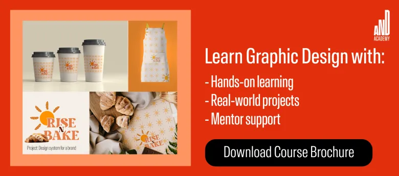
If you’d like to know more about graphic design or related topics, head over to the AND Academy blog for more articles. You can also check out this project by AND Learner, Sant Kaur, to get inspiration for your next graphic design project!
If you still have unanswered questions about pursuing graphic design, consider these additional resources for further information:
- Watch this session by graphic design industry leaders Soumya Tiwari and Sakshi Jain.
- Talk to a course advisor to discuss how you can transform your career with one of AND Academy’s courses.
- Explore our Graphic Design Course, which is taught through live, interactive classes by industry experts, and comes with a job guarantee.
- Take advantage of the scholarship and funding options that come with our courses to overcome any financial hurdle on the path of your career transformation.
Note: All information and/or data from external sources is believed to be accurate as of the date of publication.


