
Curious about balance in graphic design? Understand its importance and explore its types, expert tips, and inspiring examples.
Balance in graphic design refers to the distribution of visual weight across different elements in a composition. It helps maintain equilibrium in a design and brings harmony regardless of the layout type — diagonal, vertical, or horizontal. Without balance in your designs, the viewer’s eye may struggle to focus on any specific area, making it difficult for your message to be conveyed effectively. Balance is what allows the audience to absorb information, ensures resonance with viewers, and communicates the message.
If you’re looking to improve your composition, visual balance is probably where you should begin. People naturally gravitate toward designs that feel comfortable and easy to engage with. This is why achieving balance in your designs is so important— it creates a sense of order and ease for the viewer. In this comprehensive guide, we will discuss the significance of balance in graphic design, its types, explain how to apply it in your designs, and provide some examples for inspiration.
Here’s everything we’ll be covering in this article!
- What is balance in graphic design?
- What is the need for balance in graphic design?
- Types of balance in graphic design
- How to apply balance in graphic design
- Tips for using balance in graphic design
- Bonus tips
- Examples of balance in graphic design
- The bottom line
What is balance in graphic design?

Image Courtesy: Fabrik Brands
Balance is a fundamental principle in graphic design and other visual art forms. It is the process of arranging elements in a design in a way that looks and feels proportionate. Whether it’s logos, website layouts, packaging labels, banners, blog images, or other visual assets, a well-balanced design naturally pleases the eye and displays a sense of order. However, balance doesn’t necessarily mean that every element needs to be identical in size, shape, weight, or color. It’s more about achieving a visual where no single element overpowers the rest and everything works together to ensure a harmonious aesthetic.
Balance is what gives a design appeal and purpose. It is a prerequisite that distinguishes your brand from the rest and ensures the right amount of attention from potential customers. Balance needs to be visible through your colors, images, texture, and white space. As we’ve seen, balance in design isn’t limited to symmetry; asymmetry can be just as effective, often creating more engaging and satisfying solutions.
What is the need for balance in graphic design?
Our eyes are used to seeing things in order. When balance is effectively used in storytelling and advertising, it creates clear focal points that convey the message in the right order. With the help of balance, graphic designers can guide viewers through a composition, emphasizing the most important elements.
Balance creates rhythmic movement in a design, making it visually appealing and easy to navigate. Without it, a design can feel cluttered, disorganized, and confusing. Many designers use asymmetry, contrast, focal points, and even intentional dissonance (a lack of harmony) to create the desired impact. The solution is to understand the fundamentals of balance and apply them strategically.
Types of balance in graphic design
Before applying balance to your designs, you must first understand the types and how to effectively use them for different purposes.
1. Symmetrical balance

Image Courtesy: Behance
Symmetrical balance is an even distribution of visual weight across a design. This simply means that when you draw a straight line through the center of the composition, the weight appears evenly balanced on both sides, creating order and stability. It is easier on the eyes of the viewers, attracts attention, and delivers the message. Using various techniques, you can maintain an intriguing and harmonious design by identifying the center and reflecting similar visual weight on both sides.
2. Asymmetrical balance

Image Courtesy: Behance
Visual balance doesn’t always require perfect symmetry in the distribution of elements. One can also achieve balance through asymmetry. An asymmetrical design usually includes one large focal point on one side and is complemented with less prominent focal points on the other. It deliberately creates an uneven arrangement of elements, introducing tension, movement, noise, and dissonance. To achieve this effect, one side of the composition may feel heavier than the other, but as long as the overall balance is maintained, the design remains effective.
3. Mosaic balance

Image Courtesy: Fabrik Brands
Mosaic balance, also known as crystallographic balance, initially seems chaotic and abstract, with a distinct lack of a focal point. But when you look closely, you will see that all the elements work together as a team, with specific areas receiving more emphasis.
4. Radial balance

Image Courtesy: Fabrik Brands
Radial balance is a composition in which elements are arranged around a central point and radiate outward in a circular or spiral pattern. This type of balance creates a sense of harmony and unity, as all elements are connected by their relationship to the center. Radial balance often draws the viewer’s eye toward the center of the design, making it a powerful way to highlight a focal point while maintaining an even distribution of visual weight.
5. Discordant balance
Discordant balance or off-balance is all about breaking the rules and making the viewers think and take action. It intentionally disrupts visual harmony by using elements that seem out of place or unbalanced. This type of design creates unrest, often through the use of contrasting colors, shapes, sizes, or positioning. The lack of symmetry or traditional balance can evoke strong emotions and draw attention, making it an effective technique for creating energetic visuals. However, it requires careful execution, so use it carefully.
How to apply balance in graphic design?
After understanding the significance and types of balance in graphic design, let’s take a look at how to apply this concept in your designs:
1. Choose the kind of balance that best suits your design
Out of the five types of balance: symmetrical, asymmetrical, radial, mosaic, and discordant, consider picking one among the first three options you find ideal. Evaluate your goals and how you want to convey your message. If you have multiple points that are equally important, a symmetrical balance could be the best option. Alternatively, you could use an asymmetrical balance to draw attention to a particular point. Radial balance could be a great choice if you have an important message supported by additional details.
2. Create a focal point
A well-balanced composition requires a focal point to anchor the entire layout. In an asymmetrical balanced design, a larger or more prominent element (like a text box, an image, or a shape) placed on one side of the layout can create a sense of balance despite the uneven distribution. This draws attention to the focal point, making it the natural starting point for the viewer’s eye.
It’s best to define the focal point first, as it helps to dictate the arrangement of the other elements. Once the focal point is set, everything supporting it can work together, ensuring the final design feels balanced and intentional, even though it’s not symmetrically arranged.
3. Spread out the elements
After setting the focal point of your layout, the next step is to carefully arrange the other design elements around it. Pay attention to the visual weight of each element and see how they look when placed close to one another. Proper distribution of elements across the layout will help you achieve a balanced composition.
4. Experiment with your ideas
The most effective way of applying balance in your design is through experimentation. Move the elements around your page and explore symmetrical and asymmetrical layouts. The more you experiment, the better you’ll understand what balance feels like visually. You can also try your hand at templates and intuitive drag-and-drop tools that make mixing, matching, and adjusting elements easy until you discover a style that suits you.

Tips for using balance in graphic design
So far, we’ve discussed how different visual weights can work together to achieve balance. However, when a design is filled with many elements, each carrying its own visual weight, it can be challenging for designers to organize them effectively.
Whether you’re working on a website, an advertisement, a poster, or any other form of design, the following techniques for achieving balance will be extremely helpful.
1. Balance from shape
When complex shapes are arranged within a flat composition having a solid color, their combination creates a contrast that allows the intricate details of each element to harmonize with the surrounding plain background. If you’re working with shapes, it’s ideal to go for a plain background to bring a sense of balance to your designs.
2. Balance from color
Combining small patches of bright colors with larger areas of dark colors helps achieve balance in layouts. However, to make this work effectively, it’s important to learn about color theory in design. Understanding how colors influence emotions and perceptions helps in executing this balance successfully.
3. Balance from size
Size is another effective way to create balance in a design. Larger elements carry more visual weight, while smaller ones appear lighter. Depending on the needs of your design, adjust the size of the elements to achieve balance in your compositions.
4. Balance from position
You can work with position-based balance in a design by strategically placing smaller elements throughout the composition to balance out the presence of a much larger element.
Bonus tips for balance in graphic design
Here are a few more quick tips to help you get started:
1. Practice with templates
If you don’t have much experience as a designer or you’re just starting out, templates with balanced composition can be a great option. When you have a pre-existing balanced framework in place, it becomes easier to experiment with different ideas. The more you practice on these templates, the more confident you’ll get in applying balance to your designs.
2. Do not ignore grids
Grids are basically guidelines for your layout. They may be a little restrictive in nature, especially if you’re trying to create a disruptive design, but if you’re new to this and unsure how to achieve balance in designs, grids can be your best friends. They ensure that each section is evenly balanced in your composition.
Compelling examples of balance in graphic design
Now, let’s take a look at some examples of popular brands that have used balance in their favor.
1. Starbucks logo

Image Courtesy: Boon
The Starbucks logo is one of the most recognizable logos in the world, largely because of its balanced design. The logo uses a vertical plane of symmetry, which creates a sense of stability that naturally draws people in. This balance provides visual appeal and structure, making it pleasing to the eye and easy to recognize. The symmetry is evident in the arrangement of elements, such as the central siren, which is evenly placed within the circular frame.
2. A Minor Fall book cover

Image Courtesy: Penji
Balance in design doesn’t necessarily require elements to be centered. It can also be achieved by positioning them to the left or right, as seen on the cover of A Minor Fall by Price Ainsworth. By organizing text, images, and other design elements into rows or columns, you can create a sense of order and harmony. This arrangement helps establish balance throughout the composition.
3. Pinterest homepage

Image Courtesy: Medium
One type of balance that’s less commonly used by graphic designers is mosaic or crystallographic balance, often referred to as organized chaos. This approach avoids giving any one element more prominence than the others, which makes it well-suited for platforms like Pinterest. While it lacks vertical alignment, the balance is achieved through consistent horizontal alignment and the uniform size of the images. This creates an overall sense of order despite the seemingly chaotic arrangement.
4. Mountain Dew Billboard

Image Courtesy: Penji
Texture can contribute to balance in your designs as well. By adding a detailed, textured area next to a flat section, you can create a sense of balance. This concept is clearly illustrated in Mountain Dew’s billboard, where the combination of textured and smooth areas helps achieve a visually balanced composition.
The bottom line
We hope this holistic guide has made you aware of the importance of balance and given you a fair idea about how it works in graphic design. Keeping that in mind, you can choose the right type of balance that aligns with your designs. Observe designs around you, experiment with new and unconventional ideas, and take your designs to new levels.
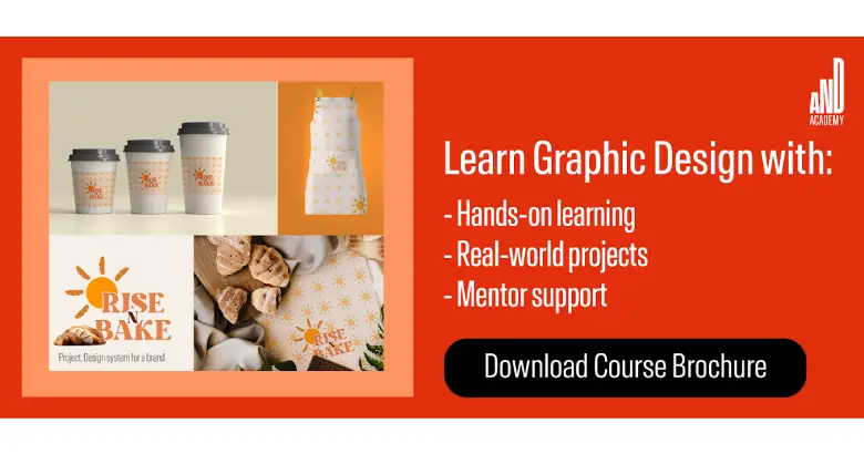
To learn more about balance and its applications in graphic design, check out the courses offered by AND, which comes with a comprehensive curriculum covering hands-on learning opportunities, unparalleled mentorship, and dedicated placement support. You can check out this project by AND Learner, Roohani Goyal to further understand the usage of balanc in different types of designs.
If you’d like to know more about graphic design or related topics, head over to the AND Academy blog for more articles. As a starting point, you can consider going through the following resources:
1. The Significance of White Space in Design (With Examples)
2. 10 Best Graphic Design Apps To Count on in 2025
3. Top 8 Free AI Logo Design Tools for 2025
Next Steps
In case if you need further assistance, visit our blog or consider the following resources:
- Watch this session by design veteran and AND’s Academic Head, Prachi Mittal, and our Course Lead, Soumya Tiwari.
- Talk to a course advisor to discuss how you can transform your career with one of our courses.
- Pursue our Graphic Design courses – all courses are taught through live, interactive classes by industry experts, and some even offer a Job Guarantee.
- Take advantage of the scholarship and funding options that come with our courses to overcome any financial hurdle on the path of your career transformation.
Note: All information and/or data from external sources is believed to be accurate as of the date of publication.


