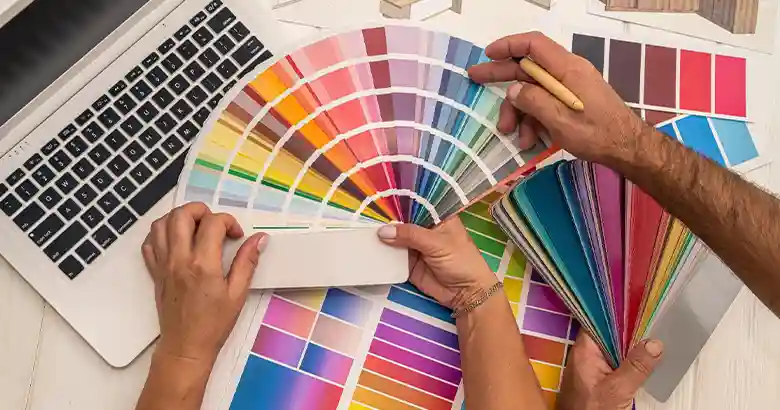
Colour palettes have the power to make or break your designs—so choose wisely! Learn about the six different colour palettes and how to use them in this guide.
One of the first, and most important, steps in any design project is choosing a colour palette.
Your colour palette determines the set of colours you’ll apply throughout your design. It shapes the brand identity, impacts the usability and accessibility of your designs, and even influences the emotions and perceptions of your target audience.
Selecting or creating a colour palette isn’t simply a case of throwing a few colours together. You’ll need to consider the relationships between different colours and how they can be combined to create contrast, harmony, and visual balance.
But, once you’re familiar with the different types of colour schemes, choosing the right hues for your next design project will be a whole lot easier. So without further ado, let’s dive into our guide.
Contents:
- What is a colour palette or colour scheme?
- Some useful colour palette vocabulary
- The 6 colour palettes (with examples)
- Tips for choosing a colour palette
- Further reading and resources for designers
First things first: What exactly is a colour palette?
1. What is a colour palette or colour scheme?
A colour palette, or colour scheme, is a collection of colours that forms the basis of a brand’s visual identity and/or features throughout a specific design or series of designs.
Colour is an incredibly powerful tool in the realm of art, design, and branding. Whether you’re designing a website or an app, a promotional poster, product packaging, or a magazine—the colours you use will have a huge impact on the overall aesthetic and how it’s perceived by the target audience.
As such, plenty of care and consideration should go into choosing a colour palette. Working with a set colour palette ensures visual consistency and cohesion, and helps to convey the desired message to the end-user or customer.
Different colour schemes achieve different effects depending on the relationship between the various colours involved. These relationships are determined by where the colours sit on the colour wheel.
For example: colours that sit directly opposite each other on the colour wheel create a highly contrasting colour scheme—like yellow and purple. Colours that are next to or near each other on the colour wheel—like amber and yellow— create a harmonious colour scheme.
Colour palettes are rooted in colour theory—the study of how different colours work together to create different visual effects. Colour theory also considers colour psychology; how different colours make us feel and the associations they evoke.
Colour theory provides a framework for understanding colour, and colour palettes are a practical tool for putting that framework into action. For a more detailed introduction, check out our complete guide to colour theory in design.
2. Some useful colour palette vocabulary
Before we explore the different colour palettes, it may be useful to go over some key terminology. These terms will crop up as we introduce the various colour schemes, so here’s a reminder of what they mean:
The colour wheel: A circular diagram depicting the primary, secondary, and tertiary colours (or hues) and their various shades, tints, and tones. Learn more about the colour wheel (and how to create your own) here.
Primary colours: Red, yellow, and blue—used as the basis for creating all other colours.
Secondary colours: Orange, purple, and green—created by mixing two primary colours.
Tertiary colours: Amber, vermillion, magenta, violet, teal, and chartreuse—created by mixing a primary colour and a secondary colour.
Hue: A colour in its purest form, without any added shade, tint, or tone. The primary, secondary, and tertiary colours are all base hues.
Shade: Refers to the addition of black to a base hue in order to create a darker colour.
Tint: Refers to the addition of white to a base hue in order to create a lighter colour.
Tone: Refers to the addition of grey (i.e. black and white) in order to adjust the saturation or brightness of a particular hue.
Ok, vocabulary in check! Now let’s discover the different colour palettes and what they mean for your designs.

3. The 6 colour palettes (with examples)
There are six main types of colour palettes:
Monochromatic: based on one colour.
Analogous: based on adjacent colours.
Complementary: based on two complementary (i.e. opposite) colours.
Split-complementary: one base colour plus the two colours adjacent to its complementary colour.
Triadic: three colours spaced evenly around the colour wheel.
Tetradic: two pairs of complementary colours.
Let’s explore each colour palette in detail and share some examples.
i. Monochromatic colour palettes
Monochromatic colour palettes are built on a single base hue and its various tints, tones, and shades. Monochromatic colour palettes are ideal for achieving visual balance, unity, and consistency. They are often associated with simplicity, elegance, and sophistication.
Bear in mind that, because you’re working with just one hue, monochromatic colour schemes are low-contrast—which can cause issues if your designs are text-heavy or if you need to ensure that certain elements stand out.
Monochromatic colour palette examples


Source: Beautifulhomes.com
ii. Analogous colour palettes
Analogous colour schemes consist of colours that are next to each other on the colour wheel. To apply this type of colour palette, choose one dominant hue that will feature most prominently throughout your design—for example, as the background colour—and then two adjacent hues to create accents.
Analogous colours effortlessly flow from one colour to the next, creating a harmonious and well-balanced aesthetic. As with monochromatic colour schemes, analogous palettes aren’t as effective at achieving contrast.
Analogous colour palette examples

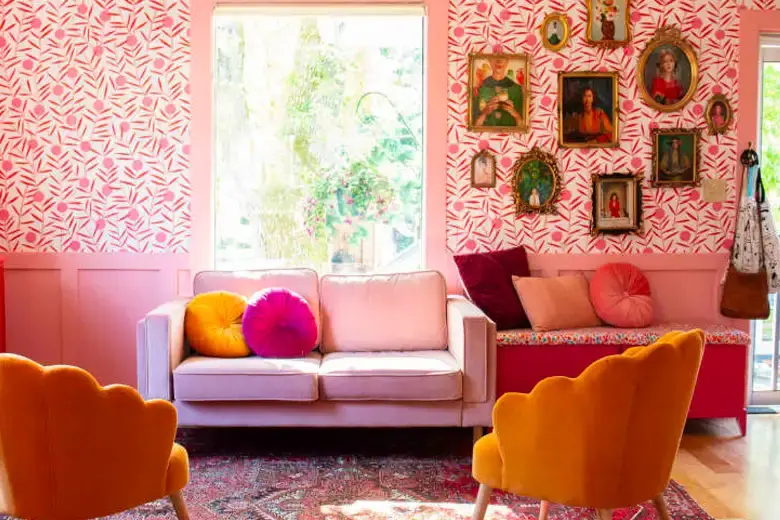
Source: Mackenzie Schieck

Source: Pinterest
iii. Complementary colour palettes
Complementary palettes comprise two colours that sit directly opposite each other on the colour wheel. As such, complementary colour palettes create a strong contrast. Complementary colour pairings also help to enhance each other’s intensity, often resulting in a vibrant visual pop.
Complementary colour schemes are striking and bold—great for conveying an energetic, exciting aesthetic. Note that this vibrancy and high contrast does have the potential to clash and can make it difficult to achieve visual harmony, so it may not be ideal for certain design contexts.
Complementary colour palette examples
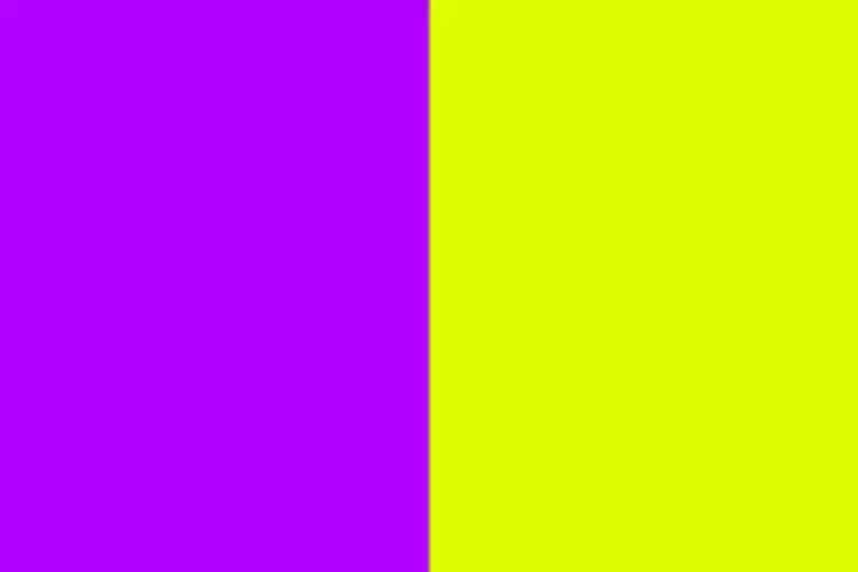
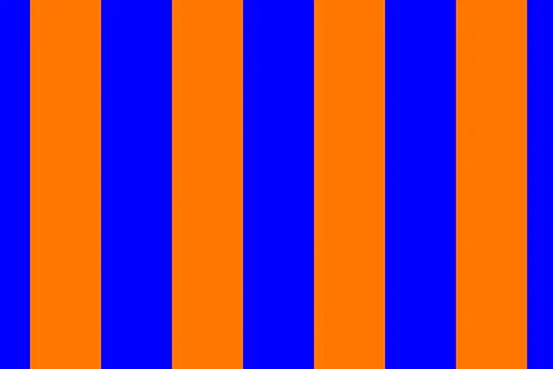
Source: Pinterest

Source: Zillion Designs
iv. Split-complementary colour palettes
Split-complementary colour schemes comprise three colours: one base colour and the two immediate neighbours of its complementary colour on the colour wheel.
Split-complementary palettes are the perfect sweet spot between contrast and harmony—a softer, smoother alternative to complementary colour schemes. They’re also incredibly versatile; they can be vibrant and dynamic or sophisticated and elegant depending on the hues, shades, and tones at play.
Split-complementary colour palette examples
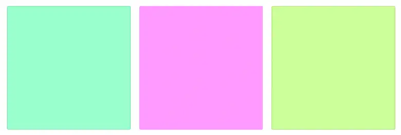


Source: Rethinking The Future
v. Triadic colour palettes
A triadic colour palette is based on three colours that are placed at equidistant intervals around the colour wheel. Examples of triadic colours include red, yellow, and blue, or green, orange, and purple.
Similar to split-complementary palettes, triadic colour schemes strike a good balance between contrast and harmony. Because of their equidistant placement on the colour wheel, three triadic colours when used together help achieve a pleasing sense of balance—with a little more visual intrigue than, say, analogous colour schemes.
Consider a triadic colour palette if you want a vibrant, eye-catching aesthetic that’s both harmonious and high-contrast.
Triadic colour palette examples
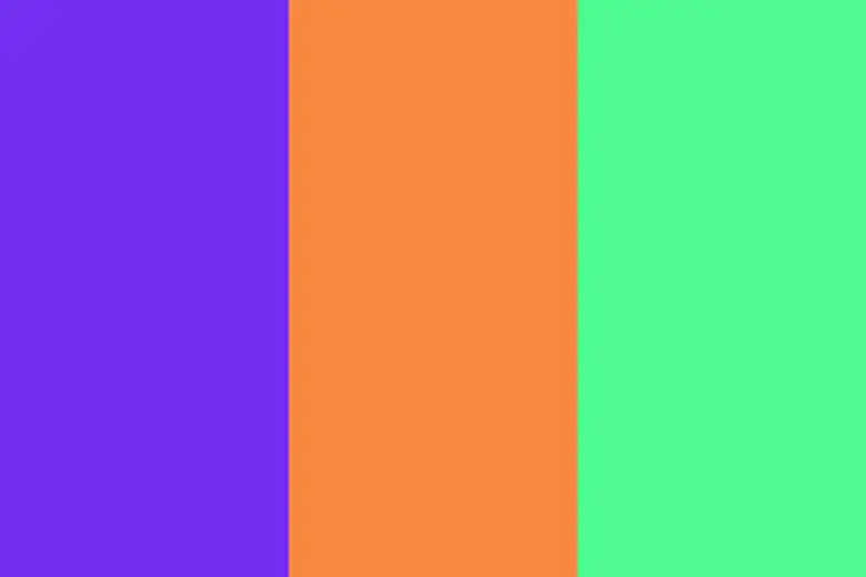
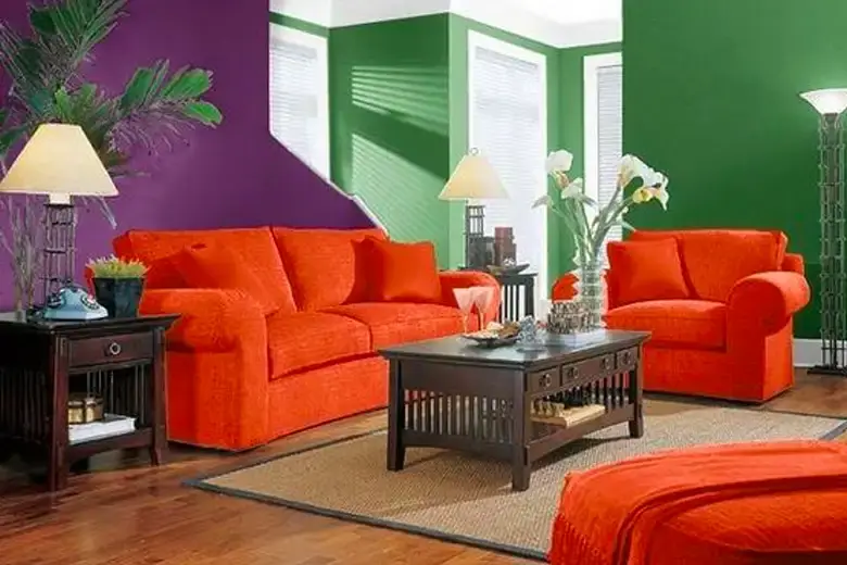
Source: Pinterest

Source: Fanta
vi. Tetradic colour palettes
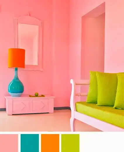
Tetradic (or double-complementary) colour palettes are based on two complementary colour pairings—four colours in total. Complementary colours are those that are directly opposite each other on the colour wheel. So, if you want to create a tetradic colour scheme, you’ll pick two base colours and find their direct complements on the colour wheel.
Tetradic colour palettes are rich and vibrant—and potentially overwhelming if not applied with care. Consider selecting one colour as your dominant hue and then using the remaining three colours for highlights and accents.
Tetradic colour palette examples
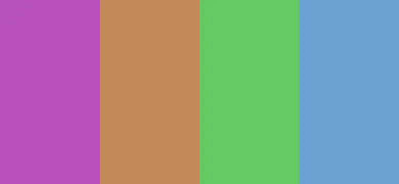

Source: Pinterest
Source: Pinterest

Source: Microsoft
4. Tips for choosing a colour palette
You’re now familiar with the six types of colour palettes. So how do you go about choosing one for your next design project?
As we’ve highlighted throughout this guide, different colour schemes achieve different visual effects. This is down to how the colours are selected and how they relate to one another, based on their position on the colour wheel. As such, some colour palettes are more suited to certain contexts than others.
Here are some practical tips to help you decide what type of colour palette to use.
Consider the design context
First and foremost: what medium and audience are you designing for?
If you’re choosing a colour palette for a website or app, you’ll need to prioritise usability and accessibility—and therefore choose a colour palette that allows for plenty of contrast, such as a complementary or split-complementary palette.
If you’re designing primarily for aesthetic appeal, however, contrast may not be a priority. In which case, you have the freedom to use a monochromatic or analogous palette.
Remember that colour can serve both a functional and aesthetic purpose. While you may love how a certain type of colour scheme looks, it’s important that your chosen palette enables you to meet the goals of the project. Those will vary depending on what you’re designing, the medium you’re using, and who you’re designing for.
Use the colour wheel and colour palette generator tools
The colour wheel is your main point of reference when choosing a colour palette. By looking at the wheel, you can already get an idea of what kinds of colour combinations you might want to use—and this will naturally lead you towards a certain type of palette.
You can also make the most of online colour palette generator tools such as the Toptal colour palette builder, Coolors, ColorSpace, and similar. If you’ve already got a base colour in mind, enter the HEX code into your palette generator and build out your colour palette from there. Otherwise, simply experiment with different hues and suggested palettes to see what kinds of combinations you like.
Take guidance from colour psychology
As you experiment with different colour palettes and their myriad variations, allow the principles of colour psychology to guide you.
Colour psychology explores how different colours can make us feel. Your chosen colours should accurately represent the brand personality—be it playful and light, serious and authoritative, or luxurious and elegant—while evoking the desired emotions in your target audience.
Of course, colour psychology isn’t an exact science, and different colours have different associations depending on the audience’s perception of them. Still, there are some fairly universal meanings ascribed to certain colours—such as orange for energy and vitality, green for nature, and blue for calm and tranquillity.
While considering your colour palette, consistently ask yourself: How will my target audience feel when they perceive these colours? Is that in line with the brand identity and the emotional connection I want to establish? Once you can answer with a solid “yes” to the second question, you’re well on your way to landing on the perfect colour palette.
Further reading and resources for designers
Colour is an essential skill to master, especially if you wish to specialise in graphic design. Your ability to effectively choose appropriate colour palettes and apply them in different contexts will go a long way!
If you’d like to learn more about creating beautiful, powerful, and on-brand designs as a graphic designer, check out these articles:
- What Is Typography? Everything You Need To Know
- What Skills Does a Graphic Designer Need?
- Fundamental Graphic Design Principles and How to Apply Them
Alternatively, you could also consider some of our other resources to further your understanding of graphic design:
- Watch this session by design veteran and AND’s Academic Head, Prachi Mittal, and our Course Lead, Soumya Tiwari.
- Talk to a course advisor to discuss how you can transform your career with one of our courses.
- Pursue our Graphic Design courses – all courses are taught through live, interactive classes by industry experts, and some even offer a Job Guarantee.
- Take advantage of the scholarship and funding options that come with our courses to overcome any financial hurdle on the path of your career transformation..
Note: All information and/or data from external sources is believed to be accurate as of the date of publication.

