Are you searching for the perfect fonts for your website design? Discover the different options, learn how to select the ideal fonts for your website, and explore the best types for your next project.
Fonts shape the user experience of a website, influencing its brand identity and the mood of its audience. As an essential element of website design, fonts subtly communicate the essence of your brand. However, with limitless fonts available on the internet, selecting the one that’s perfect for your website can be a little daunting.
In this article, we will provide valuable insights into the importance of fonts and factors to consider when choosing a font for your website. Additionally, we will clarify the distinctions between fonts, typography, and typefaces, explore various website fonts, and highlight the best fonts that can upgrade user experience while leaving a lasting impression.
Here’s a clickable list of everything that we’ll be covering in this article!
- What is a font?
- The difference between a font, typeface, and typography
- Types of website fonts
- How to choose the best fonts for your website?
- 15 best fonts for website design you must try
- What next?
What is a font?
A font is a collection of characters (letters and symbols) designed in a consistent style. It is a graphical representation of text characterized by distinct features such as style, weight, and color. Often used in both digital and print formats, it creates a visual impact, helps convey emotions, and improves readability. While it could easily be confused with typography and typeface, font is distinguished by a particular set of characteristics and falls under the broad spectrum of typography and typeface.
What is the difference between a font, typeface, and typography?
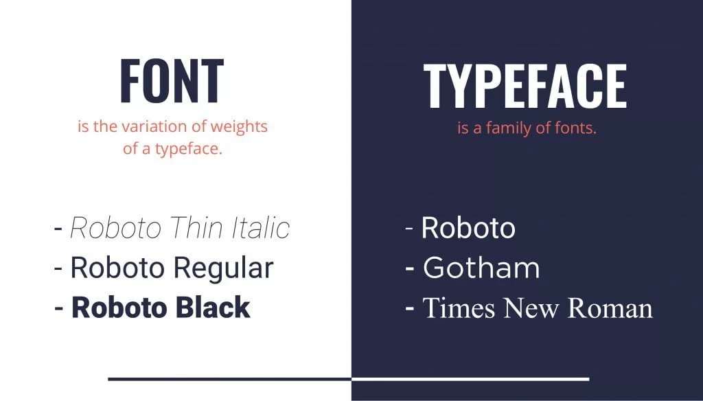
Image Courtesy: Kontra
Typography is an umbrella term that refers to the art and technique of designing and arranging text. It includes the selection of typefaces, as well as decisions about font size, line spacing, letter spacing, and text alignment, all aimed at enhancing the overall appearance and readability of content.
Now, typefaces and fonts both influence the styling of text. However, they are not the same, though people often use the terms interchangeably.
A typeface is a specific style of lettering that includes characters, symbols, and glyphs. Each typeface comes with a variety of design features, such as styles, weights, and font families, which define how numbers, letters, or characters will be styled across a certain piece of text. It also determines the spacing, balance, and height variations between different characters. Some examples of typefaces include Times New Roman, Arial, and Comic Sans.
A font reflects a specific version of a typeface, defined by a particular style, size, and weight while maintaining the overall consistency of text styling. Fonts offer variations within a typeface for emphasis, establish hierarchy, and enhance aesthetics. They refer to how you apply your typeface. For example, if you’re working with Times New Roman, you can apply it in bold, italic, size 12, and color green.
A font family is a collection of typefaces with a similar design theme. The fonts have a visual identity within a font family with different stylistic versions. For example, in the Helvetica family, you will have variations like Helvetica bold, light, medium, italic, etc.
Types of website fonts
Typography is a rich and intricate form of art that covers various elements, including aesthetics, text alignment, and spacing. Before exploring the different types and choosing the best fonts for your website, it is important to first understand and identify the three main categories of fonts — serif, sans serif, and script. This information will help you work around fonts and choose the best ones that fit the brand identity and the style of your website design.
Serif fonts
A serif is a small line or stroke added to the end of a letter or symbol. This feature gives serif fonts a classical and elegant appearance. Due to their conventional style, serif fonts are commonly associated with print publishing. Some examples include Times New Roman, Georgia, and Bodoni.
Sans serif fonts
Sans serif fonts lack the serif lines at the ends of their letters or symbols, giving them a clean, minimal, and modern look. Their simplicity and neutral tone make them ideal for website design, offering clarity and optimal readability. Some examples include Futura, Oswald, and the well-known Comic Sans.
Script fonts
Script fonts are inspired by and modeled after handwriting styles, including cursive fonts. It is advisable to use them sporadically for titles because their complex design can make the body text difficult to read. Some examples include Monotype Cursiva and Lucida Handwriting.
How to choose the best fonts for your website?
Image Courtesy: Dradept
Fonts play a critical role in creating an impactful website. While you may be focused on selecting the perfect color palette and background for your website, it is just as important to carefully choose the right fonts. Fonts tie together all the elements of your user interface, helping you establish your brand’s voice, clarify the purpose of your products and services, and attract your target audience.
With so many typefaces available today, selecting the right one that captures the essence of your website takes time and effort. To help you with this, we’ve compiled a checklist of factors to consider when shortlisting your website fonts.
1. Readability and legibility
Readability has to be your top priority when deciding on a font, as some typefaces are more legible than others. This ensures that the users can consume the content of your website with clarity and overall ease of understanding. Therefore, it is important to select fonts with clear, distinguishable characters and a well-balanced proportion of height, weight, and spacing. While you can always experiment with quirky and unconventional fonts, it’s best to avoid overly decorative typefaces for the body of the text. Fonts like Helvetica, Futura, Arial, and Times New Roman are a few fonts that are widely popular for their clarity and readability.
2. Reflection of personality, tone, and branding
With an infinite choice of fonts available, you can easily fall into the rabbit hole of selecting ones that don’t suit your website’s personality and visual appeal. Therefore, it is necessary to choose fonts that can capture the essence and tone of your brand while considering the needs of your target audience. Consider how you want your audience to feel after visiting your website and what type of user group you want to attract. Think about the emotion you want your site to evoke—whether it’s playful, luxurious, authoritative, or humorous. For instance, Playfair Display can evoke elegance, while Times New Roman suggests tradition and authority.
3. Minimalism and consistency
When designing a website, it’s easy to get carried away and use too many typefaces, resulting in a cluttered and confusing interface. To avoid this, we recommend using a single typeface family. This approach allows you to utilize different fonts within the same family that complement each other and work harmoniously, helping you achieve a neat and cohesive look for your website.
However, if you’re feeling adventurous and want to experiment with a couple of typefaces, it is best to limit yourself to a maximum of three typefaces for a single design. These can be categorized as:
- Primary font— Used for larger texts to reflect brand identity
- Secondary font— Applied to the main body text of your website
- Tertiary or accent font— Reserved for specific website elements like menus or navigation.

4. Scalability
Using scalable or vector fonts is crucial when integrating typography into your user interface. While some typefaces remain easily readable at larger sizes, those with intricate letterforms or decorative designs may become illegible when scaled down. The benefit of scalable fonts is their ability to be enlarged without losing clarity or sharpness, ensuring high-quality output across all screen sizes and device resolutions.
To ensure your chosen font scales well, consider these tips:
- Use scalable fonts: These maintain their quality regardless of size adjustments.
- Test with real text: Instead of relying on Lorem Ipsum placeholders, use actual content to get a more accurate representation of how your typeface will appear in different sizes.
5. Font load and licensing
When selecting typefaces for website design, it’s crucial to consider browser compatibility. Slow-loading fonts can negatively impact user experience, potentially frustrating your audience. To address this, consider using web font libraries like Google Fonts, which offer browser-compatible font files that render smoothly and quickly.
Additionally, it’s important to remember that fonts are intellectual property. This means designers must comply with licensing agreements and legal considerations when using them. While free, open-source fonts approved for commercial use are available, always review the terms and conditions before implementing any typeface on your website.
15 must-try fonts for website design
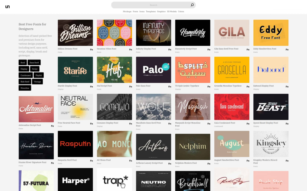
Image Courtesy: Neuron
Now that you have all the necessary information and criteria for choosing the best fonts, we have curated a set of trending fonts and font combinations to help you assemble an aesthetic and functional layout for your website. Read on to discover fonts that can take your website design to a whole new level.
1. Raleway
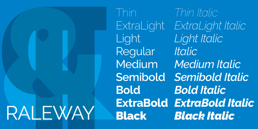
Image Courtesy: Adobe
Raleway is a modern, sleek font known for its clean lines and excellent readability. It brings a contemporary and crisp feel to any design and offers great versatility for various design applications. Ideal for brands that value sophistication and minimalism, Raleway can seamlessly enhance your visual identity.
2. Poppins
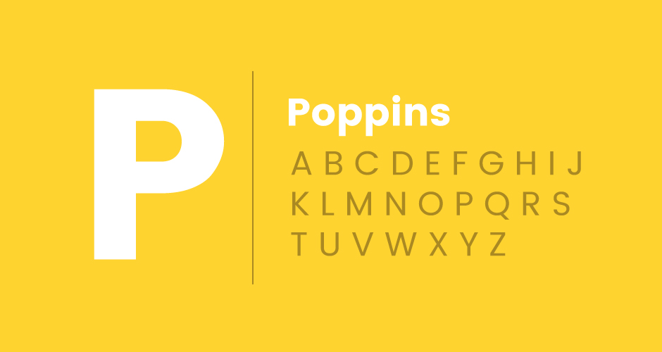
Image Courtesy: Go Fish Digital
Poppins is a geometric font with a relaxed, contemporary vibe. It supports both Latin characters and the Devanagari script used in Hindi and Sanskrit, making it a perfect choice for brands aiming for international and local reach.
3. Playfair Display
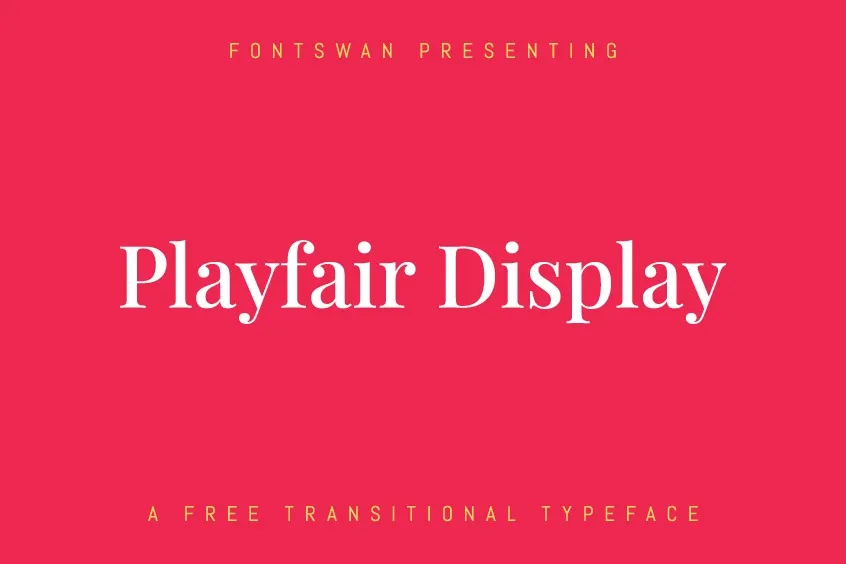
Image Courtesy: Be Fonts
Playfair Display is a font with elegant and bold accents. It’s well-suited for headlines and titles, featuring condensed characters with rounded terminals, and has an old-school classical charm. Its open shapes and graceful curves bring a timeless feel to your website design.
4. Quicksand
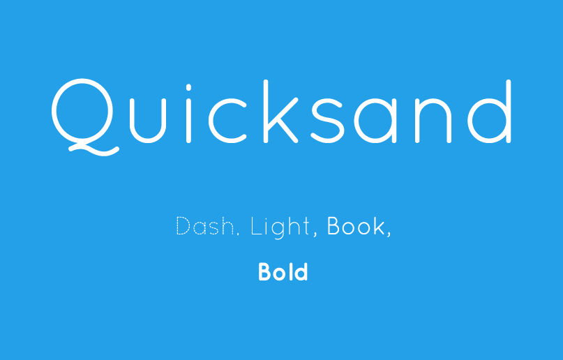
Image Courtesy: Free Fonts
Quicksand is a modern font known for its rounded terminals, which add a friendly and approachable feel to your website. It balances simplicity and style, offering an inviting yet classic tone that works well for a wide range of websites.
5. Oswald
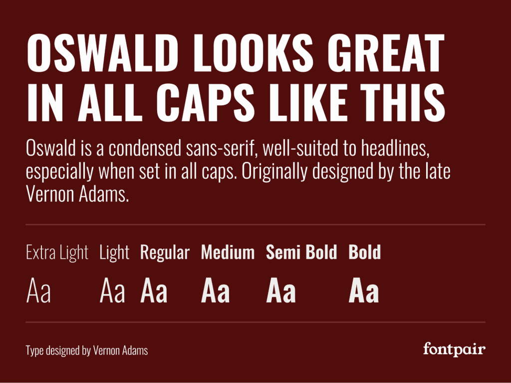
Image Courtesy: Font Pair
Oswald is a bold font that grabs attention. Its condensed style is a perfect choice if you want to make an impact and convey a powerful and authoritative brand identity. It also pairs well with other sans-serif fonts, making it a versatile choice for striking designs.
6. Crimson text
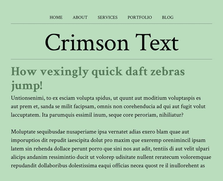
Image Courtesy: ASK Design
Designed by Sebastian Kosch, Crimson Text is a traditional and timeless font that exudes sophistication and elegance. It enhances your website with a classic touch while maintaining excellent readability for users.
7. Lato
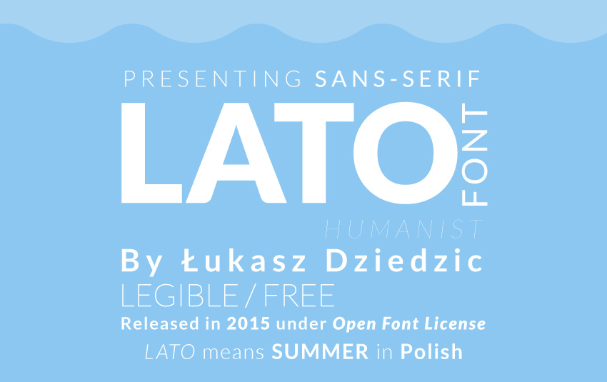
Image Courtesy: Design and Illustration
Lato, designed by Lukasz Dziedzic, features a clean, open, and minimal aesthetic with excellent readability. Its versatility allows it to pair well with more elegant fonts, making it a go-to choice for giving your website a professional and contemporary look.
8. Alegreya
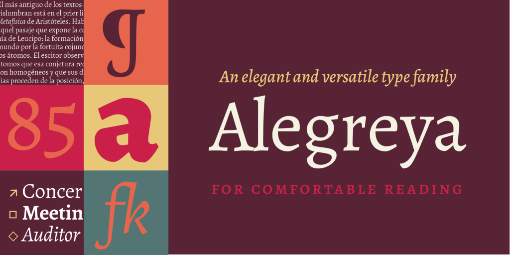
Image Courtesy: Adobe
Alegreya draws inspiration from the classic forms of the printed press. It provides excellent readability for both large and small bodies of text, making it perfect for lengthy content. With a variety of styles available through Google, this font offers designers plenty of options to suit their needs.
9. Libre Franklin
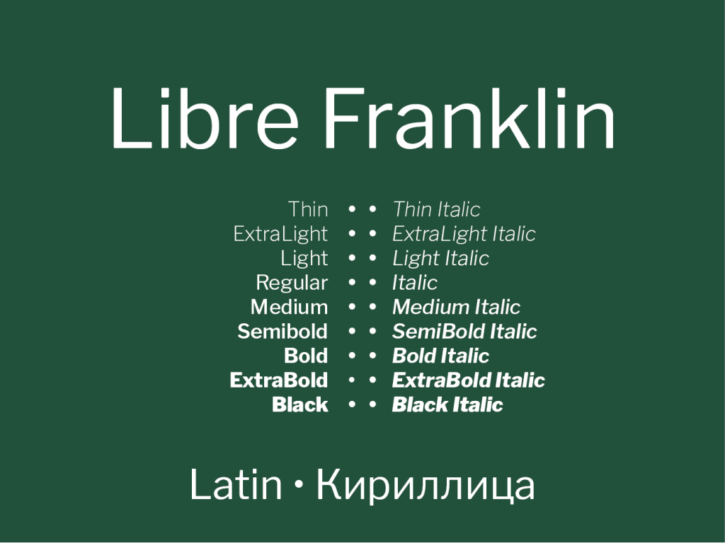
Image Courtesy: Local Fonts
Libre Franklin stands out for its geometric precision and open counters, ensuring excellent readability and a clean, modern aesthetic. With a wide range of weights and styles, it offers designers flexibility when pairing with other fonts for website design. Additionally, it supports both Latin-based languages and non-Latin scripts like Greek and Arabic, enhancing its versatility.
10. Open Sans
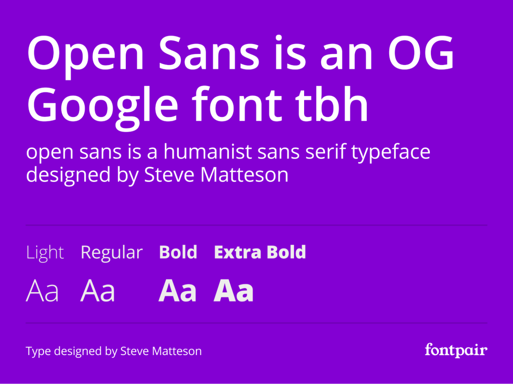
Image Courtesy: Font Pair
Open Sans, created by Steve Matteson, is the most popular Google Font and is available for free. Its flexibility makes it suitable for a wide range of applications and pairs well with most other fonts. Open Sans is optimized for print, web, and mobile use with a simple, friendly design.
11. Pacifico
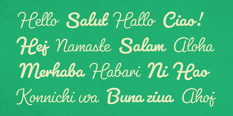
Image Courtesy: Adobe
Pacifico, designed by Vernon Adams, exudes a casual, cheerful, and informal vibe. Its letterforms are relaxed, fluid, and reminiscent of vintage hand-crafted signs seen at beaches and unique shops. This font is an excellent choice for creating a friendly and authentic brand identity for various products and services.
12. Roboto
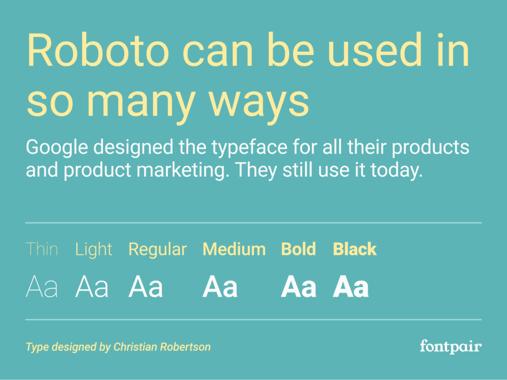
Image Courtesy: Font Pair
Roboto is a minimalistic and modern font that is a perfect choice for websites that prioritize simplicity and demand clarity. Designed by Christian Robertson, Roboto is widely used due to its geometric elements, spacious letterforms, and well-proportioned structure. It also offers a diverse range of styles and weights and is compatible with various languages.
13. Breadley Sans
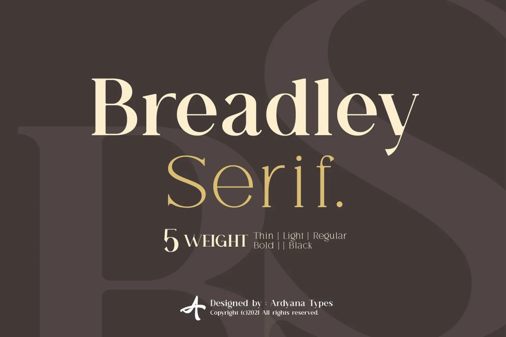
Image Courtesy: Da Font Free
Breadley Sans offers a unique aesthetic with its elegant, modern, and inviting letterforms. Its distinct personality makes it versatile for various websites. Inspired by Art Deco, this sans-serif typeface adds a touch of sophistication and appeal to your website design.
14. Animatic SC
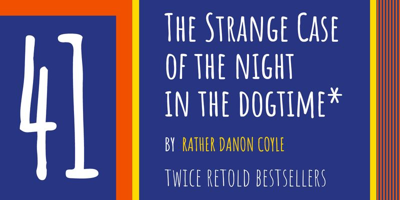
Image Courtesy: Adobe
Animatic SC, designed by Vernon Adams, is a playful, hand-drawn font with a thin, elongated shape that conveys a youthful and creative aesthetic. Its open, light letterforms make it ideal for setting the tone for websites related to travel blogs, preschools, pet stores, and similar themes.
15. Merriweather
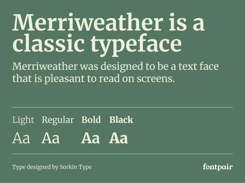
Image Courtesy: Font Pair
Designed by Eben Sorkin, Merriweather is optimized for compelling screen reading. Its large x-height enhances readability, making it suitable for both long texts and headlines. The font offers a wide range of styles, allowing designers to seamlessly integrate it into their websites.
Conclusion
We hope that you’ve enjoyed browsing our comprehensive guide on the top 15 fonts for website design and found it suitably inspiring for your next design project. Beyond aesthetics, you should consider factors such as licensing, font load, readability, and scalability when choosing fonts. These features impact the overall design quality and the user experience of your website.
If you’re interested in learning more about typography and fonts, consider going through the ultimate guide to typography design. Here, we share the fundamental rules and principles of typography and teach you how to apply them in your work.
If you’re well-versed in the art of typography and are looking for some inspiration, consider reading the following blog posts:
1. 21 Cool Fonts to Spruce Up Your Next Design Project
2. 25 Calligraphy Fonts to Consider Downloading
3. 30 Outstanding Typography Examples To Inspire You
Next Steps
We recommend checking out this Typography Composition Project by AND learner Sreya Sara Binoy to understand in detail how fonts and typography can have a profound impact on your projects.
In case you need further assistance, here are some of our resources you can consider:
- Watch this session by design veteran and AND’s Academic Head, Prachi Mittal, and our Course Lead, Soumya Tiwari.
- Talk to a course advisor to discuss how you can transform your career with one of our courses.
- Pursue our Graphic Design courses – all courses are taught through live, interactive classes by industry experts, and some even offer a Job Guarantee.
- Take advantage of the scholarship and funding options that come with our courses to overcome any financial hurdle on the path of your career transformation.
Note: All information and/or data from external sources is believed to be accurate as of the date of publication.


