Graphic design principles are the golden rules of design. Learn what they are and how to apply them in this guide.
Graphic design is all about visual communication. No matter what you’re designing, the goal is to create something that’s both aesthetically pleasing and conveys a certain message.
Graphic designers must make careful choices about each and every design element, as well as how they all fit together for an effective composition overall. In doing so, graphic designers consider the basic principles of graphic design.
These fundamental principles are often a crucial part of most graphic design courses. And, if you’re an aspiring graphic designer, they’re one of the first things you’ll need to learn.
The most important graphic design principles are:
Contents:
- 1) Balance
- 2) Alignment
- 3) Contrast
- 4) Colour
- 5) Hierarchy
- 6) Movement
- 7) Proportion
- 8) Proximity
- 9) Repetition
- 10) Rhythm
- 11) White space
- 12) Unity
Keep reading to learn what each principle means, why it’s important, and how to apply it in your work.
1. Balance
Balance refers to how you distribute the visual weight of the page.
Each individual element holds a different visual weight; for example, a large, bold, textured headline holds more visual weight than small text written in a light, thin font. Equally, a bright, colourful shape will appear heavier (i.e. more eye-catching) than a simple line.
Balance is an important graphic design principle because it influences the viewer’s perception of the overall design, drawing their eye towards heavier elements. Balance also helps to create structure and ensure that the individual design elements all pull together harmoniously.
How to create balance
How you apply this graphic design principle depends on the kind of balance you want to create.
For symmetrical balance, divide the page in half and distribute your design elements evenly on either side of the central axis. Each half of the design will hold similar visual weight, creating a sense of formality and predictability. Symmetrical balance in graphic design is a bit like the human face, where you have the same features on either side.
If you want to achieve a more dynamic, unconventional design, you can create asymmetrical balance by varying the visual weight in different sections. For example, you might have a single, large (heavy) element on the left, balanced out by a collection of smaller, lighter elements on the right.
Radial balance involves positioning elements around a central point. Common examples include flowers, spirals, and stars. This can create a strong focal point for the design, or it can be used to convey movement.
In short: Consider the visual weight of each individual element and think about how to distribute this weight on the page.
2. Alignment
Alignment considers how each individual element is positioned in relation to the other elements on the page.
The most familiar example is text alignment. Think about how, when typing in a Google Doc or writing a birthday card, you align the text in a certain way; either left, centre, or right. This same principle applies to graphic design—you align your design elements to create a sense of order and structure.
How to create alignment
Graphic designers typically use a grid system to map out the invisible underlying structure of their designs—similar to how you might have used graph or grid paper in maths or science class at school.
Follow the grid structure to align individual design alignments, considering how element A should be aligned in relation to elements B, C, and D, and so on. You don’t need to use the same type of alignment throughout the design; you might use a combination of left, centre, and right alignment depending on the overall effect you want to create.
In short: Follow a grid structure and align your elements within that structure, aiming to create order and consistency.
3. Contrast
Contrast helps to distinguish between different design elements. This ensures that certain elements stand out, directing the viewer’s attention and guiding their perception of the page.
Contrast is also critical for accessibility, ensuring that text is clearly legible and that the viewer can easily make out individual elements. A lack of contrast may create a design that’s inaccessible for people with visual impairments. Disregard this graphic design principle and you’ll not only impact your design’s aesthetics, but also its accessibility.
How to create contrast
You can create contrast through size (big vs. small elements), line weight (thick vs. thin), colour (light vs. dark), texture, and white space.
Pay special attention to the contrast between text and the background as this will impact legibility and accessibility. Avoid placing text directly on a “noisy” textured background or over an image, and ensure that there’s sufficient colour contrast.
Bear in mind that contrast also plays into the principle of hierarchy. Elements that stand out through higher contrast will automatically grab the viewer’s attention and therefore come across as more important.
In short: Apply contrast when you want certain elements to stand out, and to ensure that your designs are legible and accessible.
4. Colour
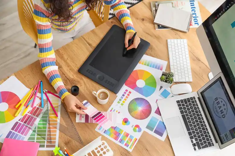
Colour is extremely powerful in graphic design. It’s used to achieve balance, harmony, and contrast—all of which are essential for creating beautiful, effective designs.
Colour also determines the overall mood of the design, evoking certain feelings, emotions, or associations in the viewer. As such, it plays an important role in conveying the desired message and reinforcing the brand identity (that is, the visual elements of a brand such as colour, type, and logo, that capture the brand values and make the brand easily recognisable).
Overall, colour presents a great opportunity for graphic designers to make a strong visual impact.
How to use colour in your designs
How you use colour will be determined by colour theory and colour psychology.
Colour theory provides guidelines to help you understand what colour pairings work well together and how different colour combinations can create different effects. It considers the relationship between primary, secondary, and tertiary colours, as well as the impact of hue, saturation, and brightness.
Colour psychology considers how different colours can impact people’s emotions, moods, and behaviour. For example, yellow may be associated with hope and optimism, while blue may evoke a sense of peace and calm.
When choosing your colour palette, think about how you want your audience to feel when they perceive your designs. As you apply your colour palette, consider how colour can be used to create contrast, to draw the viewer’s attention, and to establish an overall sense of balance in the design.
In short: Use colour theory and colour psychology to choose a colour palette that evokes the right mood.
5. Hierarchy
Hierarchy tells the viewer which elements on the page are most important. If you’re designing the artwork for a book cover, for example, you’d want to give the book title particular prominence in the visual hierarchy.
Graphic designers create hierarchy through size and scale; elements that appear larger will be perceived as more important. They also use contrast and colour to ensure that important elements and information stand out.
Another key aspect of visual hierarchy is the position of the elements on the page. Elements that appear higher up or in the very centre of the design will catch the viewer’s attention. A line of text in the bottom left corner, not so much.
How to establish hierarchy
Consider all the different information you’ll present through your design and organise it in terms of importance (either mentally, or by writing it down). Then decide how you can give the most important elements more visual prominence.
In addition to size, scale, colour, contrast, and positioning, think generally about how people naturally tend to consume information. For example, most people will typically scan from top to bottom or from left to right, but this may vary depending on the audience and the context.
In short: Graphic design is all about communicating the right message. Establish hierarchy within your designs to ensure that the most important information stands out.
6. Movement
This fundamental graphic design principle considers how the viewer’s eye moves across your designs.
As you read this blog post, your eyes are probably moving from left to right horizontally across the page, then down to the next line, and so on. When you come across a poster, you might scan it from top to bottom.
Graphic designers think about the pathway the viewer’s eye is most likely to follow and then organise their designs accordingly. The aim is to position important elements so that they fall within the viewer’s line of sight.
How to apply the movement principle
First, consider the most common eye movement patterns:
- the F-pattern, where viewers scan from left to right, focusing mostly on the left-hand side of the page;
- the Z-pattern, which assumes that the viewer will move from the top left of the page to the top right, then to the bottom left and the bottom right (like a Z);
- the layer-cake pattern where people focus mainly on headings and subheadings without paying too much attention to the body text in between.
Which of those eye movement patterns is your audience most likely to follow when viewing your designs? Are you presenting text-heavy content or a mix of text and images? Where can you place different elements so that they fall into the viewer’s visual pathway?
In short: Consider the viewer’s likely pattern of eye movement and position your design elements strategically.

7. Proportion
The proportion principle is all about the size of different elements in relation to each other.
Keeping all the different elements in proportion can help to create a sense of harmony in your designs, while displaying elements in different sizes can help to establish a visual hierarchy.
Designers can also break the rules of proportion to evoke humour or create a sense of playfulness. For example, an illustration of a dog that appears much larger in relation to a drawing of a person will create the sense that the dog is giant, or that the person is tiny.
How to apply the proportion principle
How you apply the proportion principle will depend on what you’re hoping to achieve.
If you want to create realistic and balanced designs, you’ll need to avoid proportional extremes. But, if you’re going for a sense of comedy or fantasy, experiment with exaggerated scale and proportions.
Again, you can use a grid system to guide you in scaling individual elements up and down.
In short: Consider the desired effect of your design and create proportional relationships between individual elements accordingly.
8. Proximity
According to the proximity principle, elements that are positioned close to each other appear as though they belong to the same group. Likewise, elements that are further apart appear unrelated.
Proximity makes it easier for the viewer to understand the information presented on the page. For example, when reading a restaurant menu, you can easily see that the ingredients listed under each meal belong to that particular meal because they’re positioned close together.
The proximity principle also helps to establish visual balance, grouping elements together logically to bring structure to the design.
How to apply the proximity principle
Applying the proximity principle is simple. Group related elements together while ensuring sufficient space between unrelated elements.
Pay attention to how you use white space (or negative space). When grouping elements together, you still want sufficient white space to ensure that each individual element is distinguishable and to make the content easily readable.
You can increase the white space between unrelated elements to signify that they should be considered separately.
In short: Use proximity and white space to visually convey that certain elements belong together.
9. Repetition
Repetition refers to the repeated use of the same design elements, either within a single design or across different designs and projects for the same brand.
You can use repetition to create texture and patterns—for example, repeated use of a single circle would create a dotted pattern. Repetition also contributes to consistency, unity, and brand recognition. You might use the same fonts and colours throughout, or feature the brand’s logo in a certain position each time you design something new.
How to use repetition in your designs
Repetition is essential when it comes to creating a strong and memorable visual brand. You’ll want to repeat the same fonts, icons, colours, and logos to ensure that a brand is instantly recognisable.
At the same time, use repetition within individual designs to create a sense of unity. But don’t overdo it; you want to avoid too much repetition to the point of monotony. The goal is to strike a balance, creating designs that are cohesive but not dull.
In short: Use repetition to create a strong brand identity and to achieve unity in your designs, while taking care to avoid monotony.

10. Rhythm
Rhythm builds on the repetition principle. By repeating certain elements throughout your design, you can create a sense of rhythm or flow with the space you leave between each repeated element (i.e. the intervals at which the elements are repeated).
There are several different types of rhythm:
Random rhythm occurs when you vary the space (or interval) between each repeated element. There is no rule or pattern, you’re just placing the elements randomly.
Regular rhythm is created when you repeat certain design elements at regular intervals. This results in a clear pattern.
Flowing rhythm creates a sense of movement, repeating design elements to create curves, swirls, or waves.
Progressive rhythm repeats a design element with a slight change each time, conveying a sense of gradual change or progression.
Rhythm can help to achieve consistency throughout your design or to add an element of excitement and dynamism.
How to apply the rhythm principle
Consider the rhythm principle whenever you use repetition. Determine what kind of effect you want to achieve and then space your repeated elements out accordingly.
If you want to create a consistent pattern, you’ll opt for a regular rhythm, spacing the repeated elements out evenly. If you want to convey motion, follow a flowing rhythm in your desired shape or direction. If you want to evoke a sense of change or transformation, apply a progressive rhythm.
In short: Different rhythms create different effects. Think about the overall effect you want to achieve and then space your repeated elements out according to the most appropriate rhythm.
11. White space
White space (or negative space) refers to the space you leave blank within your designs; the space between and around your individual elements. Note that white space doesn’t necessarily have to be white—a plain coloured background also serves as negative space.
White space ensures that each design element has enough room to breathe, preventing your designs from becoming too cluttered. It can also be used to emphasise important elements, highlighting their prominence in the visual hierarchy. For example, if you surround one element with lots of white space, that element will stand out and draw the viewer’s eye.
How to use white space
The use of white space should be as intentional and carefully considered as any other design element.
Experiment with increasing the white space between text and different design sections to improve legibility, and give important elements more negative space to help them stand out and catch the viewer’s eye.
Overall, white space should help to declutter your designs, create balance, and emphasise important elements.
In short: Experiment with scaling your white space up and down until you strike just the right balance.
12. Unity
Unity refers to the overall harmony of your designs. Do all the different elements exist harmoniously together? Does everything appear to be in the right place and generally ‘in sync’?
If you step back and review your work, it should feel like everything on the page belongs to the same design.
Unity is achieved through a combination of several graphic design principles: from the right amount of white space to repetition, balance, alignment, and proximity. Apply all of those principles correctly and you’ll naturally achieve a sense of cohesion.
How to create unity
As you select and create individual design elements, do so with the unity principle in mind. How will those individual design elements work in combination with others? Do they contribute to the overall effect you’re trying to create?
Strive for consistency in terms of the shapes and colours you use, focus on alignment and proximity to create order and structure, use repetition purposefully to achieve visual coherence, and consider how the visual weight is distributed (balance).
In short: Review your designs holistically, ensuring that all the individual elements work together harmoniously to create an aesthetically pleasing composition.
Applying the fundamental graphic design principles to your work
These fundamental graphic design principles are there to guide you in the creation of visually compelling designs that connect with the target audience and deliver the desired message.
As your knowledge and confidence grow, you’ll find that applying these principles comes naturally—you’ll no longer need to stop and think about each individual principle; you’ll gradually develop your own eye for what works and what doesn’t. Take a look at some of our AND learner’s Behance profiles that utilise all principles you just learnt about:
- Bibin S’s – PG Diploma in Graphic Design
- Dushyant Singh – PG Diploma in Graphic Design
- Rushali Sharma – PG Diploma in Graphic Design
And, as you become more confident, you’ll no doubt want to be more experimental with your designs. That’s when you might choose to break some rules—for example, using clashing colours or unlikely typography pairings, incorporating more white space than usual for a dramatic finish, or discarding the grid system and going freestyle.
Graphic design is, after all, an artistic discipline, and there’s always room for creative freedom. As long as you’re achieving the desired effect and creating something that resonates with your target audience, you can’t go wrong.
Learn more about graphic design
The fundamental principles of graphic design are one of the first things you’ll need to learn as an aspiring graphic designer. Find out what additional skills a graphic designer needs in this guide, get familiar with the most popular graphic design tools here, and check out these awesome graphic design examples to inspire your next project.
Want a clear-cut route into graphic design? Follow this step-by-step guide on how to become a graphic designer.
Here are some additional resources that might prove useful:
- Watch this session by design veteran and AND’s Academic Head, Prachi Mittal, and our Course Lead, Soumya Tiwari.
- Talk to a course advisor to discuss how you can transform your career with one of our courses.
- Pursue our Graphic Design courses – all courses are taught through live, interactive classes by industry experts, and some even offer a Job Guarantee.
- Take advantage of the scholarship and funding options that come with our courses to overcome any financial hurdle on the path of your career transformation.
Note: All information and/or data from external sources is believed to be accurate as of the date of publication.


