Ever encountered a website that made you click away almost immediately? Or have you seen a downright unattractive logo? Good design makes a powerful impact. Read to know how.
Good graphic design is not just a ‘nice-to-have,’ especially in an era where first impressions are instant and attention spans are shrinking. Good design is a must-have—it draws people in and helps them retain information. This is how brands build relationships, convey their message, and ultimately gain clients.
But what makes ‘good graphic design’? It’s not simply about creating something “aesthetic,” although that helps. It is about solving problems visually. It’s about using colors, typography, images, and the arrangement of these elements to tell a story or carry a message.
Good graphic design does not require superhuman intelligence. It is not a form of art closed off from the world. It is based on a set of core components and ideas; consider them the magic ingredients that can make the design work perfectly.
Here’s what we have discussed in the following sections:
- What Makes a Graphic Design Good?
- Apple.com – Simple and Clean Website Design
- Mailchimp’s Rebrand – Fun and Bold Branding
- Headspace App – Easy-to-Use Mobile App Design
- Oatly- Eye-Catching Packaging
- Nike’s Social Media Graphics
- Airbnb’s Website
What Makes a Graphic Design Good?
A “good” graphic design may appear like a subjective concept, but there actually are principles that guide a good design. It is not only about aesthetics but functionality as well. A good graphic design is one that conveys a message, draws interest, and results in a good user experience.
Here are the core principles graphic design should follow in order to be classified as “good”:
- Balance: It refers to a feeling of stability and harmony in the design. Balance can be symmetrical (elements are mirrored), asymmetrical (different elements are used to create balance), or radial (elements are arranged around a center point).
- Focal Point: It is used to direct the viewer’s attention to important details.
- Contrast: This technique uses differences in color, size, shape, texture, or typography to create visual interest and differentiate elements.
- Emphasis: Emphasis draws attention to specific design elements by making them stand out through contrast, color, size, or positioning.
- Hierarchy: Hierarchy refers to the arrangement or organization of visual elements within the design to convey the relative importance of each.
- Pattern: Pattern is defined as repeated and recognizable arrangements of elements and shapes to create a visual structure.
- White Space: These are empty areas of design that are intentionally left either “white” or “blank.” They are also called negative spaces.
- Harmony: It is all about bringing elements together, forming unity through adjacent colors, similar shapes, and related textures.
- Color Theory: Color theory is the study of the framework that illustrates how colors interact with each other and how they have an impact on our emotions and perceptions.
- Typography: Typography is a study of designing, styling, arranging letters or text, and making them readable.
- Proportion: This refers to the relative size and scale of design elements. A correct proportion creates visual harmony to establish hierarchy.
These principles help designers create an impactful design that captures human eyes, builds brands, increases website conversions, and conveys the brand message- all of which are defining aspects of good graphic design. In short, a good design is not about drawing shapes and spilling colors on a canvas. It is about crafting an experience that feels authentic. A good graphic design effectively communicates a message, leaving an ever-lasting impression on the audience.
1. Apple.com – Simple and Clean Website Design
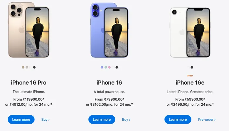
Image Courtesy: Apple.com
Think of a simple and clean design that gets instantly recognized. This is Apple’s design language summed up in one sentence. Their website, Apple.com, is a perfect example of a minimalist design done right.
When you visit Apple’s website, the first thing that stands out is the lack of clutter. Apple uses plenty of white space to create a calm and centered feeling. The product images leap off the screen, and the typography is clean and easy to understand. The navigation flow is seamless and it almost feels like the brand has read your mind. Apple’s website is a guiding example of a good minimalist graphic design. Here are a few elements that make it shine:
White Space
Apple focuses sharply on its products, eliminating anything that may distract the user by taking advantage of white space. It also uses high-resolution pictures occupying most of the screen and gentle parallax scrolling to feature parts like the iPhone cameras. It ensures that users instantly grasp the product’s value, guided by Gestalt principles of proximity and simplicity.
Clean Typography
Apple’s San Francisco typeface is clean and resizable; it can be used on any device without losing quality. The text is minimal, with headings displayed prominently, and details arranged in organized grids. This structured layout follows the Golden Ratio principles to achieve designs that are practical and visually appealing.
Hierarchy
Apple’s website has visible headings, clear product names, and noticeable action buttons like ‘Learn More’ that are easy to find. These elements help make the website’s navigation simple and represent well-executed graphic design.
Primary CTAs (“Buy” and “Learn More”) are placed in accordance with Fitts’s Law, which states the amount of time it takes a person to reach a target area, and are centered in well-sized and padded boxes that allow for easy clicking.
Apple’s website is a prime example of a good graphic design done right. By focusing on clarity, simplicity, and ease of use, they have built an online experience that is as effortless as their products.
2. Mailchimp’s Rebrand – Fun and Bold Branding

Mailchimp has given itself a fresh, fun look. They changed their old logo, colors, and pictures to create a friendlier style that’s easy to understand and fun to explore.
From an understated design to an unforgettable one, Mailchimp underwent a significant branding makeover and completely ditched everything that came with its previous logo. The rebrand is a perfect example of how a bold and unconventional design can make a brand stand out.
Mailchimp’s new identity features vibrant colors, hand-drawn custom illustrations, and a distinctive typeface. Despite being unconventional in the tech industry, these elements make the brand identity playful and friendly.
Mailchimp’s rebrand is one of the prime examples of good graphic design, and its success is hooked on these principles:
Bold Color Palette
Mailchimp’s bold Color Palette has playful and creative identity colors that are vibrant and expressive. This palette includes saturated hues and contrasting neutrals to create a unique and energetic visual language.
Here are the primary colors from Mailchimp’s color palette:
- Cavendish (#FFE01B)
- Peppercorn (#241C15)
Mailchimp also uses colors like pinks, greens, and blues for more flexibility across different designs and platforms.
Playful Illustrations
Illustrations are used extensively to promote the humanization of the brand and make it more approachable and relatable. Freddie, Mailchimp’s mascot, evolved, and other elements were introduced to convey emotions and make the brand more empathetic. The characters represent a range of ages, body shapes, and cultural backgrounds emphasizing inclusivity as a core value of the brand. These visual elements serve as storytelling aids making features like email automation relatable, through engaging narratives.
Unique Typeface
Mailchimp’s rebranding consists of Cooper Light font with rounded corners and a bouncy baseline for a playful and retro feel. Cooper Light serves primarily in headlines and logos, while body copy is written with cleaner typefaces like Helvetica Neue. Its unorthodox, hand-drawn appearance matches Mailchimp’s friendly and less corporate identity. The typeface is now part of the visual language on their website, logo, and marketing collaterals.
3. Headspace App – Easy-to-Use Mobile App Design

Headspace app’s design feels like stepping into a quiet, calm room. The soft colors, friendly illustrations, and simple words make it easy to find your way and relax, just like a gentle guide on a peaceful journey.
The design principles used by the Headspace App create a calm and soothing experience for the user. The app’s core purpose of mindfulness and well-being guidance became the base of design choice for graphic designers. The graphic design principles this app uses include color psychology, navigation, and consistent look and feel to reduce stress and improve focus. These elements provide users with a comfortable experience throughout their entire meditation process.
Color Psychology
The app creates a calming environment due to the use of soft color gradients ranging from sky blue to lavender. Hand-drawn illustrations add to the app’s warm feeling. The use of rounded soft shapes through organic design adds to the overall feeling of comfort associated with the app. Visuals simplify complex mental health concepts into simpler and easy-to-understand metaphors.
Intuitive Navigation (User Flow)
The app’s easy-to-use navigation helps users locate meditations and other exercises quickly. Features like guided onboarding, categorized sessions, and mood check-ins create a stress-free and seamless user experience. The design helps users stay focused on their mental wellness and avoid getting lost elsewhere on the app.
Typography and Space
Clear and easy-to-read fonts combined with ample line spacing help users read content easily and effectively. The use of white space brings the user’s attention immediately to features like “Meditate Now.” This visual hierarchy also aligns with Gestalt principles. Regular spacing and structural grid patterns create a rhythm that signals the app’s focus on a mindful routine.
Headspace’s minimalist graphic design is a combination of illustrations and navigation. This design produces a seamless user experience. The app transforms into a mindful journey through visual and emotional experiences. By designing around core meditation practices, the app creates an environment that promotes relaxation and meditation.
4. Oatly- Eye-Catching Packaging
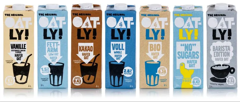
When you look at Oatly’s packaging, it feels like a friendly hello. The big, fun letters and simple colors make it easy to spot, and the design shows that the company really cares about the planet.
Oatly’s packaging design represents how effective graphic design on packaging can improve a product’s visibility in the marketplace. Oatly’s brand’s success is credited to its deliberate design decisions, which resemble consumers’ emotions while being true to its essence.
Typography
Oatly uses large sans-serif black letters on a light background, creating high contrast for instant shelf impacts. Phrases like “Wow! No Cow!” or “It’s Like Milk, But Made For Humans” are injected to create purposeful and funny copies. The typographic hierarchy is also aligned with the Gestalt (figure-ground) principle. The use of informal language makes the brand more relatable, which builds loyalty among its consumers.
Clean Color Palette
Oatly’s packaging features a simple and clean design that makes its products gain attention on densely populated store shelves. Neutral background elements with text in contrasting colors produce an eye-catching visual effect. The uncluttered graphics effectively communicate vital product details without any sacrifices to clarity. The brand’s Scandinavian heritage is visible through its simple design, which draws customers who want clear and straightforward communication.
Sustainable Design
Recyclable materials and matte finishes make the eco-values easy to understand without fancy graphics. Tiny text on the packaging, such as disclaimers (e.g., “This carton is a climate fighter”) and carbon footprint labels, is fun and playful. The” anti-design” aesthetic – irregular print textures, hand-drawn arrows – looks intentionally imperfect, in tune with the brand’s grassroots spirit.
5. Nike’s Social Media Graphics
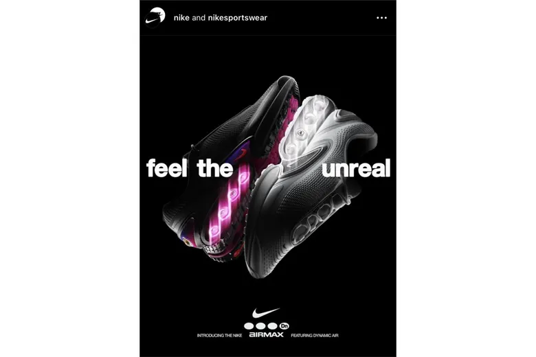
Image Courtesy: Nike Instagram
Nike’s social media graphics are one of the best examples of implementing graphic design principles to create urgency, inspiration, and brand loyalty. Their visual approach combines appeal with meaningfulness to create clear and memorable content that cuts through digital static. Here’s how they do it:
Bold Color and Contrast
The combination of high-contrast color palettes, such as black/white with neon colors, produces a visual hierarchy in the design. Using saturated colors, especially electric orange and neon green, signifies power, while minimalist contrast between an athlete and a neutral background isolates essential elements. The application of Gestalt principles helps guide viewers toward essential messages and products through visual design choices.
Dynamic Composition & Negative Space
Nike’s layouts thrive on asymmetry and intentional emptiness. The combination of diagonal elements with overlapping text and product shots that display close-up views generates a dynamic effect representing athletic movement. The negative space surrounding Nike slogans and sneakers helps to clear visual clutter, which improves visual clarity. The “rule of thirds” placement of subjects off-center generates tension and depth in the composition. The graphics remain uncluttered and lively despite being displayed on compact mobile screen formats.
Consistent Branding
Each Nike campaign produces different visuals but maintains standard identifying features, including swoosh placement, bold sans-serif text, and rugged surface textures. The design system provides recognizable branding through adaptable means that allow for creative freedom. The use of retro 90s filters works with streetwear fans, but crisp minimalism attracts performance-oriented viewers. The typography adjusts perfectly from Instagram Story’s punchy headlines to TikTok’s shorter text messages. Brand voice unity with adaptable designs ensures both universality and timeliness.
The combination of contrasting elements with dynamic composition and consistent design points works with psychological principles to attract user attention while building brand recognition. Every element serves a goal: to inspire action, not just admiration. The simplicity of their design demonstrates the ultimate sophistication within the saturated digital world.
6. Airbnb’s Landing Page

Image Courtesy: Airbnb Website
Airbnb’s website is designed practically and is a great example of impactful visual storytelling. It builds trust and motivates users to take action or click. These elements help to prioritize user needs. At the same time, combining emotional impact with usability.
Visual Hierarchy
Airbnb displays vibrant destination images to create an immediate sense of wanderlust. The image selection aims to show diverse accommodation types, such as cozy cabins and urban lofts while prioritizing emotional impact (in line with Gestalt’s “law of similarity”). The CTAs and overlaid text follow a Z-pattern design, which guides users through a natural reading pattern. The interface uses soft scrims and gradients to maintain text readability, in a way that the primary focus remains on the destination images.
Color Psychology
Off-mute white and earthly tones create a calm experience. The signature coral red accent color of Airbnb directs viewers’ eyes toward buttons and discount offers while providing a sense of excitement and warmth. The reviews and ratings are strategically placed near the booking button to tackle the user’s hesitation. The design method uses contrast to create an urgent feeling while simultaneously providing reassurance because this combination works best for persuading travelers who hesitate.
Minimalist Navigation
Airbnb uses Hick’s Law by implementing clean dropdowns and icons to simplify complex choices such as dates and filters to reduce cognitive load. Complex choices such as location, date, and filters are simplified by implementing auto-suggestions and calendar popups. It also uses Fitts’s law for thumb-friendly mobile interaction.
Combining perfect design elements with practical functionality makes Airbnb’s pages stand out. Visual impact through noticeable elements creates emotional engagement, and the user-friendly design structure builds confidence.
Conclusion
A good graphic design engages users effectively and serves a functional need for the brand. The examples demonstrate how simplicity, boldness, and clarity make designs effective. Apple’s clean website allows products to communicate on their behalf. The new Mailchimp design presents a playful yet friendly and distinctive image. Headspace’s app promotes relaxation to help users concentrate, while Oatly’s untraditional packaging turns customers into fans.
So, what unites them? The fact that every single element has been selected to convey a specific message. Nike creates impactful visual experiences through its social media platform. Airbnb’s website is used to tell a story visually. Good design puts the audience first, guiding them without any confusion.
The takeaway is simple: understand your audience’s needs. Highlight important points with contrast. Use negative spaces effectively and select font and color options to represent your brand’s personality. Good design requires clarity, usefulness, and memorability instead of complexity. It generates trust and sparks emotional responses. When executed right, it turns ideas into action.
Next Steps
We highly recommend that you check out this Brand Identity Project by AND learner Bibin S for inspiration. In case you need further assistance, here are some of our resources you can consider:
- Watch this session by design veteran and AND’s Academic Head, Prachi Mittal, and our Course Lead, Soumya Tiwari.
- Talk to a course advisor to discuss how you can transform your career with one of our courses.
- Pursue our Graphic Design courses – all courses are taught through live, interactive classes by industry experts, and some even offer a Job Guarantee.
- Take advantage of the scholarship and funding options that come with our courses to overcome any financial hurdle on the path of your career transformation.
Note: All information and/or data from external sources is believed to be accurate as of the date of publication.


