Are you curious about the color wheel and how to craft one yourself? Delve into the world of color theory as you embark on a journey to construct your color wheel from the ground up, guided by this comprehensive step-by-step tutorial.
The colour wheel is an essential design tool. It shows you how different colours interact, harmonise, and contrast with each other—providing a visual reference to guide you whenever you’re working with colour.
Of course, you can easily find colour wheels online. But, by creating your own, you get to see first-hand how different colours are made and why certain colour combinations create different visual effects. Not to mention that it’s fun!
In this guide, we’ll show you how to create a physical colour wheel from scratch. Here’s what we’ll cover:
- What is the colour wheel?
- A brief recap of colour theory
- What tools and materials do you need to create your colour wheel?
- How to design a colour wheel: Your step-by-step guide
- How to use your colour wheel
If you’re already familiar with the basics and want to skip straight to the practical guide, just use the clickable menu.
1. What is the Colour Wheel?
The colour wheel is a fundamental tool for designers and artists. It presents the primary, secondary, and tertiary colours in a circular format—it is, quite literally, a wheel of colour!
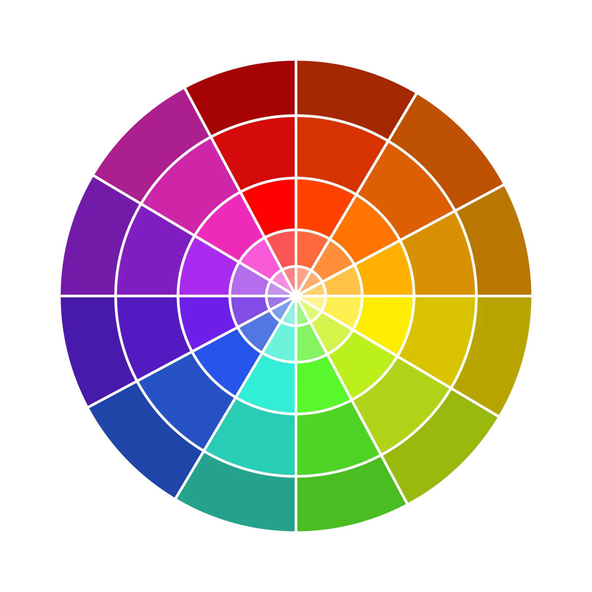
The colour wheel can vary in complexity. A simple 12-point colour wheel features the three primary colours, the three secondary colours, and the six tertiary colours. A more complex colour wheel features those 12 colours (or hues) on the outer edge, as well as their different shades, tints, and tones.

|
|
The colour wheel is useful because it visually depicts the relationship between different colours. Designers can use the colour wheel to see and understand how different colours relate to and interact with each other. This is essential when it comes to choosing a colour palette and achieving the desired visual effects in your designs.
Before we show you how to create a colour wheel, let’s first recap on some essential colour theory. If you’re already familiar with these basics, feel free to skip ahead.
2. A Brief Recap of Colour Theory
Colour theory is a broad field of study that explores how colours interact and combine to create different visual effects. It encompasses a wide range of principles, concepts, and guidelines—spanning art, science, and psychology.
Colour theory helps designers understand the role that colour plays in connecting with the target audience, creating visual harmony, evoking feelings and emotions, and communicating certain messages. And tools like the colour wheel provide a practical framework for choosing, combining, and applying colour effectively in different design contexts.
Before you create your own colour wheel, it’s important to get to grips with some fundamental terminology. Let’s set out some key definitions:
Primary colours: The three primary colours are red, yellow, and blue, and these form the basis for creating all other colours. The primary colours are evenly spaced around the colour wheel.
Secondary colours: The three secondary colours are orange, purple, and green. These are created by mixing two primary colours. The three secondary colours are positioned at regular intervals around the colour wheel, in between the two primary colours that make them. Orange, for example, sits between red and yellow.
Tertiary colours: There are six tertiary colours—amber, vermillion, magenta, violet, teal, and chartreuse. Tertiary colours are created by mixing a primary colour and a secondary colour. On the colour wheel, the tertiary colours are located between the primary and secondary colours that make them.
Hue: The terms “colour” and “hue” tend to be used interchangeably. But, technically speaking, hue refers to the colour of origin in its purest form—without any shade, tint, or tone.
Shade: If you want to create a darker variant of a particular hue, you can add black. The resulting colour variant is known as the “shade”.
Tint: If you want to create a lighter version of a particular hue, you can add white, and this would be called a “tint”.
Tone: Tone refers to the addition of grey (i.e. black and white) to an original hue in order to alter the saturation or brightness.
Colour schemes: A colour scheme, or colour palette, is a combination of colours taken from the colour wheel. There are six main types of colour schemes, and they each achieve a different effect depending on the relationship between the colours they’re based on. An analogous colour scheme, for example, comprises colours that are next to each other on the colour wheel—and therefore work harmoniously together. A complementary colour scheme, on the other hand, takes colours that are opposite each other on the wheel and therefore creates high contrast.
Colour theory is a huge topic, and we’ve barely scratched the surface here—but that’s all the terminology you need to get started with your colour wheel.

3. What Tools and Materials Do You Need to Create Your Colour Wheel?
Here’s what you’ll need to get started:
- A large blank piece of paper (that you can draw and paint on)
- A lead pencil
- An eraser
- A compass
- A ruler
- Red, blue, yellow, black, and white acrylic paints
- Paintbrushes
- A cup of water (to clean your brushes)
- A large, flat work surface
Tools at the ready? Then let’s begin!
4. How to Design a Colour Wheel: Your Step-by-Step Guide

To create your own colour wheel, you’re essentially going to draw out the circular template in pencil, divide it into 12 segments, and then divide each of those segments into three. Then, using paints, you’ll fill in the three primary colours, the three secondary colours, and the six tertiary colours, as well as their respective tints and shades.
That’s the process in a nutshell. Now let’s break it down step by step.
i. Draw the basis of your colour wheel
The first step is to map out your colour wheel template. For this, you’ll need a large blank piece of paper, a lead pencil, a compass, and a ruler.
First, take your large blank piece of paper and find the centre point. To do this:
- Measure the length of the paper and mark the halfway point with your pencil
- Measure the width of the paper and once again mark the halfway point with your pencil
- Use your ruler to locate where these two marks intersect—that’s your centre point. Mark it with your pencil.

Next, with your centre point clearly marked, use a compass to draw three circles around it. Start with the smallest circle—the one closest to the centre point—then expand your compass to draw the second, medium-sized circle around that, and finally, the third and largest circle around that.
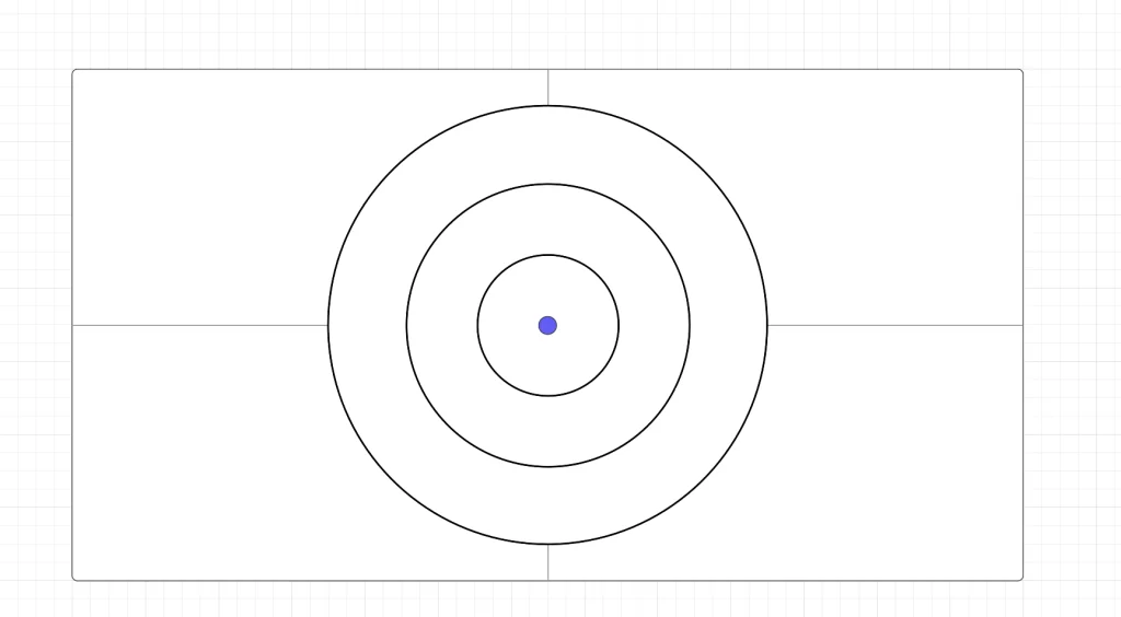
Now you’re going to label your colour wheel with numbers 1-12 (in pencil). For this step, it helps to think of your colour wheel as a clock face. First fill in labels 12, 3, 6, and 9—in exactly the same positions as you’d find them on a clock. Then, using those labels as a guide, fill in the remaining numbers.
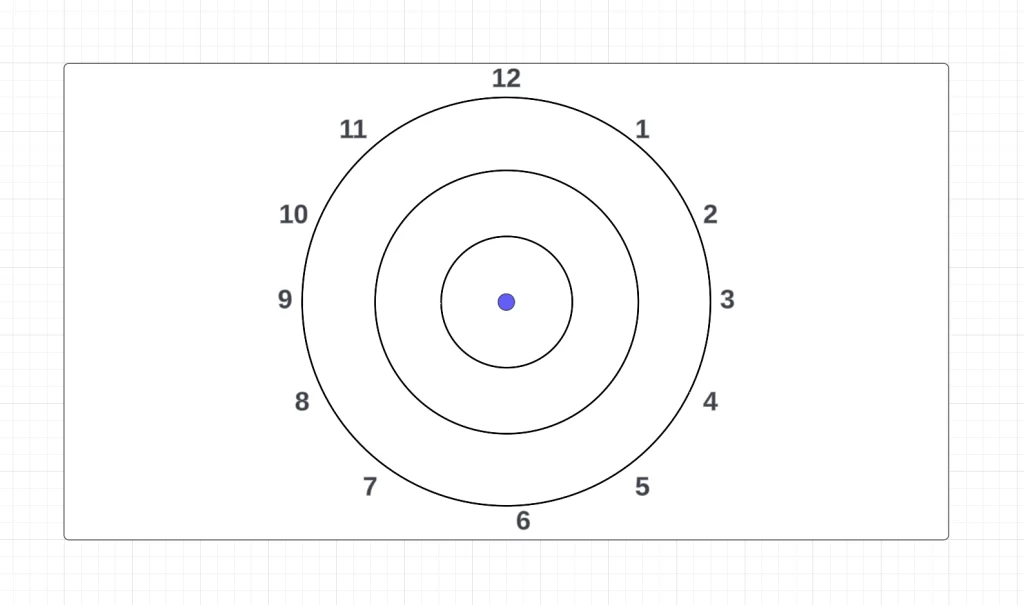
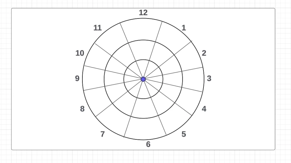
Using the numbers to guide you, divide your colour wheel into twelve segments. Place your ruler between number 12 and number 1, and line it up so it passes evenly through numbers 6 and 7 at the other end (and through the centre point). Then use your pencil to mark a straight line through the entirety of the wheel. Repeat this step until you have 12 equal segments marked out.
ii. Add your primary colours
Your colour wheel template is ready—great work! Now it’s time to add some colour, starting with the primary hues.
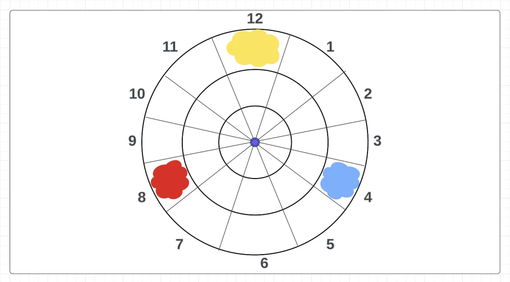
Your primary hues are yellow, blue, and red, and they’re going to sit on the very outer edge of your colour wheel in positions 12, 4, and 8 respectively.
So, grab your yellow, blue, and red acrylic paints and brushes and fill in the relevant sections of your colour wheel.
iii. Add your secondary colours
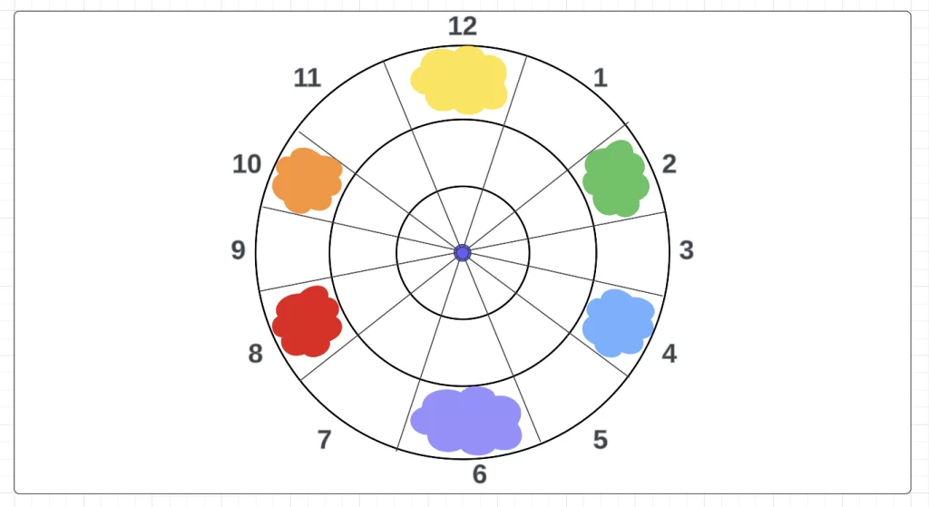
The next step is to fill in your secondary colours. The three secondary colours are green, purple, and orange, and you’ll need to mix the following primary colours to create them:
Green: Mix equal parts yellow and blue paint
Purple: Mix equal parts blue and red paint
Orange: Mix equal parts red and yellow paint
Your secondary colours—green, purple, and orange—will occupy segments 2, 6, and 10 respectively on the outer edge of the colour wheel. Notice how each secondary colour sits in between the two primary colours that combine to produce it. That’s the beauty of the colour wheel—it allows us to easily see the relationship between different hues!
iv. Add your tertiary colours
To complete the outer edge of your colour wheel, you’ll add the six tertiary hues. Here’s how to create them:
Chartreuse: Mix yellow and green paint
Teal: Mix green and blue paint
Violet: Mix blue and purple paint
Magenta: Mix purple and red paint
Vermillion: Mix red and orange paint
Amber: Mix orange and yellow paint
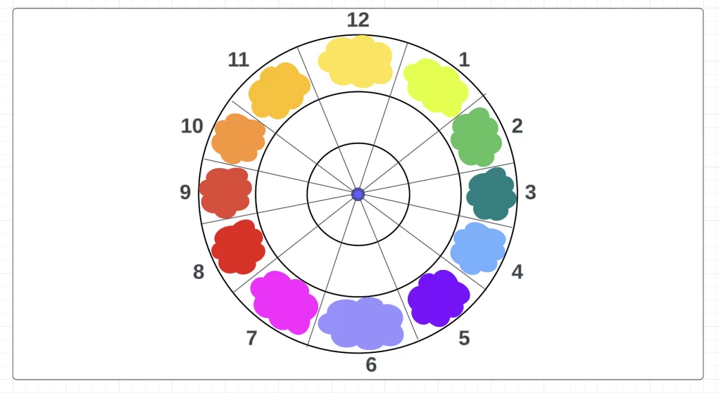
Cleaning your brush throughout, fill in your tertiary colours as follows (on the outer edge of your colour wheel):
- Segment 1: Chartreuse (in between yellow and green)
- Segment 3: Teal (in between green and blue)
- Segment 5: Violet (in between blue and purple)
- Segment 7: Magenta (in between purple and red)
- Segment 9: Vermillion (in between red and orange)
- Segment 11: Amber (in between orange and yellow)
v. Add tint
The outer edge of your colour wheel is now complete. Looking good!
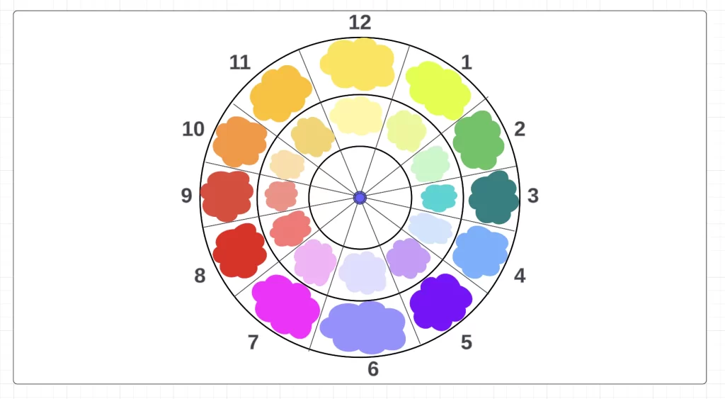
Next, we’ll fill in the middle section with the tint for each hue. If you remember our colour theory recap from earlier, the term “tint” refers to the addition of white to a base hue in order to lighten it.
So: now you’re going to mix each original hue from the outer edge of your colour wheel with white paint to create the tint. Once you’ve got a noticeably lighter colour, paint the segment directly beneath the base hue on the colour wheel.
vi. Add shade
All that’s left to do now is fill in the innermost section of your colour wheel. This section will be painted with the shade of each hue—that is, your original hues (the paints you used to fill in the outer edge of your colour wheel) mixed with black paint.
So, with a clean brush each time, mix each base hue from the outer edge of your colour wheel with some black paint to create a darker shade of that hue. Once you’ve got a noticeably darker shade, paint the segment directly below the tint for each colour.
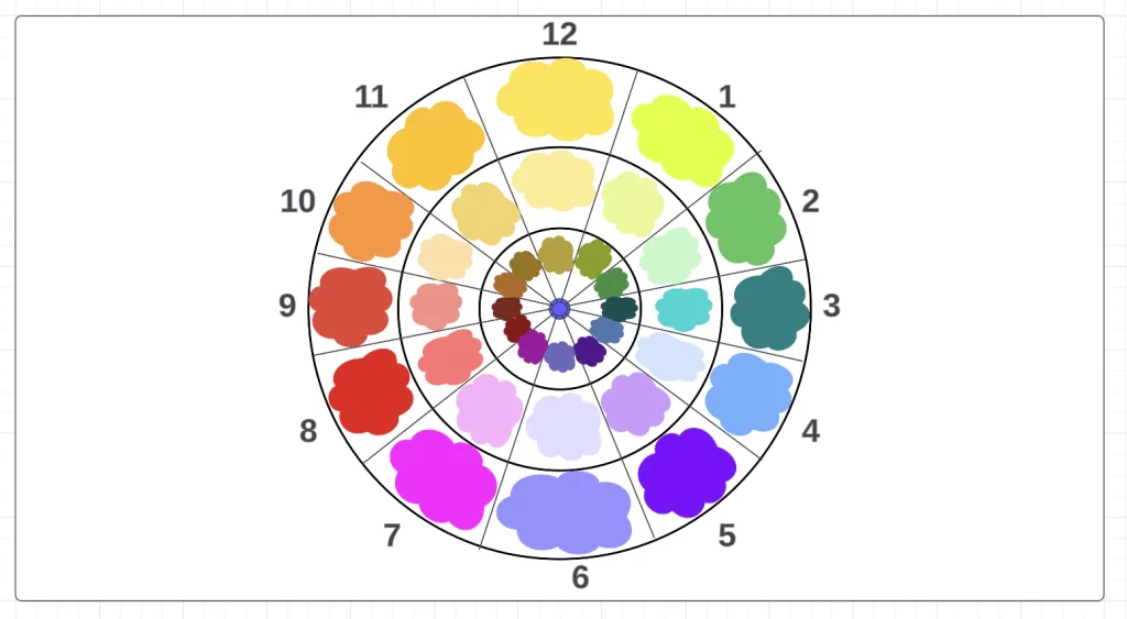
With all your hues, tints, and shades filled in, your colour wheel is complete. As a finishing touch, use the eraser to rub out the number labels around your colour wheel.
5. How to Use Your Colour Wheel
Congratulations on creating your very own colour wheel! Keep it close by and refer to it whenever you’re working with colour. The position of each hue on the wheel helps you to choose effective colour schemes depending on your design project and what you want to achieve.
If you want a harmonious colour palette, you can choose a colour you like and then build out your colour scheme based on the colours that are next to, or close to, your base colour on the wheel.
Perhaps you want a vibrant colour scheme that creates an exciting “pop”. In that case, select your base hue on the colour wheel and pair it with the colour directly opposite.
Those are just a few examples of how the colour wheel can help you make smart colour choices and develop an eye for how different colours work together.
6. Additional Resources for Designers
We hope you’ve enjoyed getting hands-on with colour and are pleased with the end result. The colour wheel is an incredibly useful tool—whether you’re a web designer, an artist, an interior designer, or a graphic designer.
If you’re learning graphic design (or aspiring to), the colour wheel is just one of many concepts you’ll want to master. Once you’re a colour wheel expert, consider expanding your knowledge with these guides:
- The Fundamental Graphic Design Principles and How To Apply Them
- Typography Design 101: Key Elements, Rules, and Principles of Good Typography
- How To Design a Logo: Your Ultimate Step-by-Step Guide
Next Steps
Alternatively, you could also consider some of our other resources to further understand the graphic design space:
- Watch this session by design veteran and AND’s Academic Head, Prachi Mittal, and our Course Lead, Soumya Tiwari.
- Talk to a course advisor to discuss how you can transform your career with one of our courses.
- Pursue our Graphic Design courses – all courses are taught through live, interactive classes by industry experts, and some even offer a Job Guarantee.
- Take advantage of the scholarship and funding options that come with our courses to overcome any financial hurdle on the path of your career transformation.
Note: All information and/or data from external sources is believed to be accurate as of the date of publication.


