Looking for some logo design inspiration to make your day? Read on for a walkthrough of logo design examples (and images) from the world of fashion....
SUMMARISE WITH:
Looking for some logo design inspiration to make your day? Read on for a walkthrough of logo design examples (and images) from the world of fashion, music, sports, and pop culture.
A half-bitten apple. A dark green crocodile. A simple swoosh. These are just symbols. But, undoubtedly, nobody can think about them without visualizing Apple Inc., Lacoste, and Nike. That, right there, is the power of an inspiring logo design.
Logo design plays a pivotal role in establishing a robust brand identity and is a valuable niche within the realm of graphic design, influencing brand recognition and visual branding strategies. They make a brand so iconic that one can see the logo anywhere and automatically recognize them. Effortless, as they may seem, logo designs can take very long to reach fruition and are often very well thought out.
Come along with us for some insight into the history of this art, along with iconic logo design examples from the world of fashion, music, pop culture, and sports.
Contents:
- Glimpse Into the History of Logos and Logo Design
- Logo Design Examples to Inspire You
- Pop Culture Logo Design Examples
- Music Logo Designs
- Fashion Logo Designs
- Sports Logo Designs
- YouTube Logo Designs
- Learn more about Logo Design
- Next Steps
1. Glimpse Into the History of Logos and Logo Design
Ancient Egypt is largely credited with being the first civilization to start using symbols and attributing meaning to them around 3200 BC. Nearly 1,000 years later, the Egyptians began incorporating grids into their designs, a practice that remains a fundamental principle of logo design.
Soon after, China developed a system of characters that each represented an idea and Ancient Greeks created their script of syllabic signs and ideographic signs each symbolizing different objects or commodities. Interestingly enough, the word “logo” is essentially an abbreviation of “logotype”- etymologically broken down into the Greek words lógos meaning ‘word, speech’ and túpos meaning ‘mark, imprint.’
By the Middle Ages, logo design had found multiple applications. However, it was around the 14th Century that logos became the brand identification symbols we know them as today. The first company to ever use a logo was brewer Stella Artois in 1366.
The 19th Century witnessed the advent of mass colour printing, allowing brands and companies to further develop their logo designs and include them in advertisements and posters. Several classic logos such as Coca-Cola and Levi Strauss were designed during this time.
From here on, logo design branched into several different types and the digital/television era ushered in the trend of dynamic logos – mostly powered by MTV’s decision to constantly alter their logo and keep changing with the times.
Now, let’s get right into the iconic examples.

2. Logo Design Examples to Inspire You
Many of the all-time great logo designs have been around for decades or even centuries. These iconic logos have undergone several transformations to suit the changing trends and target audience. Take AND learner Akhil N’s project, where he created a brand identity complete with a logo and other details for a hypothetical brief.
Hence, it is no surprise that, across industries, there’s no dearth of examples of logo designs we could get into. In this list, however, we focus on iconic logo designs in the realms of fashion, music, sports, YouTube, and pop culture. Let’s get right to it!
i. Pop Culture Logo Design Examples
a. World Wide Fund for Nature or WWF

Image Sourced from 1000Logos Website
The WWF or World Wide Fund For Nature, previously known as the World Wildlife Fund, is synonymous with saving the planet and the creatures inhabiting it and the logo’s symbolism remains true to the organization’s core objective.
A pictorial mark logo that makes beautiful use of the black-and-white colour scheme and white space, the WWF Panda has gone through several redesigns between 1961-2000. The logo uses a sans-serif font close to Zar Brush Gothic Regular and the giant panda featured on it serves as a reminder of all endangered species we humans share the planet with.
Trivia: One of the founders of WWF confessed that they chose black and white as the colour scheme to reduce printing costs.
b. DC Comics or Detective Comics Inc.
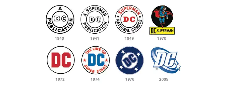
Images sourced from DC Official Website and ComicBeat
DC Comics is owned by Warner Bros. and is the publishing company behind the inception of legendary superheroes such as Batman, Superman, and Wonder Woman.
The DC logo is a wordmark-type logo that has changed massively from its inception to the 2016 white and blue minimalistic version that remains in use. The latest and revamped version of the logo retains the bullet-style font and is more of a homage to the previous versions, especially the 1970s version, as opposed to a complete detour from it. The wordmark uses a bold custom serif typeface; the sharp curves represent energy and dynamism while the colour palette evokes a feeling of evolution and timelessness.
Trivia: The 1976 version of the DC logo was the longest-standing one and remained in use for almost 30 years.
c. Pac-Man

Image Sourced from Deviant Art website
Widely accepted as one of the greatest video games ever created, Pac-Man originally went by Puckman in Japan. The game’s success was so mammoth that it led to several sequels, as well as two television series and a hit single.
The official Pac-Man logo was adopted in 1980 and hasn’t undergone any major changes since then. This wordmark logo makes very intelligent use of colour and stylized typography to create recall value. Across variations, yellow almost always remains the central colour and the usage of the Pac-Font lends a youthful and fun aura to the logo. What sets this logo apart is the “C” in Pac which has been designed to mimic the central character of the game.
Trivia: Pac-Man was created with the intent to attract more women to the gaming arcade and the colour scheme of the game as well as the logo were created in line with what was understood as being aesthetically pleasing to them.
d. Toblerone
Image sourced from 1000Logos
A brand registered in 1909, Toblerone comes with a legacy of its own. The name Toblerone is comprised of two words: Tobler refers to the eponymous surname and “one” is a part of the Italian word Torrone meaning nougat.
The logo has remained more or less consistent ever since its inception in the late 90s. A combination logo, the design makes use of both text and imagery to deliver a message about the brand identity. The triangular shape, common to the yellow mountain in the logo and the chocolate, takes inspiration from one of the Alpine peaks, Matterhorn Mountain. The second element of the logo is the geometric serif lettering majorly in red as a form of homage to the Swiss flag.
Trivia: If you notice the logo closely, you can spot a bear standing up on its hind legs inside the mountain; Tobler’s way of paying tribute to Bern or the City of Bears, where the chocolate bar was created.
ii. Music Logo Designs
a. Spotify
Image Sourced from DesignRush website
Spotify is a music streaming giant that hardly needs an introduction. The Swedish company was established in 2006 and has nearly 550 million monthly active users.
The Spotify logo has undergone nearly three redesigns since its first official release in 2008. Though an abstract logo that is minimalistic with a clean design, the three white lines representing sound waves give the logo a unique identity and help people immediately recognize that this brand belongs to the music industry. Using very few elements, the Spotify logo is an easily scalable one.
Trivia: All redesigns of the Spotify logo have used the three lines that represent sound waves, despite other elements changing considerably.
b. Shazam
Image Sourced from SeekLogo website
Released in 2002, Shazam is a unique application that was created to identify songs through the smallest sound cue that could be recorded via a phone’s microphone. The app was acquired by Apple in 2018 and is available across mobile platforms.
The Shazam logo has evolved from a wordmark to the now lettermark-type logo that is widely recognized. Designed on a solid bright blue palette, the icon used in the logo represents the loading sign on the application and is one of the most contemporary-looking logos that can be placed against any background but would still stand out.
c. The Rolling Stones
Image Sourced from 1000Logos Website
Legendary rock band The Rolling Stones was active from the 1960s right up to seven decades later. If you’re having trouble remembering who they were, we wonder if their lead vocalist’s name Mick Jagger rings a bell?!
The tongue and lips logo was designed for the band by English art designer John Pasche and was a regular feature on all of Rolling Stones’ album covers as well as merchandise. The emblem logo resembles the stuck-out tongue of the Hindu Goddess Kali and stands for an anti-authoritarian attitude, much in line with the band’s lifelong persona.
Trivia: Pasche designed the logo in return for a mere £50, but the original draft was sold to a London museum for $92,500.
d. The Beatles
Image Sourced from Wikipedia
Another Rock band that might need no introduction, The Beatles was founded in 1960 and has been considered instrumental to the counterculture as well as recognition of popular music as a form of art.
Although a wordmark logo, in the typical definition of it, The Beatles’ logo came to be known as the drop-T logo due to the unusually long vertical bar that was used to emphasize the letter in the band name. The logo became an official trademark in the 1990s.
Trivia: The creator of this logo chose to create every character of the font from scratch, eventually leading to the inception of the “Bootle” typeface.
iii. Fashion Logo Designs
a. Chanel
Image Sourced from Wikipedia
Founded in 1910, Chanel is a French luxury fashion house that caters to women’s accessories, clothing, and other luxury goods. The brand’s perfume Chanel No. 5 remains one of the most popular scents ever created and has a place of its own in the history of fashion.
Chanel’s wordmark logo has remained the exact same since its inception in 1925 and is commonly known as the Double C or interlocking C logo. The letters stand for Coco Chanel, the founder of this fashion house and the designer of the logo, and the clean, albeit customized, sans serif font in black speaks to the philosophy of elegance in simplicity that Madame Chanel lived by.
Trivia: Black was always a colour associated with mourning until Coco Chanel came along with the concept of the little black dress and created her iconic logo in the same colour.
b. Cartier
Image Sourced from TurboLogo website
Luxury brand Cartier has been one of the most trusted names in the world of high jewellery, timepieces, and accessories, for close to 150 years. Headquartered in Paris, Cartier has a legacy of sales to royalty and boasts a royal warrant from King Edward VII and the Maharaja of Patiala, among others.
Another fashion logo design example that makes use of the interlocked C, the Cartier logo was made official in 1900 and designed by Pierre Cartier. The serif typeface that the logo uses is a calligraphic handwritten oblique font called Cartier CG and the monogram is placed inside an elongated oval.
Trivia: The Cartier logo uses a font that is in fact a unique inscription designed in the 19th Century.
c. Lacoste
Image Sourced from Design Rush website
With a legacy spanning almost a century, this brand was founded by Rene Lacoste, one of the greatest tennis players in the world. Started as a company that manufactured tennis shirts, Lacoste has now diversified into footwear, watches, perfumery, and leather products.
The founder of Lacoste was nicknamed ‘The Crocodile’ by the media and that’s where the brand logo came from. The original Lacoste logo featured a sketch of a highly detailed crocodile which was later changed to the green digital crocodile, a smaller emblem than the previous versions, alongside the wordmark in a bold, sans serif typeface.
Trivia: The original Lacoste logo remained in use for 51 years, making it the longest-standing logo ever for a clothing brand.
d. Versace
Image Sourced From Logo.com
Founded by Gianni Versace in 1978, this luxury fashion brand is famed for its use of bold and bright colours, as well as flashy prints. Post the unfortunate death of its founder, Versace is now run by Donatella Versace and boasts several high-profile collaborations with brands such as Lamborghini and H&M.
This emblem and wordmark-combination logo features the head of the Greek mythical figure, Gorgon Medusa, alongside the brand’s name in bold lettering. By association with a figure from ancient Greece, the brand conveys the message that their designs are timeless in nature, much like the mythological figure their logo embodies.
Trivia: The founder termed the symbol as ‘fatal beauty’ and competitors are said to believe that the logo had a way of casting a spell on anyone who came into the vicinity of it!
iv. Sports Logo Designs
a. Liverpool Football Club
Image Sourced from Logos-world website
The Liverpool Football Club (LFC) is the most successful English team in European football tournament history and holds the title of having won six European Cup/Champions League trophies. The club also competes in the Premier League, considered to be the top tier of English football.
This mascot-and-wordmark logo presently used by LFC consists of the Liverbird placed inside a heraldic badge and some gradient shades which were added as part of the 1999, and final, redesign. The font, Albertus, belongs to a glyphic serif typeface and fits right in with the bold colour palette this sports logo design follows.
Trivia: The Liverbird has remained this football club’s mascot throughout redesigns and serves as the team’s tribute to their origin city.
b. Mumbai Indians
Image Sourced from 1000Logos
A Twenty20 men’s cricket team founded in 2008 as part of the Indian Premier League, or IPL, Mumbai Indians (MI) has emerged as one of the strongest teams in the country and won the trophy five times.
This combination logo uses a pictorial mark alongside a blue wordmark in a custom, italicized, and bold, sans-serif typeface. Heavily inspired by the Sudarshan Chakra, often associated with the Hindu deity Vishnu, the Mumbai Indians logo design has maintained a fair bit of consistency in their logo design from the time it first appeared in 2010. The orange and green strokes around the chakra are a bow to the Indian tricolour.
Trivia: In 2010, MI decided to release a glyph-based, minimalistic, lettermark logo that was to be used alongside their primary logo.
c. Real Madrid
Image Sourced from Logos-world website
Nicknamed “Los Blancos” by virtue of the all-white uniforms they play in, Real Madrid is one of the world’s best-known football teams that competes in the top-tier Spanish football tournament, La Liga. The club boasts a repertoire of the creme de la creme of football, including David Beckham, Zinedine Zidane, Kaka, and Ronaldo.
The present emblem-based logo of Real Madrid FC has been in use since 2001 and features a crown right above the yellow and blue ring- the most prominent element of this sports logo design. The colours yellow and blue are a tribute to the Spanish flag.
Trivia: The Real Madrid logo uses multiple fonts for the three letters and none of these are part of any standard typeface. Creativity galore!
d. Entertainment and Sports Programming Network or ESPN

Image Sourced from 1000Logos
Founded in 1979, ESPN is an American satellite/cable sports TV channel headquartered in Bristol. The channel is among the most valuable media networks in the world with total assets estimated to be worth more than a whopping $40 Billion!
One of the most simplistic type-based logos ever designed, the ESPN logo uses a scarlet-coloured, futuristic-looking font, that represents the vigour and energy the sports network stands for. The white strip moving across the slanted letters embodies swift movement and dynamism. All characteristics that one instantly associates with sports.
Trivia: An earlier version of this sports logo design is widely believed to have used the Nike swoosh.
e. Detroit Red Wings
Image Sourced from Logos-world website
Colloquially referred to as “Wings”, this professional ice hockey team was established in 1926 and is one of the most celebrated franchises in the National Hockey League.
This iconic emblem logo has been in use since 1948-49 and its colour palette is another classic example of sports logo designs using red as a symbol of power, speed, and energy. Although extremely minimalistic, this wheel spokes and feathers- based logo is considered as one of the most revered ones in the world.
Trivia: The team originally went by the name Detroit Falcons and the upward direction of the wings might have been inspired by the wings of a falcon.
v. YouTube Logo Designs
a. Pewdiepie
Image Sourced from Logos-world website
Felix Arvid Ulf Kjellberg, better known by his stage name, Pewdiepie, is a Swedish YouTube personality who has garnered fame as a figurehead for YouTube in the gaming genre. He has been recognized in TIME Magazine’s 100 Most Influential People and his channel remains one of the most highly viewed and subscribed channels in the world.
Among the most unique YouTube logo designs, Pewdiepie’s logo uses an optical illusion and fits into the definition of an abstract logo. Adopted in 2016, the logo makes use of two colours, red and black, and its ever-changing nature embodies the YouTuber’s commitment to constantly evolving the content on his channel.
Trivia: Pewdiepie’s logo features parallel lines that keep changing the imagery they create; the longer you look the higher number of different visuals you’ll spot.
b. Mr. Beast

Image Sourced from 1000Logos website
American YouTuber, James Stephen Donaldson, aka MrBeast, has carved a niche for himself by pioneering a genre of videos that stand on expensive stunts and challenges. His most popular and watched video to date was a recreation of the Netflix hit “Squid Games” which came with a $456,000 prize fund!
Mr Beast’s YouTube logo design is a combination of wordmark and pictorial mark and uses simple yet impactful imagery and a catchy colour theme. The blue panther with a pink lighting bolt emanating from the animal’s eye forms the crux of this logo and is followed by the channel’s name in a funky bold typeface. This YouTube channel creates content around stunts and the choice of a wildcat for the logo makes it immediately clear to the audience that they’re entering a space dominated by danger, dynamics, and speed.
Trivia: Unlike most logos that use a customized font, Mr. Beast uses a free font called Obelix Pro.
c. BRIGHT SIDE
Image Sourced from YouTube
Stylized in all caps, Bright Side is a YouTube channel from Cyprus and is run by the media publishing house TheSoul Publishing, As the name suggests, Bright Side produces light-hearted and positive content that is equal parts informative and diverse in terms of the topics it has covered.
This YouTube channel logo design is one of the simplest ones and yet does an excellent job of getting the message across. A pictorial mark design, the Bright Side logo features a lit-up bulb boldly outlined in black and placed on a yellow background. The icon of a bulb stands for two major things the channel’s vision incorporates: spreading light through happy content and enabling the spread of Eureka moments through knowledge dissemination.
d. PopSugar
Image Sourced from YouTube
Started in 2006 by husband and wife pair Lisa and Brian Sugar, PopSugar (stylized in all caps) is one of the biggest pop culture blogs at the present time. The channel began as one dedicated to celebrity scoop but has now diversified into beauty, entertainment, fashion, fitness, food, and parenting, among others.
The logo is a black and white lettermark with the initials of the company’s name and is a highly dynamic design in the sense that it can be replicated in several settings and backgrounds. In some cases, the YouTube logo design also chooses to go with a wordmark that has the organization’s full name in the same bold font and monochrome colour scheme. When it comes to logo designs, PopSugar’s logo stands testament to the fact that basic designs can also be impactful.
3. Learn more about Logo Design
While these were only some of the iconic logos from around the world, there’s one thing that’s common to each of them. They’re all easily recognizable and make us attach a certain persona to the brand. And, this is one of the many reasons why a logo design is critical to the brand. To know in detail about logo design, here’s a holistic guide you can read: All You Need to Know About Logo Design.
When it comes to the ways in which one can design a logo, the world really is your oyster. However, there are some broad types of logo design that are widely recognized and you can read about them here: 7 Different Types of Logo Design.
While these resources can help you understand the principles and rules of logo design, if you’re looking to be a professional logo designer you would need to be thoroughly familiar with all the fundamentals of graphic design and acquaint yourself with the world of typography. Nevertheless, the best and most tried and tested way to carve out a path for yourself in this hyper-creative field is to take up formal training in graphic design and then explore the more niche field of logos and logo design.
Learn More: The Top 7 Graphic Design Courses for 2023
4. Next Steps
We hope our blog was helpful. Here are some additional resources and recommendations that will surely be useful in learning more about the field of graphic design.
- Watch this session by design veteran and AND’s Academic Head, Prachi Mittal, and our Course Lead, Soumya Tiwari.
- Talk to a course advisor to discuss how you can transform your career with one of our courses.
- Pursue our Graphic Design courses – all courses are taught through live, interactive classes by industry experts, and some even offer a Job Guarantee.
- Take advantage of the scholarship and funding options that come with our courses to overcome any financial hurdle on the path of your career transformation.
Note: All information and/or data from external sources is believed to be accurate as of the date of publication.


