Curious about branding design? Understand what it means for businesses and explore its principles, essential elements, inspiring examples, and common mistakes to avoid.
Think of some of the most successful brands you admire. What’s the first thing that comes to your mind? It is either their logo, social media presence, or a product you recently purchased, right? Whatever it is, your connection to the brand is rooted in its visuals and how it makes you feel. And, that’s what branding design is essentially responsible for. It focuses on creating a unique visual identity that helps your target audience connect with your brand on an emotional level.
Whether you’re looking to learn more about branding design or want a practical guide to get started with your journey, this in-depth article will guide you on how to go about it.
Here’s a clickable link to everything we’ll be covering in this article!
- What does branding design mean?
- What is brand identity? Why does it matter?
- Core principles of branding design
- Essential elements of branding design
- Stages of building a successful branding design
- Successful examples of branding design
- Mistakes to avoid in branding design
- Key takeaways
What does branding design mean?
Branding design is the art of creating a distinctive visual identity that helps the audience recognize, connect with, and support a brand's narrative. It is a specialized niche within the graphic design discipline focused on how a brand visually expresses itself, both online and offline, using elements like logos, fonts, colors, and other design elements.
Maintaining a consistent brand identity across different platforms, be it on social media channels, websites, or billboards, allows businesses to create an imprint on the minds of their audience and helps build trust. With an effective branding design in place, brands can clearly communicate their values, making it easier to attract and engage potential customers.
What is brand identity? Why does it matter?
Brand identity is a combination of writing style and visual language that shapes how your brand communicates with the world. It is built on intentional design choices and a well-defined mission and vision, which form the foundation for all branding decisions.
Some essential elements of brand identity include:
- Brand name
- Logo
- Tone of voice
- Color palette
- Typography
- Design elements
Your brand identity makes your business recognizable and sets you apart from competitors. It is what attracts and retains customers and even influences their decision-making process. A successful brand identity establishes trust, consistency, and loyalty.
However, to be truly effective, your brand identity must be designed with your audience in mind. Creating buyer personas—detailed profiles of your ideal customers—can provide valuable insights into their preferences and behaviors. This approach ensures that your branding resonates with the right audience, strengthening your market presence.

Core principles of branding design
We’ll explore the different aspects of branding design shortly. First, let’s take a look at the fundamental principles of branding design.
1. Simplicity
A clear, recognizable, and easily digestible design is easier to remember. Overly complex designs tend to lose impact, making them harder to recall. Clean layouts, legible typography, and a restrained color palette create a powerful identity and maintain integrity across different sizes and platforms.
For example, Apple’s logo is a classic case of simplicity done right—it is effective with or without text, in any color and medium.
2. Consistency
Branding design needs to maintain a consistent identity across websites, mobile apps, social media, packaging, and print materials. It establishes brand recognition and trust. Many companies have brand design guidelines for this purpose—to document the standards of branding design and ensure consistent use of the same design elements. Fonts, heading styles, and spacing should be uniform for all branding materials, whereas icons, buttons, and illustrations should follow a set visual style for familiarity.
For example, Google’s material design guidelines ensure a consistent brand presence for all its products while evolving for new user interface needs.
3. Recognition
Recognition is a byproduct of consistency, but also requires infusing a distinct personality into your branding design. To stand apart from competitors, your brand must have visual elements that instantly capture attention. A well-designed brand identity helps the audience recognize and remember your brand over time.
For example, The Nike swoosh is one of the most recognizable symbols globally—simple, iconic, and adaptable.
4. Color Psychology
Colors evoke emotions and define how a brand is perceived. But, more importantly, they can be used to build trust with your audience. Color schemes in branding design must be intentional and consistent across all touchpoints to show your audience that you are a reliable and trustworthy brand. High-contrast color schemes ensure readability and inclusivity for visually impaired users. With dark mode widely used across apps and devices, branding elements must look appealing in both light and dark interfaces.
For example, Spotify’s green, black, and white color scheme enhances visibility in both light and dark modes, ensuring a seamless user experience.
5. Scalability
Your branding design has to be scalable so that it can be used for different formats and mediums. This ensures your branding elements work effectively in various contexts, strengthens consistency, and reinforces recognition over time.
For example, McDonald’s M is instantly recognizable, whether displayed on a massive roadside billboard, a mobile app icon, or food packaging.

Essential elements of branding design
A good mix of visuals, typography, and design elements makes for a perfect brand narrative. As you develop your brand’s look, think about how each of these elements will work together to form a strong identity. Whether you’re designing banners, digital ads, or social media posts, these are the elements that must be in sync to make your brand memorable and engaging.
1. Logos
A well-designed logo captures attention and leaves a strong first impression. Successful logos are ideally designed considering two things—the business objectives and the emotional impact of shapes and colors on audiences. When designing your logo, focus on what sets your brand apart. Aim for a design that is meaningful, visually attractive, and resonates with your purpose, avoiding unnecessary details or excessive text.
A simple rule for effective design is to use no more than three colors to keep the design clean, symbolic, and impactful. If you're unsure about your logo’s appearance, try experimenting with different styles and color combinations to discover the best possible outcome for your brand.
2. Typography
Choose two or three fonts that best represent your brand’s personality to maintain a clutter-free and professional look. Consider options like classic serif fonts for a timeless feel, decorative scripts for elegance, bold block lettering for impact, or sleek minimalist typefaces for a modern touch.
Before finalizing your choice, experiment with different font styles and sizes to ensure readability across all design applications.
3. Color
Go for a color palette that aligns with your brand’s products or services. With thousands of hues available, explore color theory to find complementary shades or use color psychology to understand how different colors influence perception.
For example, blue is often associated with calmness and trust, while orange conveys energy, playfulness, and optimism. Experiment with various combinations to create a visually appealing and meaningful brand identity.
4. Icons and illustration
Custom imagery, icons, and illustrations do more than just enhance visual appeal—they make messages clearer and easier to understand. With shorter attention spans, well-designed graphics simplify complex ideas, making them easier to grasp at a glance.
This is especially valuable for industries like technology, finance, and healthcare, where abstract or technical concepts can be challenging to explain. Thoughtfully crafted visuals can break down intricate information, ensuring clarity. For example, a simple icon representing an advanced product feature can make it feel approachable, helping your brand stand out from competitors.
5. Identify your voice
Make sure your brand’s messaging aligns with its purpose and values. The tone you use should reflect the nature of your industry and audience expectations.
For sectors like healthcare, security, law, or finance, a clear, professional tone paired with a traditional or subtle color palette builds trust and credibility. A lighthearted approach in these industries can be misleading or off-putting. In contrast, brands in fashion, beauty, food, or pet products can benefit from a more playful and engaging voice. Every aspect of how you communicate- from tone to color choices- shapes your overall brand identity.
Stages of building a successful branding design
A successful branding design not only focuses on the aesthetic aspects but also pays attention to the emotional impact of the message being communicated. Therefore, you need to fully understand the brand’s business goals and conduct research on its target audience. Below are the five essential stages that can help in your brand design.
1. Purpose and business goals
Before working on the branding design, you need to understand the brand’s purpose and the message it wants to convey. This sets the foundation for the design process. Having clear guidelines at the start helps the design team stay on track. If a company doesn’t provide a clear description, you should ask for important details that best represent the brand’s identity.
2. Market and audience research
Once the purpose and goals are established, you must conduct research—a crucial step for any design project. Research helps you understand the brand’s environment and identify factors that could influence its success.
The first step is market research, where you analyze the industry and competitors. Learning from their successes and failures helps create a unique and effective logo that sets the brand apart. Next is user research, which focuses on the target audience. A brand must connect with potential customers and earn their trust. Understanding their preferences and behaviors ensures the design appeals to them. Relying solely on creativity without research increases the risk of failure. A well-researched approach saves time and leads to more effective results.
3. Logo design
A logo is an essential part of branding design, but it is just one element of a larger process. However, given its role in branding and marketing, a logo deserves careful attention throughout its creation. A well-designed logo is the primary visual representation of a brand and a valuable asset that helps connect with the target audience.
A part of the market research includes exploring the logos of competitors to avoid similarities and create an original visual identity. Once the necessary information is gathered, you move on to the creative phase, experimenting with styles and color schemes that best reflect the brand’s purpose. After the design is finalized, you need to test your design. A logo that looks good on a digital screen may not appear the same across different surfaces or contexts. Testing ensures that the logo remains effective in all placements, preventing unexpected issues.
4. Visual elements
While a logo is central to branding, other elements like mascots and typography also play a significant role in building a strong brand identity.
Mascots are custom-designed characters that symbolize a brand and enhance its personality. They can be integrated into the logo or used as a separate brand element. A well-designed mascot helps create a deeper emotional connection with the audience. By serving as a recognizable brand representative, mascots make marketing messages more impactful and interactive.
Typography used in business cards, banners, and company correspondence should reflect the brand’s style while maintaining consistency. Some companies opt for custom fonts, while others use carefully selected font combinations that align with their brand image.
5. A style guide
Once the visual materials are ready, your final job is to guide your client on their appropriate usage. This is done through a style guide, a document that provides clear instructions on using the brand’s graphics effectively.
A style guide typically explains the concept behind the logo, outlines the color palette, and specifies how these elements should be applied across different platforms. It may also include examples of incorrect usage to prevent inconsistencies or poor visual representation.
Successful examples of branding design
When you begin your branding design process, take inspiration from the following examples.
1. McDonald’s

Image Courtesy: Dezeen
McDonald’s is a prime example of how effective branding design can create a globally recognized and trusted identity. The golden arches, an instantly recognizable symbol, are the brand’s signature mark that reinforces a powerful visual identity. The bold red and yellow color palette evokes warmth, energy, and happiness, strengthening the brand’s connection with its audience. Every element of the brand—from its logo and packaging to its messaging and tone—is designed with its customers in mind. Moreover, its signage, uniforms, and even store interiors reflect the same tone, ensuring that customers experience a sense of familiarity no matter where they are.
McDonald’s success highlights how strategic design choices shape a brand’s identity and create lasting customer loyalty. Its ability to maintain a renowned brand while evolving with market trends is an excellent example of branding done right.
2. Spotify

Image Courtesy: Wix
Spotify is another great example of creating a visual identity that’s intentionally simple. The brand’s green, black, and white color palette provides a neutral backdrop highlighting the vibrant album covers featured on the platform. Its minimalist logo—three curved lines within a circle—symbolizes the flow and movement of sound. Interestingly, the slight tilt in the design adds a human touch, making the brand feel more approachable.
Spotify also ensures brand consistency across mobile and desktop platforms, creating a seamless user experience. Its brand style guide also allows external businesses to design branded playlists that align with their own identity while maintaining a Spotify aesthetic.
3. Coca-Cola

Image Courtesy: Simplilearn
Coca-Cola’s iconic red-and-white logo has remained a symbol of tradition and reliability. Its classic serif-script font gives the logo a hand-drawn feel, making the brand more approachable and familiar.
The brand’s consistent use of color, typography, and visual elements has solidified its identity across generations. Coca-Cola’s packaging, advertising, and in-store displays ensure that wherever you see its design, you immediately associate it with the brand. Its branding design extends to every detail, from the iconic bottle shape to the typography used in marketing materials. This attention to design consistency has helped the brand maintain strong customer loyalty, making it not just a soft drink but a globally recognized symbol of enjoyment.
Mistakes to avoid in branding design
Now that we’ve covered some standout examples of branding design, let’s move on to the common mistakes you should avoid.
1. Overcomplicated logo
A logo should be clear, adaptable, and relevant over time. Overly intricate logos might lose their impact when resized, making them harder to identify on small screens or printed products. Whether displayed on a billboard or a smartphone, your target audience should always be able to recognize your brand.
2. Inconsistent design
A brand’s foundation is based on consistency. When elements like your logo, color palette, and typography vary across platforms, it weakens recognition and credibility. If your website and social media channels present inconsistent visuals, it becomes difficult for your audience to form a clear and lasting impression of your brand. Maintaining a coherent design style across all touchpoints ensures your brand remains recognizable and trustworthy.
3. Ignoring mobile optimization
With over 60% of web traffic coming from mobile devices, a brand design that isn’t mobile-friendly can lead to poor user experiences and lower engagement. Mobile users expect seamless navigation and high-quality visuals, and if your design fails to meet these expectations, you risk losing a significant portion of your audience. Ensuring a responsive and visually appealing design across all devices is essential for maintaining user interest and brand credibility.
4. Skipping usability testing
A visually impressive design means nothing if it isn’t user-friendly. Without usability testing, you risk overlooking frustrating pain points impacting users. Neglecting this crucial step can lead to unsatisfactory user experiences, higher bounce rates, and missed business opportunities. Prioritizing functionality alongside aesthetics ensures a design that not only looks great but also delivers a seamless and engaging experience.
5. Neglecting feedback
Feedback from customers and internal stakeholders offers valuable insights into how your brand design is perceived. Overlooking these perspectives can mean missed opportunities for improvement and growth. Actively listening and adapting based on feedback ensures your brand remains relevant, engaging, and aligned with audience expectations.
Key takeaways
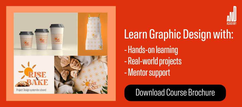
We hope you’ve found our comprehensive guide to branding design insightful and understood its importance for businesses. While branding design is just one of the many specialized areas within graphic design, to learn more about design as a broader topic, you can consider checking out the Graphic Design Course offered by AND. This course comes with a comprehensive curriculum covering hands-on learning opportunities, excellent mentorship, and dedicated placement support.
If you’re eager to learn more about design as a topic, head over to the AND Academy blog for more articles. As a starting point, you can consider going through the following resources:
What Is Spatial Design? Complete Guide With Examples
What Is Social Media Design?: A Holistic Guide With Tips and Examples
What Is Product Packaging Design? A Holistic Guide With Tips and Examples for 2025
Next Steps
We hope you’ve enjoyed learning about the role of AI in graphic design, and feel (cautiously) optimistic about the future of AI. We also recommend that you check out this project by AND Learner, Kayo Hattori for inspiration on how creative you can get with graphic design.
Additionally, here are some more resources you can consider:
- Watch this session by design veteran and AND’s Academic Head, Prachi Mittal, and our Course Lead, Soumya Tiwari.
- Talk to a course advisor to discuss how you can transform your career with one of our courses.
- Pursue our Graphic Design courses - all courses are taught through live, interactive classes by industry experts, and some even offer a Job Guarantee.
- Take advantage of the scholarship and funding options that come with our courses to overcome any financial hurdle on the path of your career transformation.
Note: All information and/or data from external sources is believed to be accurate as of the date of publication.