Learn everything about brochure design, including what it entails, its core principles, and how to design one. Also, find some examples to help you get started.
SUMMARISE WITH:
Brochure design is an excellent medium for promoting products, services, or even ideas. It combines text and graphics to convey your message into a powerful marketing asset that informs and encourages customers to take action. Brochure designs make it easier for customers to consume insights about your brand.
Whether you're designing a tri-fold for an event, a multi-page brochure for a luxury brand, or a digital PDF for downloads, this comprehensive guide will walk you through all about brochure design- what to include, the core design principles, a production process, and inspiring examples that actually work.
Here's everything we'll cover:
- What is brochure design?
- What are the principles of brochure design?
- What to include in a brochure design?
- How to make a brochure design?
- Examples of brochure design to get started
- In Summary
What is brochure design?
Brochure design involves arranging copy, images, graphics, and other visual elements into a folded sheet of paper. Designed as printed marketing or promotional materials by businesses and organizations, it informs and persuades readers to take an interest in their products or services. A brochure is a single folded sheet that does much more than a heavy booklet, if the structure and messaging are on point.
There are two aspects to keep in mind so that you design for impact as well as feasibility:
Communication lens — what single idea, action, or emotion should the reader walk away with?
Production lens — how will this be manufactured (printer specs, paper choice, finish, and fold), and how does that influence layout decisions?
Brochure designs are made for various purposes, such as:
Brand awareness
Event promotion
Information dissemination
Marketing and promotion
Sales support
Educational materials
What are the principles of brochure design?

Image Courtesy: Unsplash
Effective brochure design is based on a few fundamental principles that enable purpose-driven storytelling. Whether it’s a corporate brochure or a cultural publication, the following principles ensure your brochure communicates clearly and leaves a lasting impression.
1. Visual flow
A brochure is read in parts. Establishing a strong visual hierarchy helps the reader know where to start, what to read next, and where to focus. Use headings, subheadings, font sizes, spacing, bullet points, and placement to guide the eye naturally through panels and folds. Create a clear reading order and ensure the user never has to hunt for the main message.
2. Grid
An invisible grid keeps things tidy and consistent. When you design multiple panels (a tri-fold or booklet), it ensures the elements line up smoothly across pages, creating a balanced visual flow. Grids also make layout designs faster and more efficient.
3. Balance
Maintain balance between written content and visual elements so the spread isn't top or side-heavy. The brochure design can be symmetrical or asymmetrical, depending on your preference. However, ensure the images, illustrations, or graphics you use add context and clarity and don't serve as mere fillers.
4. White space
White space (or negative space) helps separate sections, improves readability, and gives the content room to breathe. Mindful spacing makes a brochure feel premium and intentional.
5. Contrast
Contrast draws attention to differences in font sizes, weights, colors, or images vs. text areas. Use contrast to make the CTA pop and to separate content blocks.
6. Readability
No matter how striking a brochure looks, it fails if it's hard to read. Choose appropriate font sizes, maintain sufficient contrast, and avoid cluttered layouts. Remember that brochures are often read quickly and sometimes not in ideal lighting. So, choose legible fonts, avoid using more than two or three type styles, and pay attention to line length for comfortable reading (50–75 characters per line is a good guideline).
7. Repetition & consistency
Repeat type styles, icon treatments, and color blocks throughout the design to build continuity. This is especially important in multi-page brochures to maintain a professional look.
8. Consistent branding
The choice of typography, color palette, tone of voice, and elements should align with the brand identity. Consistency builds trust and recall, especially in brochures meant for brand awareness or sales support. Limit the color palette to 2-4 primary tones plus neutrals.
9. Intentional folds & panels
The fold isn't just a production detail. Each panel is meant to reveal information progressively and logically. Design with the opening sequence in mind so the reader's journey feels intuitive.
10. Production-aware design
Design decisions should always be made based on printing needs — paper type, finish, ink coverage, bleed, and fold accuracy. Use a 3 mm (0.125") bleed, comfortable inner margins, and keep important content away from folds/trim lines. Export as a print-ready PDF (PDF/X or PDF Print) and include crop marks.
What to include in a brochure design?

Image Courtesy: Vistaprint
When designing a brochure, you should be sure about the right placement of each piece of information. Whether you're planning a bifold, trifold, or multi-page brochure, every element needs to support the vision you've already defined. So, before you get started, here is a list of things to include in your brochure design:
1. Cover picture content
Your cover page is the first thing your audience will notice, so it has to make an impact. What it should include is:
- A compelling headline that draws attention and gets potential customers interested in your brand.
- High-quality visuals that resonate with your content.
- Your logo in the highest resolution.
2. Value proposition/Subhead
A one-sentence expansion of the headline that clarifies the benefit or what to expect inside the brochure.
3. Content that goes inside
Finalize your copy in advance and make changes as per your design requirements. Ideally, your brochure should include an introduction, information about your products/services, and features. Use short paragraphs, bullet points, and icons. Also,
decide on a few high-resolution images.
4. Social proof
Testimonials and awards help reassure readers that your brand delivers and builds genuine credibility. You can include quotes from satisfied customers and their photographs. You can also provide brief profiles, photos, and the expertise of team members.
5. Call to action (CTA)
Create strong CTAs on the back page of the brochure so that your users know how to get in touch with you. Include your business address, phone numbers, email, website, opening hours, social handles, and QR code. Use persuasive language, such as "Call us now" or "Visit the website for more information."
How to make a brochure design?

Image Courtesy: Venngage
Designing a compelling marketing brochure is a combination of strategic thinking and a creative mindset. Here's a step-by-step process that shows how it is done:
1. Define your target audience
Before you start designing a brochure, you need to identify your customers and goals. A marketing brochure should speak to a specific customer segment, not everyone at once. Segment your audience by factors like age, location, lifestyle, or buying behaviour, and shape your messaging and visuals around that group. The user personas will help guide the tone, positioning, and content choices. Having a clear goal helps generate leads and makes the brochure design more persuasive.
2. Create targeted messaging
Once your focus is clear, the next step is writing the copy. Let the brochure's structure guide this process — decide what information goes on the front, middle, and back panels, and write the content to fit each section. This helps keep the messaging clear, logical, and easy to follow.
3. Audit content & create a brief
Collect copy, images, and brand assets. Create a content hierarchy and draft the headline, subheads, benefits, and CTA. Treat copy as design material—short, scannable, and benefits-first.
4. Choose a format
Select the format beforehand, as it affects layout decisions. Some common formats are:
- Tri-fold (A4/A5 folded into three panels) — good for short informational pieces and event handouts.
- Bi-fold (single fold, four panels) — more formal, often used for product catalogs or services.
- Z-fold / accordion — good for step-by-step or timeline content.
- Booklet / saddle-stitch — multiple pages, ideal for company profiles or portfolios.
- Leaflet / single flat sheet — cheap and effective for quick handouts.
5. Design the brochure around your copy & images
- Centre your content (images, icons, and texts) horizontally within each section.
- Resize and crop images so they look alike.
- Use solid colors and background images to define sections.
- Leave some negative space in your layout
- Avoid using more than two or three colors, preferably your brand colors.
6. Use a low-fidelity wireframe
Sketch rough layouts on paper or a whiteboard. Decide where the hero image goes, where the copy breaks, and where the CTA sits. For folded brochures, sketch each panel and physically simulate the fold to check the sequencing.
7. Repurpose the brochure design for different products
Use the same layout, but swap out colors, images, and copy for variations.
Checklist before printing:
- Proofread for typos, grammar, and accuracy.
- Ensure all images are properly sized and of high-resolution.
- Verify that the colors match your brand guidelines and look appropriate on different screens.
- Check the dimensions and folds against your printing specifications.
- Confirm whether any important elements have extended into the bleed area.
- Examine the file format.
Examples of brochure design to get started
Now that we’ve covered how to design a brochure, let’s take a look at a few examples and understand what is needed to create a good one.
1. Minimalist book-style brochure

Image Courtesy: Figma
Ideal for: New age contemporary brands
Format: Bound
This brochure template provides ample space for content while keeping a clean look. Its minimal layout feels refined and professional, with a well-designed cover and multiple inner pages that are easy to customize. It's especially well-suited for design-led practices, such as architecture and interior design companies.
2. Creative agency brochure

Image Courtesy: Figma
Ideal for: Digital marketing agencies and start-ups
Format: Tri-fold
This tri-fold brochure uses a simple visual hierarchy with a fairly bright color palette, including yellow-orange and green, all easy on the eyes. The template comes in multiple layout options, making it adaptable to different needs. It also works well for team introductions, with an “About Us” section and dedicated spaces for headshots on the back panel.
3. Campaign brochure

Image Courtesy: Figma
Ideal for: Nonprofit organizations and advocacy groups
Format: Tri-fold
This bold brochure template is designed to grab attention while clearly communicating the mission of advocacy and nonprofit organizations. It features prominent figures and graphs for impact, along with dedicated space to share detailed information about your organization.
4. A4/A5 Professional brochure

Image Courtesy: Figma
Ideal for: Professional brands with more information
Format: Bi-fold
This extra-large A4/A5 brochure provides a generous amount of space for businesses to clearly communicate their message. The template comes in a bright colour scheme that can be easily customised to suit your brand. The minimalist layout uses bold pops of colour to capture attention and maintain visual interest across multiple pages.
5. Software marketing brochure
Ideal for: Software and marketing agencies
Format: Tri-fold
This classic brochure features a professional layout designed for marketing and software development agencies. It allows you to present your services clearly using numbered key points and includes a dedicated section for social media links.
6. Magazine-style brochure
Ideal for: Conveying more information
Format: Bound
This magazine-style, bound brochure offers multiple layout variations, making it ideal for presenting content in depth. It comes in vibrant colour options, such as grey and orange, red and grey, and brown and white — allowing flexibility and keeping the design visually cohesive. Designed for professional printing and binding, the format delivers a premium finish that enhances the overall reading experience.
7. Company profile brochure

Image Courtesy: Figma
Ideal for: Company profiles and business introductions
Format: Bound
This company profile template features well-structured pages designed for detailed corporate storytelling. The layout maintains a consistent visual style and includes dedicated sections for services, leadership profiles, client highlights, and company history.
8. Product catalog brochure

Image Courtesy: Figma
Ideal for: Product lineup displays
Format: Bound
This brochure is designed for a variety of product ranges. Its bright, modern design is eye-catching and engaging. Each product is given two full pages — one for product details and the other for nutritional information.
9. Fast food brochure

Image Courtesy: Figma
Ideal for: Fast food and takeout restaurants
Format: Tri-fold
This tri-fold brochure is designed for fast food restaurants but can be adapted for a wide range of dining businesses. Its vibrant colour palette is flexible and easy to customise. The template works well as a takeout menu or promotional flyer and includes circular frames to showcase photos of your best dishes.
In Summary
Knowing how to put together an effective brochure design is a must-have skill for any marketer and/or graphic designer, and we hope that our comprehensive guide makes the process easy for you. Start with a single goal, craft concise content, choose a format that supports the message, and apply classic design principles to create clarity and visual interest. Whether you're collaborating within a design team or honing your skills for personal projects, learning how to design brochures can be highly beneficial.
Here are a few things to keep in mind:
- A brochure is a folded printed marketing piece that uses text and visuals to communicate information about a brand, product, or service.
- Clearly defining your purpose and target audience helps shape the brochure design and messaging, ensuring it speaks directly to the reader's needs.
- Select a fold style—such as bi-fold or tri-fold—based on how you want to organize and present your content.
- Use strong visuals and concise copy to keep the brochure engaging, clear, and easy to understand.
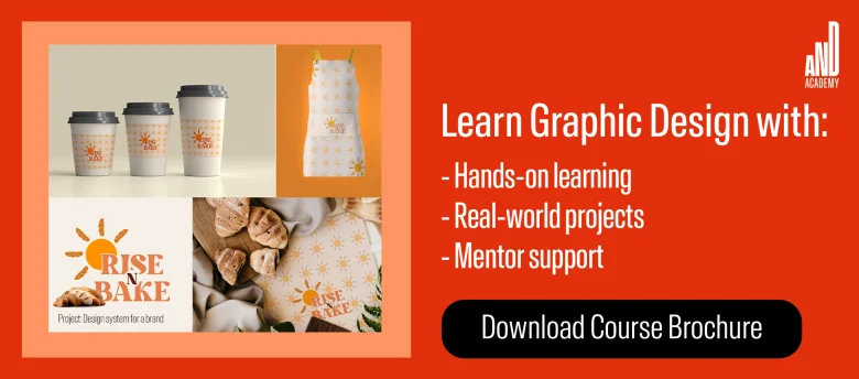
To learn more about brochure design, check out the Graphic Design Course offered by AND, which includes a comprehensive curriculum with hands-on learning opportunities, unparalleled mentorship, and dedicated placement support. Check out this project by AND learner, Sant Kaur, to see how we also help you create a strong portfolio.
If you’d like to know more about graphic design or related topics, head over to the AND Academy blog for more articles. As a starting point, you can consider going through the following resources:
- 1. The Significance of White Space in Design (With Examples)
- 2. 10 Best Graphic Design Apps To Count on in 2025
- 3. Exhibition Design: Principles, Types, Trends, and How To Become an Exhibition Designer?
Next Steps
In case you need further assistance, here are some of our resources you can consider:
- Watch this session by design veteran and AND’s Academic Head, Prachi Mittal, and our Course Lead, Soumya Tiwari.
- Talk to a course advisor to discuss how you can transform your career with one of our courses.
- Pursue our Graphic Design courses - all courses are taught through live, interactive classes by industry experts, and some even offer a Job Guarantee.
- Take advantage of the scholarship and funding options that come with our courses to overcome any financial hurdle on the path to your career transformation.
Note: All information and/or data from external sources is believed to be accurate as of the date of publication.