Your complete guide to complementary color schemes with their types, applications, examples, and pro tips in Interior Design.
In 2026, homeowners and designers are looking for more ways to add energy and balance to their spaces without making the design more complicated. Complementary colors that sit opposite to each other on the color wheel are the perfect option for this. By pairing these colors, you can create spaces that feel dynamic, harmonious, and lively.
Here’s a simple example of how to use complementary colors in design. Imagine a drawing room with walls painted green- a color that acts as a calm base. Now, pair this with burgundy chairs and decor. Since green and burgundy are opposites on the color wheel, they don’t clash, at the same time making for a cohesive contrast.
In this guide, we will explain complementary color schemes and how they can change the look of any room. We will also walk you through the principles, provide real-life examples, and offer advice on how to use these color combinations in your decor.
Here’s a clickable list of everything we’ll cover in this article!
- Why Complementary Colors Are Perfect for 2026
- Understanding the Color Wheel: Basics of Complementary Colors
- Types of Complementary Color Schemes
- Standard Complementary Color Scheme
- Split Complementary Color Scheme
- Double Complementary Color Scheme
- Double Split Complementary Color Scheme
- Common Mistakes to Avoid
- Conclusion
Why Complementary Colors Are Perfect for 2026
Complementary color combinations are lively, making the space more energetic- something many homeowners will seek in 2026. After a long period of using a neutral and simpler color palette, there is a clear shift towards bolder and more contrasting looks. In 2026, earthy tones will still be in fashion, but expect to see them combined with vibrant colors.
For example, using an earthly shade with its opposite shade on the color wheel creates a natural and appealing space. Most paint brands are already picking up this trend. One such collection, “Naturally Refined,” has soft sage green with blue hints against warmer, muted red—orange tones.
Furthermore, the trends seem to follow richer and more complex colors, such as
pinks, purples, greens, and yellows, which can be combined with earthy tones. Consider combining soft olive green with paprika; the contrast is engaging but calming. These color combinations create eye-catching spaces that are perfect for 2026 design goals.
Understanding the Color Wheel: Basics of Complementary Colors
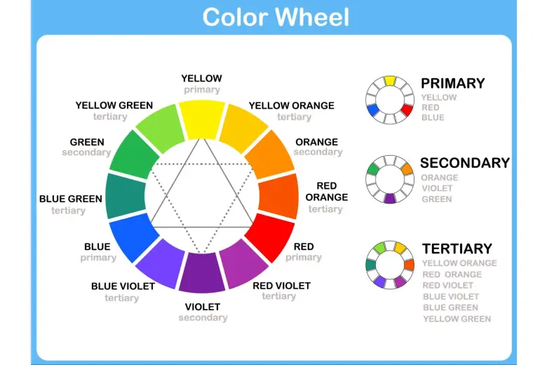
To completely understand the complementary colors, it is important to understand its foundation: the color wheel. It is the best tool for understanding how colors are related to each other. It organizes colors into primary, secondary, and tertiary colors.
Primary colors: red, yellow, blue
Secondary colors: green, orange, and purple (from mixing primary colors)
Tertiary colors: The colors that are obtained by mixing primary and secondary colors.
Complementary colors are those that sit directly opposite each other on the color wheel. In combination, they make each other look more vibrant and intense – like “opposites attract” in the color world. The three basic complementary pairs are:
Red and Green
Blue and Orange
Yellow and Purple
Each pair combines a warm color with a cool color. For example, yellow (warm) is complementary to purple (cool). This temperature difference produces the contrast that makes complementary colors effective. Understanding these basic relationships is a primary step toward using complementary colors well in interior design projects.
Types of Complementary Color Schemes
Although the standard complementary scheme, which we’ll speak about in this section, is powerful, some variations provide different levels of contrast and visual interest. You may want to know some of these options to help you pick the ideal scheme for your personality and the look you wish to achieve in your space. Read on to explore options that can help you find what fits your personal style and mood.
1. Standard Complementary Color Scheme
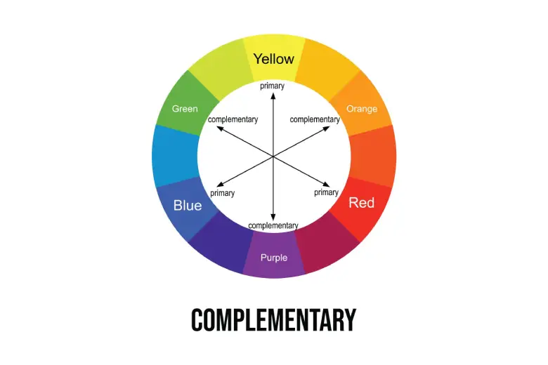
This color scheme uses two colors that are directly opposite to each other on the color wheel. The pairing of these colors creates a strong contrast, which adds energy and liveliness to a living room.
Examples
Take inspiration from these examples for using opposite colors on the color wheel for a bright and fun room.
- A living room with warm terracotta walls balanced by deep teal throw pillows and artwork.
- A bedroom with a bold purple sofa against soft yellow walls.
- A space with rich green cabinetry, which is complemented by warm red accents in textiles and decorative items.
Using these opposite color pairs can make any room look lively and nice. Try adding colorful pillows, rugs, or artwork to match your style.

2026 Application
In 2026, the trend bends toward sophistication and balance. You can choose muted or earthly tones instead of bright and saturated colors, such as:
- Pair of dusty blue walls with warm, muted terracotta accents
- Soft sage green (a trending color for 2026) as the main color, with muted rose or peach used in smaller decorative elements
Pro Tip
This tip shows an easy way to keep your colors balanced and nice. It makes sure one color does not overpower the other.
- Avoid using complementary colors in equal quantities. Follow the 70/30 rule.
- Use one color as the dominant color or shade (about 70% of the space)
- Use its complement as an accent (about 30% of the space)
It is the perfect way to achieve an appealing visual contrast. If one color is particularly bold, consider using a softer version of its complement for better balance.
2. Split Complementary Color Scheme
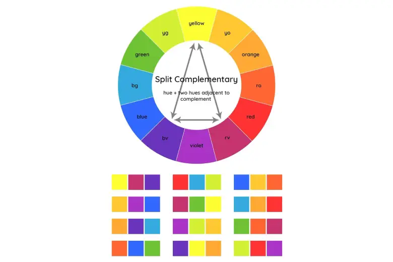
Image Courtesy: Pinterest
This color scheme provides a high level of contrast while maintaining less tension than the standard complementary colors. It uses one base color and two adjacent colors that complement the base color.
Examples
These examples show how one main color and two matching colors can mix together to make a room look balanced and fun.
- A living room that has blue walls and red-orange artwork with yellow-orange throw pillows.
- A bedroom with sage green as the primary color, accented with terracotta and muted lavender in the bedding.
Using these color sets can make your room feel calm and interesting. Try adding pillows, rugs, or art to see how the colors work together. These combinations combine warm and cool tones for a balanced space that has a rich mix of both.
2026 Application
This scheme works well with the 2026 trend of combining balance and natural elements. Think,
- Modern style muddied blue paired with earthy orange and green for a sophisticated grounded look.
- Olive green (expected to trend in 2026) paired with muted red and orange to lend a nature-inspired touch.
This color scheme provides more flexibility than standard complementary colors. It is an excellent choice for interior designers who want to introduce contrast in a subtle way.
Pro Tip
This tip shows a simple way to use three colors without making the room too busy. It helps you know how much of each color to use. Follow the 60-30-10 rule:
- 60% of the room in your base color (walls or large furniture)
- 30% in one of the split complementary colors (upholstery or curtains)
- 10% in the other split complementary color (accessories or artwork)
3. Double Complementary Color Scheme
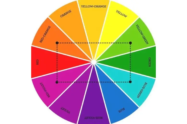
Image Courtesy: Pinterest
The double complementary (also known as tetradic) color scheme utilizes four colors arranged into two pairs of complementary colors. They form a rectangle on a color wheel. This arrangement creates a rich, intense color palette with a high level of contrast.
Examples
These examples show how using two pairs of opposite colors can make a room look bold and fun.
- A living room with blue walls, orange chairs, a purple rug, and yellow pillows.
- A space in which the colors range from pale to golden yellow, paired with lavender to deep purple.
2026 Application
In 2026, you can use muddied and earthly tones to balance the intensity that comes with double complementary color combinations.
- A dining room with muted olive green walls and dusty blue curtains.
- Add terracotta tableware and muddied pink artwork as the second complementary pair.
These gentle shades keep the room from feeling too bright. You can change how light or dark each color is to match your taste. Furthermore, the concept of “Double Drenching,” which involves using two strategically chosen colors to define a room, simplifies this scheme and can be used in your space.
Pro Tip
- Allow one complimentary pair to dominate while the other is used more as an accent.
- Start with a neutral base, then introduce the two pairs to create harmony.
- Adjust the lightness or darkness of the selected colors for more balanced results.
This plan makes your room feel balanced and lively. You can adjust each color’s brightness to get just the right look.
4. Double Split Complementary Color Scheme
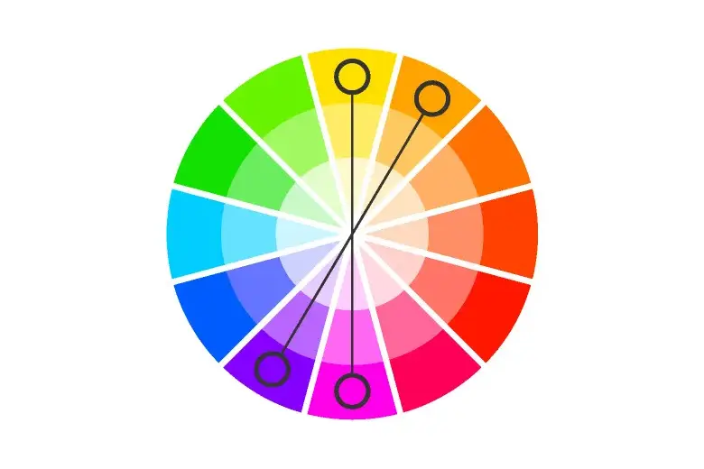
Image Courtesy: moving.com
The double-split complementary color scheme has two pairs of complementary colors, forming an X on the color wheel. It contains two cool and two warm colors. This results in a palette of four colors of high visual interest.
Examples
Here are some examples to show how mixing two cool colors and their split complements can work for a room.
- A room with light blue walls, a green sofa, yellow curtains, red‑orange pillows, red‑violet artwork, and yellow‑orange rugs.
- A space with sky‑blue walls, mint green chairs, coral cushions, mustard pillows, violet lamps, and peach blankets.
Use cool colors (blue and green) on walls and big furniture, and warm colors (red‑orange, yellow‑orange, red‑violet, yellow‑violet) in small touches like pillows, curtains, and art.
2026 Application
You can use double-split complementary colors to add a touch of sophistication to your space. In 2026, people like soft, earthy shades to make bright schemes feel calm. Try these ideas:
- Think of a home office with muted teal and soft coral as one split complementary pair.
- Add muted lavender and pale yellow (colors adjacent to teal and coral) as the second pair, using it in different elements of the space.
Using these colors in different proportions and textures results in a refined, stylish space that is youthful and calming.
Pro Tip
When using so many colors, you must create a careful balance between the color schemes. These tip shows how to use all six colors without making the room look too colorful. It helps you know where to put each color.
- Choose one or two colors to be dominant and use the others as accents
- Tone down the saturation of all colors for a more harmonious, sophisticated look
This keeps your room balanced and fun. You can always tweak the amounts a bit, but this is a great place to start.
Here’s a simple chart to help you remember the crux of these color schemes
|
Scheme Name |
Definition |
Number of Colors |
Typical Applications |
|---|---|---|---|
|
Standard Complementary |
Two colors directly opposite on the color wheel. |
2 |
Bold statements, high contrast, focal points. |
|
Split Complementary |
One base color and the two colors adjacent to its direct complement. |
3 |
Softer contrast, visual harmony, balanced spaces. |
|
Double Complementary (Tetradic) |
Two pairs of complementary colors, forming a rectangle on the color wheel. |
4 |
Vibrant spaces, complex palettes, visual interest. |
|
Double Split Complementary |
Two adjacent colors and the split complement of each. |
4 |
Intricate palettes, high visual interest, depth. |
Common Mistakes to Avoid
When using complementary color schemes, you should avoid these mistakes:
1. Don’t use a 50/50 Ratio: Don’t use both colors in equal amounts. One color should be dominant, and the other one should be used as an accent color.
2. Ignoring Saturation and Brightness: Simply picking colors opposite to each other is not enough. Look for how bright and intense each color is. Pairing two colors of the same brightness can be annoying; use a softer tone to create a more pleasing look. Using a more muted or off version of one or both colors will create a more harmonious effect
3. Neglecting Neutrals: Do not underestimate the power of white, gray, beige, and black. They provide visual breaks and balance the intensity of complementary colors. Neutrals can be great for walls or large pieces of furniture in a space that uses complementary colors.
4. Not Considering Lighting: Colors look different at different levels of lighting. It is always important to test the colors that you choose in the actual space with the light. Always test your color choices in the actual space and under the lighting you will use to make sure that you achieve the desired effect.
5. Overdoing It: One can easily get carried away with complex schemes like the double-split complementary color scheme. Remember that less is often more. Instead of using all colors to the same extent, focus on balance and cohesion among the ones you’ve chosen.
Conclusion
Using complementary color schemes offers a great way to add energy, balance, and visual interest to your interior design projects. Understanding the principles of the color wheel, along with the various types of complementary schemes, enables you to create harmonious interiors that are aligned with the trends of 2026. The thoughtful application of these pairings, particularly their tones, is sure to bring energy, balance, and visual interest to your design projects. In short: don’t be afraid to use opposites, and let your imagination shine.
If you’d like to learn more about interior design, head back over to these blogs:
- How To Design a Colour Wheel: Your Step-by-Step Guide (With Images)
- A Complete Guide to Colour Palettes and How To Use Them
- A Designer’s Guide to Colour Combinations
Next Steps
We also recommend you check out this project by AND Learner, Sunali Khajua to get inspiration for your next interior design project.
In case you need further assistance, here are some resources to consider:
- Watch this session by Snehanshu Mukherjee, Founding Partner at T.E.A.M and Mansi Almadi, an Interior Designer at Studio Lotus
- Talk to a course advisor to discuss how you can transform your career with one of our courses.
- Check out our Interior Design courses – all courses are taught through live, interactive classes by industry experts.
- Take advantage of our scholarship and funding options to overcome any financial hurdle on the path of your career transformation.
Note: All information and/or data from external sources is believed to be accurate as of the date of publication.


