Are you looking for inspiration for your interior design website? Then you’ve landed in the right place. Read on to learn more about how top interior design firms layout their websites and get some new ideas for your own site.
Your interior design website is the place where you can demonstrate your skills and experience, offer your services, and showcase your very best work. However, knowing how and where to start with your interior design website can be daunting. If you include too much information you run the risk of overwhelming website visitors; if you don’t include enough valuable insights or images it can leave you looking inexperienced.
In this article, we want to offer you inspiration from the websites of some of the top interior design firms out there. We’ll be looking closely at these websites and outlining what they’re doing well before offering you some actionable ideas for your own interior design website–from content best practices to tips on delightful user navigation.
Contents:
- Eastlake Studio
- Urbanology Designs
- ACTUAL Interior design
- Perkins&Will
- Decorilla
- Casamota
- Cory Damen Jenkins
- Project AZ
- Wadsworth Design
1. Eastlake Studio
About the website
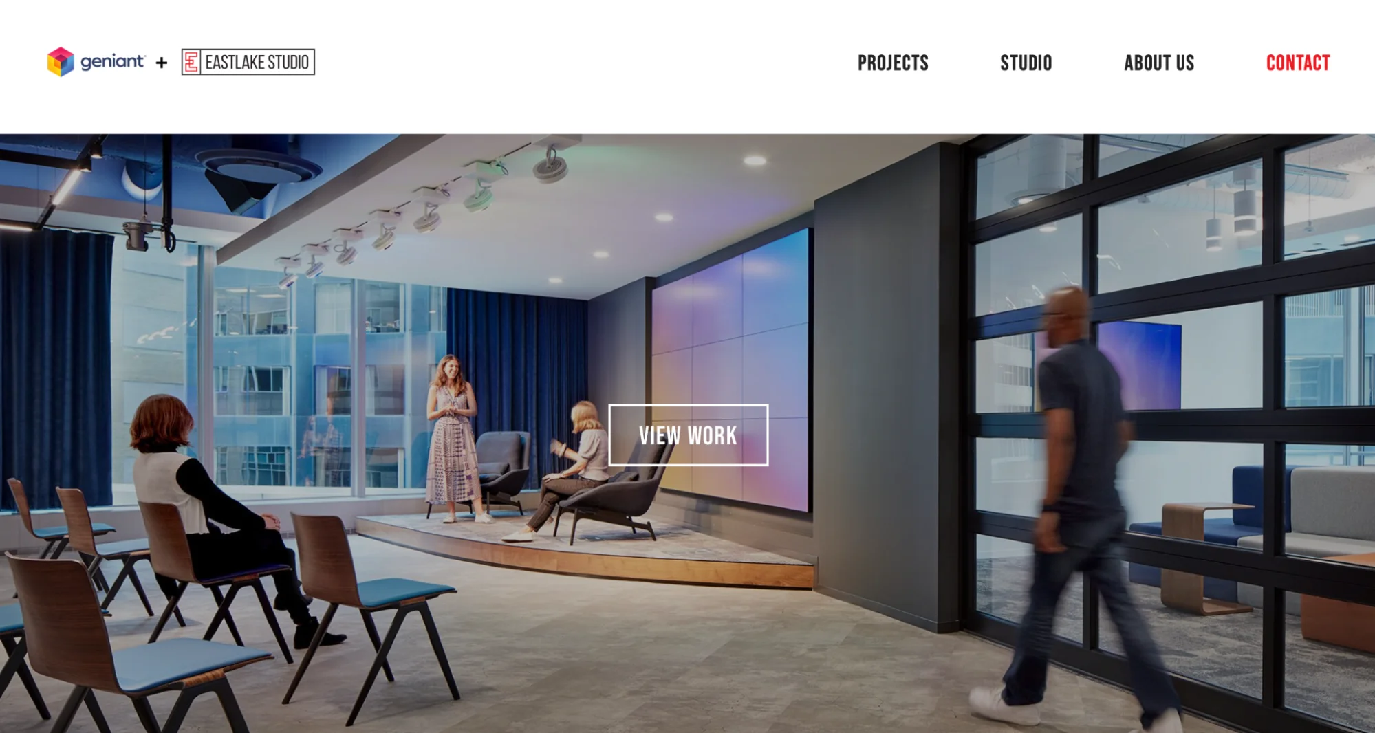
Eastlake Studio is a corporate interior design company. The company website doubles up as a portfolio to showcase their extensive projects, while positioning the team as thought leaders in the interior design space. The website is divided into Projects, Studio, About Us, and Contact. Potential clients or interested designers can peruse the range of projects on the first page, which can be handily filtered by project and client type. Those who want to learn more about the team can head over to the Studio page and get details about team members, the studio’s values, and what working at the company looks like. Each listing on the Project page can be clicked on to reveal the story behind the transformation as well as a host of high-resolution images of what the design team has achieved. In addition, the About Us page contains fascinating insights and articles that demonstrate the team’s passion for and knowledge of their industry.
What we like:
A particularly inspiring element of the Eastlake Studio website is its combination of first-class design work and insights into day-to-day life at the company. This means that visitors to the website can enjoy elegant design transformations while also getting to see the spirit of the team, the community around the brand, and how the team works together.
Ideas you can get from this website
What we can learn from this website is the value of sharing the story behind a project. Images are an extremely important element of every interior design company’s website. However, supporting these images with information about the goals of the project, the inspiration for different designs, challenges that were overcome, and how the design transformation came about, demonstrates a company’s process and approach. The Eastlake website is a great example of how sharing learnings in this format demonstrates transparency and gives potential clients an idea of what they can expect if they choose to work with the company.
2. Urbanology Designs
About the website
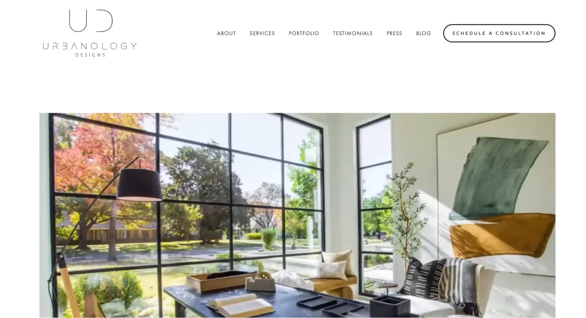
Urbanology Designs wows its website visitors with a sleek landing page video introduction. Visitors get to enjoy a video reel of stunning interior design transformations showcasing a range of both contemporary and traditionally designed residential interiors. The website is separated into sections for easy navigation, covering About, Services, Portfolio, Testimonials, Press, and Blog. The About page introduces visitors to the team and their values, with each staff member given their own unique profile page, while the Services page outlines the areas the team specializes in and the design packages the company offers. The Portfolio page is divided into residential and commercial projects; when users click on a project they are taken to a gallery of high-resolution photographs of the transformed interior and a caption discussing the inspiration behind the design. The whole website is designed using soft, natural colors that create an understated, yet professional and elegant impression.
What we like:
The blog on Urbanology Designs is a hidden gem. Covering a range of subjects from recent projects, trends in interior design, and tips and tricks to guides for improving your home’s interiors, the writing style is personable, humorous, and engaging, with posts punctuated by luxurious images of inspirational interior designs. Whether you’re a budding interior designer, someone interested in improving their own home, or a potential client, this personable and knowledgeable blog offers numerous valuable insights.
Ideas you can get from this website
What we can take away from the Urbanology Designs website is the value of investing in high-quality blog content for your interior design website. Not only will well-written posts on interior design help to build trust with users and potential customers, they will also boost your SEO ranking and help to establish you as an authority in the field. Another great idea that Urbanology has nailed is the consistent color theme throughout the website. The use of natural colors such as beige, white, and wood tones makes the website very easy on the eye while reinforcing a brand identity that is focused on creating natural yet timeless and luxurious looks through interior design, too.
3. ACTUAL interior design
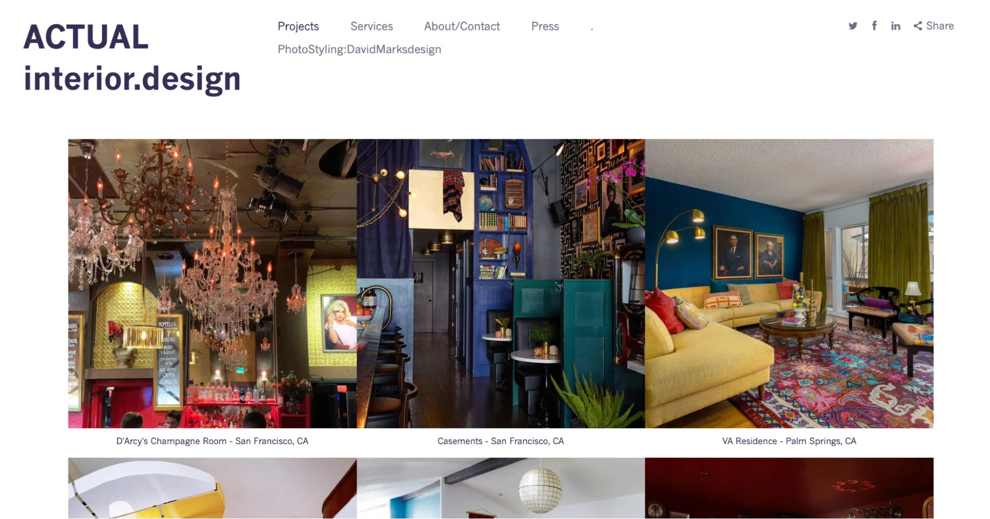
About the website
ACTUAL interior design is the brainchild of commercial and residential interior designers David Marks and Chris White. The website greets visitors with a gallery of colorful and eye-catching images of interior design projects that the pair have worked on, ranging from the luxury homes of their clients to high-end drinking establishments and magazine editorials. Visitors can click through to see more high-resolution photographs from each project and gain a sense of the care and attention that has been put into designing each space. The Services page is without images and instead uses typography and white space to highlight the Studio’s expertise in areas such as Interior Design, Color Consultation, and Home Staging, among others.
What we like:
Despite the wide range of services that ACTUAL offers its clients, the website’s simplicity is its winning feature. Images are favored over extensive paragraphs of text, letting the work speak for itself. When text is needed–as is the case on the Services page–the website keeps it very short and to the point, with clear headers and no images.
Ideas you can get from this website
Displaying your work front and center in a click-through gallery of images is a very effective way to draw visitors in and demonstrate your versatility and experience at a glance. While you might want to reserve this for your Project or Portfolio pages, it’s an idea that’s certainly worth considering for your initial landing page, too.
4. Perkins&Will
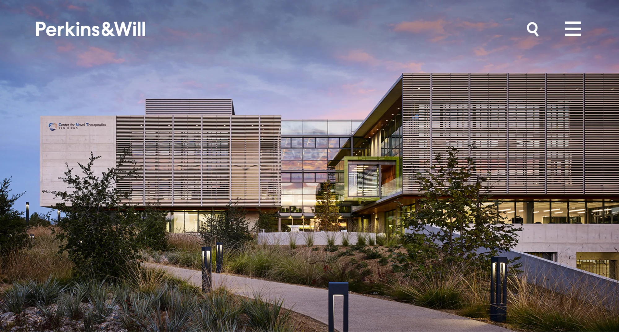
About the website
Perkins&Will is a Chicago-based interior design and architectural firm that operates globally. When landing on the site, visitors are greeted with a single, large, high-resolution image of a huge interior or exterior space that has been designed by Perkins&Will. This inspirational image changes upon refreshing the page, but the effect is the same: the visitor is filled with awe at the use of space, light, and form–a sense that is only emphasized by the sheer scale of the image used. When users keep scrolling on the landing page, they are shown more projects, insights, and company news stories. This means a user can simply stay on the landing page to get a sense of the whole website and what the company does. For those who click on the menu, the contents are arranged as follows: Work, Purpose, Insights, People, Studios, News, Careers. These categories enable users to know about the work of the designers in more detail and understand what drives the company forward. A search bar next to the menu also makes it easy for users to find exactly what they’re looking for.
What we like:
This is a website that you can’t help but feel inspired by. This sense of awe is achieved through the use of large-scale photography combined with a consistency in design that uses white space to draw attention to projects, articles, or other features. In addition, the ability to keep scrolling gives the user the feeling that there are always more exciting things to learn about this company and more groundbreaking interior and architectural projects in the pipeline.
Ideas you can get from this website
A great takeaway from this website is its use of large-scale photography and white space. These web design features work to draw the user’s eye to each different project without feeling overwhelmed. Text is used sparingly, except for in the Insights section where in-depth, expertly-written articles on different design subjects are published–another great idea for your own interior design website to help build authority and demonstrate expertise in the field.
5. Decorilla

About the website
Decorilla offers a slightly different approach to the services provided by traditional interior design companies. Rather than working in person with an interior designer, clients are invited to complete a questionnaire, attach photos, and outline their personal preferences which are then sent to multiple interior designers. These designers then send the user their proposals for the project and the user chooses which designer they would like to work with. This professional works closely with the client, albeit remotely, to transform their home. The website reflects the company’s unique approach; the landing page showcases impressive interiors the company’s designers have created for their clients, while further down a simple illustrated video explains how the process works. Over on the Portfolio page, users can see Before and After shots of interiors, and on the Style Quiz page, users are invited to take a free quiz to get to know their own interior design style better. Decorilla’s Blog page covers commonly-searched interior design topics, and is divided into office interiors and home interiors to provide inspiration for both workplace and living environments.
What we like:
Unlike other websites we’ve discussed here, the Blog page for Decorilla focuses less on pushing the brand as a thought leader in the design space and more on answering commonly asked user questions about interior design. By doing this, the brand is appealing directly to those who want to live in a stylish home but are not necessarily designers themselves. It makes the brand seem accessible and works as a helpful resource, providing value to website visitors even if they don’t choose to work with the Decorilla service.
Ideas you can get from this website
One of the central learnings we can take away from the Decorilla website is the value of explaining your process. Not only has the company put together a short but very engaging video demonstrating exactly what working with them looks like, but also dedicated a whole page to How It Works. This section outlines the process, tells clients what they can expect from the service, highlights top benefits, and includes an FAQ section. This transparency means clients and website visitors know exactly what they’re signing up for and what they’ll get in return, in turn building client confidence and increasing the likelihood of them working with the brand.
6. Casamota
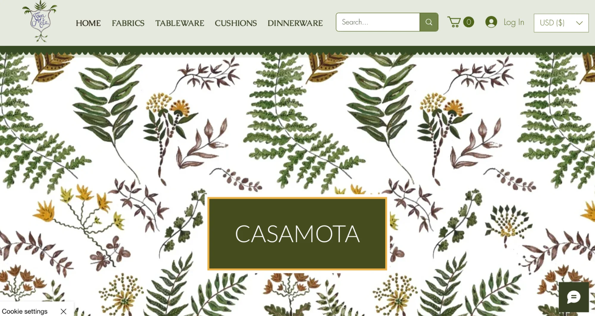
About the website
Carlos Mota is a creative consultant, stylist, interior designer, product designer, former international style editor for Architectural Digest, and editor-at-large for Elle Decor. Upon landing on his website Casamota, the visitor is greeted with an overhead menu consisting of Home, Fabrics, Tableware, Cushions, and Dinnerware, before a luscious plant pattern leads the user to a scrolling gallery of Carlos’s “Verde Collection”–one of his homeware collections. The landing page is also used as an ‘about page’ for Carlos.- where friendly image of the designer seated in a luxurious home interior is followed by a detailed account of his experience, passions, and inspirations.
What we like:
The website’s consistent design theme of plants and flowers–which complements the patterns of the products on sale–creates a luxurious and yet flamboyant feel to the website. The combination of illustrations and photographs create an eye-catching landing page that invites the user to investigate further.
Ideas you can get from this website
An idea worth considering for your own website is aligning the color theme of your website with that of the interior designs you’ve worked on. For example, if one of your signature pieces is a classically styled English country kitchen, you could use the same pastel and wood-colored tones for your website.
7. Corey Damen Jenkins
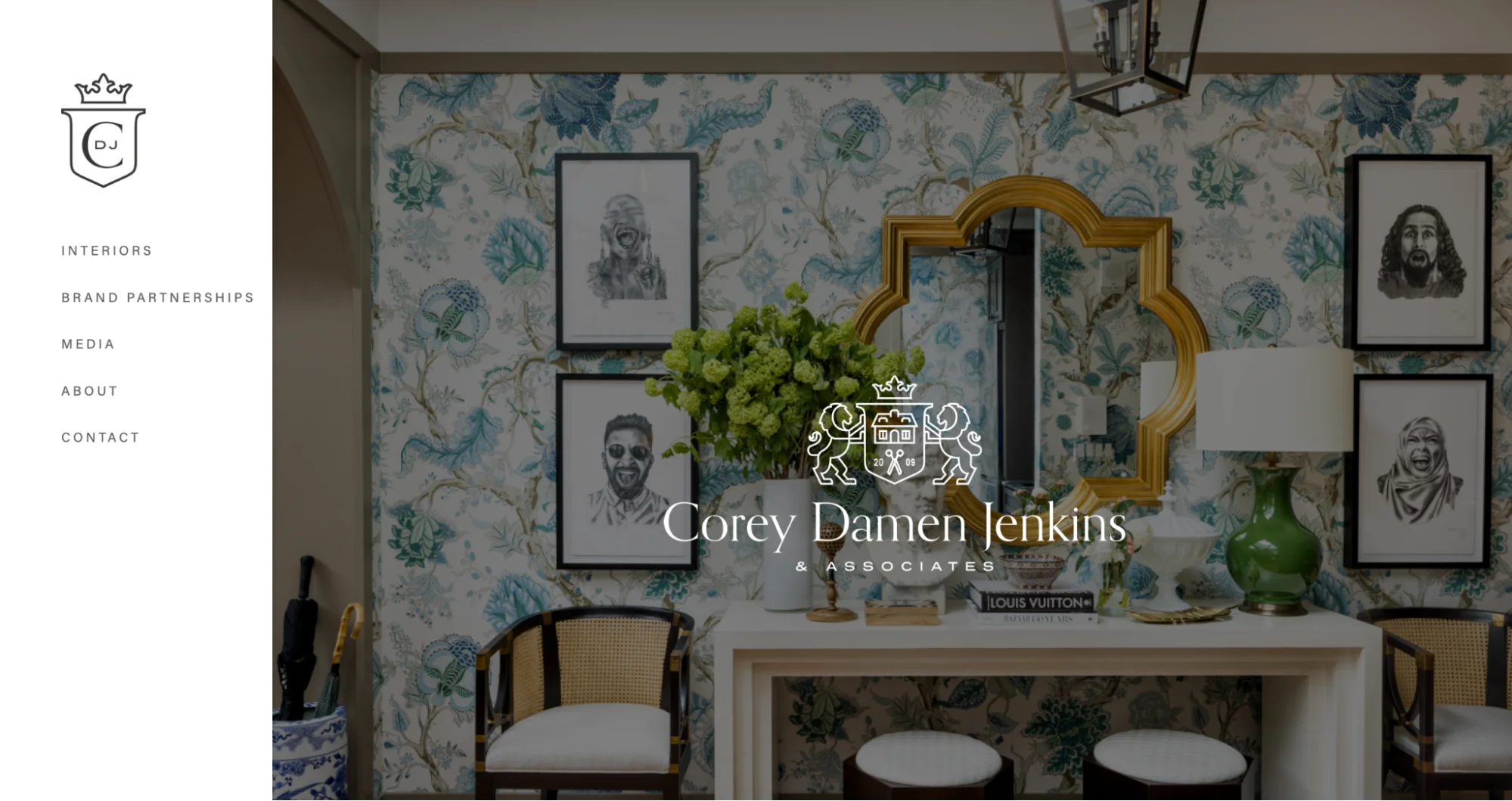
About the website
Corey Damen Jenkins is an internationally renowned interior designer based in New York. The landing page of Corey’s website showcases his company’s signature style, one which exudes New York sophistication and elegance. From the Interiors page, visitors can click on a photograph of one of his projects which takes them to a dedicated page showing the work from different angles. In addition to admiring the high-resolution photographs, visitors can read one or two paragraphs of text telling the story of the space, the client’s goals, and how the design came together.
What we like:
This website mirrors the same elegance and sophistication of Corey Damen Jenkins’ interior design work. This is not just true of the colors and imagery used but is also reflected in the smooth navigation between projects and photographs. Subheaders appear as if by magic and photographs are zoomed in slightly even when the mouse is just hovering over an image. This attention to detail tells the user about the brand’s attention to detail in their approach to interior design, too.
Ideas you can get from this website
As we’ve already seen utilized by other websites on this list, the use of white space serves as inspiration for interior designers to create their own portfolio sites. While the team at Corey Damen Jenkins are great advocates for the use of bright and mixed-color palettes in their interiors, the website uses a lot of white space. This draws the user’s eye towards the stunning photographs, with the white contrast of the backdrop making the colors used in their wallpaper, furniture, and accessory choices, really stand out.
8. Project AZ
About the website
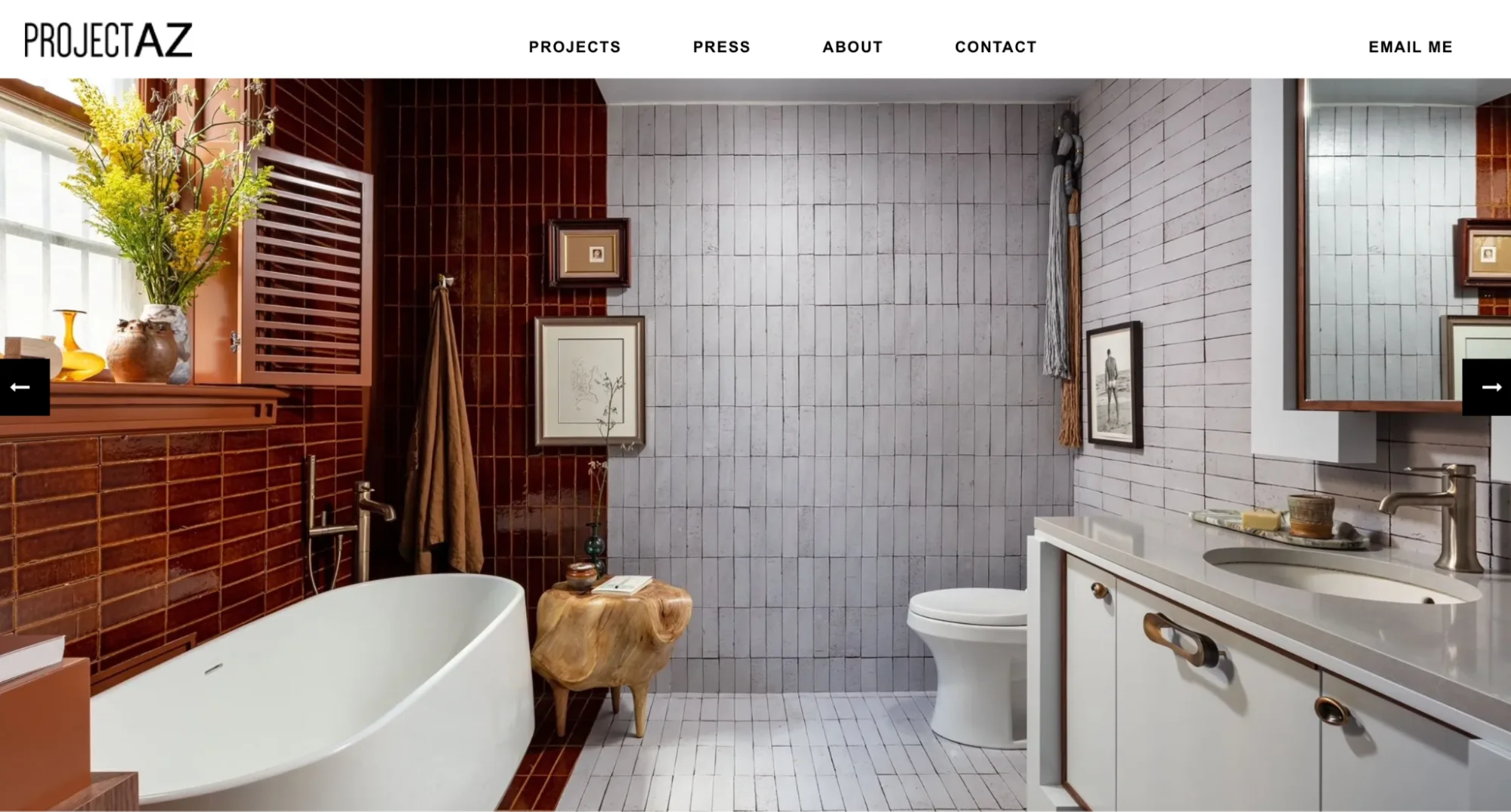
Project AZ is a New York-based design studio that works with clients to create modern and functional interior spaces both in the residential and commercial sectors. The website is a sleek and beautiful introduction to the company’s work, with visitors to the landing page being greeted by a large, high-resolution photograph of an interior the team has worked on. After a few moments, the page jumps to a new image, showcasing the versatility of both the interior designs and the types of clients the brand caters to. The website offers visitors two menus, one at the top of the page with Projects, Press, About, and Contact, and another one at the bottom of the page for Services and Blog.
What we like:
While the website actually offers visitors quite a few different destinations, from an insights-packed interior design blog to a carefully curated projects page, the design doesn’t feel cluttered or overwhelming. Instead, the website feels thoughtfully designed with plenty of space given to each element. Visitors to the website can enjoy the quiet luxury of the designs that are then reflected in how they are presented on the site.
Ideas you can get from this website
It takes a brave interior design company to include a star-rating system for its designs! At AZ Project they have taken this unusual step, allowing visitors to rate each of their design projects out of five. The result? The company can boast numerous five-star reviews. This won’t be a move every interior designer feels comfortable making, but it does demonstrate both the company’s confidence in the work and a desire to learn from feedback that reflects quite positively on the company and its approach. Another idea that’s worth considering is the Email Me link that appears in the corner of every page. This makes it easy for potential clients to get in touch without having to search for a contact page.
9. Wadsworth Design
About the website
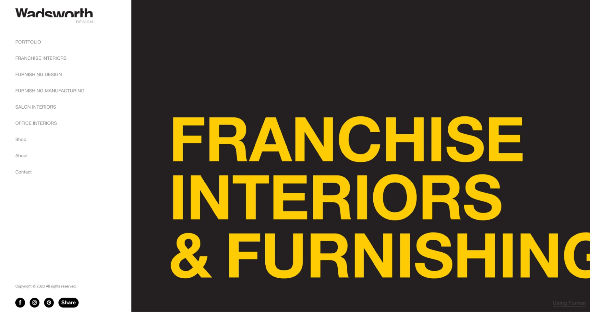
Wadsworth Design specializes in franchise interior designs and furnishings, with the company’s offices based in Utah, USA. The website landing page is immediately striking, using a large, yellow font for the text against a black background. A menu on the left-hand side provides visitors with a selection of destinations to check out, while an arrow invites them to scroll through a curated gallery of large, high-resolution photographs of projects, with images broken up by short text labels describing the company’s different services.
What we like:
The bold style of the Wadsworth Design website is instantly appealing to visitors and the clever inclusion of information about services between the images (which is continued on the portfolio pages) keeps potential clients informed of services without the messaging appearing too pushy or overwhelming. Navigation between images and pages is seamless, while the constant presence of the company’s social media handles in the bottom left-hand corner of the page makes it easy for potential clients to see more of the team’s work or get in touch.
Ideas you can get from this website
On the pages of the website which include lengthier sections of text, the team at Wadsworth Design end the final paragraph with an offer for the visitor to find out more. With CTAs including “Let us elaborate” and “Let’s discuss your project” which link to the contact page, the company is very effectively ensuring that the user is given somewhere to go when they’ve finished reading and encouraging them to get in touch. You may want to consider something similar for your own website!
Conclusion
We hope you’re feeling inspired by the websites and ideas we’ve outlined in this article.
When offering design services, it’s important that functionality and usability top your digital agenda. Users will recognize the care and attention you’ve put into your website and see it as a reflection of your general work ethic. They’ll also make note of your website design color and thematic choices, and hence these should ideally mirror your personal interior design preferences and style.
For these reasons, rather than trying to include all of your favorite ideas, try to start small and execute well instead. Keeping your website simple but stylish will be more appealing to users than if your pages seem cluttered or chaotic with many different styles and ideas. Aim for an authentic approach that reflects your own style preferences, while still demonstrating your versatility through the projects you select to showcase. Take AND learner Aakriti Sharma’s portfolio for instance, which includes diverse projects to effectively demonstrate her capabilities as a designer.
Next Steps
If you’d like to learn more about interior design and receive professional support from industry experts while putting together your interior design website, take a look at AND’s Interior Design Courses. For more articles about interior design and careers in the field, head back to our Design blog!
You can also refer to the following resources in case of further assistance:
- Watch this session by Snehanshu Mukherjee, Founding Partner at T.E.A.M and Mansi Almadi, an Interior Designer at Studio Lotus
- Talk to a course advisor to discuss how you can transform your career with one of our courses.
- Check out our Interior Design courses – all courses are taught through live, interactive classes by industry experts.
- Take advantage of the scholarship and funding options that come with our courses to overcome any financial hurdle on the path of your career transformation.
Note: All information and/or data from external sources is believed to be accurate as of the date of publication.


