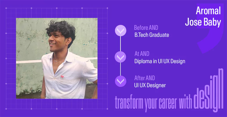
AND learner Aromal Jose Baby takes us through all the intricacies of his career and how the exciting world of UI UX design shaped it. Read on to know all about his transformational
SUMMARISE WITH:
AND learner Aromal Jose Baby takes us through all the intricacies of his career and how the exciting world of UI UX design shaped it. Read on to know all about his transformational journey, and get detailed insights into his process, work, and learning experience at AND Academy!
“There was never a moment where I felt bored or confused with the assignments I was working on.”
With this edition of our student interaction, we join the Internet’s unanimous love for UI UX design and we hop on to this bandwagon with a journey that promises to ignite your passion for design. In conversation with Aromal Jose Baby, a recent graduate of our Diploma in UX UI design we bring to the forefront all that goes into designing an attractive and seamless user experience.
Starting with his background in technology, Aromal goes on to discuss his passion for design and what motivated him to pursue a career in the field of UI UX. He also takes us through three of his key works and also shares insights and advice for aspiring designers.
Here’s a glimpse of what we covered during the conversation:
- Aromal’s background
- What made him pursue UI UX design as a career
- Why he decided to learn with AND Academy
- His experience with projects
- Kiddy Kinder Project Overview
- Insight into the Process for Kiddy Kinder Project
- Kiddy Kinder Project- Final Designs
- Campus Ambassador Project
- Game Creators Hub Project Approach
- Final Designs of the Game Creators Hub Project
- 3 things he liked the most about AND
- Career Aspirations
- Thoughts on AI and ChatGPT
- Advice for future AND learners
Without further delay, let’s dive right into it!
Hey Aromal! Would you like to start with a brief introduction?
Yeah sure! I am based out of Kochi and have recently graduated with a Bachelor of Technology. Alongside my undergrad degree, I was also working as a freelancer and offered services to clients primarily in motion graphics and graphic design. After completing my degree at AND, I have now expanded my services to UX UI design. Outside my professional interests, I like to work out and also have a keen interest in AI and related technologies.
We see we have a gym freak among us today! But jokes apart, switching to design, especially as an engineer is a big jump.
So, what drove you to pursue UI UX design as a career?
I think my transition to design, and by extension to UI UX design for that matter was quite organic. Being an engineering student, I often had to work on projects that involved website development or had a significant focus on AI. This, combined with my general curiosity for web development, motivated me to join Web3-related communities in college. And it was through these communities and clubs that I first got introduced to the design space.
As you know, I started freelancing while I was still a student. Although my work was primarily focused on branding, one of my clients at the time requested me to assist in designing a website for their business. At that point, I had very limited knowledge of UI UX design and my experience in graphics meant my approach was mostly focused on the visual side of UI UX. However, I’d say it was this project that ignited my interest in the field and pushed me to explore it further.
Well, that is a unique journey to UI UX design for sure!
How did AND come into the picture?
With my website design project coming to an end, my curiosity about UI UX only increased. I wanted to learn more about the discipline and started looking for short-term courses to acquire key skills. However, I noticed that most of these courses were primarily focused on the aesthetic or software aspect of UI UX design, and often didn’t cover the fundamentals.
That is when I decided to switch strategies and tried looking for design institutes in India. My search efforts led me to IIAD, and eventually to AND. What had me sold was the website’s comprehensive and clean design. I could find all the required information on the homepage, including the curriculum, which I must say was exactly what I was looking for. I loved how the curriculum also focused on design and the processes behind it, alongside software training.
That’s a huge complement coming from a competent UI UX designer like yourself!
“Classes were very interactive and instructors used activities to explain concepts instead of a standard pitch deck.”
Talking about the curriculum, courses at AND come with a strong practical component. How did that approach chalk out for you?
I think the project-first approach that AND takes works really well, especially for those with little to no experience in design. The initial few modules are taught alongside a small project to truly give a glimpse of what the design process looks like. At a later stage in the learning process, we have to take up two capstone projects.
My experience working on projects and hands-on assignments has been extremely satisfying. There has never been a moment where I felt bored or confused when working on the assignments. All the projects were compact and challenging, but did a great job at keeping the learner engaged and making the learning experience fun.
We are glad our approach to design education worked well for you.
Since we are already on the topic, could you tell us a little bit about your Kiddy Kinder Project?
So, to give you some context, Kiddy Kinder is the name of the mobile application we designed to help parents find a babysitter for their children.
The problem statement for this project was quite straightforward: in today’s world, it has become increasingly difficult for parents to look after their children, especially if both parents are working. However, despite this apparent need for help, Indian parents feel hesitant to hire a stranger to look after their children.
My aim, while working on the project was to first understand why this gap existed, and then design a mobile application that addressed most, if not all, the challenges that deterred parents from hiring babysitters.
This sounds like an intense project. How did you go about it?
Oh, it was surely intense and required a lot of effort, especially in terms of research. Therefore, to streamline the process, I divided the entire project into three phases.
The first phase was user research, wherein I surveyed approximately 50 people. The sample audience for this research incorporated parents from different family structures, ranging from single parents, and working parents to those welcoming a baby for the first time. I also carried out competitors analysis and gathered feedback on existing products from parents. All this was combined with user interviews where I talked to more than 10 parents to get deeper insights into their motivations, challenges, and pain points.
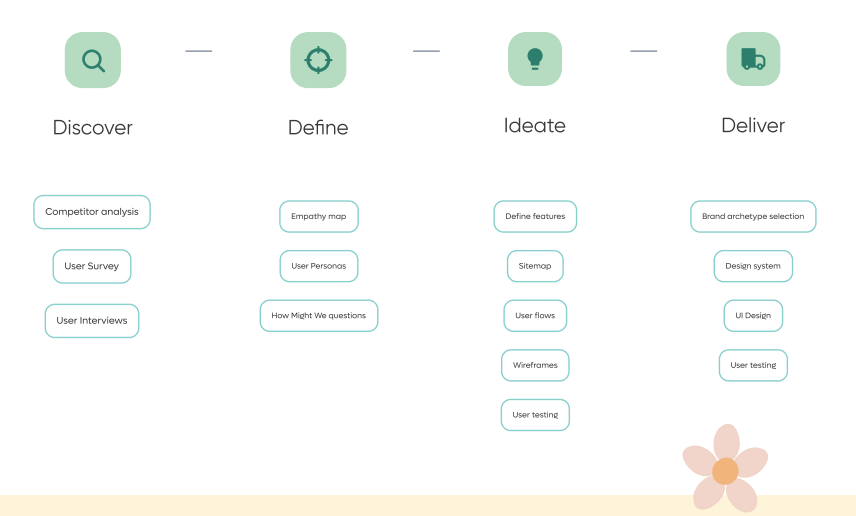
Design process for Kiddy Kinder Project
Once I had all the required data, I moved on to the second phase of the project – data analysis and insights. Affinity mapping, empathy mapping, and creation of a user persona, were the three popular techniques I used to interpret the data and identify key patterns. This entire exercise eventually helped me derive two major insights. First, there was a lack of verification and standardization in the hiring process. Second, parents wanted multiskilled babysitters who could also handle household chores.
The last and final stage was developing a product strategy for the mobile application. The entire process was heavily dependent on the insights I had gathered during the research stage of the project. For instance, a common pattern I noticed during the analysis was the limited information parents had about the babysitters. It is natural for parents to be wary of hiring strangers as babysitters, especially when key information on previous work record and skills are missing. Therefore my product strategy focused on creating a platform that addressed this gap at multiple touchpoints.
The navigation and the structure of the app were yet another important consideration at this stage. Since my mobile application design was intended to be used by the babysitters and parents, I needed a simple interface with an intuitive flow and had to be mindful of the visual style when formulating the design systems and the brand archetype. I achieved this by creating low-fidelity wireframes which were shared with parents for their feedback and suggestions. All these insights were then incorporated into the final designs.
Wow! What a thorough approach.
Could you also take us through the final designs for the project?
Gladly.
Let’s start with the insights I derived during the research phase. As I had mentioned before, most products in the market did not mention the essential babysitter information, culminating in a sense of distrust for parents.
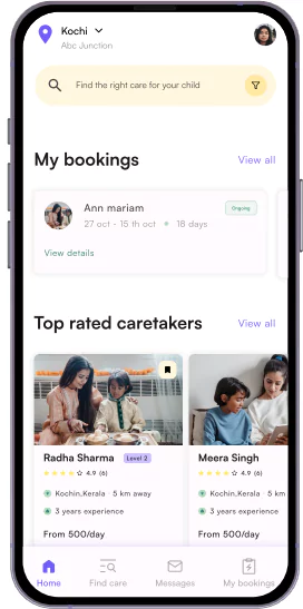
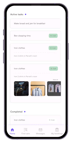
Homepage and Task Section view of the application
To combat this, I incorporated a Trial Hire and a Book Meeting feature for users. Parents who were unsure of their decision could book babysitters for a trial period, or alternatively, meet them in person before hiring. I also included a detailed babysitter profile that included information like the language they spoke, their prior experience, and their calendar for parents to schedule meetings.
It is also important to note that every parent has a different need or mental model when it comes to hiring babysitters. Most Indian parents prefer to hire a multiskilled professional who can also handle household chores alongside babysitting. To meet such diverse needs, I ensured there was an option for parents to list all the services they wanted from a babysitter.
Parents could also customise their tasks using the Task Section and assign specific chores to their babysitter via the application. This allowed them to stay updated with task completion and also schedule chores for specific dates through the calendar feature on each profile.
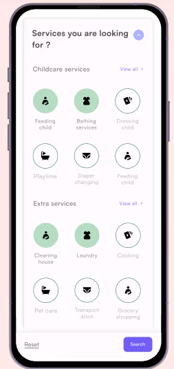
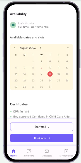
[Services and Trial booking features in the application]
There are several other small features I incorporated for a seamless experience. Older users who have booked babysitters previously could track their services straight from the Home Page using the Booking Status tab. Similarly, for an intuitive search experience, I limited the search flow to two queries and incorporated the rest via filters. The direct messaging box was also segregated into past conversations, active messages and booking requests to help parents keep track of their conversations.
Phew! That’s some real head-scratching strategizing there.
This has gotten me curious. Were your other projects also equally time-consuming?
Absolutely! However, my projects were also fundamentally different from each other and required a unique approach. The best example of this would be the Campus Ambassador Project. Although the solutions I ideated were quite minimal, they had a significant impact in terms of the numbers.
Oh, that’s great! Would you like to elaborate on the project?
Yeah sure. So Campus Ambassador is a marketing programme wherein college students partake in a referral scheme to bring in more visitors to their college fests. Whoever gets the most registrations is rewarded with a special prize at the end of the fest period. We’d noticed a growing dip in student participation which was a major challenge since the final prize was sponsored via this exercise. To address this growing concern, I undertook a project to redesign the Campus Ambassador experience to improve participation, and by extension the number of registrations.
I followed a similar process, starting with user research to gather feedback from Campus Ambassadors via interviews and surveys. This was followed by a competitor analysis where I studied the programmes of other colleges to understand common student pain points. All these data points and analyses enabled me to derive three major insights:
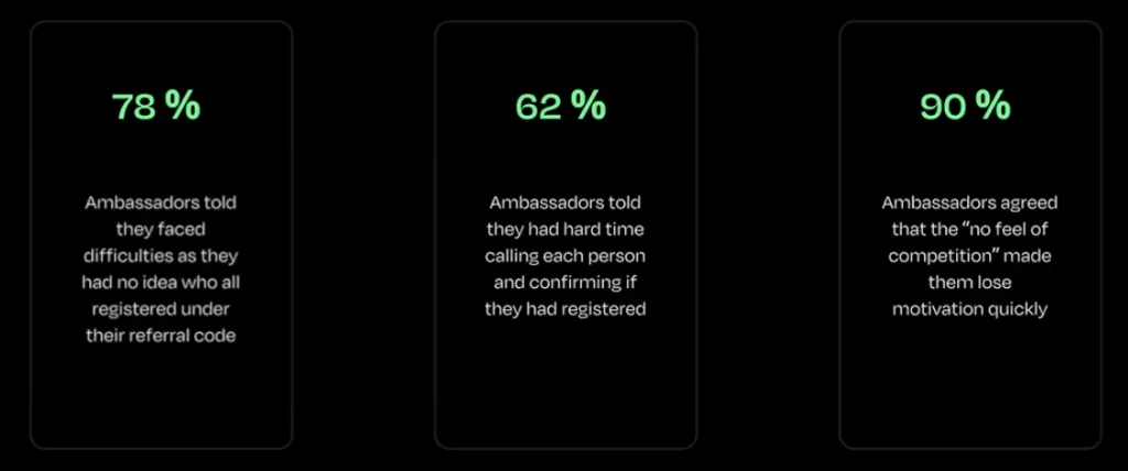
User research results and statistics
First, Campus Ambassadors could not track the number of people who registered under them on the website. This lack of feedback over the course of the programme demotivated them, leading to a high attrition rate.
Second, to keep track of their registrations, Campus Ambassadors had to follow up on a call with each participant and manually enter the data into a sheet. This significantly added to their workload, contributing to poor performance rates.
Third, the poor tracking mechanism also led to a lack of competition and made the experience uninteresting for Campus Ambassadors.
To address these challenges, I decided to create a separate ambassadors dashboard and make the overall process more seamless for participants. Since keeping track of registrations was a key pain point, I designed a system that allowed the ambassadors to automatically gather the said data. Essentially, instead of using a referral code, ambassadors were provided with referral links. Whenever a member registered using the given link, their details and data would be automatically recorded on the individual ambassador dashboard.
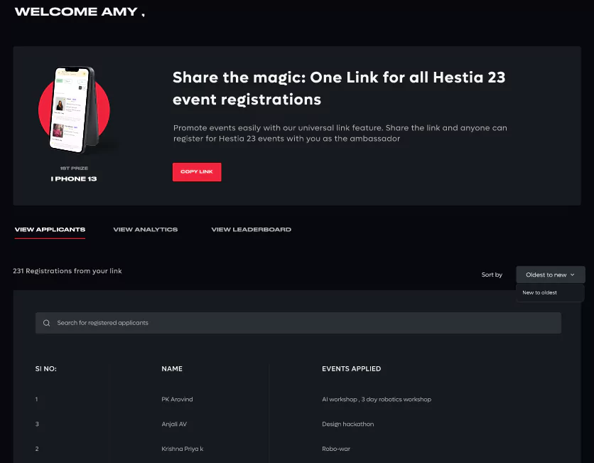
The final dashboard for data tracking and analysis
I also introduced a leaderboard to the website that recorded the individual ambassador rank across colleges. This was done primarily to establish a sense of competition and keep them interested. Moreover, I made sure the prize was featured on the dashboard at all times to gently nudge the ambassadors and keep them motivated through the course of the programme. Finally, each ambassador dashboard came with a dedicated insights section to help them formulate new strategies and measure their performance. These strategies eventually proved to be quite effective with the total number of registrations increasing by a whopping 26%.
These seem like such minor yet profound changes! What an intelligent way to enhance user experience.
We’ve also heard great praise about your Game Creators Hub Project. How did you approach that?
Game Creators Hub was a freelance website design project where I had to create an online gaming community for creators to connect, share their work, and also advance in their careers. My client was a project manager at a gaming studio who was looking to assemble a team for a particular project. However, he faced a major roadblock when it came to recruitment. Since a typical gaming project requires a diverse set of members, it was especially challenging for him to hire individual team members. Additionally, this often included a long and time-consuming resume review process.
Subsequently, my aim when working on the project was to first identify the key factors that made the hiring process difficult. Secondly, I wanted to understand the challenges and needs of game creators and address those through a comprehensive online community. The natural first step, therefore, was conducting thorough user research.
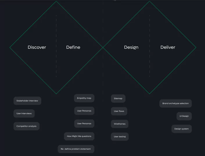
Game Creators Hub design process
Since my deliverable was intended to enhance the experience for two sets of audience, I chose to conduct both stakeholder interviews and user interviews. This helped me understand my client’s vision and scope better while also allowing me to align it with the expectations of game creators. I combined this with a competitor analysis of platforms that provided similar services.
The insights I gathered from this exercise were profound. From a recruitment perspective, I realised the challenge lay in the inherently complex nature of the hiring process. Product managers and recruiters had to manually filter through applications to identify the right candidates. The fact that most applicants also fabricated information added to the issue of authenticity.
On the contrary, from a creator’s perspective, most individuals felt that existing platforms did not adequately allow them to showcase their skills. For instance, voice artists often have to conduct a lot of backend research to connect with the character. However, they found it difficult to showcase these aspects on most platforms that mostly focused on the visuals. Game creators also found the application process quite repetitive since they had to incorporate the same information multiple times on different platforms.
Therefore, my problem statement for the project was as follows: I had to create a platform that allowed creators to showcase their skills, made it easier for recruiters and creators to find jobs/hires, and enabled creators to find inspiration for projects.
This sounds like a project that would have been quite challenging to navigate.
How did your final designs turn out?
Although I was working with two distinct target audiences, I did not want to change the functionalities and the interface based on the type of user. So I had to ideate on an interface that addressed the diverse needs without drastically changing the design system for the two personas.
One way I managed to achieve this was via customisable public profiles that allowed creators to conveniently showcase their skills, and projects, and connect with the community at large. The profiles also included different sections such as Portfolio, About Me, Jobs and Asset Marketplace to reduce user effort and streamline the navigation. Each of these sections was incorporated to reduce user effort and subsequently make the platform independent of diverse user needs.
For instance, the dedicated Portfolio section has been designed to support various file formats, allowing creators (users) to effectively upload their work regardless of the project type. Similarly, I added a Heading and Description option that enables users to go into the details of their process and include all the information they deem appropriate. Users could also add tags to images and other uploads to improve discoverability and increase their chances of getting hired.
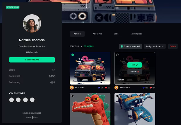
View of the Portfolio section in the Profile
The About Section fundamentally functions as a resume for recruiters. Creators can add their interests, hobbies, work experience and projects, all of which are structured in a resume format to make the application process easier. Users simply have to share the links to their profiles when applying for jobs on the Games Creators Hub.
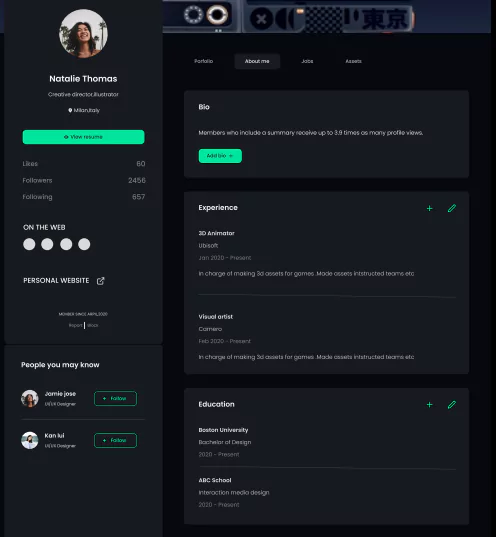
View of About Me section in the profile
In case someone wants to export the file and share it elsewhere, the platform allows users to download a watermark-free version of the said section. Streamlining the application process was a little tricky, but I addressed it by incorporating a search bar in the Job section. Essentially, users can search, sort and filter opportunities right from their profiles. Any recruiters looking to hire creators can also post jobs in the said section.
One distinct feature I incorporated for easy recruitment was the Collaboration Job option. If you remember, a major pain point when it came to recruitment was managing the application and also finding the diverse pool of talent conveniently. The Collaboration Job feature is designed specifically to reduce user effort when it comes to assembling a team. Under this, recruiters can include the different roles they are hiring for, the project description, and the required skill set for each of the roles.
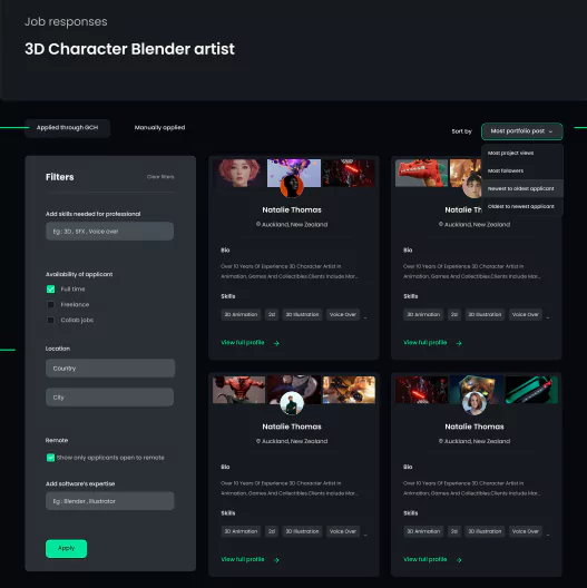
View of Application Screening section
For the effortless screening of applications, I also created a dedicated space where recruiters can sort or filter applicants and visit their profiles directly by clicking on the tile. And last but not least, the Asset Marketplace section features creatives from members that can be used for inspiration or downloaded for use.
As you can see, this is a comprehensive platform that enables users to carry out multiple tasks without having to navigate to different pages. I also conducted user tests among 10+ participants to ensure the effective operation of the platform.
This is mind-blowing. I can only imagine the amount of hard work and thought process that must have gone into this!
Moving on, if you were to describe your overall experience at AND in 3 words, what would you say?
I think three words are a little too less to truly describe my experience at AND, but if I have to stick by your question, I would say informative, ample industry exposure, and connections.
The curriculum here is perfectly structured, starting with research and then slowly progressing to analysis and core principles of design. I also absolutely love how accommodative the entire course schedule is. Classes are conducted at 7:30 and 10:30 which is a suitable time for both working professionals and students to attend and learn. All concepts are taught alongside projects, which in my opinion, is an excellent way to impart design education. Each project came with a significant learning curve.
The quality of faculty and mentors here are intrinsic to why I believe AND offers excellent industry exposure. You get to learn from design experts and not in a standard classroom format. There is no pitch deck that mentors follow, instead, they incorporate interactive sessions, which in some ways is a great mark of their own capabilities. Additionally, this being an online course opens up avenues for diverse mentors to become a part of the entire ecosystem.
The industry experience of the faculty also offers excellent opportunities for students to make connections and network. And of course, the relations and connections you make here extend to a rich peer learning community.
We are glad our curriculum and faculty could make this experience valuable for you.
What are your career aspirations now that you have completed your course?
I plan to pursue UX design for certain. If possible, I would like to learn more about the field and explore areas that I have not yet ventured into. And hopefully, in the coming years I will be able to bag a leadership role where I get to manage both the development and the design teams.
Your ambitions and clarity of thought are truly inspirational
Considering your experience in engineering and your career aspirations, I would like to know where you stand with the whole AI and ChatGPT situation?
I did get to explore AI a little bit during my B.Tech, and I am also, at a personal level, quite intrigued by the discipline. In fact, I took up a lot of AI-related projects during the pandemic to experiment with it. But coming to your question, I think I am more inclined towards the psychology and behavioural pattern of a user. So yes I have used ChatGPT for insights, especially those that pertain to identifying behavioural patterns. In my experience, I would say it is a great resource for abstract primary research to get started with the process. But this only works at the initial stage when everything is a little uncertain.
That’s interesting and definitely unconventional to hear.
Any advice you’d like to share with future AND learners and designers?
Of course! I think my first advice to new learners and designers would be to approach the field with a very open mindset. I am speaking from experience, it is very easy to get fixated on an idea and lose sight of the primary objective. As a UX Designer, it’s your job to bridge the gap between the needs of a business and those of the user. So instead of fixating on your next innovative idea, remember to stay aligned with the larger project goal.
However, that was the UX Designer within me speaking. At a more personal level, I would suggest college students, in particular, to explore new things and disciplines. That is how I got introduced to UX design, and that is how you expand gradually as a person too. And do not be afraid of failing. Remember that the faster you fail, the quicker you can fix it.
Such wise and inspirational words!
Thank you so much Aromal for your time and such detailed insight into your projects. We wish you all the very best for your future endeavours.
Think you have what it takes to be an excellent UX Designer like Aromal? If the answer is yes, we recommend you go through UX UI Design courses at AND Academy. Our stackable courses allow you to test the waters with an 18-week Certificate course and seamlessly upgrade to a Diploma or PG Diploma to advance your knowledge.
For further queries, please feel free to contact our Course Advisors.
Note: All information and/or data from external sources is believed to be accurate as of the date of publication.

