Looking for some inspiration to improve the UX design of your product or service? Check out our list of UX frontrunners who have paved the way in the field of UX and user-centred design.
Ever wondered how the best websites and digital products in the world have created such seamless and enjoyable user experiences? If you’re looking for some inspiration to improve the UX of your own digital product, then you’re in the right place. In this article, we want to run you through what it takes to create a truly user-centric digital product or service that keeps your users returning again and again.
From Google’s industry-defining search engine to Spotify’s groundbreaking music streaming service, we’re going to break down exactly how these innovative platforms have created a user experience that has made their services second to none.
Contents:
Ready to learn more? Then let’s dive in.
1. What do we mean by good UX design?
When we talk about good UX design we are generally referring to the design and creation of interfaces that center around providing a positive and seamless experience for the users who interact with them. To achieve this result, UX designers conduct extensive user research and testing to understand the needs, preferences, behaviours, goals, and challenges of users so they can make informed design decisions about the products they are building and ensure a highly intuitive, logical, and enjoyable experience.
Good UX design will typically ensure users can easily navigate a website or app, quickly comprehend the information that is offered to them, and be able to effectively accomplish the tasks they have set out to complete within the system. In addition, these interactions should foster satisfaction and engagement and prompt the user to return to and recommend the platform to others. Take a look at AND learner Shrikant Subramaniam’s Smart Parenting App, for instance. The UX design caters to the needs of the users discovered during the research process and facilitates users to effectively meet their desired goals.
Elements that contribute to a positive and well-designed user experience include clear information architecture, an intuitive navigational design, responsive design, and engaging and brand-relevant visual aesthetics. Great UX design will always seek to match the goals of a company’s users with the goals of the business. This approach encourages the UX team to focus on great usability and functionality which in turn increases user satisfaction and ultimately boosts the overall success of the product or service being offered.

2. 8 UX design examples to inspire your next project
i. Google’s search engine
Source: Google
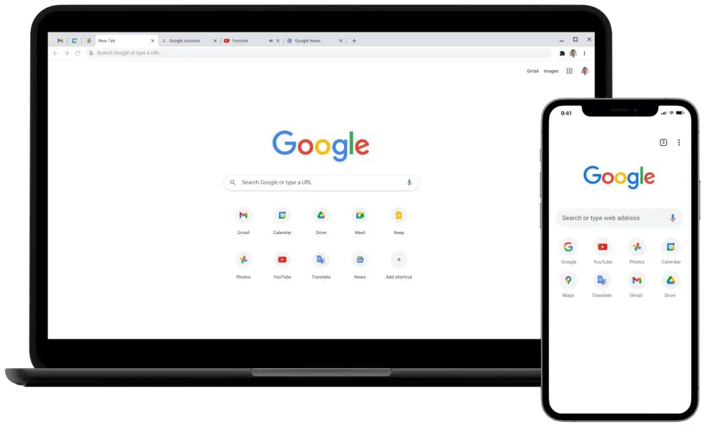
You’ll be hard-pressed to find anyone who hasn’t used Google’s search engine to find information at some time or another. But what’s the key to its success? Excellent UX design. By sticking to basic UX and UI design principles and laws, the design team at Google has created an interface that is seamless, intuitive, and user-centred.
The clean, minimalist design of the search engine’s homepage is one of the main reasons behind the page’s phenomenal success. The design highlights the search bar, the starting point of the user’s journey, and invites users to type in what they are looking for. The simplicity of the design prevents users from getting distracted or overwhelmed and enables them to instead focus on the page’s core functionality: search. The placement of the search bar is also highly intuitive as it prioritizes the primary action that the user wants to take.
Fast loading times are another contributing factor. Results are quick to load which reduces user waiting times and, in turn, user frustration. Close-to-instant access to what they are looking for enhances user experience and makes them return to the page again and again.
Finally, the effectiveness of Google’s powerful search algorithms that deliver results in milliseconds cannot be overlooked as a key component in its popularity. Without this, all other UX design elements would be irrelevant, leaving users dissatisfied.
Key features
- Powerful algorithms that ensure relevant, accurate results
- Seamless, intuitive, and clean interface design that reduces distractions and does not overwhelm
- Fast loading times for instant results, reducing user waiting times and frustration
ii. Apple’s product pages
Source: Apple
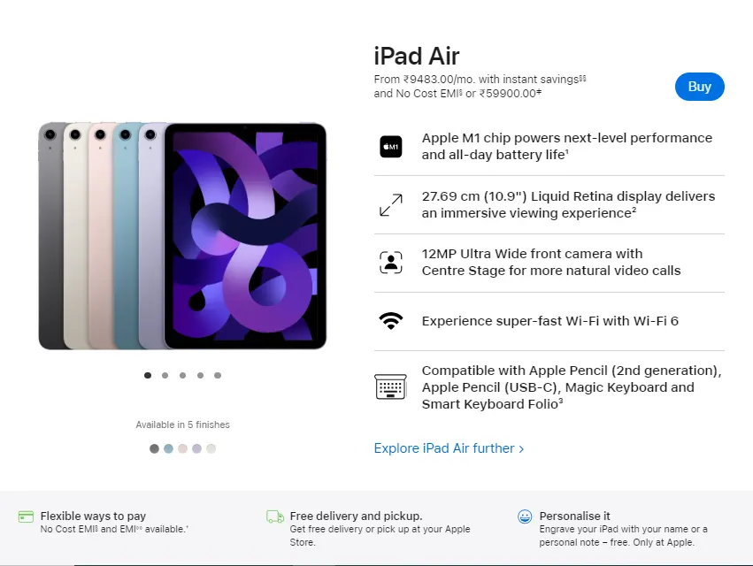
One of the most well-known companies in the world, Apple Inc. designs and produces numerous consumer electronics, computer software, and services. The company created the Macbook and the iPhone; two products famed for their intuitive and sleek user-centric designs. Like the products they create, Apple’s product pages are considered to be excellent examples of UX design. These pages boast a clean and minimalist aesthetic with lots of white space, clear typography, and high-resolution images that enable users to focus on the products and immerse themselves in the Apple brand.
Apple’s product pages make the most of interactive elements, such as 3D models, sliders, and animations. The inclusion of these components assists in creating an immersive experience for users and enables them to explore the products in a dynamic and realistic way, further enhancing their experience.
As creators of electronic devices such as smartphones, tablets, and laptops, the team at Apple knows a thing or two about responsive design. Apple’s product pages are designed to be responsive across a wide range of different devices to ensure the user experience remains both consistent and enjoyable.
Perhaps the most defining feature of the design of Apple’s product pages (and their product design in general) is their human-centred approach. This means putting the needs, wants, and limitations of the people who will most directly benefit from its solution above everything else. A core facet of Design Thinking, the human-centred design in Apple’s product pages focuses on simplicity and minimalism over complexity. This stems from a philosophy that technology and design should work together seamlessly to enhance each user’s individual experience.
Key features
- Clean, minimalist design with intuitive and dynamic elements based on natural gestures
- High-resolution images and videos that truly immerse the user
- Seamless integration of technology and design that prioritizes the human experience of the page interaction above all else
iii. Airbnb’s booking platform
Source: Airbnb
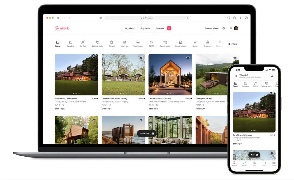
As a booking platform, few provide the seamless user experience of Airbnb. The process of booking a place to stay is straightforward and efficient, with users able to quickly search and filter results based on preferences such as price, location, type of accommodation, and more. The platform reduces friction by prioritizing simplicity and ease of use; users can find what they want with just a few clicks. In addition, results are always on point: users will only be shown accurate and relevant results, in turn increasing trust and ensuring users return to use the platform for future accommodation searches and holiday bookings.
The Airbnb site has adopted a human-centered approach to design which ensures that pages and content are well-organized and easy to navigate for both regular users and newcomers. An AI-powered chatbot improves the user experience further by assisting customers in real time with any questions or concerns they might have about the process, further improving accessibility.
The visual design of the website is functional and aesthetically appealing. Pages are clean, simple, and modern, mirroring the brand’s focus on innovation, creativity, and seamless experiences. To maintain consistency across different devices, Airbnb has worked hard on its responsive design, ensuring customers can access and navigate the website and app from a multitude of devices–a feature that is particularly useful for their core audience of holidaymakers.
High-quality photos of the accommodation and detailed reviews and recommendations from users help to foster a culture of trust on the platform and guide users to make informed choices about where they might stay. Additionally, the “Experience” section of the site, which caters to those looking to try out local activities, contributes to a sense of community, supports local businesses, and enables holidaymakers to make real connections while away from home. These additional touches set Airbnb apart from its competitors and give users the feeling that they can not only trust the booking platform but by using it become part of the global Airbnb community.
Key features
- Focused, filtered search results provide accurate and relevant options to users that suit their preferences and meet their needs
- Aesthetically pleasing visual design
- Culture of trust and community is fostered with in-depth reviews, high-quality visual content, images, and tailored experiences
iv. Spotify’s music streaming service
Source: Spotify
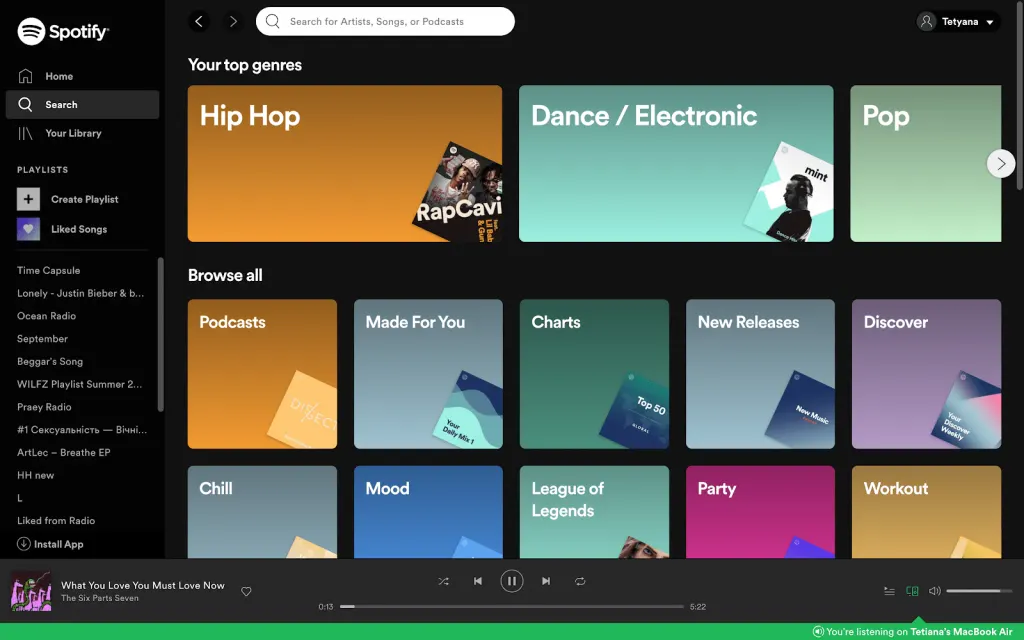
Spotify has become the go-to platform for music and audio fans the world over. Its success lies in the huge library of up-to-date content it has to offer, including playlists, albums, and podcasts, combined with its seamless delivery of personalized content.
A core component of Spotifiy’s UX and UI design strategy is its consistent and cohesive aesthetic which aligns with the company’s overall brand identity. The company uses an immediately recognizable green and black colour palette throughout its platform as well as in all advertising and marketing materials that have over time become synonymous with the brand and strike an instant visual chord with users. Album artwork and images of artists are seamlessly integrated throughout the platform’s existing aesthetic which further assists in the creation of an immersive and engaging visual environment.
Another crucial facet of Spotify’s UX design is the ease with which users can discover music effortlessly. By analyzing user listening habits and preferences (thanks to advanced machine learning algorithms) the software is able to offer users personalized recommendations through features like Discover Weekly and Daily Mix that truly match each individual’s music taste. What makes these features even more effective is how they are integrated into the user’s library, appearing in the interface alongside favourite albums and saved artists, thus making them easy to find and return to.
In addition to the strong visual design and tailored recommendations, clear labels, simple controls, and recognizable icons make the overall design intuitive and accessible to every kind of user. The structure of the platform, with information intuitively categorized and well-organized, enables users to effectively navigate and explore the platform, discovering more features as they go. Accessibility is also prioritized by the design team at Spotify. Font sizes are scalable, there is alt text for images, and users can select from various high-contrast options, ensuring those with visual impairments or other disabilities are fully catered to.
Key features
- Personalized music recommendations and playlists
- Intuitive interface design that enables easy navigation and discovery
v. Duolingo’s language learning platform
Source: Duolingo Blog
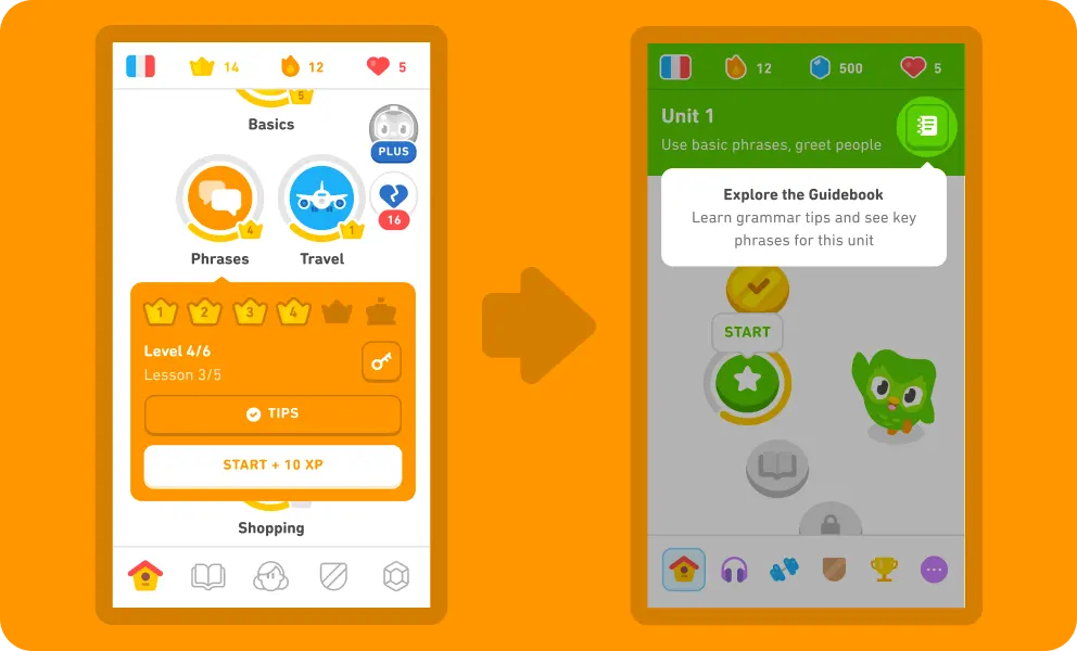
If you’ve ever tried to learn a new language using an app, you may very well have tried Duolingo. The platform uses gamification to help users stay motivated and overcome the common challenges associated with language learning. Daily goals and advanced educational psychology are cornerstones of the app, while distinctive branding and a range of eccentric characters encourage and guide users at every level of their learning.
The gamification element is what sets Duolingo apart from other language learning techniques and is what makes it so popular with users. Users receive awards, can compete with friends, and earn points for successfully completing each round of questions. This reward function motivates users to keep going and ensures the learning process stays fun.
Another standout feature of Duolingo is its intuitive interface. By keeping it simple, users can easily navigate between resources and learning materials without getting overwhelmed or distracted. The design is simple, clear, and straightforward, which reduces friction and user frustration while further contributing to a positive user experience.
Using entertaining visual indicators, Duolingo is able to give users a clear sense of the progress they’ve made in learning their chosen language. This design element is another example of highly effective UX design. Users can see how far they’ve come as well as the challenges ahead. When this design element is combined with instantaneous feedback on each exercise, another innovative Duolingo feature, users get a real feel for how much they’ve learned and what they’ve achieved. Feedback loops also enable users to quickly correct themselves, learn from their mistakes, and reinforce their learning.
Finally, community and social integration, multiple-device responsiveness, multi-sensory learning, and algorithms that adjust the difficulty of exercises based on a user’s current knowledge level together create a highly effective language learning tool and a second-to-none user experience.
Key features
- Gamification of language learning exercises keeps users motivated and engaged
- Visual progress indicators help users stay on track
- The ability to observe the progress of friends and community members encourages healthy competition
vi. Slack’s communication tool
Source: Slack
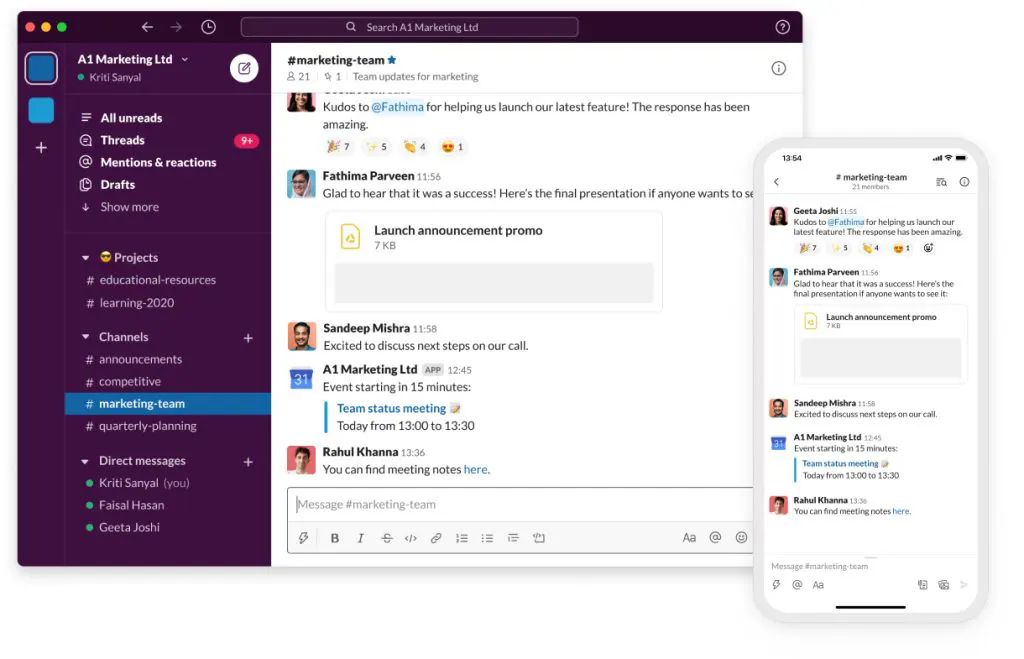
With its emphasis on simplicity, Slack is a communication tool that has been adopted by large corporations, startups, and freelancers all over the world. Perhaps you’ve used it when part of a company team or you’ve been invited to be a guest of a workplace channel when in a temporary position. By streamlining communication into different conversations and channels, the tool enables users to compartmentalize topics and discussions without getting overwhelmed or distracted.
Slack has an intuitive, straightforward, and visually appealing interface that highlights key features and prioritizes accessibility. This layout combined with a powerful search function means that users can find what they need quickly as well as seamlessly navigate between private chats, curated groups, and public channels.
Integration with third-party apps and services is another integral part of the Slack experience and makes it the go-to chat system for companies and teams around the globe. With Slack able to integrate with Google Drive, Zendesk, Asana, and GitHub, to name just a few, users get to enjoy additional functions and features that enhance the chat tool and boost team collaboration overall. These add-ons not only optimize functionality and save time, but they significantly reduce friction by eliminating the need for users to move back and forth between different applications to reach their goals.
Slack’s sophisticated notification management settings are another stand-out feature. With granular control over notifications, users can personalize exactly how and when they want to hear from colleagues or teams or about particular subjects. This helps prevent information overload and enables Slack users to stay focused on their work without missing out on the news that matters to them.
Key features
- Ability to integrate with a wide range of tools that further enhance the user experience
- An intuitive and seamless tool for managing multiple conversations, information streams, and team projects
vii. Medium’s content platform
Source: Medium
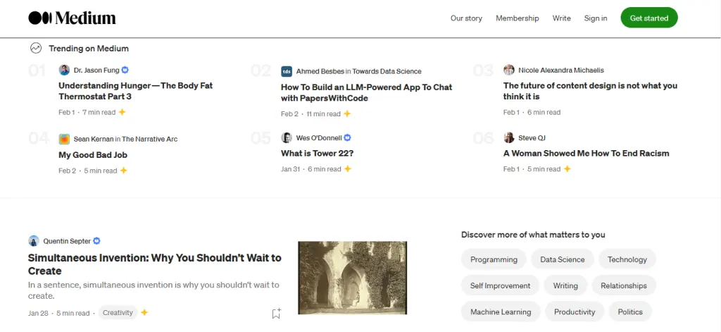
If you’ve ever used Medium to read or publish a blog post then you’ll know how intuitive and seamless the interface of this content platform is. The clean lines and minimalist design help users focus on the content they are seeking to create or consume without getting distracted by unnecessary clutter or too much information. The design of the platform has been created with an intuitive reading and writing experience in mind. This is achieved through the use of clear typography, layout, and formatting which together enable the easy consumption of content and help users fully engage with their chosen articles.
Like all of the examples we’ve featured here, Medium is designed to be accessible across multiple devices, from PCs and laptops to tablets and smartphones. The responsive design ensures users receive a consistent and user-centric experience irrespective of the device they are on.
Medium has become well known for its WYSIWYG (What You See Is What You Get) editor, a type of digital interface that lets users manipulate the content they are creating or working on in a way that its appearance while editing is the same (or very similar to) its appearance when the content is published. This user-friendly editor means users who are less tech-savvy can concentrate on their writing without becoming confused or frustrated by more complicated formatting options; drafting and publishing articles with the tool feels intuitive and natural.
Another element that enhances the user’s experience of Medium is how the platform supports the discovery of new content. Users can discover articles and stories that are relevant to their interests, thanks to recommendations from trained algorithms informed by their stated preferences, behaviour, and reading history. Further engagement with posts and authors is then actively encouraged through the enablement of commenting, sharing, and highlighting. By being able to perform these actions, users get a sense of community that increases their engagement and fosters further discussion.
Key features
- Focus on responsive design means users can access Medium from a range of different devices and have consistent experiences
- The minimalist layout combined with the WYSIWYG editor enables users to focus on their work without getting distracted by other types of content or the process of creating a post.
viii. Trello’s project management tool
Source: Trello
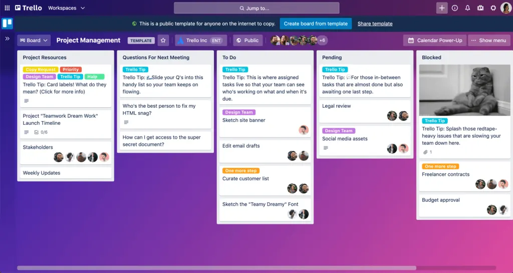
Trello is a project management tool that assists teams as they plan and manage projects, delegate tasks, and track progress. It boasts an uncluttered interface that’s made up of simply designed Kanban boards on which users create cards to represent different projects or activities. Users can tag other users in these cards, outline the details of the project or activity, link to or attach other resources, and move the card to different sections depending on the task’s status.
In addition to its uncluttered interface and user-friendly collaboration capabilities, Trello’s UX design stands out from its competitors because of its drag-and-drop functionality. This function makes it really easy for users to move cards around and reflect on a project’s progress or make changes to its status, increasing transparency across teams.
The tool’s significant and wide-ranging integration capabilities are also a game changer. The tool functions with a huge selection of additional project-related software such as Slack, Jiro, Miro, Dropbox, Gmail, Google Drive, Typeform, OneLogin, Telegram, and MailChimp to name just a few! The integration possibilities enhance the usability of the platform for users and ensure a seamless workflow between other apps and services.
Finally, the speed with which users can get started using Trello is another advantage of its effective UX design. The quick learning curve is down to the tool’s simple and intuitive design which means new users can understand the basics of the platform quickly and dive straight in with very little guidance or instruction. This is a huge benefit to team managers when onboarding new members of staff as they don’t have to waste time teaching them the ins and outs of the system before they can start creating and tracking their own projects and progress.
Key features
- The simple and intuitive interface ensures quick and easy onboarding, saving teams time when getting started with the tool
- Transparency is promoted across teams as everyone can track the status and progress of each project
- Extensive integration with other tools means that users can simplify their workflows considerably
3. Conclusion
We hope you’ve found some inspiration for your next project with our breakdown of the UX design of these industry-transforming digital products. As we have seen, these innovative digital platforms and products have led the way in the field of UX and user-centred design, demonstrating the huge impact that an excellent user experience can have on both user satisfaction and customer retention.
If you’d like to learn more about UX design and are considering launching a new career in the field, you might want to consider browsing the range of UX design courses on offer at AND Academy. Mentored by industry experts, the courses include project-based learning, portfolio creation, job application assistance, and a job guarantee, ensuring you’ll find a UX role you love when you’ve completed your studies.
4. Next Steps
We hope our compilation of the best UX design examples could ignite a spark of inspiration for your next project. For further queries and assistance, here are some additional resources you can consider:
- Watch this session by Shiva Viswanathan, Design Head of Ogilvy Pennywise, and Naman Singh, Product Experience Designer at RED.
- Talk to a course advisor to discuss how you can transform your career with one of our courses.
- Pursue our UX UI Design courses – all courses are taught through live, interactive classes by industry experts, and some even offer a Job Guarantee.
- Take advantage of the scholarship and funding options that come with our courses to overcome any financial hurdle on the path of your career transformation.
Note: All information and/or data from external sources is believed to be accurate as of the date of publication.


