
Are you curious about interaction design and its impact on the user experience? Check out these features and design elements that are great examples of this impactful practice.
Interaction design is a methodology that is highly valued by organizations looking to increase user engagement, improve accessibility, and enhance overall user satisfaction with a product or service.
In this article, we dive into examples of some of the most commonly used gestures and motions in interaction design and their advantages for users and businesses.
Contents:
- What is interaction design?
- 5 examples of mobile interaction design
- 5 examples of mobile interaction design
- Best practices of interaction design
- Conclusion
- Next Steps
Ready to learn more about interaction design? Then read on.
What is interaction design?
Interaction design is a subset of UX design which is concerned with creating engaging and intuitive interactions and experiences between humans and digital interfaces or systems. With a focus on how users interact with technology, an interaction designer creates digital products that enable seamless and enjoyable user experiences and also effectively meet the needs and preferences of target users.
Elements of the design that an interaction designer will pay special attention to include the user interface, the information architecture, usability, accessibility, and user psychology as these will have the most impact when it comes to creating user-friendly and efficient digital-human interactions.

5 examples of mobile interaction design
The role of the mobile interaction designer is to craft intuitive, seamless, and engaging experiences for users of mobile devices such as smartphones and tablets. Let’s take a look at some of the most commonly implemented gestures and motions in this type of interaction design.
Pull to refresh

An intuitive interaction design pattern, the “Pull to refresh” motion or gesture is when users are able to update the content on the page or app they are interacting with by performing a pulling down motion on the screen of their mobile with a finger. Although this gesture originated in mobile interaction design, the “Pull to refresh” motion has since also been adopted by website interaction designers. This downward swipe or dragging motion typically triggers an arrow or a loading spinner which indicates that the content being accessed is about to be refreshed and updated. When the finger (or cursor) is released, the website or app fetches the updated content from the server and displays it to the user, replacing the previous content.
The benefit of this action is that users can stay up to date with any changes to a website or app without having to navigate away from the page or perform any additional actions. It’s also a universal motion that can be applied to multiple websites and apps, irrespective of the service being offered or the content being displayed. This eases the cognitive load of the user who does not need to find out the method for refreshing content on different websites or apps. From the designer’s perspective, the “Pull to refresh” gesture helps them to conserve screen space as a refresh button is no longer needed. This supports minimalist design and contributes to a cleaner interface. For those with mobility issues or impairments, a “Pull to refresh” function eases their interaction with a mobile device as they don’t have to find or click precisely on a button to achieve the same effect.
Swipe gestures

A commonly used interaction design pattern on mobile devices and tablets (or touchscreen laptops), swipe gestures enable users to swiftly, fluidly, and intuitively navigate, interact, and manipulate content on their screens. The swipe gestures most frequently adopted by users include swiping left or right to move between pages, cards, images, or screens, and swiping up or down to browse an app or website’s content.
Swipe gestures have transformed mobile interfaces for users, vastly enhancing the user experience thanks to how it bring immediate and satisfying results with one simple motion of the finger that mimics a real-world gesture. In addition to viewing content, swipe gestures can be used to archive, delete, or rearrange items on a screen and enable smartphone users to complete tasks with ease and reach their goals effortlessly. Again, accessibility for those with limited hand/finger dexterity is improved as fine motor control is not needed to perform swipe gestures effectively.
Shake to undo
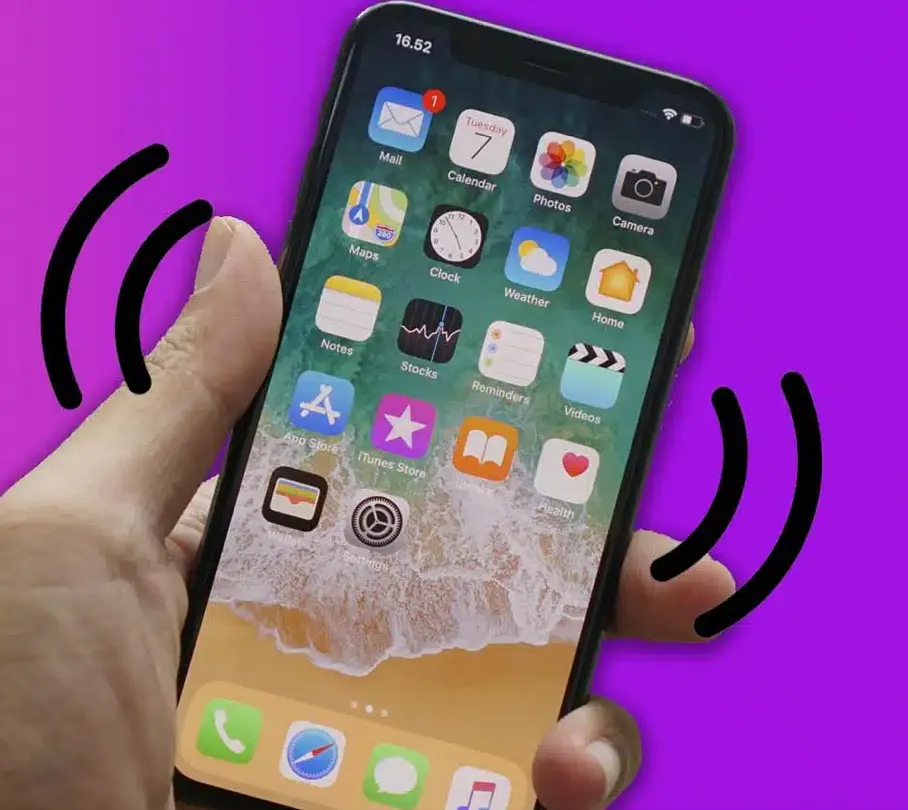
Frequently implemented by interaction designers to support users in conveniently and swiftly reversing a recent action, “Shake to undo”, is a popular and intuitive interaction design gesture for mobile devices. Actions that might be reversed include deleting text or items, moving or rearranging elements, and making selections. The movement makes undoing an unintended or false action accessible and easy, mitigating the need for further navigation or menus. When a user shakes their device, the system is able to interpret the motion and instigate the undo function, in doing so restoring the previous state and communicating feedback to the user. “Shake to undo” enhances usability and accessibility while providing a fun and natural-feeling method for error correction, boosting the overall user experience on hand-held devices.
This interaction design gesture offers numerous benefits to users. In addition to speedy error correction and immediate feedback, the action increases accessibility for those with limited hand or finger control, promotes an intuitive and natural interaction with a device, and can be used in a wide range of contexts.
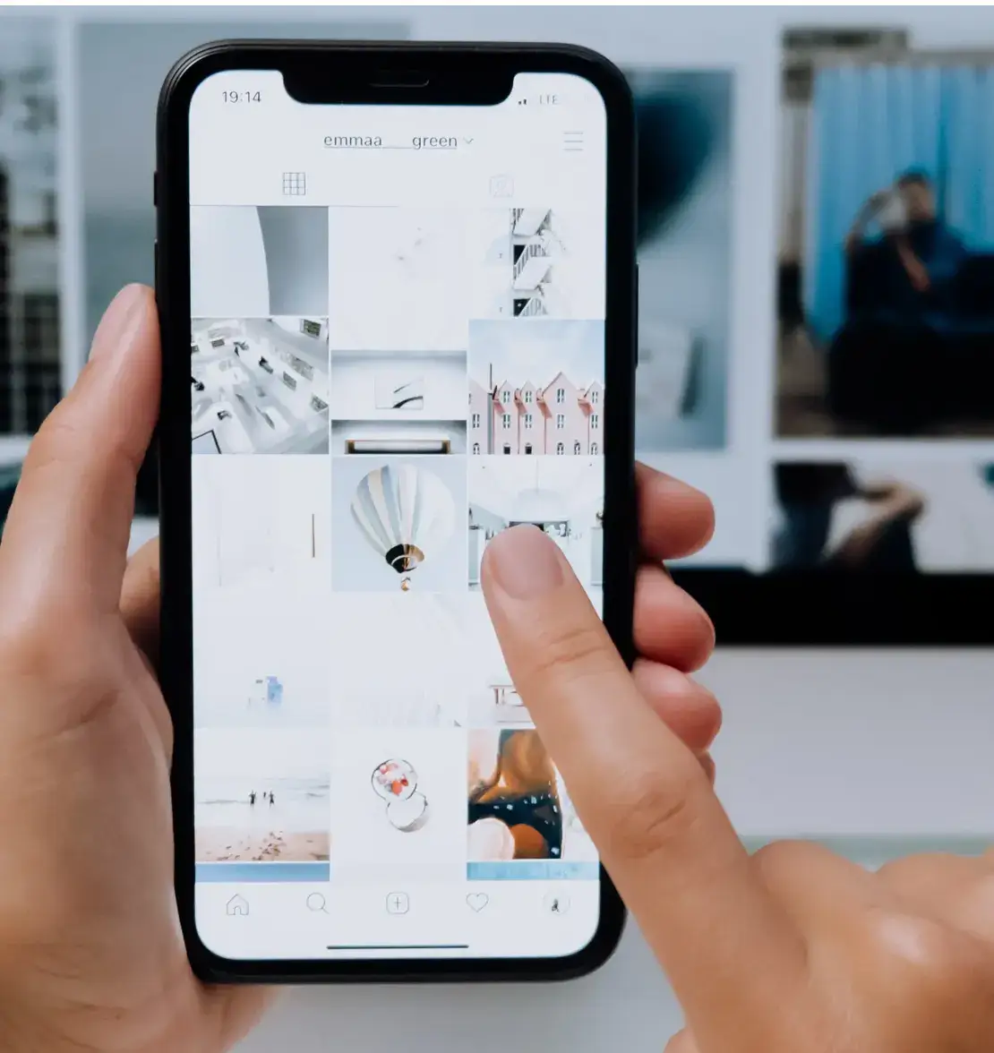
Double tap to ‘like’

An interaction design pattern frequently seen on social media platforms such as Instagram, “Double tap to like” enables users to indicate their appreciation of or fondness for the content displayed through the action of tapping twice on the screen. When a user sees a piece of content such as an image, video, comment, or piece of text that they approve of or are drawn to, they can double-tap on the screen of their mobile or tablet (or touchscreen laptop) to demonstrate their positive opinion of it. The gesture, which users tend to experience as intuitive and seamless, enables users to interact with content without having to search for or navigate to a button or menu.
Commonly, the platform which users are interacting with displays immediate visual feedback to the “Double tap to like” gesture in the form of a heart icon appearing on or close to the content, communicating to users that their “like” has been registered. Additionally, the “like count” for that piece of content will increase each time a different user performs this action. Not only is this interaction design gesture convenient, but it is also engaging, rewarding, and fun for users to perform, prompting them to continue interacting with content on the site or app.
Pinch to zoom

“Pinch to zoom” describes the interaction design pattern used by mobile phone and tablet users which enables them to zoom in or out on the screen’s displayed content through the use of a two-finger pinching gesture on a touchscreen.
To perform the gesture, users place two fingers on the screen of the device and move them closer together to make the content appear larger, and spread the fingers further apart to cause the content to appear smaller for a broader view of the content whether that be an image, map, text, or icon. This interaction design feature enables users to interact intuitively and easily with a wide range of content, increasing usability and providing a positive user experience.
3 examples of website and mobile interaction design
Website interaction designers seek to build intuitive and accessible experiences for users navigating such interfaces. Let’s dive into some of the most commonly used website interaction design features.
1. Infinite scrolling
Infinite scrolling describes an interaction design technique for both mobile and websites whereby, as the user scrolls down the page, new content is continuously loaded. This interaction design method mitigates the need for pagination and menus as, rather than the content being categorized and segmented, it is instead displayed in an uninterrupted stream of information, from text and images to videos and animations.
Infinite scrolling offers users a seamless and smooth experience with a web page or app and, and is commonly seen on social media feeds, news websites, image galleries, and product displays. Potential drawbacks of this kind of ongoing and seemingly endless “content discovery” include navigational challenges for users and performance issues. It can also be hard for users to find what they are looking for or find something that they have already scrolled past.
2. Drag and drop

“Drag and drop” describes a website interaction design feature that enables users to choose and move digital items from one part of an interface to another. Users select the item they want to move or manipulate by clicking on it using the mouse then dragging it to where they would like it to be by holding the cursor down and moving it along using the mousepad or a mouse. Although this feature is sometimes available on mobile devices (in which case, a user would select and drag the item using their finger instead of a mouse) it is more commonly found on desktop interfaces.
This interaction method is both intuitive and tactile, enhancing the user experience by providing a visually clear and interactive way for users to manage and interact with the content on their desktop. It reduces friction by mitigating the need for more traditional input methods such as clicking on buttons or filling out forms which can be time-consuming and fiddly. File managers, email providers, and webpage builders often utilize the “Drag and drop” function as it provides significantly great control and flexibility to users in how they interact with the digital interface.
3. Long press for context menu
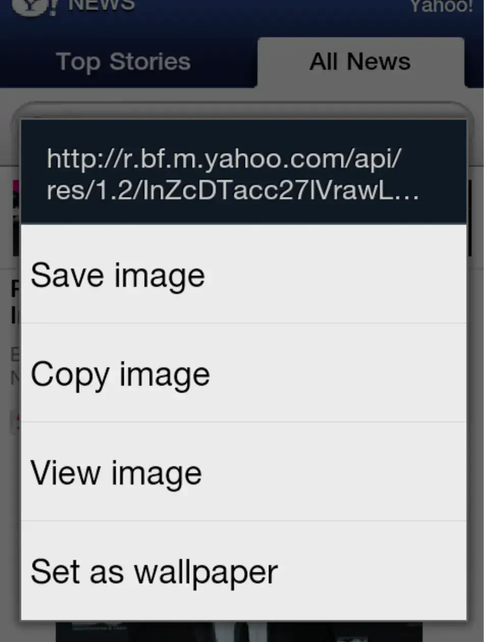
By selecting a design element with the mouse and holding the button down, the “Long press for context menu” interaction design pattern provides users with more options or actions for that design element without having to find options elsewhere or navigate away from the page altogether. The “Long press for context menu” is typically offered as an option on a link, image, or button, with a menu appearing after the user has performed a long press gesture on it. This technique is typically implemented by interaction designers on both mobile and web interfaces, in doing so creating a handy and seamless way for users to find out about and use secondary functions like opening a link in a new tab, saving an image, or sharing the content. From the designer’s perspective, this design pattern saves space on the interface, ensuring the design remains uncluttered. For the user, this technique reduces the cognitive load, as they are not overwhelmed with all primary and secondary options when they first glance at the screen. Other benefits include efficiency, intuitiveness, and enhanced usability, all of which contribute to a positive overall user experience on both desktop and handheld devices.
Best practices of interaction design
Let’s go over some of the best practices to keep in mind when implementing interaction design features such as the ones we’ve outlined in this article.
1. Be consistent
As with many elements of UX design and interaction design, consistency is key to providing a positive user experience. When implementing interaction design gestures such as swipe or “Pinch to zoom”, consistency ensures a seamless and intuitive experience across multiple features, screens, and devices. When a designer ensures uniformity in terms of both how gestures function and how visual feedback is communicated to the user, users can more effectively predict how interfaces will respond to their actions which reduces confusion and enhances usability.
2 Simplify where possible
Simplifying interaction design gestures helps users to easily grasp and utilize them, mitigating the need for guidance or instruction which can clutter the interface and overwhelm users. Interaction designers therefore seek to streamline gestures, designing interactions so that they exist only in their most essential form. This reduces complexity for users and boosts satisfaction.
3. Provide on-going feedback
Feedback plays a huge role in interaction design. By building in clear visual cues that confirm the success of their actions, it keeps users engaged and builds their trust in an interface. As with everything else we’ve talked about in this article, consistency here is key; this ensures users understand the results of their actions, eases uncertainty, and boosts their confidence in the interface and the brand behind it.
Conclusion
In this article, we’ve run through some of the most commonly-used interaction design gestures such as “Pull to refresh”, “Infinite scrolling”, and “Drag and drop”, which, when implemented correctly, can transform the user experience thanks to their intuitive, seamless, and delightful design.
If you’d like to learn more about interaction design, head back to the AND Academy blog for more articles like this one containing practical advice on interaction design theory, application, and careers. We also highly recommend checking out this Mobile Application Project by AND learner Amartya Dev to understand how real-time insights can be implemented to create novel solutions.
Next Steps
We hope these 8 real-world interaction design examples could inspire your inner designer. For further insights into the field and how to start your career, here are some resources you can refer to:
- Watch this session by Shiva Viswanathan, Design Head of Ogilvy Pennywise, and Naman Singh, Product Experience Designer at RED.
- Talk to an AND Academy course advisor to discuss how you can transform your career with one of our courses.
- Learn more about our UI UX design courses. All courses are taught through live, interactive classes with industry experts, and some offer a Job Guarantee.
- Take advantage of our scholarship and funding options to overcome any financial hurdle on the path of your career transformation.
Note: All information and/or data from external sources is believed to be accurate as of the date of publication.


