Are you curious about form UI design? In our complete guide, uncover best practices, common mistakes, and real-world examples from this important design specialization.
From registering a profile on a website to completing a bank transaction, with so many digital experiences requiring the input of user information, form design can make or break the user experience and determine the success or failure of an online interaction.
This is where form UI design comes in. Form UI design is the creation of user-optimized digital forms that enable users to seamlessly and swiftly provide their data and reach their goals. But what exactly does it involve? In this complete guide, we’ll be finding out.
We’ll be walking you through what form UI design is, its importance, and the range of forms commonly used. We’ll also be providing you with some best practices and letting you know what to avoid to ensure your users stay engaged and complete their tasks. Finally, we’ll be showcasing some top examples from leading organizations who use their forms to enhance the user experience so you can learn from the best in the field.
Contents:
- What is form UI design?
- Why is form UI design important?
- What is the role of forms in UI design?
- Types of forms
- Best practices for form UI design
- Common mistakes in form UI design
- Examples of well-designed forms
- Conclusion
Let’s dive into form UI design!
What is form UI design?
Form UI design is all about creating functional, user-friendly forms
that enable users to input data seamlessly and intuitively within digital interfaces. Best practices within UI design involve focusing on clarity, simplicity, and accessibility, with designers in this specialization categorizing and organizing form fields, labels, and buttons that support users in completing their intended tasks. From making online payments to completing questionnaires, with so many of our online interactions involving forms, it is important that users can navigate this UI element successfully to effortlessly achieve their goals.
Why is form UI design important?
As a design element and tool, forms are used frequently to gather user data and help users perform tasks. Here’s a short list of some of the most common places you might be expected to fill in an online form:
- Registration pages
- Login forms
- Contact forms
- Checkout pages
- Feedback forms
- Job application forms
- Event registration forms
- Online booking forms
- Newsletter sign-up forms
With forms used in so many of our daily online interactions, their design is of the utmost importance. The design of a form impacts the user experience with a product or service and contributes to the overall effectiveness of the UI UX design.
Cleverly designed forms reduce user frustration, minimize errors, boost conversion rates, improve data accuracy, and bolster customer satisfaction. However, when a business does not spend time designing UI-friendly forms, users can quickly become confused. This might lead to incomplete submissions and unreliable or unusable data. It also leads to users abandoning the process they have started and going elsewhere.
For both interface efficacy and user experience reasons, companies are increasingly looking at form UI design that focuses on usability, clarity, accessibility, and intuitiveness by applying UI design thinking techniques, companies can better understand user needs and effectively customize forms to meet those needs. When these best practices are prioritized, companies can be sure of a more positive user experience for their customers that enhances engagement with the brand overall and increases trust.
From a business perspective, a focus on form UI design ensures a company is also able to gather more accurate data that enables it to perform its services to the highest standard.
What are the roles of UX and UI designers in the creation of forms?
In UX and UI design, forms are the principal method for users to interact directly with an interface, be that a website, app, or any other digital environment.
The UI designer seeks to create forms that are visually appealing and accessible as well as intuitive and easy to use. They do this by bringing together clear labeling, prominently displayed buttons, and a well-organized structure within the interface. Together, these well-designed elements and features assist in the creation of a smooth and attractive interface.
The UX designer is focused on the user’s experience with the form and how that contributes to their experience with the product as a whole. By focusing specifically on the simplicity and efficiency of each of the form’s functions, the UX designer can better ensure a trouble-free and effortless experience that leads to a successful result for the user and the business.

Types of forms
As users, we’re often asked for essential information from interfaces when, for example, registering on a website or providing our contact details. Let’s take a look at the most common types of forms that a form UI designer creates for digital interfaces.
1. Registration forms
You will no doubt be familiar with registration forms. Such forms are used by organizations to collate data from users who wish to create an account or who want to engage with the company’s specific services. Depending on how much information the company is seeking to collect from new users, these forms can be fairly short, sometimes just asking for a name and essential contact details.
However, it’s not unusual for companies to use registration forms as an opportunity to ask for additional, though non-mandatory, information from users related to their demographic, user preferences, or need for additional support.
The most common input fields you’re likely to see include Full Name, Email Address, Username, Password, and Confirm Password. Optional input fields might include Age, Gender, Location, Phone Number, Referral Source, Occupation, Interests/Preferences, Profile Picture Upload, and Terms and Conditions Agreement.
2. Contact forms
Contact forms are used by businesses and organizations who wish to enable customers to get in touch through queries, requests, or feedback. These might be related to the late delivery of a product, an unusual or special request related to a service, a positive customer experience, or a question on how to contact a specific individual within the company.
Most organizations will have a standard form for enabling customers and potential customers to contact them, with fields including Full Name, Email Address, and Message. However, depending on the nature of the business, other fields might be added to a contact form too. These additional fields help particularly large organizations to ensure the right person (in the right department) sees and deals with the message. Examples of additional input fields include Subject, Phone Number, Preferred Method of Contact, Reason for Inquiry (drop-down menu), Location, and Attachment Upload.
3. Payment forms
Payment forms are commonly used on e-commerce sites such as Amazon to collect customer payment details securely. These details might be a credit card number or a bank account number that a user inputs to enable the transaction to go through.
In addition to e-commerce sites, there are a range of other online services that use payment forms. These include subscription services, travel booking sites, ticketing platforms, donation platforms, membership sites, and even educational platforms.
For a transaction to be seen as valid and secure, payment forms usually need a customer’s billing address. Alternatively, some payment forms trigger an SMS to be sent to a user’s phone with a code that the user must then input into the form. The system then knows that the user of the card is the same as the user of the phone that is registered with the card and is therefore not being used fraudulently.
4. Survey forms
Organizations use survey forms to gauge the success of their products or services with users. These forms usually contain an array of multiple choice, closed, open, and scale questions on a specific topic that enable the company to gather valuable quantitative and qualitative data. This data is then used to improve products or services and help the company gain a deeper understanding of its target users and how it might better serve them.
Questions on a survey form might include:
- How did you hear about this product? (Drop-down menu of options)
- Ease of use (scale rating)
- Would you recommend this product? (Yes/No)
- How would you suggest we improve this product? (Open text field)

Best practices for form UI design
When starting out with form designs, it’s important to bear in mind the following best practices to ensure your users can access, understand, and use your forms correctly.
1. Prioritize clear labeling and instructions
Clarity is a key component of UI design and form UI design is no different. When designing the layout of your form, it’s important that each form field is clearly labeled to ensure that users fully understand the input that is needed from them. Avoid jargon, vague language, or overly technical terminology and instead use concise sentences to guide and instruct users on how to fill out the form.
2. Incorporate a logical flow
A designer should always be trying to see the world through the eyes of the target user. This is particularly true of form UI design. When sketching the form, the designer should aim to create a layout that has a natural and logical sequence accurately reflecting other forms the user might be familiar with.
They should also consider carefully how the user might typically think about the information being asked of them. For example, a user will almost always expect to give their full name first. A form that requests the user’s phone number or gender before asking for their full name might increase the user’s cognitive load and slow down the process.
3. Minimize fields for simplicity
While forms are a great way for organizations to collect valuable data, customers do not typically enjoy answering lots of questions. For this reason, you’ll want to keep your form as short as you can, only asking users for the information that is absolutely essential in order for them to complete the task.
You’ll find that simple, short forms have much higher completion rates than longer forms as users are less likely to get bored or give up halfway through. Remember: every new input field you add to your form increases friction, so be sparing regarding the information you ask for!
4. Use responsive design for different devices
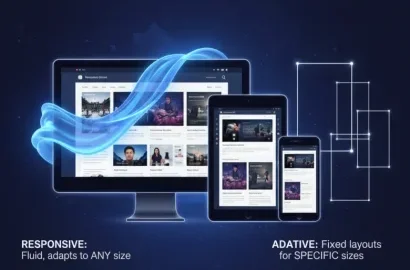
Responsive design is when an interface is designed to be compatible with a range of different devices such as a smartphone, tablet, laptop, or desktop computer, and different screen sizes. Forms should always be fully responsive to enable users to access them from their preferred devices. To do this, use flexible grids, scalable inputs, and touch-friendly design elements.
When creating the design for your form, be sure to test it on all the devices it might be accessed on to ensure that the form can be filled in effortlessly irrespective of the technology used to access it.

5. Utilize autofill
To speed up the form-filling process and save users’ time, it’s important to make use of autofill when designing your forms. Autofill populates the fields of commonly asked questions with information that has been saved from previous forms, such as email addresses or card details. In addition to cutting the time it takes to fill out the form in half, it makes the overall experience much more convenient. This is because with autofill users don’t have to dig out lengthy numbers or search for long-forgotten pieces of information. Autofill also reduces the likelihood of mistakes such as wrong information and typos.
6. Try out multi-step forms
If the form you are creating requires significant input from users, it can be a good idea to break it up into multiple steps or sections covering different topics. This helps to prevent users from getting overwhelmed and keeps them more engaged while supporting the sense of progress. The overall length of the form is also typically perceived by users to be shorter when it is broken down into multiple steps.
7. Highlight optional and mandatory fields
It’s standard practice on forms to let users know which fields are optional and which are mandatory. This enables users to make informed decisions about which inputs to give and reduces user frustration from submitting incomplete forms. Visual cues are a great way to draw attention to mandatory and optional input fields. Asterisks are commonly used for mandatory fields while gray text is a popular choice when indicating that a field is optional.
8. Use placeholders to demonstrate formatting
Finally, don’t forget to make full use of placeholders to indicate to users how to format the text they are inputting. A common example of this is “MM/DD/YYYY” for dates or “[email protected]” for an email address. Hints like these enable users to get their formatting right the first time and ensure they can submit the form successfully.
Common mistakes in form UI design
Let’s take a look at three common mistakes you should always try to avoid with your form UI design.
1. Overloading users with too many fields
Users can feel quickly overwhelmed when faced with too many input fields on a form. For this reason, keep your form as brief and concise as possible, asking only for the information you absolutely need for the user to reach their goal such as registering or logging in. Consider keeping hidden any input fields that do not apply to particular users as this will prevent them from getting the impression that there is more for them to fill out than there actually is.
2. Poor error handling
While users don’t need extensive detail on why their form has not been submitted successfully, it’s important that they do know the reason it has happened so that they can go back and correct it. For this reason, and to stop users abandoning the form before completion, communicate clearly what mistake has been made or what still needs to be done.
3. Non-intuitive layout
Users want to interact with interfaces that feel natural, familiar, and, crucially, intuitive to them. A non-intuitive form layout causes confusion as users struggle to understand what information is needed from them. This slows down the process of completing the form, increases abandon rates, and generates a negative user experience.
By grouping fields by topic and structuring them in a logical sequence, users recognise the progression between sections and understand what inputs are required. They also have a clearer sense of how long the process will take which manages their expectations and reduces frustration.
Examples of well-designed forms
Now that we’ve covered the dos and don’ts of good form UI design, let’s look at some examples from leading brands.
Stripe’s payment form

Why is this a good example of form UI design?
- Stripe’s credit card form automatically recognizes which device the user is accessing the payment service with (GPay or Apple Pay) which removes friction for the user and enables them to pay more quickly than if they had to input their preferred method manually.
- Placeholders to guide and instruct the user are clearly visible but faded to indicate that they will disappear when the user enters their own information in the input field.
- When details are entered, the logo of the processor appears, removing a step for the user as they no longer need to select it manually.
- Finally, the button to confirm the transaction not only tells the user that they are committing to paying but also clearly shows the final price which ensures users do not incur any surprise costs.
Slack’s contact form
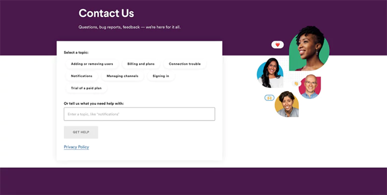
Why is this a good example of form UI design?
- The form offers users a range of possible topics to choose from, making it easier for users to identify and define their particular issue.
- When a topic is selected, users are guided to relevant content such as blog articles to help them with their query, in many cases eliminating the need to contact a customer service representative.
- Whether they select an issue from those listed or provide their own, users still have the option of contacting the company either via email or using the live chat function. This gives users the option to get instant feedback or to wait for a human response.
- Users have the option of selecting and uploading a file to provide context for their query.
Metropolis Moving’s moving quote form
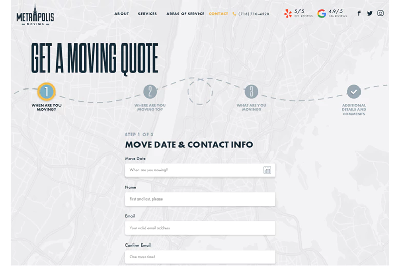
Why is this a good example of form UI design?
- The design of the form is both playful and practical. The map background indicates the service is New York-based, communicating to users the physical limitations of the moving company.
- The step indicators let users know the exact process they need to follow in order to get a quote, how long that process is, and where they are on that journey.
- The placeholder text is conversational and friendly while still being concise and informative.
- By breaking down the form into multiple steps, users are not overwhelmed and the cognitive load is reduced. The process feels manageable and the user feels supported at each stage.
Conclusion
There you have it, a complete guide to form UI design. In this guide, we’ve discussed the importance of this design field, its role within UI design as a whole, and the different types of surveys you are most likely to use in your interface designs. We’ve also outlined the best practices that form UI designers follow to provide users with intuitive and successful form interactions and run you through what you should avoid to reduce form abandonment and low completion rates. Finally, our industry-leading examples offer inspiration for your designs and demonstrate how you can support your users in reaching their goals.
Next Steps
If you’re considering a career in the exciting, creative, and rewarding field of UI Design, head back to the AND Academy blog for more insightful articles or check out AND Academy’s range of design courses that offer mentorship and career support. You can also refer to this UI UX Project by AND Leaner, Yash Ramdas, to learn more about how to apply UI design principles in real-life projects.
In case you think you need further assistance, here are some of our resources you can consider:
- Watch this session by Shiva Viswanathan, Design Head of Ogilvy Pennywise, and Naman Singh, Product Experience Designer at RED.
- Talk to a course advisor to discuss how you can transform your career with one of our courses.
- Pursue our UI UX Design courses – all courses are taught through live, interactive classes by industry experts, and some even offer a Job Guarantee.
- Take advantage of our scholarship and funding options to overcome any financial hurdle on the path of your career transformation.
Note: All information and/or data from external sources is believed to be accurate as of the date of publication.


