How does our psyche perceive and organize visual information? The answer lies in Gestalt Principles. Read on to understand.
In the most fundamental sense, design is about understanding visual perception- the way users interpret what they see, how they group elements, find patterns, and assign meaning. Gestalt psychology, as formalized by Kurt Koffka in Principles of Gestalt Psychology, Max Wertheimer in his Productive Thinking, and Wolfgang Köhler’s theory of ‘insight’, teaches us that perception is a process of organization, through which the mind seeks patterns, wholes, and meaningful structures.
For UI/UX designers, this means that every layout, icon, or component is more than just a visual element and is part of a larger system. If that system doesn’t align with how the human mind naturally organizes information, the design fails, regardless of how visually polished it may appear. In this article, we try to understand how that system of visual organization works and how, as designers, you can use it to your advantage.
Here is a list of topics we have covered!
- What are the Gestalt Principles?
- Why Gestalt Principles Matter in UI/UX Design
- How to Apply Gestalt Principles to Your Design Workflow
- Final Thoughts
- FAQs
What are the Gestalt Principles?
Gestalt principles explain how our psyche perceives and organizes visual information. It discusses matters like ‘why things look the way they look?’, ‘what is a shape?’, ‘how do we perceive them?’ and builds a psychological science of Gestalt.
Let us first understand what these principles are and then look at how they can be used in UI/UX Design.
Figure and Ground
The principles of figure and ground are principles that explain how we organize a visual scene in our perception. A figure is the dominant, attention-grabbing part of the visual field, an object that stands out distinctly. A ground is less salient, the background part of the visual field that surrounds the figure. The figure is characterized as having a defined shape or boundary, appears solid, seems to lie in front of the ground, and is easier to remember and describe. The ground, on the other hand, lacks a clear form or boundaries and appears uniform and continuous, seems to extend behind the figure, and is less memorable.
Our visual system automatically separates or segregates what we see into figures and ground based on cues like contrast, closure, and continuity (discussed further). Some images (like Rubin’s vase) allow figure-ground reversal, where what was ground can become a figure, e.g., switching between seeing a vase or two faces.
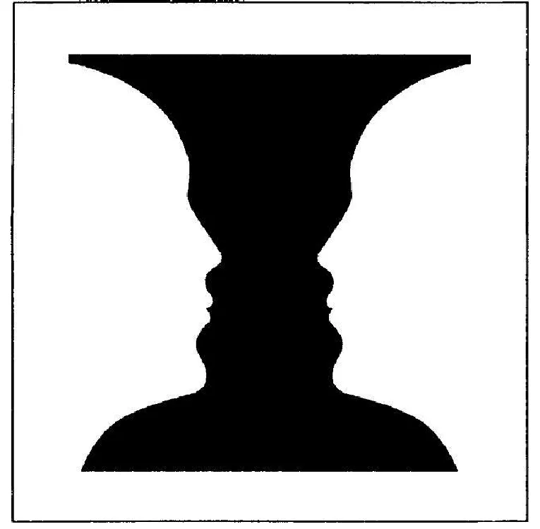
The figure’s appearance, i.e. size and color, depends on the ground, as in brightness or color constancy, which is a perceptual phenomenon where the apparent color of an object remains relatively stable despite changing lighting conditions. For example, a red apple looks red under sunlight, indoor lighting, or shade, even though the actual wavelengths of light reflected from it change.
A concept called contour also helps with this segregation. The contour or boundary between the figure and the ground is not neutral. Instead, the contour belongs to the figure alone. This ‘ownership of the contour’ is one of the key determinants in figure-ground articulation. It explains why we see one region as a distinct shape and another as mere background; the side that ‘owns’ the boundary becomes the perceptual figure.
The relationship between the figure and the ground is not arbitrary or reversible at will; they are, in fact, interdependent. The nature of the ground, whether less structured or more, depends on and is defined by the figure based on certain parameters or dynamics of figure-ground articulation, such as:
1. Orientation
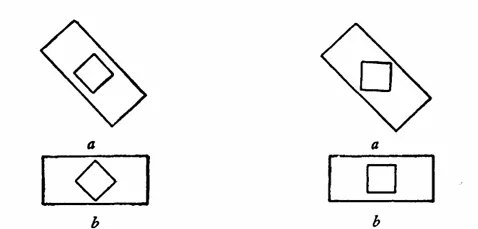
The direction or angle of a shape plays a role in whether we see it as the figure or the background. Shapes aligned either vertically (up and down) or horizontally (side to side) are more likely to be seen as the figure. In contrast, shapes that are tilted at an angle (‘oblique’) are less likely to be concrete and take longer to psychologically organize themselves; the ‘a’ figures are more ambiguous in the image presented below. In other words, our eyes and brains seem to prefer upright or level objects because these orientations are more common in our daily lives.
2. Relative Size
The size of a shape compared to its surroundings can also influence how we perceive it. According to the theory, smaller areas are more likely to be seen as figures, while larger areas are perceived as background. Smaller regions have higher energy density (energy refers to the brain activity used to perceive), which makes the shape more noticeable. This makes our minds treat it as the figure, while the larger, less concentrated area fades into the background. For instance, a bird perched in a tree or a single flower in a large field.
3. Enclosedness
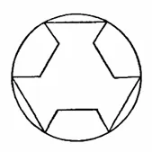
Another important clue our brains use to separate the figure from the ground is enclosedness. When one shape is surrounded by another, the enclosed shape is seen as the figure. A circle drawn inside a larger rectangle will appear as the figure, even if both shapes are plain. Our perception treats bounded, self-contained regions as meaningful objects.
4. Internal Articulation
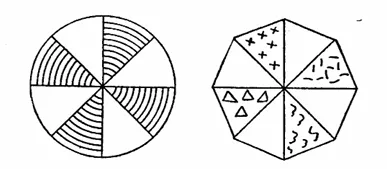
How much detail or structure a shape has also determines whether we see it as the figure or the background. A shape with clear patterns, lines, colors, or texture is more likely to become a figure than one that is plain or empty. This is because an intricate shape provides more information for the brain to process. For example, a patterned shape next to a blank one would stand out and be seen as the figure. This idea is called internal articulation.
5. Symmetry and Simplicity
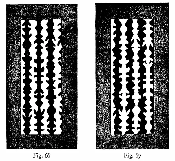
All else being equal, the perceptual system organizes visual input into the simplest, most stable configurations possible, a principle tied to the Law of Prägnanz (explanation in the next section). In an experiment by Edgar Rubin, where observers are shown patterns containing symmetrical and asymmetrical stripes of alternating colors, like shown in the figure above, observers overwhelmingly report seeing the symmetrical stripes as figures, regardless of whether they are black or white. This is because symmetrical, simple structures produce stable organization in perception.
The Shape
In everyday life, we see objects as having shapes: a square, a triangle, a curved surface, and so on. But how do we actually perceive those shapes? Are they simply reflections of the objects in front of us, or does something more complex happen in our minds to create the sense of ‘shape’? This is “the problem of shape”, an important issue in Gestalt psychology.
1. Shape As Something Unique
When we see a black ink blot on a white piece of paper, we notice that it’s there, but we also perceive what shape it has. We might say, “It looks like a bird”, or “It’s a cloud”. That experience of what something looks like is the shape, and is more than noticing that something is different from the background. This makes the problem of shape different from the simpler problem of separating a figure from its background, also known as segregation.
2. Ambiguity of Shape Perception
A single figure can be experienced as a square with curved sides, a three-dimensional sail, or a kite seen from an angle. This means that shape is not tied to a fixed pattern formed on our retina; instead, it is tied to other factors or forces. While it is the same physical image each time, we experience it in very different ways.
3. Forces of Shape Perception
Gestalt theory suggests the existence of forces or field forces within the perceptual system that shape how a given stimulus is experienced. These forces not only record what is on the retina like a camera takes pictures but also organize sensory input depending on the whole field. A drop of oil in water becomes a sphere because of the physical forces acting on it. Shape in vision works the same way.
4. Effect of the Ground or Framework
The way we see shape is influenced by the larger environment or background it appears in. For example, if a square is presented tilted at 45 degrees on a white background, we might see it as a diamond. But if the background has a grid that is tilted the same way, we’ll see the same shape as a normal square. So, what we perceive as ‘the shape’ depends on the figure itself, and also on the ‘framework’ around it.
5. Prägnanz
When we are in difficult perceptual conditions, like when an image is faint, flashed very quickly, or hard to concentrate on, we tend to see simpler shapes. In the example image below, (a) the small grey triangle that is positioned on top of a large black triangle appears to be part of the larger black triangle, but in (b) the same grey triangle appears more to be part of the white background and not the black cross, which means that it is perceived differently in each case. In Figure (a), the triangle belongs to the black triangle, and in Figure (b), the triangle does not belong to the black cross, which means that the shape is subject to the organizational forces within the figure in (a), and to the white field in (b).

But why does the triangle appear to ‘belong’ to the black figure in one case and the white in another? Because in Figure (a), the whole black triangle is a good, balanced shape, a strong Gestalt. It naturally includes the small triangle. In Figure b, the black cross is already a stable shape without the little triangle; adding the small triangle disturbs that balance, so it is perceived as separate. This tendency is a fundamental Gestalt principle called Prägnanz. It says that our minds tend to favor the most orderly, simple, and ‘good’ forms possible in any situation. In other words, we see the simplest, most stable shape we can, especially when things are uncertain.
In sum, perception of shape, or perception in general, is not a passive process. It is actively structured by field forces that group elements into wholes. This is a central insight of Gestalt psychology.
Grouping and Organization
In Max Wertheimer’s 1923 Laws of Organization in Perceptual Forms, grouping refers to the mind’s organization of sensory elements into unified wholes based on the objective arrangement of the stimuli themselves. Rather than perceiving isolated dots or lines, we naturally experience them in meaningful clusters, depending on factors like how close they are to each other (proximity), how similar they are (similarity), what sequence they follow (Einstellung), and whether they move together (common fate). Wertheimer shows that grouping is not arbitrary or solely based on subjective interpretation but that it follows systematic laws that are inherent to perception, which dictate how we experience order in what we see.
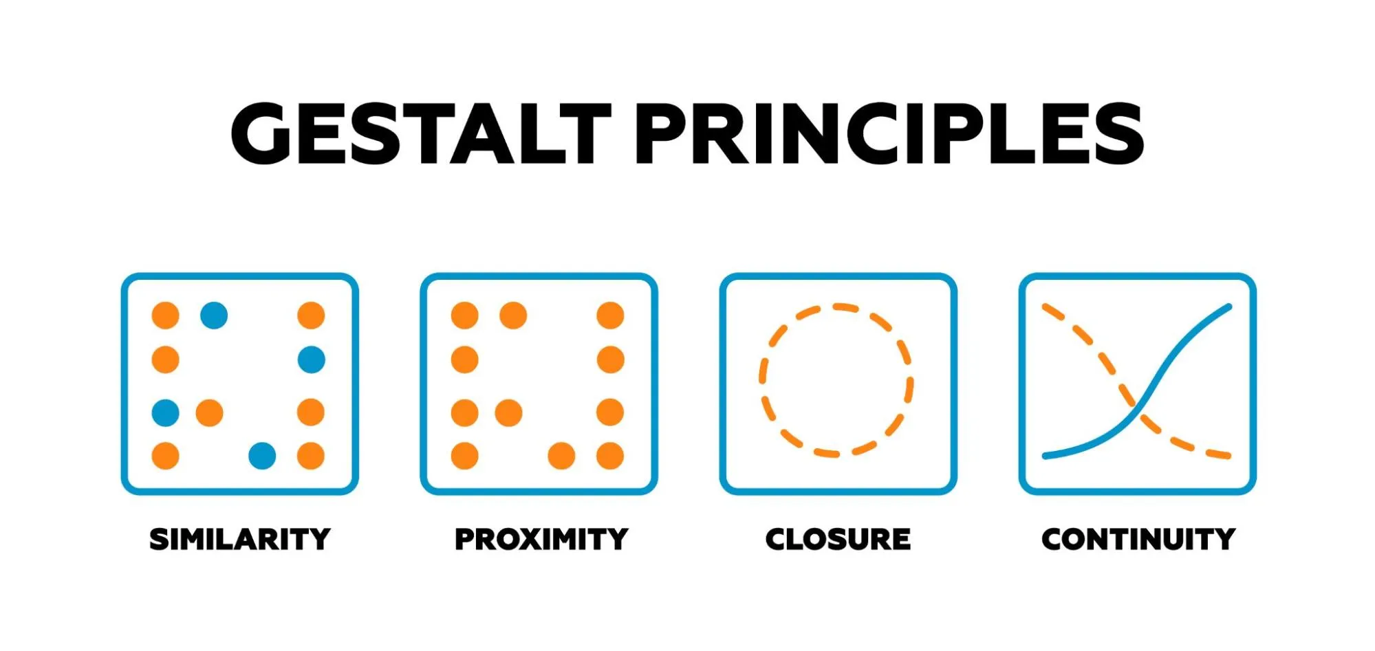
1. Proximity

When elements such as dots are arranged with varying distances, we tend to group together those that are closer to each other, forming ‘natural’ units within the visual field. Even when the number of elements increases, proximity continues to guide grouping, whereas ‘unnatural’ arrangements (such as grouping elements that are far apart while ignoring closer neighbors) become difficult to sustain in perception. Let’s say that the six dots in the example image were named a, b, c, d, e, and f. Thus, it is natural for them to be grouped as ab-cd-ef as opposed to a-bc-de-f.
2. Similarity

When elements share similar attributes, such as color, shape, or even sound quality, they are grouped together, even when proximity is held constant. In his experiments, Wertheimer shows that when dots of different colors are interspersed at equal distances, the mind naturally organizes them into groups based on their similarity.
3. Common Fate (Uniform Density)
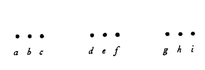
When a set of elements within a visual field moves together in the same direction or undergoes the same change, they are perceived as a group, even if their proximity or similarity is not allowed. Consider the image, when a slight shift upward is given to (d, e, f), these moving dots are grouped together because the shift aligns with their natural grouping. However, if the movement is such, a shift upward to, say, (c, d, e) that cuts across established groupings, the shift feels abrupt and disturbing, creating a conflict in the organization, further creating two distinct rows of horizontally arranged dots.
4.Objective Set (Einstellung)
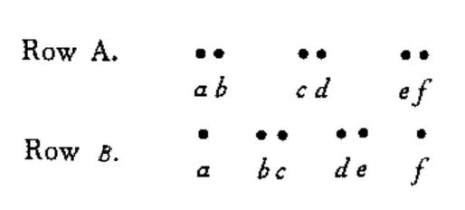
What we have seen just before influences how we see what comes next, even if the physical stimulus remains the same. For example, if we look at a sequence of dot patterns(currently A) shifting gradually from one grouping to another, vis-à-vis diminishing distance between b/c and d/e, our initial way of seeing the pattern tends to stick, even as the dots (b/c and d/e move closer) change, until it eventually changes to a new way of grouping ( B). The pattern in this example goes from A – “equally spaced pairs”, to “not quite equally spaced”, to again B – “equally spaced”. The insight here is as follows: since pattern A, which is a spaced pair of dots, is seen before B, B ends up being organized as a part of pattern A, as if it were a subset of pattern A. In other words, the organization of B in this case becomes contingent on seeing pattern A. Wertheimer called this the Factor of Objective Set. It states that our perception is contextual and shaped by prior input until a change forces a new organization.
Closure
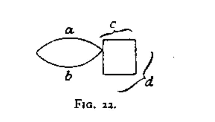
When dots, lines, or shapes form an enclosed area, our minds naturally see them as a complete unit. Even if the parts are not fully connected, we ‘fill in the gaps’ to perceive a closed shape because closure gives us a clear, bounded figure to interpret. In this example, ab/cd as a unit is apprehended over ac/bd as a unit because the closed figures form a “good gestalt”.
Why Gestalt Principles Matter in UI/UX Design
Every button, margin, or icon carries a weight in the mind of the user, which influences what the interface feels like, how it is understood, and whether it is trusted. Gestalt principles show how the mind naturally groups, differentiates, and makes sense of visual information, understanding which, one can place the right meanings and associations in the right places.
Without a principled framework, designers rely on subjective taste or inspiration boards for their layouts. Gestalt principles give objective laws to anchor the design to its foundations and inform subjective taste. They help dissect why an interface feels cluttered, why a call-to-action is being ignored, or why users fail to distinguish sections on a page. If elements lack proximity, related components may not feel grouped. If figure-ground relationships are weak, information may be lost.
The imitation of trends and templates without understanding leads to shallow design. Since Gestalt explored the fundamentals of visual perception, using it, designs can be constructed from the ground up, based on how people perceive structures, rather than relying on arbitrary systems or aesthetic mimicry. It encourages intention and clarity, rather than merely copying what appears to work elsewhere.

How to Apply Gestalt Principles to Your Design Workflow
Applying Gestalt principles in the workflow means using these laws to structure designs from the ground up. Or, looking at a design, reverse engineering it to its foundations, and understanding how and why it works. Here are a few active ways to apply these principles to your work.
1. Understanding the Forces
Gestalt forces are always present, grouping, separating, and creating meaning within the design, whether intended or not. Distance, alignment, contrast, color, and other factors may generate forces that either pull elements together or push them apart to form groups. Understanding these forces is not about asking, “What should I do with them?” but rather, “What are these forces already doing in this visual design?”
2. Figure-Ground Relationships
Figure-ground in UI means finding out how to present what matters. The figure is where attention moves towards, ground is where that attention moves from. Buttons, modals, and cards, for instance, should stand out against the background through contrast, borders, and shadows. The ground should support context and not take away attention.
3. Use Grouping Principles
Proximity, similarity, common fate, and closure are laws that determine how users scan the interface. Related components require closeness and other shared properties. Unrelated elements require separation and solid distinction. The perceptual system will group or ungroup elements based on more than one factor at once; so, the task is to ensure that it groups correctly to match the functional goal of the interface.
4. Design from First Principle Approach
Before choosing colors or layouts, analyze what the user needs to see first (figure), what should recede (ground), and how grouping will change meaning. Use proximity, similarity, and Prägnanz as a question for every element: “Does this align with perceptual laws, or does it contradict?”
Final Thoughts
With that, the discussion on a vast science of visual design and meaning formation –Gestalt– comes to a conclusion. For a designer, Gestalt holds many explanations for why some layouts feel right and others fall apart, why users miss a button, or why a simple shift in spacing changes everything. It offers clarity and tells us that perception is about how wholes are seen, how shapes emerge, and how the field configures itself. Design is perceived as a whole, so why not design it as a whole?
FAQs
Q. What does Gestalt mean?
- Gestalt is a German word meaning “shape” or “form.” In psychology, it refers to how we perceive visual elements as unified wholes rather than isolated parts.
Q. What are the 5 Gestalt principles?
- The core principles include proximity, similarity, figure-ground, closure, and continuity. These principles explain how our mind organizes visual information into patterns and meaningful structures.
Q. Who is the founder of Gestalt theory?
- Gestalt theory was founded by Max Wertheimer in 1910, with significant contributions from Kurt Koffka and Wolfgang Köhler. They developed this approach to explain perception as an active, holistic process rather than a sum of parts.
Next Steps
We recommend that you check out this project by AND Learner, Yash Ramdas, to further understand applications of these principles and also get inspiration for your next project!
In case you think you need further assistance, here are some of our resources you can consider:
- Watch this session by Shiva Viswanathan, Design Head of Ogilvy Pennywise, and Naman Singh, Product Experience Designer at RED.
- Talk to a course advisor to discuss how you can transform your career with one of our courses.
- Pursue our UI UX Design courses – all courses are taught through live, interactive classes by industry experts, and some even offer a Job Guarantee.
- Take advantage of our scholarship and funding options to overcome any financial hurdle on the path of your career transformation.
Note: All information and/or data from external sources is believed to be accurate as of the date of publication.


