Curious about icon design? Explore its significance, types, principles, best practices, and resources to learn more.
SUMMARISE WITH:
Curious about icon design? Explore its significance, types, principles, best practices, and resources to learn more.
Icon design is the representation of an idea, action, or object through a small graphical symbol. It uses simple shapes with pared-down details to quickly communicate a message. Essentially, it helps users understand what to do without having to read text descriptions.
Icon design makes interfaces cleaner and easier to use. Well-designed icons are instantly recognisable and work across different cultures and languages. Incorporating them in your work saves space and guides users through websites, apps, and other digital products.
In this comprehensive guide, we will explore why icon design matters and delve into its principles and types. We’ll also cover best practices and resources that can help you get started.
Here’s a clickable link to everything we’ll cover in this article.
- What is the difference between logos and icons?
- Why does icon design matter?
- Types of icons
- Principles of icon design that you should follow
- Icon Design Best Practices
- Icon Design Resources
- Conclusion and next steps
What is the difference between logos and icons?
Logos and icons, despite being visual symbols, have entirely different purposes. A logo represents a brand’s identity and values, helping users recognize and remember a company or product, and it usually remains consistent in form and color.
Icons, on the other hand, are functional elements used within interfaces to represent actions, objects, or navigation, such as search or settings. While a product typically has one logo, it uses many icons, and unlike logos, icons are designed for quick recognition and usability rather than brand expression. They are also far more repetitive than logos.
Why does icon design matter?
Icon designs are relevant because they can convey a message without the need for a single word. Designed icons represent actions and shape how effortlessly users interact with a product or service. When done properly, icons feel intuitive and guide users without demanding attention or explanation.
Here’s how icon designs make a difference:
1. Instant recognition
Icons provide instant recognition, allowing users to identify their purpose immediately. As the human brain processes images faster than text, icons speed up interaction by enabling users to quickly understand what they need to do without reading descriptive explanations.
2. Universal language
Icons speak a universal language, making them accessible to a global audience. Whether it’s a magnifying glass to represent “search” or a trash bin for “delete”, icons are easily understood regardless of a user’s language or cultural background. This makes them an important tool for designing global products.
3. Visual appeal
Breaking up text-heavy layouts declutters visuals and creates a cleaner, more engaging design. Icons can be customized in terms of shape, color, and style to match a product’s brand.
4. Efficient Navigation
Icons help users navigate through digital interfaces, particularly in menus, toolbars, and buttons. By providing visual cues, they reduce cognitive load and help users understand the next steps. This ease in navigation automatically increases user interactions.
Types of icons

Icon designs are available in different styles meant for specific needs. Understanding what each type is and what they’re suitable for is important before using them in your designs. The most commonly used ones include:
1. Flat icons
Flat icons focus on clarity and simplicity, avoiding shadows, gradients, or three-dimensional effects. They rely on solid colors and clean, well-defined shapes to communicate ideas quickly. This style is widely popular for its modern look and fast rendering, making it ideal for minimalist design fans who value speed, efficiency, and ease of use.
2. Glyph icons
Glyph icons are monochromatic visuals that often resemble symbols or letters. Their clean and minimal design makes them highly versatile across different screen sizes, which is why they are widely used in mobile app interfaces. Typically solid in form, glyph icons can be easily scaled to any size and customized with colors or subtle shadow effects. Their solid nature ensures excellent legibility at smaller sizes, though they may feel less visually engaging when used at larger scales.
3. Line icons
Line icons are built using thin outlines that give them a sleek appearance. They work especially well in interfaces that focus on simplicity, such as flat or material design systems. Created with vector strokes and typically hollow on the inside, line icons have their pros and cons. On the upside, their minimalist style can feel elegant and highly polished, but because they rely on outlines rather than solid shapes, users may take slightly longer to recognize and interpret them.
4. 3D icons
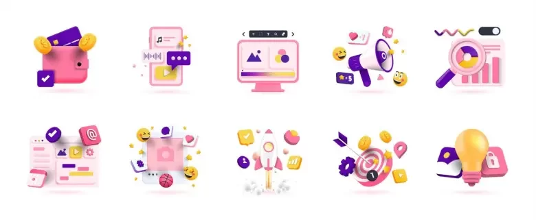
Three-dimensional icons use depth, shadows, and textures to create a more realistic feel. While they add visual richness and dimension to an interface, they are best used in moderation. Overusing 3D icons can make layouts feel cluttered and impact performance due to their higher rendering requirements.
5. Colored icons
Colored icons use solid hues or gradient palettes, giving them a more playful and informal character. However, they can be harder to align with a product’s visual identity and may draw attention away from important content. For this reason, excessive use of colored icons can negatively impact the user experience(UX).
6. Hand-drawn icons
Hand-drawn icons add a distinctive and artistic quality to digital products. They are well-suited for brands aiming to express creativity or a playful personality, helping interfaces feel more personal. That said, you should always prioritize visual clarity over stylistic expression.
7. Duotone icons
Unlike standard colored icons that rely on a single hue or gradient, duotone icons use two closely related colors that are clearly differentiated. They are created by dividing an icon into two layers, such as an outline and a fill, then applying a base color and adjusting opacity levels to achieve contrast. Duotone icons add subtle visual depth and interest without overwhelming a design. However, at very small sizes, the distinction between the two tones can become less clear, making them harder to recognize. So, take scale into account when going for such icons.

Principles of icon design that you should follow
If you intend to provide an excellent user experience(UX), you need to first understand the rules or principles upon which icon design is based. Here’s everything you need to know:
1. Clarity of meaning
The most important principle of icon design is clarity. When users see an icon, they should be able to immediately understand the meaning. This makes it essential to design icons, keeping your target audience and their expectations in mind.
Clarity becomes even more critical when creating icons that are not universally recognized. In such cases, consider the visual cues or symbols users naturally associate with the intended action. This helps reduce cognitive load, in turn creating a seamless UX. For example, a gear is a widely understood symbol for a “settings” icon for an app, whereas an abstract symbol, despite its association, may confuse users.
2. Simplicity

Image Courtesy: UX Design Institute
Since icons are displayed in small spaces, they need to communicate their meaning quickly and without unnecessary detail. From a UX point of view, simple icons are easier to scan, recognize, and remember. Overly detailed icons can lose clarity when scaled down, especially on smaller screens or lower-resolution displays. Users shouldn’t have to pause, zoom in, or decode complex visuals to understand what an icon represents.
Take two versions of a lightbulb icon, for example. One is clean and minimal, while the other includes extra details. Although both represent the same idea, the simpler design is easier to recognize and more effective in conveying its purpose.
3. Familiarity
Familiarity is rooted in one of the most fundamental UX principles: don’t make users think a lot. Instead of reinventing common symbols, it is far more effective to rely on visuals your users already recognize and understand. Whenever possible, aim for universal icons such as a magnifying glass for search, an envelope for messages, a house for the home screen, or a printer for printing. These symbols are instantly recognizable and require no explanation. When using familiar icons, there’s no need to redesign or overcomplicate them.
In UX design, breaking conventions without a strong reason can lead to confusion. Familiar icons create a sense of comfort and predictability, making interactions feel natural, safe, and effortless.
4. Readability or visual clarity
Readability is a core UX concern, especially for interfaces with limited space. Icons must remain legible at a glance and across different screen sizes, resolutions, and contexts. Overloading them with fine details or using poor spacing can cause the shapes and elements to blur, reducing their effectiveness.
Just as typography is designed for legibility, icons must be crafted with clean forms, balanced proportions, and adequate negative space.
From a UI perspective, readable icons can be easily scanned, helping users locate actions or information. This is particularly important in toolbars, navigation systems, and mobile interfaces where users rely heavily on visual cues.
5. Consistency
Consistency applies to the entire icon set and not just individual symbols. While each icon has a different purpose, all icons within a product should feel visually connected and work together as a system.
Consistency is achieved by following shared design rules such as using the same height, width, stroke weight, and overall visual balance across all icons. If color is used, it should remain uniform and align with the brand’s visual identity. A consistent icon set builds trust in the brand.
6. Brand awareness
Design your icons keeping the brand in mind. As essential elements of the user interface, icons help express a product’s visual identity and should align seamlessly with the brand. Through thoughtful use of color and style, icons can feel distinctive and memorable while still following essential principles. Brand-aligned icons strengthen recognition and emotional connection, making the interface feel intentional.
7. Balance
Icon design demands precision and attention to detail, so balance is essential. Every element within an icon should feel deliberately placed and visually stable.
In practice, this means arranging shapes so they appear balanced to the human eye. While this may involve centering elements and using equal spacing, it often relies on visual judgment rather than strict measurements to achieve a natural result. In UX design, these small details matter. Balanced icons contribute to a sense of order, highlighting the intuitiveness and aesthetic quality of the interface.
Icon Design Best Practices

As with most design principles, these practices aren’t set in stone. Think of them as flexible guidelines that work well in most situations, while allowing room to bend or break them when necessary. Ultimately, trust your judgment and design intuition to determine what works best for your icon set.
1. Determine the purpose
The first step in designing an icon set is to clearly understand the actions and tasks within your website or product. Before creating any visuals, identify what each icon should represent or what action it should prompt users to take. Making a list of all situations helps ensure nothing is overlooked.
For example, in a food delivery website, you might need icons for starting an order, adding items to a cart, selecting payment methods, or choosing add-ons. Each icon should be purpose-driven and designed specifically to support its intended function.
2. Keep your icons simple
The primary purpose of an icon is to help users complete tasks, with aesthetics taking a secondary role. Therefore, every icon should be kept as simple as possible, using only the details necessary to communicate its meaning.
Overly detailed icons can slow recognition and cause confusion. When a design becomes too complex, users may struggle to quickly understand what it represents. A well-designed icon remains easy to identify even at small sizes, due to bold lines, minimal forms, and sufficient white space, making it accessible to users with low vision.
An effective approach to creating clear icons is to begin with basic shapes such as circles, squares, and triangles. Build a rough structure using these foundational forms, and only then introduce essential details.
3. Use a grid
When you’re ready to start designing, begin by setting up a grid. A grid helps maintain consistency in size, shape, and element placement, making the design process smoother and more controlled.
Align your icon strokes and shapes to the gridlines whenever possible. This keeps the visuals clean and uniform while preventing misalignments. Working within a grid also reduces rendering issues, such as blurriness, since line widths remain even and precise.
That said, there may be occasions where stepping outside the grid improves the overall look of an icon. This is perfectly acceptable as long as it’s done sparingly and with intention.
4. Test your icons
The best way to evaluate whether your icon set works is to test it with real users. This doesn’t have to be a formal process. You can simply show the icons to a friend or teammate and ask what each one represents, or what comes to mind at first glance.
As with most design work, getting it right on the first attempt is unlikely. Expect to refine and iterate on your icons multiple times before arriving at a point that feels clear, effective, and ready to launch.
5. Target visual coherence
If you’re searching for icon design tips, chances are you’re working on an entire icon set rather than a single icon. For the set to feel cohesive, all icons should appear visually connected and consistent.
This means maintaining shared design characteristics such as stroke weight, fills, corner radii, overall style (for example, flat or three-dimensional), and color palette. Defining clear design rules from the start and applying them consistently is especially important when multiple designers are contributing to the same icon set.
Icon Design Resources
There are many resources available to support you in creating an icon set for your website. These tools can be used to explore existing icons for inspiration or to download ready-made icon libraries that can be customized to match your brand and design requirements.
Here are several helpful resources that you can try:
1. Streamline Icons
Streamline Icons offers a collection of over 30,000 professionally designed icons. The free Essential Icons pack includes commonly used symbols like email and music icons, while the paid Ultimate Pack features more specialized categories such as travel and ecology.
2. Material Design
Material Design is Google’s open-source design system that offers comprehensive guidance on typography, accessibility, and digital interface standards. It also provides a large library of icons that can be downloaded and adapted to suit your brand.
3. Free Design Resources
Free Design Resources provides a variety of downloadable icon packs, including iOS tab bar icons. Some sets are free while others are paid, and you can filter options based on compatibility with tools like Illustrator, Figma, or Sketch.
4. Animaticons
Animaticons specializes in animated icons that can add motion and personality to your website. It provides five different icon sets, with prices ranging from free to around $5.
5. Nucleo
Nucleo lets you browse, customize, and download icons directly within its app. Pricing depends on the number of users on your account, making it suitable for both individuals and teams.
Conclusion
Icon design is one powerful tenet of the broad field of UI UX design that improves navigation and strengthens user experience. We hope this holistic guide has made you aware of the importance of icon design and given you a fair idea about how it works in UI UX design. Keeping that in mind, you can start using it for your designs.
To learn more about icon design and its applications in UI UX design, check out the UI UX design courses offered by AND, which come with a comprehensive curriculum covering hands-on learning opportunities, unparalleled mentorship, and dedicated placement support.
If you’d like to know more about UI UX design or related topics, head over to the AND Academy blog for more articles. As a starting point, you can consider going through the following resources:
All You Need To Know About User Journey Maps and How To Create Them
Cognitive Load in UX Design: Meaning, Significance, and How To Reduce It
Empathy Map Examples and Templates to Follow for Impactful UI UX Design
Next Steps
If you’d like to learn more about UI UX design, check out more of our articles over on the AND Academy Design Blog. You can also check out this project by AND Learner, Saiprasad Chandran, for inspiration.
In case you need further assistance, here are some more resources you can consider:
- Watch this session by Shiva Viswanathan, Design Head of Ogilvy Pennywise, and Naman Singh, Product Experience Designer at RED.
- Talk to a course advisor to discuss how you can transform your career with one of our courses.
- Pursue our UI UX Design courses – all courses are taught through live, interactive classes by industry experts, and some even offer a Job Guarantee.
- Take advantage of our scholarship and funding options to overcome any financial hurdle on the path to your career transformation.
Note: All information and/or data from external sources is believed to be accurate as of the date of publication.


