What does good information architecture look like in practice? Take a look at these 5 real-world examples to find out.
Good information architecture (IA) is the cornerstone of good UX. It is through this process of organizing, labeling, and categorizing content in a logical and coherent manner that you ensure the user can easily find what they’re looking for—and that they’re able to navigate from point A to B.
This is crucial for designing websites and apps that feel intuitive and user-friendly—and, after user research, information architecture is one of the first considerations a UX designer will make.
But what actually constitutes ‘good’ information architecture? What does it look like in practice? Let’s bring this important concept to life with some real-world examples.
Contents:
- What is information architecture and why does it matter?
- The 8 principles of information architecture
- Information architecture in action: 5 examples
- Learn more about UX design
First: a brief recap on what information architecture is and why it’s so important.
1. What is information architecture and why does it matter in UX design?
Information architecture is the process of organizing, labeling, and structuring content within a given system or environment—such as a website or an app.
The goal of information architecture is to make it as easy as possible for the user to find what they’re looking for and complete their tasks. On an e-commerce website, for example, the user should be able to quickly find relevant products, add them to their cart, and complete the checkout process.
Information architecture is a fundamental pillar of user experience (UX) design. It creates a logical and intuitive system that’s straightforward to navigate, enhancing the overall usability and accessibility of the product.
You’ll find a more in-depth explanation in our complete guide to information architecture, together with a step-by-step framework to take you through the process of creating information architecture.
For now, though, let’s outline the key principles that underpin this important discipline.

2. The 8 principles of information architecture
There are eight fundamental principles of information architecture:
1. The principle of objects: Each piece of content should be treated as an individual object with its own unique function, characteristics, and behaviours.
2. The principle of choices: Present the user with meaningful choices when interacting with a product—but don’t overwhelm them with too many options. Each set of choices should be focused on just one specific task.
3. The principle of disclosure: Information should be revealed progressively bit by bit so as not to overwhelm the user. When booking a flight, for example, you won’t be shown seating options until you’ve selected a specific flight.
4. The principle of exemplars: When displaying multiple categories, use exemplars to describe the contents contained within each category. Exemplars are like visual clues that tell the user what to expect from each category.
5. The principle of front doors: Users won’t always land on a website via the homepage; they might enter via a blog post or a product page, for example. These additional entry points should provide enough information to help the user understand where they are within the information architecture and navigate to other pages.
6. The principle of multiple classification: Not everybody searches for information in the same way, so it’s important to have multiple pathways—i.e. classification systems—that lead back to the same content. When searching for a pair of shoes, for example, some users will filter by the brand while others may browse based on color.
7. The principle of focused navigation: A website’s navigation system should provide a clear, straightforward pathway for the user to follow. It should be as streamlined as possible, and be optimized for the completion of specific tasks.
8. The principle of growth: Assume that the content within your information architecture will grow and evolve over time. Make sure your IA is scalable and adaptable to accommodate future content.
Now let’s explore these principles in action with some real-world examples of good information architecture.
3. Effective information architecture in action: 5 examples (and what we can learn from them)
1. The Notting Hill Bookshop
You might recognize The Notting Hill Bookshop from a certain 90s rom-com, but we think the website deserves a special mention for entirely different reasons.
With its delightfully straightforward navigation, clear-as-day menu labels, and a multitude of filtering options, this is one of the best website information architecture examples around.
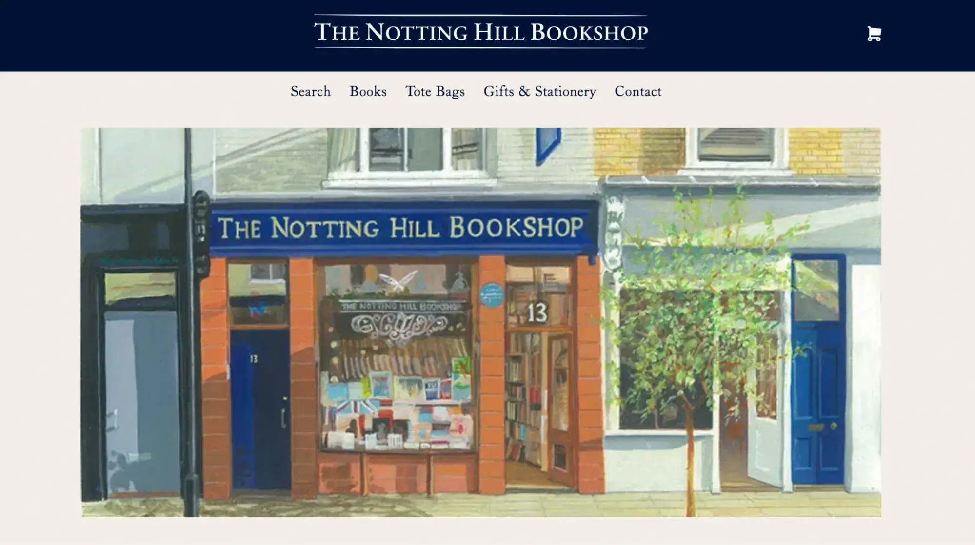
First, there’s the homepage with a simple main menu featuring five distinct categories. Each menu item is clearly labeled, making it obvious to the user what each menu item relates to and where it’ll take them.
Then there’s the very easy-to-spot headline at the top of the page, which remains in place throughout the website. This enables the user to quickly navigate back to the homepage from any point.
Navigate to the ‘Books’ category and you’ll find a broad variety of filtering and sorting options. You can filter by availability, author, collection, or genre, and sort the results alphabetically or based on price and recency. This is a great example of the principle of multiple classification, allowing the user to quickly find what they’re looking for based on their preferred means of browsing.

All in all, the information architecture is clear, logical, and easy to follow—which is especially important when you’re presenting lots of different products and product types.
The takeaway:
- Use clear, self-explanatory menu labels
- When you’re listing lots of different products and product types, implement advanced search functionality with extensive filtering options
- Provide straightforward navigation pathways that guide the user through your website
2. IKEA
If you’ve ever shopped at IKEA, you’ll know that navigating the store’s rather complicated floor plan can feel like being lost in a maze. Fortunately, the online experience is much more straightforward—thanks to the IKEA website’s highly effective information architecture.
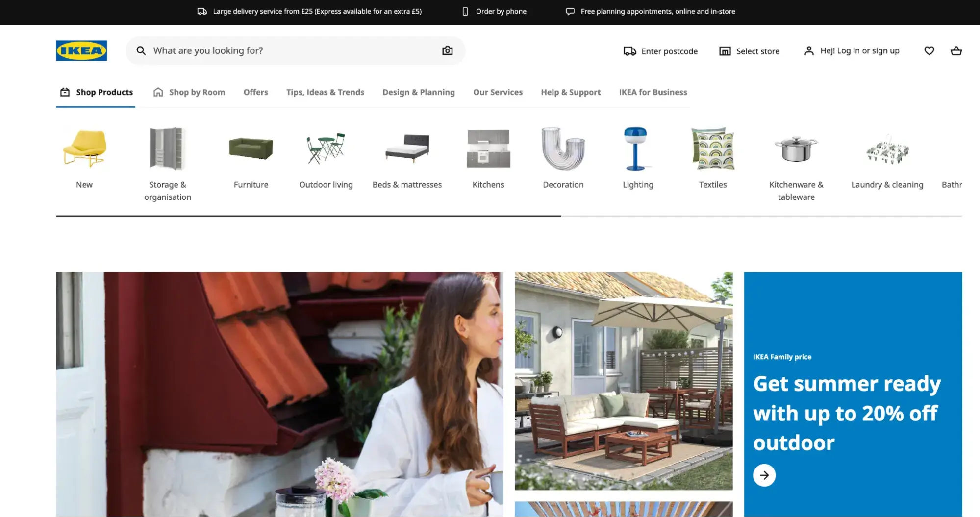
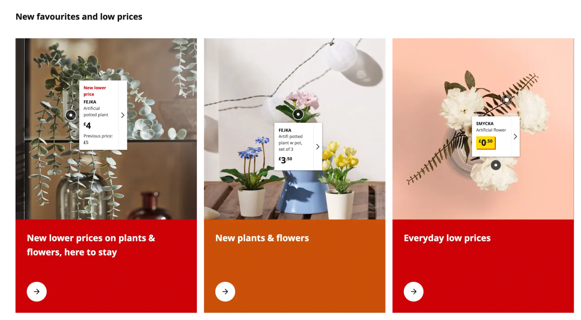
In addition to an extremely vast product catalogue, the IKEA website features design inspiration in the form of tips, ideas, and trends, as well as a virtual planning service. That’s a lot of content to navigate, with the potential to become incredibly overwhelming.
However, with a clear and intuitive navigation system, a consistent structure throughout, and plenty of visual aids—plus a robust search functionality—finding your way around the IKEA website is no hassle at all.
The main product categories are prominently displayed, with subcategories logically organized within them. This clear information hierarchy helps users navigate the site and find what they’re looking for.
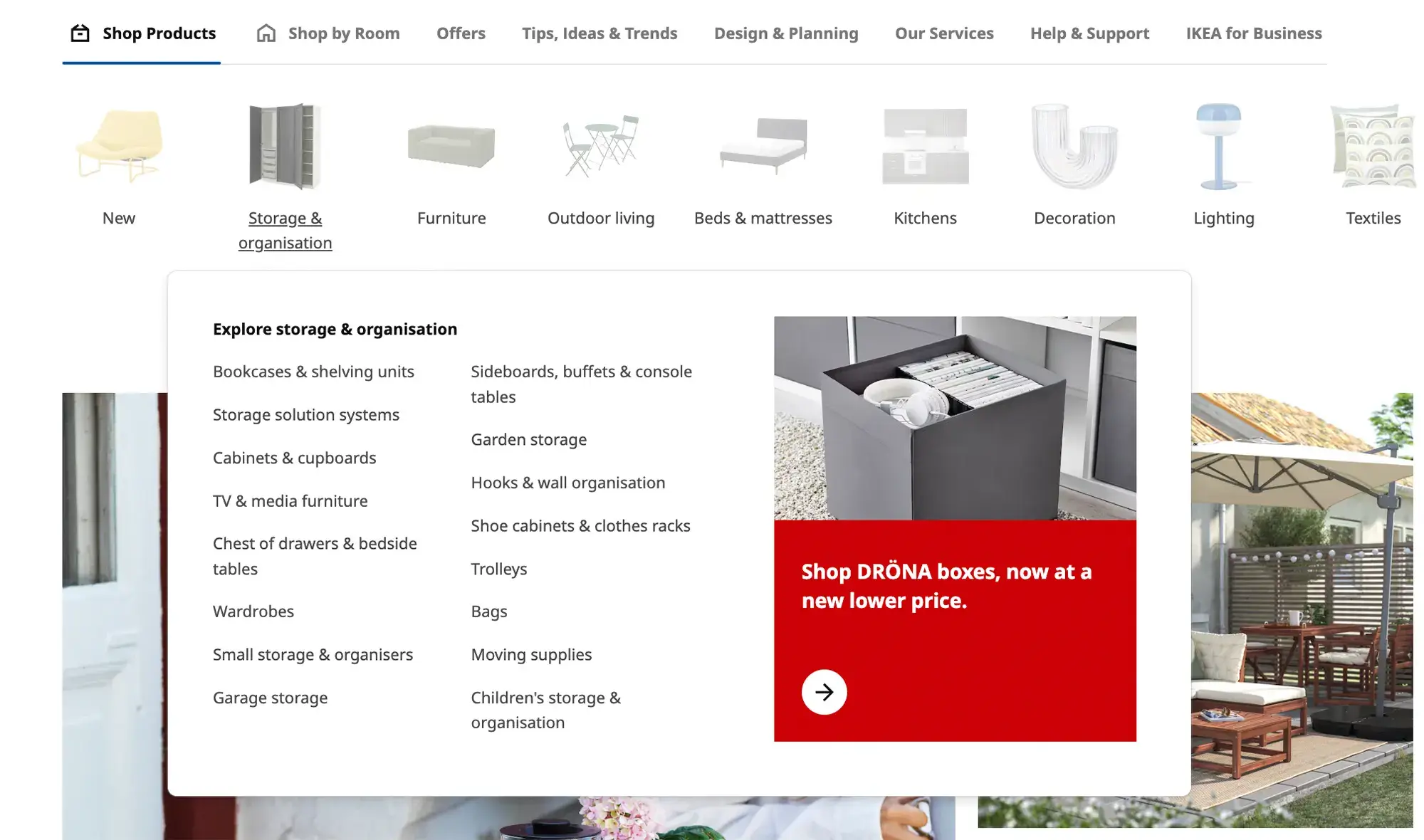
Each section of the website follows a consistent structure in terms of layout, labeling, and functionality, enabling the user to quickly learn how the system works and predict where they can find certain types of content or products.
Then there’s the use of visual cues throughout, helping to aid navigation and comprehension. Each product category has a featured image, letting you know what kind of products to expect within that section (remember the principle of exemplars?), and icons and graphics help to guide the user towards certain actions—such as saving an item to their wishlist or adding it to their basket.
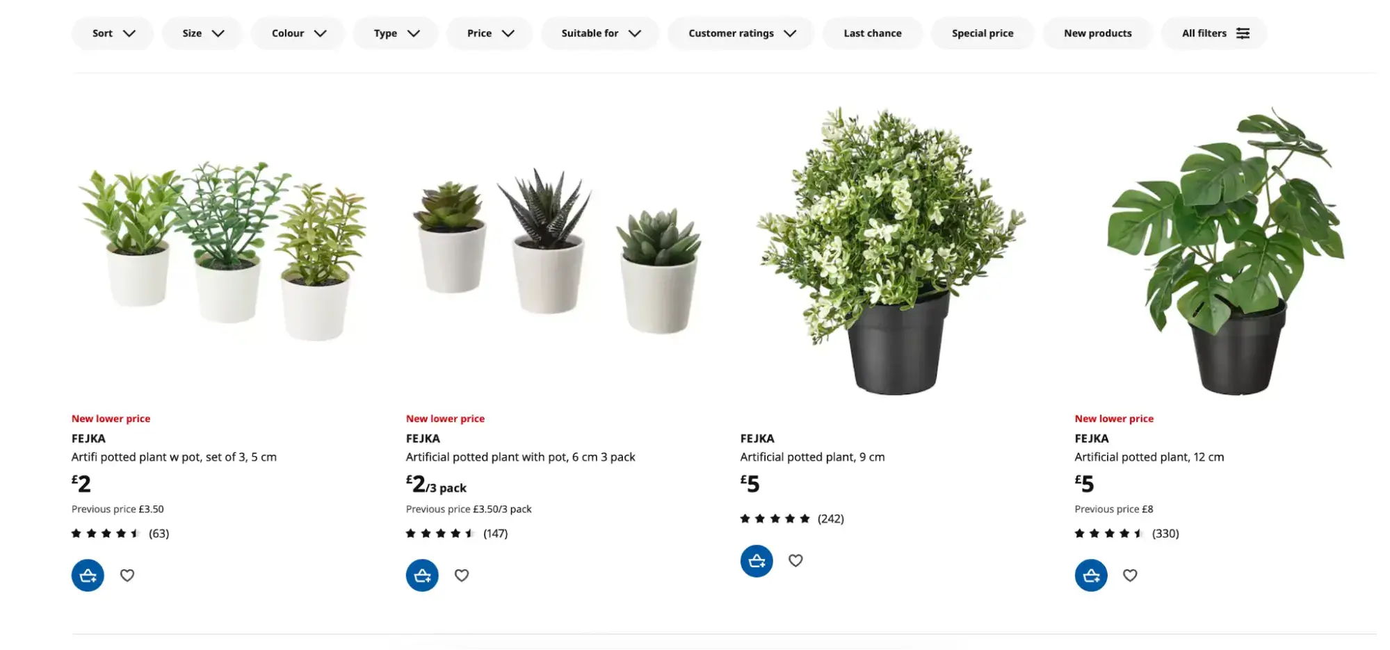
Last but not least, you’ll find an expansive set of options for filtering through products—whether you want to search by color, price, or other customers’ ratings (to name just a few).
The IKEA website provides a great example of how to structure a vast array of content in a logical and consistent format.
The takeaway:
- If you’ve got a vast library of content, logical categories, and subcategories are key
- Use the principle of exemplars to provide visual clues as to what’s included in each category
- Consistency is crucial; make sure each section follows a similar format
See also: 10 Stunning Examples of Website UI Design to Inspire Your Next Project.
3. The Clever Meal
The Clever Meal is a food blog specialising in budget-friendly, meat-free recipes that are quick and easy to make—and it’s one of the best information architecture examples on the web.

The Clever Meal demonstrates the principle of front doors in action. According to this principle, there are many different entry points through which a user can land on your website; they may not always come via the homepage. As such, it’s important to design your information architecture with different entry points in mind.
In the case of The Clever Meal, you might land on the website through a Google search. If you search ‘vegan chickpea soup recipe’, for example, The Clever Meal is one of the first results that come up.

If you click the search result, you go straight to that specific recipe page. In addition to the recipe you wanted, the page also contains a clearly labeled main menu, a prominent search bar, and, to the right-hand side, a brief introduction to Katia (the owner of the blog) and a description of what the blog is all about.
This ensures that newcomers to the website quickly understand what to expect from the site—and that they can easily navigate to and explore different pages and sections.
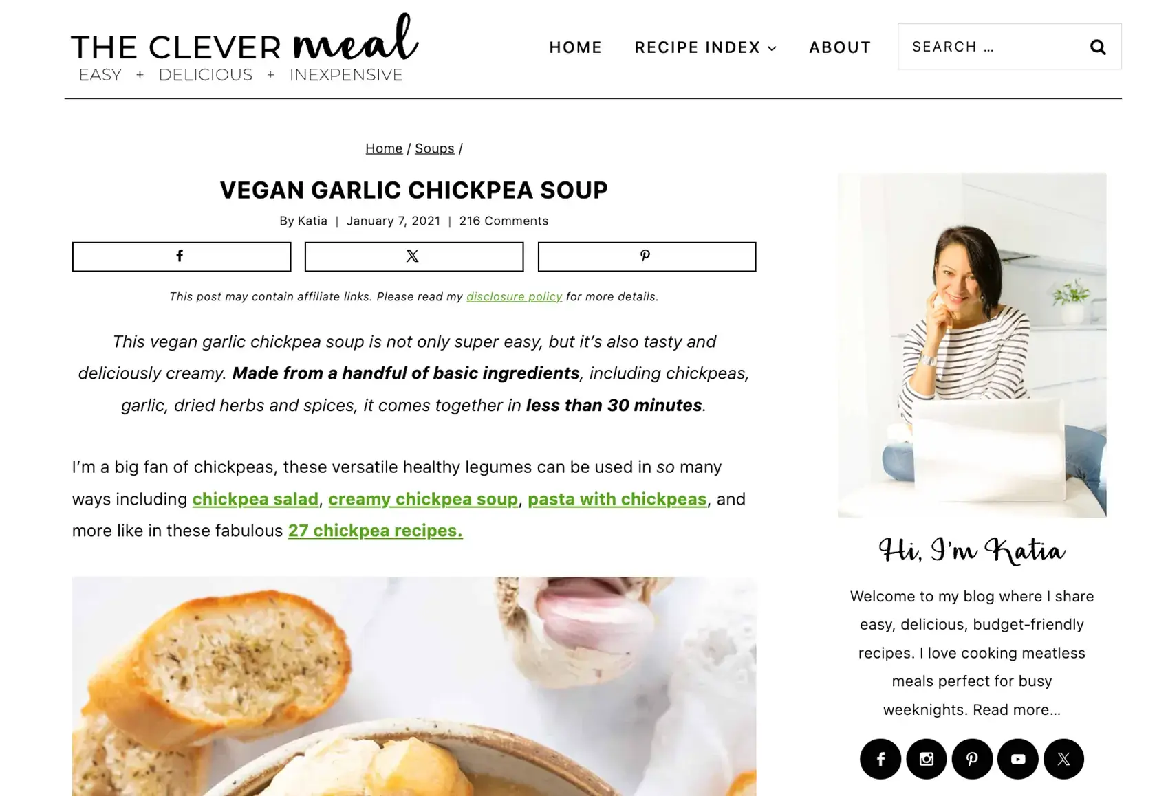
The page also features social icons prominently above the fold, encouraging the user to navigate to Katia’s various social platforms. This is a great way to guide the user towards specific actions and encourage further engagement.
The takeaway:
- Remember the principle of front doors; provide clear navigation links on each page so the user can easily find their way around if they land on your website through a page other than the homepage
- Information architecture guides the user towards certain actions—so if you want to encourage website visitors to click through to social media, for example, display the relevant icons prominently in the information hierarchy
4. Pocket mobile app
Pocket is a mobile app that allows you to save articles, videos, and web pages to read or watch later. Not only is it incredibly handy for curating your own content lists; but it’s also a great information architecture mobile app example.
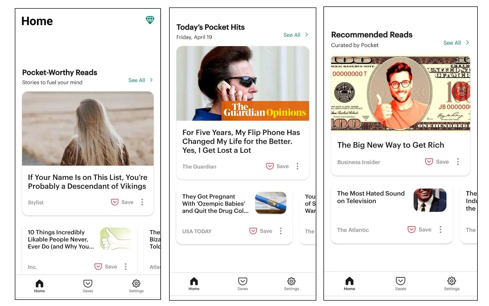
Pocket features a simple, intuitive navigation structure, with the main sections of the app (Home, Saves, and Settings) clearly labeled and easily accessible via the bottom navigation bar. This enables the user to effortlessly switch back and forth between browsing content suggestions and viewing their own curated lists.
Within the app, content is organized in a logical and consistent manner. You can view your saved items in a list format sorted by date, title, or tag—and, to make it easy to find specific content later on, you can categorize your saved items with tags.
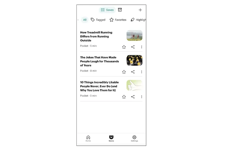
Pocket also includes robust search functionality, displayed prominently at the top of the app. So, if you’ve got a specific piece of content in mind, you can quickly search and locate it within your saved items.
Overall, the Pocket mobile app provides a great example of effective information architecture by prioritizing simplicity, clear and logical organization, and usability—ultimately enhancing the user experience.
The takeaway:
- When designing information architecture for a mobile app, you have limited screen space—so prioritize and present only the most important content
- Use elements such as bottom navigation bars and hamburger menus to ensure easy navigation from one section of the app to the next
- Incorporate a prominently featured search bar to allow for more precise navigation
Learn more: A Complete Guide to Mobile App UI Design (With Examples).
5. Delta Air Lines
When it comes to booking flights (or indeed anything travel-related), it feels like there are a million different steps to go through—from choosing a flight and selecting your seat to deciding what size luggage to take…and the list goes on and on.
Such a process calls for meticulously designed information architecture, and we can turn to the Delta Air Lines website for a great example.

First and foremost, the website homepage is very clearly designed to facilitate one specific action: searching and booking a flight.
Besides the main menu, the most prominent feature in the content hierarchy is the flight search field. This is an excellent example of the principle of focused navigation, which states that a website’s navigation system should be optimized to guide users toward their intended goals.
Enter your origin and destination locations, select your dates, and click the ‘search’ button and you’ll be taken to the results page. Here you’ll find an excellent example of another key principle in action: the principle of disclosure.
According to the principle of disclosure, it’s good practice to reveal information progressively as and when it’s needed. This reduces the cognitive load placed on the user, allowing them to navigate through the process—and all the content involved—one step at a time.
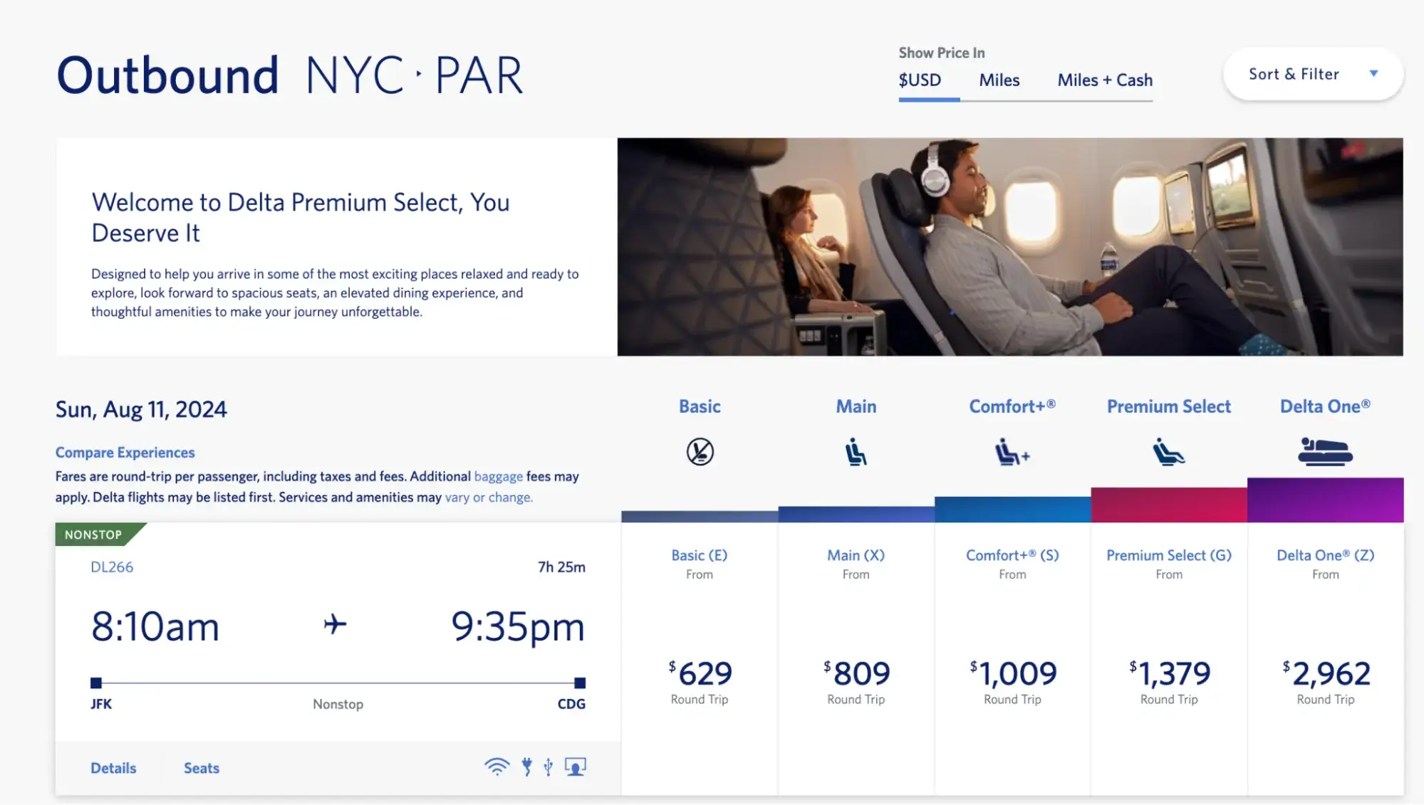
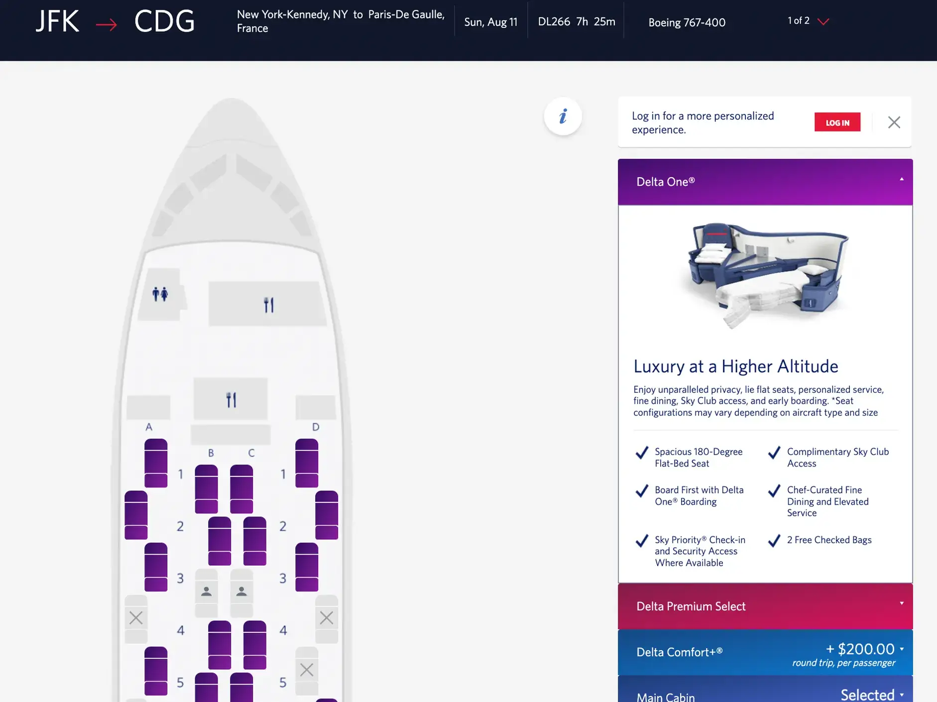
The Delta Air Lines website also incorporates breadcrumbs for additional clarity. Once you’re in the process of booking a flight, the breadcrumb trail in the top-right corner shows you what stage you’re at—and what stages are remaining.
And, if you want to restart the process, you can simply click the ‘Start over’ button to go back to square one. This saves you from the cumbersome process of clicking ‘back’ multiple times.

Through well-designed information architecture, Delta Air Lines streamlines the process of booking flights, ensuring a positive user experience overall.
The takeaway:
- Simplify complex processes by implementing the principle of disclosure, revealing content only as and when it’s necessary
- Provide clarity throughout the process by using breadcrumbs to show the user where they’re at
- Streamline and optimise your navigation towards specific user goals, as per the principle of focused navigation
4. Learn more about UX design
We hope you’ve enjoyed learning about effective information architecture and exploring what it looks like in practice. Remember that good information architecture lays the foundation for a positive user experience, ensuring that websites and apps are intuitive, well-organized, and easy to navigate—allowing the user to quickly find what they’re looking for and complete their tasks.
If you’d like to learn more about how to design user-friendly websites and apps, check out these guides:
- Fundamental UX Design Principles (And How to Apply Them)
- How to Design a Website Wireframe (Step-by-Step)
- A Complete Guide to Interaction Design (And Why it Matters)
We also encourage you to check out this UX Project by AND learner Aromal Jose Baby for a deeper understanding of implementing information architecture to your project.
5. Next Steps
We hope our guide on information architecture examples could offer the practical guidance you were looking for.
However, in case you need further help, here are some additional resources you can consider:
- Watch this session by Shiva Viswanathan, Design Head of Ogilvy Pennywise, and Naman Singh, Product Experience Designer at RED.
- Talk to a course advisor to discuss how you can transform your career with one of our courses.
- Pursue our UX UI Design courses – all courses are taught through live, interactive classes by industry experts, and some even offer a Job Guarantee.
- Take advantage of our scholarship and funding options to overcome any financial hurdle on the path of your career transformation.
Note: All information and/or data from external sources is believed to be accurate as of the date of publication.


