Explore the power of microcopy in UI/UX design, why tiny words matter, how they guide users, and the best way to craft clear and engaging messages.
SUMMARISE WITH:
Most people think design is just about how things look (colors, shapes, and animations), and that it singlehandedly governs the experience an interface delivers to the user. But the truth is that words can be just as powerful in shaping this experience. We’re not talking about articles or big chunks of text. Just those short, albeit powerful, words on buttons, text on forms, and short instructions are commonly referred to as microcopy.
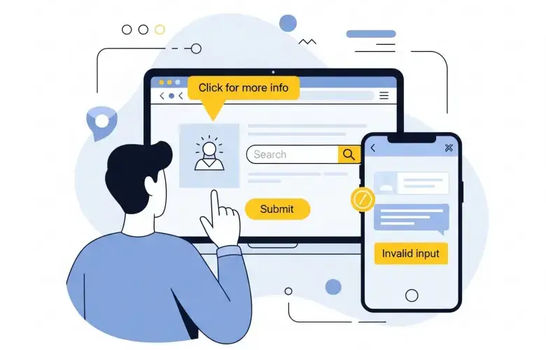
Microcopy makes a product feel simple, clear, and supportive. If poorly written, though, it creates confusion and frustration. Imagine this: you see a button labeled “Submit.” That word has become so generic that it barely gives you context. Submit what? A payment? A form? A personal detail? Without extra clarity, users are left guessing.
Now compare that with a button that says “Create Account” or “Download Report.” Suddenly, the purpose becomes clear. The moment you see it, you know exactly what will happen. That clarity is the power of good microcopy.
In this article, we will explain all you need to know about microcopy: what it is, why it matters, its forms, and how you can improve it. By the end, you’ll understand how the smallest words can create the biggest impact on user experience.
What is Microcopy?
Microcopy refers to the short words or phrases in apps and websites that help users. It’s not a long text; it’s quick guidance. Instead of paragraphs, it’s just a few words meant to push the user forward. Some examples of microcopy include:
- The label on a button (‘Sign Up Free’) tells you what happens if you click.
- The faint text you see inside a text box before you type (‘Enter your email address’)
- A tooltip explaining a feature (‘Click here to edit your profile’)
- An error message (‘Your password must be at least 8 characters long’)
The key quality of microcopy is that it appears exactly when it is useful. Unlike long instructions that overwhelm users in advance, microcopy is context-aware. It shows up at the moment you need it.
A friendly reminder: microcopy is not a full guide. It’s just a hint. The purpose is simple: keep the user moving forward without confusion.
Think about it. Would you enjoy being stuck on a page without knowing what to click?
Absolutely not! Microcopy prevents that. It makes a product feel human and approachable. Yes, a simple word choice can ease frustration and build trust. That’s why great design isn’t only about colors and layouts, it’s about words too.
Microcopy may be small, but its impact is huge. One misplaced word can confuse users. The right word can win engagement, retention, and eventually, loyalty.
Importance of Microcopy in UI/UX

You may be wondering: How do tiny words make a difference? Well, these small words guide people, set expectations, and affect how much they trust the product.
Below are four major reasons why microcopy truly matters:
1. It Builds Trust
Users don’t want to feel tricked. They want to know why they’re asked for something, like their email, and what will happen after they click a button.
Imagine this: you see “Enter your email.” That feels vague. But if it says, “We’ll only use your email to send your receipt,” you relax. You trust. Clear microcopy makes people feel safe and in control. Trust grows. Confidence builds.
2. It Reduces Confusion
No one enjoys confusion. Ever clicked a button and thought, “What will happen now?” That tiny moment of doubt creates frustration. Microcopy eliminates that. Instead of leaving you guessing, it provides complete direction at the right time. For example, instead of an error message that says, “Invalid input,” imagine one that says, “Password must have 8+ characters.” Clear. Direct. Helpful.
This reduces hesitation.
People stop second-guessing and start moving forward with ease. And isn’t that what we all want?
3. It Improves Conversions
One word can change everything. The label “Submit” feels cold. While “Get Started” feels inviting. Microcopy shapes those tiny moments that add up to conversions.
The words you choose make people feel motivated, comfortable, and ready to act. This also builds trust. When a user is guided by clear, helpful text, they feel confident in the process. If your e-commerce checkout button says, “Confirm Order,” it feels final. But if it says, “Review and Confirm Order,” it gives the user a sense of control and reduces anxiety about a mistake. That small adjustment can be the difference between a completed purchase and an abandoned cart. The goal is to make the user feel smart, not confused. Small change. Big result.
4. It Shapes the Brand’s Tone
Every brand has a personality. Microcopy is where that voice lives. If you’re struggling to match the right tone, an online paraphraser can help you reword text until it feels just right. Fun wording makes the product playful. Simple wording makes it professional.
Picture this: a loading screen that says, “Hold on tight, magic is happening.” That feels playful. Now picture one that says, “Loading, please wait.” Neither is wrong.
Both leave a different impression, though. And that impression lasts. It tells people who you are without a single logo or picture. In short, microcopy isn’t decoration. Its direction, trust, personality, and persuasion are backed into a few tiny words. And those tiny words? They can make or break the entire user experience.
Types of Microcopy
Here are the main types of microcopy you’ll normally see when browsing a website:
1. Button Labels
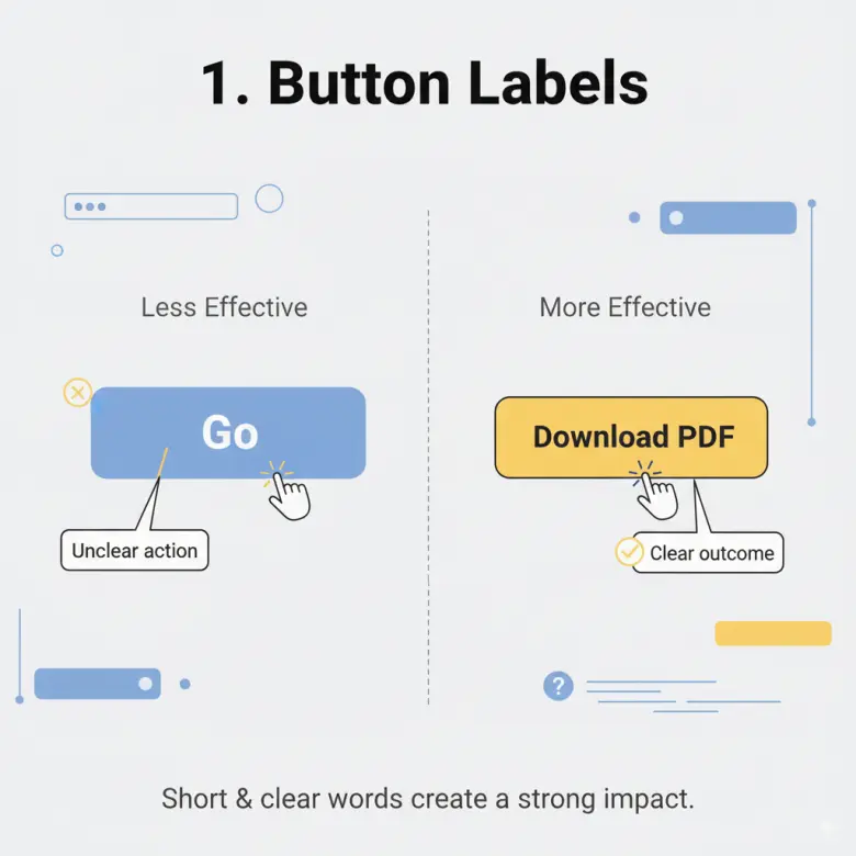
Buttons are everywhere on apps and websites, so their labels are the first thing users see. A button label tells users exactly what will happen when they click.
Take a look at these two examples of button labels:
- “Go”
- “Download PDF”
The first one, “Go,” is unclear, but “Download PDF” tells the user the exact outcome they can expect upon clicking on a button. The clearer the label, the faster users trust the product. In conclusion, short and clear words create a strong impact.
2. Error Messages
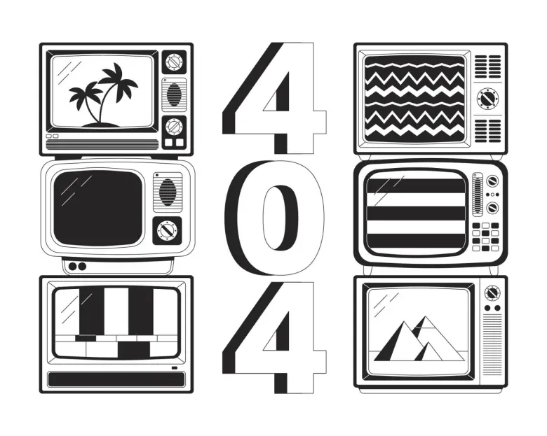
Errors are moments of frustration for users. A cold “Error 404” isn’t helpful. It feels vague and unfriendly. Instead of making users feel lost, good microcopy explains the error and shows a simple way forward.
Some common examples of helpful error microcopy are:
- “Password incorrect. Try again or reset it here.”
- “Oops! We couldn’t load the video. Refresh the page or check your internet.”
- “This username is already taken. How about trying ‘Alex89’ instead?”
Each one tells the user what went wrong and what to do next. No dead ends. Just guidance.
3. Tooltips and Hints
Tooltips give extra help only when needed, so the screen stays clean. They teach users through steps, without any cognitive overload. Hints don’t scream at you, they just show up when you hover or pause, giving exactly the nudge you need.
Examples of great tooltip microcopy:
- On a “?” icon next to a password field: “Use at least 8 characters, including a symbol.”
- On a dashboard chart: “Hover over a bar to see detailed numbers.”
- On a file upload button: “Drag and drop your files here, or click to browse.”
These tiny messages keep screens clean while making features easy to understand. They remove hesitation before it even begins.
4. Onboarding Text
When new users start using a product, onboarding text helps them get familiar with its features. This might be short instructions like “Swipe left to see more options.”
The first impression matters. What’s worse than opening a new app and feeling lost? Onboarding text prevents this feeling by offering a step-by-step guide to using a new application. Instead of dumping a manual, it gives one step at a time. For example, texts like - Swipe here. Tap there. Explore safely.
5. Form Instructions
Forms are common, but confusing ones can drive people crazy. Forms are like puzzles. If the pieces don’t fit, you give up. Microcopy is the guide that shows you how the pieces connect.
Good form microcopy doesn’t just guide; it also reassures. People often hesitate when entering sensitive details like phone numbers or credit cards. A simple line such as “Your payment details are secure & encrypted” can calm those fears. This small addition keeps users confident & willing to complete the form instead of abandoning it halfway.
Plus, instructions like “Use at least one number” and “Don’t forget the @ in your email” save users from trial and error. It eliminates guesswork and helps users complete the form successfully.
6. Empty States
New users may see empty spaces when they haven’t added anything yet. Empty state microcopy can guide users by suggesting what to do next. For example: “You don’t have any saved files yet. Click the + button to add your first one.”
How Tiny Words Influence User Behavior
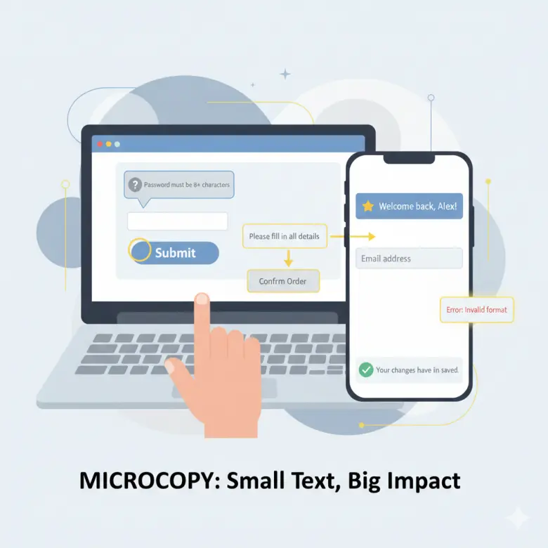
A single word can mean trust or hesitation. A single phrase can mean “Yes, I’ll continue” or “No, I’ll leave.” Here’s how microcopy can shape the user behavior:
Clear Words = Confident Users
If people understand what clicking a button will do, they’ll feel safe moving forward. No second-guessing. No hesitation. Would you click “Proceed” if you weren’t sure what comes next? Probably not. But if it says “Proceed to Checkout,” you feel reassured. You know the outcome. That clarity builds trust & encourages action.
Tone Creates Emotions
The word tone should match the product’s vibe. A banking app needs formal language. A photo-editing tool, on the other hand, can sound playful. When writing microcopy, don’t just use any words. Choose words that set the right emotional experience for your users because feelings matter just as much as function.
Guidance Reduces Mistakes
If an app tells users exactly what went wrong or what’s required, people won’t get stuck. This reduces frustration due to mistakes & keeps users engaged. For example, instead of a vague “Error,” a better message would be: “Password must include at least 8 characters & 1 number.” That kind of guidance saves time & encourages users to take action.
Motivating Words Increase Engagement
Some words spark action more than others. “Submit” feels cold & robotic. But “Join Free” feels exciting. Words don’t just explain; they inspire. The right words make people want to act. The wrong words can make them hesitate. This is the power of motivation in microcopy: it doesn’t just guide users, it encourages them to take the step you want them to take.
Best Practices for Writing a Winning Microcopy
Writing top-quality microcopy isn’t rocket science. It just needs clarity and thought. Here are the best practices to follow to write clear and engaging microcopy:
1. Be Clear and Concise
Every extra word slows the reader down. People don’t want poetry in an app; they want direction. Think about the last time you had to fill out a form online. Did you want a paragraph explaining each step? No. You wanted one short line telling you exactly what to do.
Example:
Instead of saying: “To proceed with your registration, kindly click the button below to confirm your details.”
Say: “Click below to confirm.”

2. Use Everyday Words
Users shouldn’t need a dictionary to use your product. Plain words beat complicated ones every time. How would a person understand what you’re saying if they’re new to technology?
Even experts prefer easy words instead of jargon, because easy words are faster to process.
If something feels complex, you can use an online rephraser to simplify it without changing the meaning. Always remember: simple is smart.
Example:
Instead of saying: “Authenticate your credentials to initiate session access.”
Say: “Log in to start.”
3. Answer User Questions Before They Ask
Users don’t like guessing games. If they’re unsure about what happens next, they feel nervous and may abandon their plans to use your application.
Good microcopy works like a friendly guide; it says, “Don’t worry, here’s what’s next.” Let’s imagine you are writing an online checkout page. If users wonder, “Will my payment be secure?” the best microcopy reassures them right there.
Example:
On a payment page, instead of just adding a button with text “Submit”, write: “Pay securely - encrypted checkout.”
4. Keep the Tone Consistent Everywhere
Inconsistent tone confuses people. Imagine your app greets users with a playful “Hey there!” but then warns them with a formal error message.
Mixed signals create confusion. Your product should feel like one personality - steady, predictable, and reliable. Consistency makes people trust your brand. You need to remember tone is not just about words; it’s about emotion. So, pick a brand voice and a single tone and be consistent. Example:
Playful tone: “Oops! That didn’t work; try again?”
Formal tone: “Error detected. Please resubmit.”
You should choose one way of writing microcopy and stick with it.
5. Keep Testing, Keep Improving
Top-notch microcopy grows over time. What works today may not work tomorrow. User behavior, expectations, and language change all the time. That’s why testing is your best friend..
Your microcopy should not guess, it should measure up to your and your customer’s expectations. Run small experiments and A/B test your microcopy. See what clicks. Keep what works, drop what doesn’t. Always remember, improvement is a cycle, not a finish line.
Example:
Test two button labels: “Get Started” vs. “Join Free Today.”
Track which one gets more clicks and stick with the winner.
Key Takeaways
Even the tiniest text in an app or website, like button labels or short instructions, matters a lot. These little bits of text tell people where to go, clear up doubts, and make them feel safe with your product.
Simple words can foster powerful trust and brand loyalty.
Microcopy decides how users emotionally connect with your product and whether they actually get things done. It takes confusing tasks and makes them easy. It makes the product feel natural, like it just “gets” you.
Next time you write something small like a button label, an error message, or an onboarding step, don’t ignore it. Because the smallest words? They often decide everything.
Next Steps
In case you think you need further assistance, here are some of our resources you can consider:
- Watch this session by Shiva Viswanathan, Design Head of Ogilvy Pennywise, and Naman Singh, Product Experience Designer at RED.
- Talk to a course advisor to discuss how you can transform your career with one of our courses.
- Pursue our UI UX Design courses - all courses are taught through live, interactive classes by industry experts, and some even offer a Job Guarantee.
- Take advantage of our scholarship and funding options to overcome any financial hurdle on the path to your career transformation.
Note: All information and/or data from external sources is believed to be accurate as of the date of publication.

