Learn how to create intuitive, user-friendly mobile app wireframes with the help of this guide — including examples, tools, and best practices.
SUMMARISE WITH:
Learn how to create intuitive, user-friendly mobile app wireframes with the help of this guide — including examples, tools, and best practices.
If you’re designing a mobile app, you must first determine the overall layout, structure, and flow of the app before you can even think about aesthetics.
This is where mobile app wireframes come in. They set out a basic blueprint for your app screens, showing where key elements sit on the page and what role they play in the user journey.
This is crucial for ensuring that your app is intuitive, logical, and user-friendly: everything that good design stands for.
So what exactly is a mobile app wireframe and how do you create one? You’ll find everything you need to know in this guide, including:
- What is a mobile app wireframe?
- When should you create app wireframes?
- How to create a mobile app wireframe in 7 steps
- Tips and best practices for creating mobile app wireframes
- The best mobile app wireframe tools
- Key takeaways
Let’s begin with a definition.

What is a mobile app wireframe?
A mobile app wireframe is a simple sketch, either digital or hand-drawn, that maps out the basic structure and layout of an app screen.
It depicts the elements that are needed for the user to navigate the app and complete their desired tasks — such as buttons, icons, and menus — and shows where they should each be positioned on the screen.
Mobile app wireframes are all about functionality and flow. When you create wireframes, you’re thinking about structure, navigation, and usability. You’re not thinking about visual details like color, typography, or imagery; that all comes later on.
As such, app wireframes are typically created in black and white or grayscale, and they offer a bare-bones, low-fidelity representation of what your final app might look like.
Read also: 8 Wireframe Examples to Guide Your Next Project.
When should you create app wireframes?
Creating wireframes enables you to visualize, test, and refine the structure and flow of your mobile app before you move on to the finer design details and, eventually, development.
It’s therefore important to create wireframes pretty early on in the design process. This allows you to identify any potential usability issues before you invest in more high-fidelity designs.
So when exactly should you start creating wireframes?
Before creating an app wireframe, you need to have a clear concept in mind regarding the app you’re going to create — and why you’re creating it. In other words, what is the app’s purpose and what problem does it solve for the people who use it?
Here’s what happens before you get to the wireframing stage:
User research
Conduct user research to build a thorough understanding of your target audience, including their needs, goals, expectations, and pain points, as well as the core problem your mobile app should solve. This step usually involves creating user personas.
Ideation
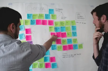
This involves brainstorming concepts for your mobile app, defining its core goals (in relation to the user problem you want to solve), and exploring the main features and functionality your mobile app should offer. You can learn more about ideation (and helpful techniques) in this guide.
Sketching user flows
This is where you start to think about the overall structure and flow of your app — in other words, how will users move from A to B? What steps will they go through to accomplish their desired tasks — say, purchasing an item or logging a workout in a fitness app?
Mapping out user flows helps you determine how many screens are needed for your mobile app, and the purpose of each.
Information Architecture
Here you consider how your app’s content and features will be structured, organized, and labeled. Information architecture is crucial for ensuring that your app is logical, intuitive, and easy to navigate — allowing users to quickly find what they need.
While mapping out your app’s information architecture, you’ll consider where and how each app screen fits into the user’s journey. You’ll define a hierarchy for your screens based on their importance and their relationship to one another.
This is like creating a family tree of app screens, distinguishing between primary, secondary, and tertiary screens. If you were creating an e-commerce app, for example, your screen hierarchy would look something like:
- Primary screens: Home, Product Categories
- Secondary screens: Product Details, Shopping Cart
- Tertiary screens: Payment, Confirmation.
With a clear structure in place, you’ll then think about how users can move from one screen to the next — say, through clickable menus and call-to-action buttons.
The information architecture process is a critical prerequisite for wireframing. It tells you which screens you need to design, how these screens connect, and what navigational elements are needed throughout.
Once you get to this point, you’re ready to create low-fidelity app wireframes. With that, let’s dive into the wireframing process.

How to create a mobile app wireframe in 7 steps
Let’s say we’re designing an app for an online grocery store. Here’s how we’d approach the app wireframing process, step by step.
1. Define the user journey
Start by clearly outlining the user journey that you want to focus on. For the purpose of our guide, we’ll imagine that the user wants to buy some bananas.
Here’s how their journey might look as they complete this task:
- Open the grocery delivery app and arrive on the home screen.
- Click “browse” to view all product categories. This takes them to the next screen.
- Select a category — e.g. “Fruit”. This takes them to another screen showing all subcategories within the fruit category.
- Select a product subcategory — e.g. bananas.
- Select the desired product — e.g. Chiquita Bananas. This takes them to a dedicated product screen showing more information about these particular bananas.
- Add to cart by pressing the “plus” icon to specify the desired quantity.
- View the shopping cart by pressing the basket icon. This takes them to another screen showing a summary of their shopping basket.
- Checkout. Click the “checkout” button and go through the payment process.
This user journey lays the foundation for the app wireframing process. So, make sure you include each and every step the user will take as they complete their desired task.
2. Make a list of all the screens you need
Once you’ve defined your user flow, make a list of all the screens the user will encounter as they complete their journey. For our banana-shopping example, we’ll need the following screens:
- Home screen showing “Special offers,” “Top picks,” and “Order again” (recommended items based on the user’s order history).
- Browse screen displaying all available product categories, e.g. Fruit and veg, Dairy, Plant-based, Snacks, Drinks, and so on.
- Category screen for “Fruit and veg,” showing relevant subcategories such as Bananas, Apples and Pears, and Berries.
- Product detail screen for Chiquita bananas, featuring basic product information, price, and an “Add to cart” button.
- Shopping cart screen showing a summary of all items the user has added to their basket, as well as the total price.
- Checkout screen where they can confirm/enter their address details, select a delivery time, and choose a payment method.
We need six screens in total for our banana-shopping user flow. Now let’s wireframe them.
3. Set up your wireframe app canvas
Open your chosen wireframing tool and select a frame or template that’s specifically optimized for mobile UI design. This ensures that your wireframes fit the actual dimensions of a mobile device.
For the purpose of this guide, we’re going to use Balsamiq. However, there are many different options to choose from. On that note, we’ll cover wireframing tools in more detail towards the end of this article.
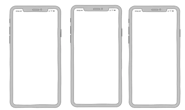
Once you’ve selected the appropriate size template or frame, create a blank canvas for each screen in your user flow and label them accordingly.
For our grocery app example, we determined that we need a total of six screens. So what we should end up with here is six blank mobile app screens labeled Home, Browse, Fruit, Bananas, Shopping Cart, and Checkout.
4. Design the basic layout for each screen
Next, you’ll define the overall structure of each screen. At this point, you’re creating the skeleton for your app, deciding where key elements such as navigation bars, headers, and content sections will go.
This step is all about establishing a clear visual hierarchy. You’re not yet thinking about the content itself, but rather, where it should be positioned on the screen.
To ensure that your design is intuitive, use familiar design patterns. Design patterns are established UI conventions that the user will have already encountered many times in other apps, so they’ll already know, intuitively, how these elements work. Most mobile apps have a bottom navigation bar, for example.
Let’s focus on our home screen. We want this screen to include a search bar, a main navigation menu, and dedicated, dynamic content sections for “Special offers,” “Top picks for you,” and “Order again.”
We’ll use basic shapes, like rectangles and circles, to represent the different content sections we want to include on our screen, as follows:
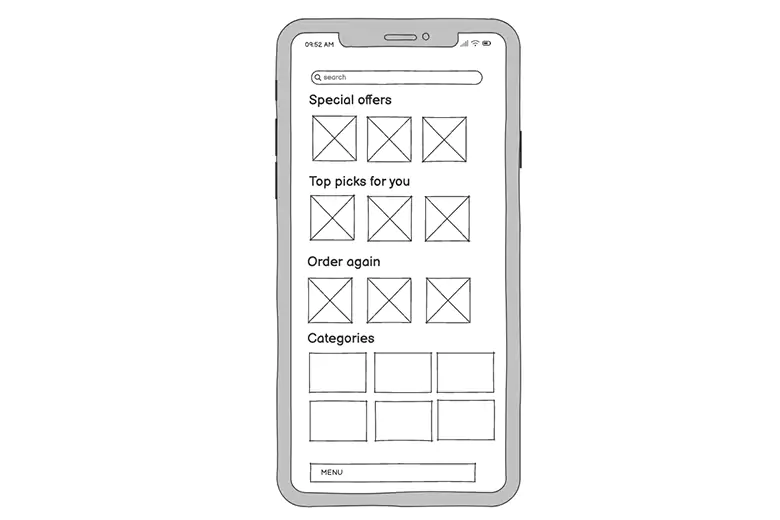
This step is all about deciding what goes where, and ensuring the layout is logical and easy to follow. It’s like creating a blueprint before you add specific content and finer visual detail.
5. Populate each screen with placeholder elements and content
You’ve defined the basic layout for each screen. Now it’s time to bring your wireframes to life with more specific placeholder elements and content. This involves adding components such as buttons, images, and text, providing a more realistic and detailed representation of how the screen should look and function.
Let’s continue with the home screen of our grocery delivery app. For each section we’ve depicted, we’re going to swap out generic shapes for more detail.
In the “Special offers” section, for example, we’ll now elaborate on what kind of information should feature here — such as a product image, a product title, a price, and a ‘plus’ icon to enable the user to add the item to their cart.
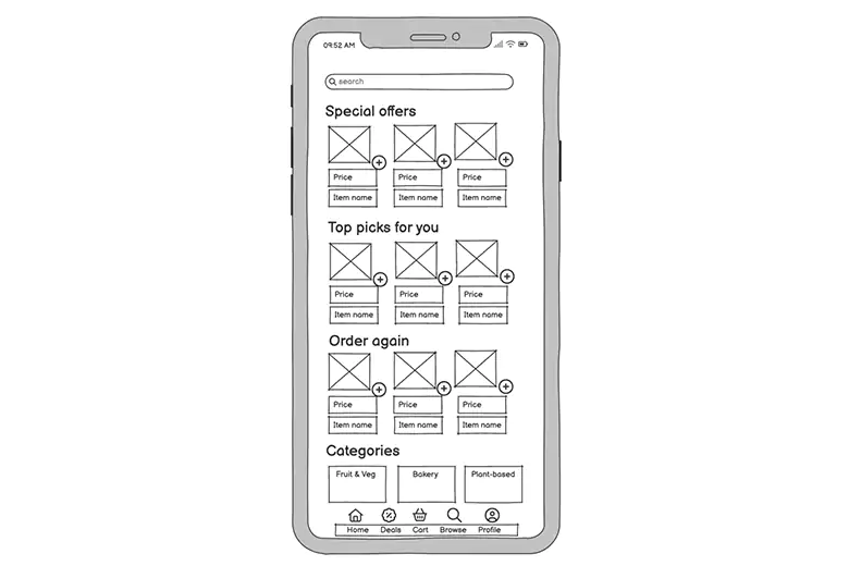
It can be useful to include labels or annotations to provide further detail. For the “Special offers” section, for example, we might add a note to say that this section will feature dynamic content based on what discounts and promotions are currently running.
Repeat this process for each screen in your user flow, maintaining consistency throughout.
6. Connect all screens to visualize the user flow
Once you’ve created your individual screen wireframes, it’s important to connect them together and view them as a whole. After all, no single screen exists in a vacuum: they’re all part of an interconnected system that forms the user’s journey.
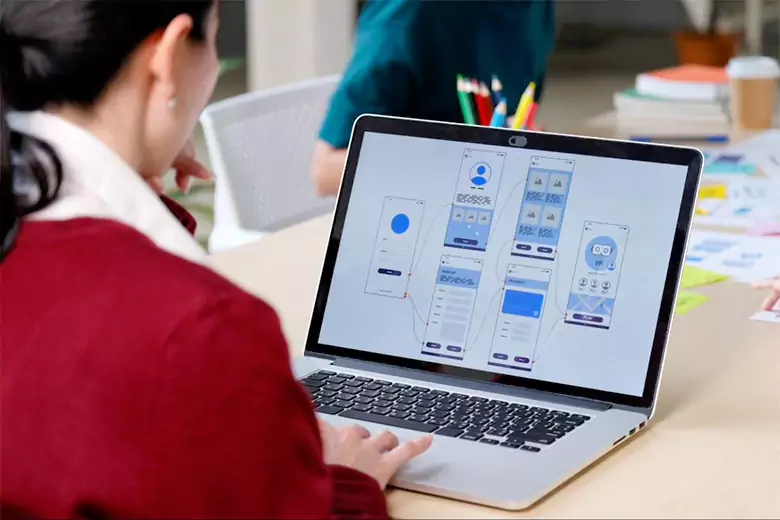
Zoom out to view your wireframes in a single workspace — and, if you haven’t done so already, arrange them in a logical sequence that reflects your user flow. Then use arrows or lines to indicate navigation paths.
These visual connectors should depict how users move from one screen to the next based on specific interactions. For example, you might draw an arrow from the “Browse” icon on the home screen to the dedicated browse screen, and an arrow from the “Fruit and veg” category card on the home screen to the “Fruit and veg” category page, and so on.
Once all connections are in place, review the flow to make sure it aligns with your initial user journey. Check that every screen has a clear entry and exit point, and that users have all the navigational elements they need to get to key areas — such as the home screen or shopping cart.
This should enable you to identify any gaps in your wireframe designs — such as missing navigation elements or unclear pathways — and make changes accordingly.
7. Share, test, and iterate
With your wireframes complete and the user flow fully mapped out, it’s time to share your wireframes with stakeholders and gather feedback. This enables you to iron out any initial design flaws or usability issues before you move on to create more detailed prototypes.
There are several ways to share and test your wireframes. You might start by presenting them to relevant stakeholders (such as fellow designers or product managers), explaining the purpose of each screen, and showing the various pathways the user can take.
You can also test your wireframes by turning them into basic clickable prototypes. Most wireframing tools allow you to connect your screens to simulate the flow in action, allowing you to run very early-stage usability tests.
Finally, having gathered feedback and conducted initial tests, update your wireframes wherever necessary. You might need to add another screen to complete the user journey, for example, or adjust the layout to make certain elements easier to find.

What happens next?
Once you’re happy with your wireframes, the next step in the process is to create prototypes. With your app’s structure and flow in place, you can start to add visual design elements as well as interactivity, moving towards a much more detailed and realistic representation of how your mobile app will look and function once it’s developed.
After prototyping, you’ll conduct usability testing (usually with real users, or with research participants who represent your target group) to identify any usability issues or design flaws.
Based on these insights, you’ll refine your prototypes until they’re ready for development. Finally, you’ll hand your prototypes over to the development team for implementation.
Tips and best practices for creating mobile app wireframes
Now you’re familiar with the mobile app wireframe process, let’s consider some useful tips and best practices to bear in mind.
Keep it simple — focus on functionality
As you create your mobile app wireframes, it may be tempting to think ahead to the finer visual details, such as imagery and color palettes. But this will distract you from what’s most important at this stage: outlining the structure and functionality of your app.
Don’t overcomplicate your wireframes with unnecessary details or intricate designs. Keep it simple, using basic shapes, placeholders, and annotations to communicate your ideas effectively.
This will ensure you get the layout and flow just right before moving on to the app’s visual design.
Design with mobile constraints in mind
Mobile screens are much smaller than laptop and desktop screens, so you’ll be more limited in terms of space when creating mobile app wireframes.
As such, it’s important that you’re ‘thinking mobile’ at all times. This means prioritizing only the most essential elements for each screen, and leaving enough space between elements so that the user can easily tap without error.
At the same time, stick with familiar design patterns that are standard for mobile design — such as a bottom navigation bar or sticky headers (this keeps the screen header in place even when the user is scrolling).
The best way to ensure that your wireframes are optimized for mobile is to start with a wireframe template that’s pre-set for mobile dimensions (this should be an option in most wireframing tools).
Use placeholder content thoughtfully
While you want to avoid going into too much detail in your app wireframes, it’s important that your placeholder content is realistic and accurate. You want to clearly convey the visual relationship between different elements, and get an idea of how space will be taken up on the screen.
As you insert placeholder content, think about sizes and proportions. And, when adding text, try to avoid ‘Lorem Ipsum’ in favor of an actual copy (or something close to what the final version will be). This gives you an idea of how much space is required for each piece of text.
And of course: always design with the end user in mind. Throughout the wireframing process, refer back to your user research and user flows to ensure that every design decision aligns with your users’ needs, goals, and expectations.
The best mobile app wireframe tools
There are many tools out there to help you create mobile app wireframes — ranging from simple, free options to more comprehensive paid software.
Some of the most popular tools include:
- Figma: A highly versatile cloud-based design tool, ideal for creating both wireframes and prototypes. Figma is renowned for its collaborative features, extensive component and template libraries, and responsive design tools, making it a firm favorite among larger design teams.
- Balsamiq: If you want to focus purely on the wireframing process, Balsamiq is a great option. It’s all about simplicity and speed, with an easy drag-and-drop interface and a solid library of common UI components. Balsamiq is ideal for creating low-fidelity wireframes without getting distracted by aesthetics.
- Wireframe.cc: A minimalist, browser-based tool designed for quick and straightforward wireframing. Its clean interface focuses solely on the essentials, allowing you to concentrate on the task at hand. You can also annotate and export your wireframes — ideal for sharing your ideas and gathering feedback.
- Justinmind: A comprehensive tool that covers both wireframing and prototyping. With pre-built UI components, animations, and transitions, you can easily move from low- to high-fidelity all within one platform.
- Sketch: A design industry staple, Sketch is a powerful tool known for its robust feature set and extensive plugin library. Sketch will take you through the entire design process, from creating low-fidelity wireframes and clickable flows to fully interactive, high-fidelity prototypes.

We’ve written a complete guide to the best wireframe tools in a separate post; check it out for a more detailed evaluation of the tools we’ve mentioned here, as well as additional options to consider.
Key takeaways
Wireframing is a crucial step in the design process, bridging the gap between initial concepts and polished prototypes. Your mobile app wireframes provide a clear blueprint for your app — and, by creating them early on in the process, you can catch any major usability issues before you spend time and money on more detailed designs.
And remember: wireframes are not about visual perfection. Focus on functionality, layout, and flow before you move on to aesthetics. Check out this project by AND Learner Yash Ramdas to understand app wireframes better.
Learn more
Knowing how to create mobile app wireframes is just one of many skills you’ll need in the design industry. For more practical guides and insights, check out the following:
- How to Design a Website Wireframe: A Beginner’s Guide
- What’s the Difference Between a Wireframe and a Prototype?
- A Complete Guide to App UI Design (With Examples)
Next Steps
In case you think you need further assistance, here are some of our resources you can consider:
- Watch this session by Shiva Viswanathan, Design Head of Ogilvy Pennywise, and Naman Singh, Product Experience Designer at RED.
- Talk to a course advisor to discuss how you can transform your career with one of our courses.
- Pursue our UI UX Design courses – all courses are taught through live, interactive classes by industry experts, and some even offer a Job Guarantee.
- Take advantage of our scholarship and funding options to overcome any financial hurdle on the path of your career transformation.
Note: All information and/or data from external sources is believed to be accurate as of the date of publication.


