Learn how designers are using the rule of thirds to transform the visual design of interfaces and engage their users–and how you can use it too!
SUMMARISE WITH:
Learn how designers are using the rule of thirds to transform the visual design of interfaces and engage their users–and how you can use it too!
The field of design can feel like it’s filled with principles, rules, and standards that designers have to adhere to. And, for those new to the field it can feel nothing short of daunting. But this is not always the case.
Let’s talk about the rule of thirds, a popular guideline (not a rule) common to visual arts fields. It recommends the use of a simple gridlike template for the arrangement of design elements on the page.
This rule is popular with design teams because, when implemented, it creates effective visual hierarchies, engaging content arrangements, and balanced compositions as well as interfaces that effortlessly support responsive design principles.
While implementing the rule of thirds is by no means a mandatory requirement for every design, it’s a hugely valuable tool every new designer should have in their toolkit to create compelling interfaces that help users reach their goals.
Contents:
- What is the rule of thirds?
- Why use the rule of thirds in UI and UX design?
- How to apply the rule of thirds to your designs
- Best practices for using the rule of thirds in your design projects
- Conclusion
Ready to learn more about the rule of thirds and how to implement it in your UI and UX designs? If so, then read on.
What is the rule of thirds?

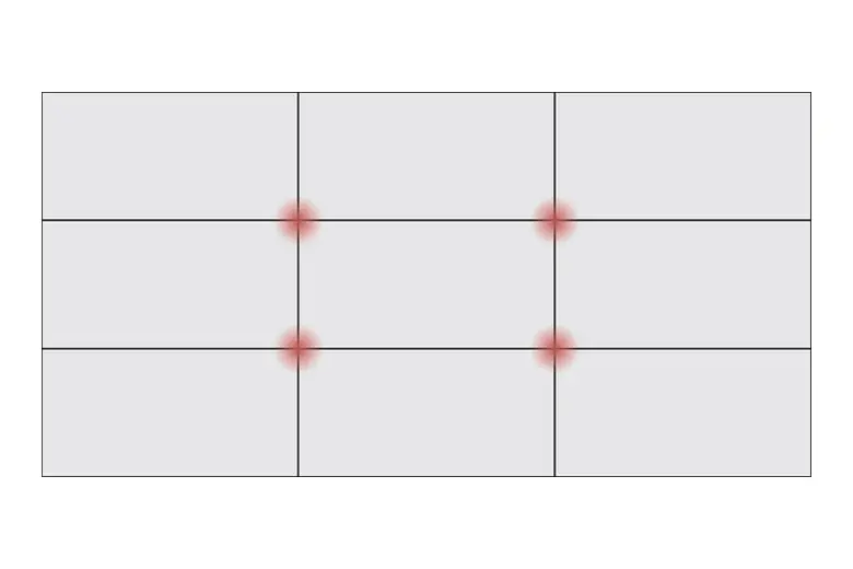
The rule of thirds is the name given to a visual guideline used by designers when creating an image and it sees the page divided up into columns and rows forming a grid of nine equal-sized squares. This deceptively simple approach to layout design is popular with UX and UI designers because it helps them align images, text, and design elements of an image or interface, to create visual harmony while facilitating the viewer’s natural eye movement across the page. By arranging elements in accordance with the grid, designers also make it easier for users to interpret the content on the page, prioritize its importance, and digest its meaning.
Why use the rule of thirds in UI and UX design?
Enhancing aesthetic appeal and supporting a harmonious design are just two of the reasons why designers rave about the rule of thirds. Let’s dive into the details of how this unique system can enrich your designs and assist your users in reaching their goals.

1. Supports visual hierarchy
Visual hierarchy refers to a pattern in the visual field that sets the priority of some design elements over others, depending on their importance. The rule of thirds helps designers create a clear and compelling visual hierarchy on an interface by encouraging the placement of primary elements on grid lines or at intersections. By strategically placing the most important design elements in these key positions, the design team can be confident that the content they want to prioritize will receive the most attention from users. But that’s not all. The emphasis on key content enables more intuitive navigation, guiding users effortlessly to where they want to be.
2. Creates a balanced composition
The rule of thirds supports balanced composition by encouraging the designer to place key elements and subjects off-center in order to create a more visually stimulating layout that guides users to what they are looking for. While this may sound like an imbalanced approach to visual design, the opposite is actually true. By placing design components, images, and key text along the gridlines or intersections of the grid, designers can more easily achieve a dynamic composition that is both asymmetrical and balanced–a combination that is engaging to the user without being visually discordant or unsatisfying.
3. Works with responsive design
An additional benefit of using the rule of thirds when designing a page or interface is that it supports responsive design–an increasingly important aspect of the design process. With more and more users looking at web pages on their phones, tablets, and laptops, designs need to be coherent and cohesive across a broad spectrum of screen sizes. The rule of thirds supports responsive design by providing a solid foundation for a design to succeed across various devices and different-sized screens. With the screen divided into thirds (or a grid of 3x3), the
alignment and focal points remain effective even when the layout shifts or is enlarged or decreased. This enables the designer to much more easily adapt their content for different screens without adjusting or changing the original design–ensuring a cohesive and high-quality user experience irrespective of how the user is interacting with the interface.
How to apply the rule of thirds to your designs
Let’s look at how you apply the rule of thirds to your designs to capture your user’s attention and direct it to where it needs to be on the page.

1. Set up your grid
Your first step when applying the rule of thirds to your design is to draw a grid. Starting with a clean design space, divide it up into a 3x3 grid consisting of three vertical sections and three horizontal sections. Once these are drawn, you’ll see you have created nine equal segments on the page as well as four intersecting points where the horizontal and vertical lines meet. If you don’t feel confident drawing this freehand, consider utilizing a digital design tool such as Figma or Sketch. Many tools offer a grid layout function that does the job for you. With a digital tool, you can ensure the precision of your grid and visualize where you might place design elements. While it can be tempting to follow the lines of your grid rigidly, this is not the ethos behind the rule of thirds. Rather, use the layout as a rough guide for the visual hierarchy and to maintain balance and focus.
2. Identify key interface elements
Before you start placing any design elements on your grid, you’ll need to pinpoint the components you wish to draw the most attention to on the interface.
Ask yourself:
- What do you want the user to see first when they land on the page?
- What action do you want the user to take?
- What message should stay in their mind?
- Are you guiding them towards reaching their goals?
Make a list of all of the design elements you would like to include on the interface. These might include a text header, an image, a drop-down menu, a call-to-action button, a logo, or an icon. Then, consider which elements are the most important to the message and the design; for example which elements drive interaction and which encourage decision-making. By prioritizing page elements at this stage, you’re better placed to decide what needs to be emphasized visually within the rule of thirds grid when the time comes.
3. Arrange key elements on the grid
Now you’re ready to strategically arrange the key design elements on your grid. The guidelines here dictate that:
- High-priority content should be placed near the intersections of the grid lines. This is because it’s at these intersections that a user’s gaze is most likely to naturally fall.
- Headlines, buttons, or striking visuals work well at intersections because they attract the user’s attention without overwhelming the entire interface.
- Balancing out your content, for example, by placing a product image on the left with the product’s description on the right, creates visual balance and reduces clutter on the page while guiding users through the content in a way that feels intuitive to them.
- The goal here is harmony, not symmetry. Be mindful of how you place your content to make the biggest impact on your users.
4. Align your text
Text can sometimes be an afterthought in design, but it shouldn’t be. Using the rule of thirds to position your text ensures your key text elements like headlines and CTAs become natural focal points for the user, drawing in the user’s eye in an organic way and hugely improving readability. To do this effectively:
- Place text on the intersecting lines of the grid
- Align key text elements with one of the vertical thirds
- Don’t feel compelled to center everything or align your content purely based on the grid
5. Position navigation elements
Good navigation is key to the user experience. Users want to find what they’ve come to your site or app for quickly and easily. The rule of thirds can be a great guide when to placing navigational elements like menus, buttons, and interactive elements in a way that naturally helps users gravitate to where they need to be.
To do this:
- Align primary navigation elements with the top horizontal third or the left vertical third to support browsing patterns for desktop interfaces
- For mobile apps, place key interaction elements like bottom navigation bars or floating action buttons at a third of the screen’s height or width to support visual balance and usability
6. Don’t forget images and media
Your visuals will define the look and feel of your site, communicate your brand’s personality, and send a strong message about what you stand for. Whether it’s a product image, an embedded video, or a banner, it’s important to try to create visual interest and engagement to draw your users in. The rule of thirds can be a really effective guide for helping you achieve these things.
Pro tip: Avoid simply centering the subject or image on the page and instead align it so that its main focal points fall on one of your four intersection points on the grid
Best practices for using the rule of thirds in your design projects
These tips will ensure you benefit from the rule of thirds and create well-balanced, navigable interfaces that convey your message clearly and consistently to the user.
1. Consistency comes first
As a design principle, the rule of thirds can be hugely helpful for designers looking to create more visually balanced interfaces that subtly emphasize the key components and messages of the page. However, despite its benefits, it’s important to remember that the rule of thirds should only ever be observed as a guiding principle rather than a hard and fast rule. How it is used depends very much on the designer’s discretion and the needs of the brand. Consistency, on the other hand, is non-negotiable in UX and UI design. Consistency in visual design supports meaningful messaging, intuitive interactions, reduced cognitive load, and increased usability. Together these things build user trust and loyalty in a brand. When designing your interface, never compromise consistency to adhere to the rule of thirds; consistency and a cohesive user experience should always come first.

2. Be selective about what goes on intersections
As we’ve seen, the intersections of your grid are where the magic happens. By placing key design elements, visuals, or text at these four critical points on the page, the user is naturally guided to the areas you want them to go. This improves usability and supports the users’ natural eye movement between different areas of the page. However, once you’re aware of how effective it is to place elements at these key intersections, it can be hard to stop. Designers can get carried away overcrowding the intersections with buttons and headers, ending up with too many items that are close together on the page. When this happens, the whole purpose of the grid becomes redundant, as the result is a cluttered, confusing, and chaotic interface where users struggle to reach their goals.
For this reason, be highly selective about what goes on the grid’s intersection points and use them only for the elements that you really want to stand out, leaving plenty of space around them, too.
3. Balance text and images
You can use your grid system to create visual harmony on your interface. Rather than overwhelming users with loads of images, or too much text, you can balance out text and images by placing them at even intervals along the lines and spaces on the grid you have created. This will ensure that neither one nor the other dominates the page and that there is adequate space between elements.
4. Don’t forget to test
As we’ve seen the rule of thirds is a great tool in the UX and UI designer’s tool kit for guiding the creation of powerful and engaging visuals. However, it does not guarantee perfect visual design. A user’s response to a design will depend on context, culture, and the platform itself- which is why testing with real users is a key part of the process. There are a few ways that you can do this.
- A/B testing
- Heatmaps
- Usability testing
These testing methods will enable you to get a feel for how real users interact with your design, allow you to assess the ease with which they can reach their goals, and validate your design decisions. Be mindful of the fact that the rule of thirds should enhance the user experience overall, rather than simply create an aesthetically-appealing layout.
Conclusion
We hope our guide to the rule of thirds gives you the confidence to go forth and experiment with this handy UX and UI design tool. This deceptively simple gridlike template for the arrangement of design elements on the page will help you create a more balanced composition, a visual hierarchy that communicates the importance of specific elements, and a design that works effectively across multiple devices and platforms.
Next Steps
Want to learn more about UI UX design? We’ve got more insightful articles like this one over on the AND Academy Design Blog. You can also check out this project by AND Learner, Aromal Jose Baby to get inspiration for your next project!
In case you think you need further assistance, here are some of our resources you can consider:
- Watch this session by Shiva Viswanathan, Design Head of Ogilvy Pennywise, and Naman Singh, Product Experience Designer at RED.
- Talk to a course advisor to discuss how you can transform your career with one of our courses.
- Pursue our UI UX Design courses - all courses are taught through live, interactive classes by industry experts, and some even offer a Job Guarantee.
- Take advantage of our scholarship and funding options to overcome any financial hurdle on the path of your career transformation.
Note: All information and/or data from external sources is believed to be accurate as of the date of publication.


