Looking for some new ideas for a UX or UI design project? If so, check out our breakdown of the designs behind some of the most well-known apps and brands out there.
Designers are always looking for inspiration to inform their projects, learn from experts in the field, and stay ahead of trends in their design niche. If you’re looking for some ideas for your next UI UX design project, you’ve reached the right place.
In this article, we’re going to break down the UX and UI designs behind some of the biggest apps and brands out there, from Spotify to Netflix, and run through exactly how these brands have successfully used design principles to inform and create engaging experiences for their users that keep them coming back again and again.
Contents:
- What’s the difference between UX and UI design?
- 3 UX design examples to inspire you
- 3 UI design examples to inspire you
- Conclusion
Ready to learn more? Then, read on to learn about some of the best UI UX design examples below!
What’s the difference between UX and UI design?
UX (user experience) and UI (user interface) design are two related fields that fall under the umbrella of digital product design. However, although there are numerous similarities between the two fields, they are distinct in their aims and outcomes.
The field of UX design is primarily concerned with a user’s overall experience with a digital product or service. The UX designer aims to design and create experiences that are meaningful and relevant to users at every stage in their customer or user journey with a brand and its products. To achieve this goal, UX designers and teams conduct extensive research into users’ needs, goals, pain points, preferences, and behaviors. The insights from this research often inform the navigation, structure, and flow of a product to ensure intuitiveness and effectiveness.
UI design, on the other hand, zooms in on the visual aspects and interaction elements of a product. A UI designer is concerned with how a product or service looks and feels, paying special attention to layout, typography, icons, elements, and buttons. Their goal is to ensure that the digital interface is consistent, accessible, and aesthetically pleasing.
UX and UI designers work closely together when designing digital products and services, with UX designers contributing the analytical work involved in fully understanding the user’s journey, and the UI designer contributing visual and interactive details that provide an engaging interface.

UX design examples to inspire you
Let’s dive into some UI UX design examples of how leading brands use UX design to improve the experiences of their users and help them reach their goals.
1. Online banking with N26
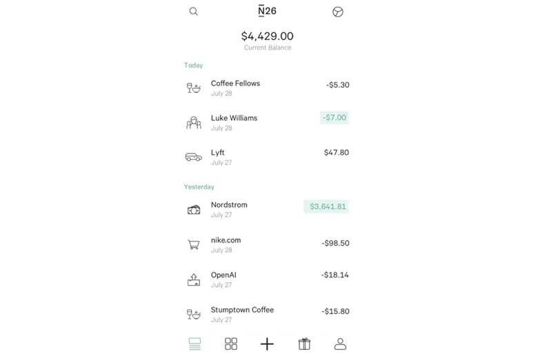
Image Courtesy: Behance
Founded in 2013, N26 is a fully mobile online bank, boasting millions of customers across Europe. The app for the German-based company provides an excellent UI UX design example thanks to its intuitive and user-centric approach that makes banking and personal finance management simple and easy for its users. A central component of the banking app’s design is its clean and minimalistic interface. The composition of the interface’s layout and the placement of interactive elements support seamless navigation without overwhelming users with features or buttons they don’t need or use. Instead, key user needs, such as transaction notifications, spending overviews and insights, and easy money transfers, are prioritized, enhancing the convenience factor for users without app security or user control being compromised.
From a data security perspective, users can also enjoy features such as customizable security settings and a biometric login option, promoting a feeling of safety when using the app. Overall, the app’s prioritization of a clear interface, simple design, and meeting key user needs with easy-to-use features make it an exceptional example of a highly effective UX design.
Key design features of N26
- Real-time notifications
- Actions tab for key activities
- MoneyBeam for instant transfers
- Clean, minimalist interface for easy navigation and findability
- Mobile-first design
- Expenses tracking
- Integrated with numerous third-party services
- Customizable settings
2. Online shopping experiences with ASOS
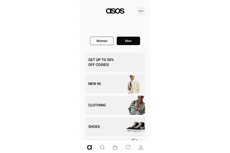
ASOS is a British online-only fashion and cosmetics retailer that was founded in London in 2000. Users can browse and shop for high-quality clothing items and beauty products on the company’s app by interacting with the user-friendly interface. The app supports searching and browsing for items at leisure thanks to its seamless, intuitive navigation system and clear tagging and categorization of items. This effective content organization enables users to easily filter their preferences such as style, price, and color in order to find the specific type of garment or product they are searching for. In addition, product pages that include detailed item descriptions, high-quality photographs, and even videos support customers in making the right purchasing decisions.
Another major UX design highlight of shopping with ASOS is the use of personalized recommendations that show users a wide range of items fitting their needs and preferences as per their browsing histories. Finally, when a user has decided on what they want to buy, the checkout process is fast and efficient, with the system supporting multiple payment methods for maximum accessibility. Trust and convenience in the brand are further supported by the integration of customer reviews and an easy returns policy.
Key design features of ASOS
- Wide range of customizable features
- High-quality images and videos
- Well-organized content
- Effective tagging that supports users’ filtering to match their preferences
- Seamless and swift checkout process
3. Meditation and wellness audio with Calm
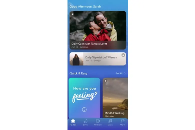
The popular meditation and wellness audio app, Calm, is a tool designed to help individuals sleep better, meditate, and find moments of serenity in their daily lives to support better mental health. With its user-centric design, visually soothing and clean interface, intuitively organized content, and wide range of features, the app is praised by UX designers and app users alike. Calm has also won Apple’s 2017 iPhone App of the Year Award and an Editor’s Choice distinction from Google Play in 2018.
What sets this app apart from its competitors is its personalised onboarding process which enables users to create their own wellness goals such as better sleep or reduced stress levels. With these hoped-for outcomes inputted by the user, the app then tailors the content they are shown to help them achieve these goals. Standout design elements include sounds from nature, a muted color palette, and gentle, instructive animations that promote a calming ambiance and mirror the brand’s messaging and tone. In addition, a well-organized and searchable content library makes finding the right wellness tools easy for users, with the app providing a wide range of sleep stories, music tracks, and guided meditations to promote rest and relaxation. Finally, the app can be integrated with wearable devices and offers progress tracking and reminders, all of which help users maintain positive routines and habits.
Key design features of Calm
- Tailored content based on user goals and preferences
- Clean, minimalist interface
- User-centric design
- Consistent branding experience across the app
- Searchable content library
- Wearable device integration
UI design examples to inspire you
Curious to learn about the very best examples of UI design? Let’s take a look at these industry leaders.
1. Music streaming with Spotify
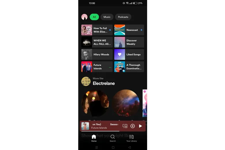
Music streaming service, Spotify, is exemplary when it comes to UI design. The app’s clean and simple layout and intuitive navigation offer an uncluttered and well-organized first impression without overwhelming users or contributing to cognitive overload. In addition, the app’s consistent design language–including a cohesive color scheme of green, black, and white, easy-to-understand iconography, and clear typography–builds trust with users, supports brand recognition, and increases familiarity.
A stand-out feature of the app is the seamless search functionality it offers when a user is looking for a particular song, artist, album, playlist, or podcast. The strong search function responds quickly, displaying results in order of relevance and within useful categories that support user understanding of different genres. Finally, the use of compelling images, videos, and animations that are integrated with different artists’ artwork, logos, and music create a visually appealing interface for users that complements the audio experience. While interactivity is also used to enhance the interface, it is implemented subtly so as not to distract users from what they came to the app for: listening to music.
Key design features of Spotify
- Robust search function
- Consistent design language
- Well-organized content
- Integration of image, video, and animation to increase appeal
2. Book summaries with Blinkist
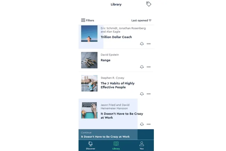
Blinkist is a book summary app that helps users digest key insights from leading non-fiction books in around 15 minutes. One of the first things you’ll notice about the user interface of the app is the appealing imagery the brand uses to draw users in and communicate information about different books. By using high-quality book covers and related images, the app enhances its visual appeal with users while supporting them in swiftly identifying the content they want to consume. In addition to these images, the iconography and visual representation of different book categories help with content discovery as users can see at a glance the different genres and subject areas available.
Accessibility is another UX design principle that is highly prioritized at Blinkist. The app includes adjustable text sizes and audio options, enabling those with visual or auditory impairments to access the content with ease. Another key feature of the app’s UI design is its interactive aspects. Users can highlight key points, create bookmarks, and even make notes on the content, all of which enhance their engagement and satisfaction with the app and boost the number of interactions they make with the content on offer. Finally, Blinkist also offers personalized content recommendations based on a user’s history, reading habits, and personal preferences. Not only does this boost user trust in the app and help users find the content they need, but the book titles are displayed in a way that makes it extremely easy for users to browse through, identify, and explore.
Key design features of Blinkist
- Highly accessible UX design
- Numerous interactive features for enhanced engagement
- Personalised content recommendations
- High-quality images
- Optimised content discovery through eye-catching iconography
3. On-demand video streaming with Netflix
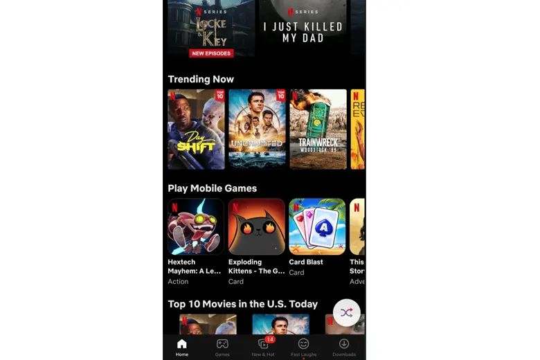
Founded back in 1997, subscription-based streaming service, Netflix, has grown into one of the largest entertainment companies in the world, boasting 270 million paid memberships in over 190 countries. The company’s app demonstrates how a clean, uncluttered, and simple user interface that is focused on content discovery is what leads to the most positive experience for users. With a sidebar for quick access to different sections such as Home, TV Shows, and Movies, content is quick to access and navigation is straightforward to manage. Scrolling carousels of different shows also boosts the efficiency of exploring categories and recommendations and enables users to process a lot of information at a glance.
As we’ve discussed with some of the other apps in this list, Neflix’s UI is personalized, with content and products tailored to a user’s viewing preferences and watch history. These recommendations are prominently displayed on the interface to enable users to quickly find their next favorite show. A consistent design language that represents a unified and familiar brand experience, a strong visual hierarchy, and high-quality images and trailers further contribute to Netflix’s impressive UI design. Additionally, the design team’s consistent approach to responsive design–enabling viewers to switch between tablet, laptop, and smartphone–brings about a cohesive overall impression and helps to maintain a high-quality experience across all devices.
Key design features of Netflix
- Prominent sidebar for seamless navigation
- Prominently displayed carousels of personalized content for easy scrolling
- Consistent and unified branding across the platform
Conclusion
We hope you’ve enjoyed this run-through of UI UX design examples of the leading apps and brands out there today. The expert UX and UI designers behind these industry-defining apps have focused on user-centricity, strong navigation, and an intuitive yet engaging experience, in doing so effectively catering to their users’ preferences and setting themselves apart from their competition.
We also recommend checking out this UI UX Project by AND learner Abhishek Singh for a deeper understanding of how principles are applied to real clients and briefs.
Next Steps
If you’d like to learn more about UI development, head back to the AND Academy blog for more articles like this one.
Here are some specific action points and further resources for you to consider:
- Watch this session by Shiva Viswanathan, Design Head of Ogilvy Pennywise, and Naman Singh, Product Experience Designer at RED.
- Talk to a course advisor to discuss how you can transform your career with one of our courses.
- Pursue our UI UX Design courses – all courses are taught through live, interactive classes by industry experts, and some even offer a Job Guarantee.
- Take advantage of our scholarship and funding options to overcome any financial hurdle on the path of your career transformation.
Note: All information and/or data from external sources is believed to be accurate as of the date of publication.


