Make sure your next website UI design project is a success. Discover the 6 elements of a great website and take inspiration from our stunning real-world examples.
Some websites are an absolute delight—beautiful, easy to use, and highly efficient. Others, not so much. You know the type: confusing, chaotic, or downright dull.
When it comes to website UI design, you want to make sure you fall into the first category. No matter what kind of website you’re creating, it’s essential that your design is functional, user-friendly, and visually on-brand.
So how do you achieve that?
In this post, we unlock the six key elements of effective web design and share ten stunning examples of beautiful web UI in action. Enjoy them, learn from them, and use them to inspire your next design project.
Contents:
- What are the elements of effective website UI design?
- 10 examples of stunning website UI design to inspire your next project
- Getting started: the best website UI design templates and tools
- Learn more about website UI design
Let’s jump in.
1. What are the elements of effective website UI design?
Effective website UI design is all about delivering a great user experience and visual appeal. The goal is to engage the end user, facilitate their journey throughout the website, and ultimately encourage them to take a specific action—be it making a purchase, subscribing to a newsletter, or returning time and time again to enjoy the website’s content.
That’s great website UI design in a nutshell. But what specific elements and characteristics achieve this effect?
Here are six important qualities that all the best websites possess:
- Visual appeal. The first thing you’ll notice about your favourite websites is that they look great. Whether it’s a beautiful colour palette, eye-catching animations, intriguing scroll patterns, or simply perfect use of white space—looks certainly matter in the world of web design.
- Usability. Beyond the surface, it’s essential that a website is both easy and enjoyable to use. This requires intuitive navigation, a logical layout and structure, keeping cognitive load to a minimum (not requiring too much mental effort from the user), and making use of familiar design patterns.
- Accessibility and inclusivity. The best websites are accessible to, and inclusive of, everybody. They are designed with a diverse user base in mind, incorporating accessibility features, inclusive language, and culturally sensitive design choices.
- Consistency. Well-designed websites feel familiar, predictable, and coherent—and that’s because they’re created with consistency in mind. They implement a cohesive visual style throughout, and there are no surprises in terms of how things work. That’s paramount for a great user experience!
- Efficiency. Most websites are designed to solve a particular user problem or to facilitate a specific action. An e-commerce website is designed to encourage people to purchase. A nutrition-focused website might be designed to help people eat more healthily. So, another marker of a great website is how efficiently it enables the user to achieve their goals. Can the user complete their tasks quickly and easily? Or is the process complicated and cumbersome?
- Excellent microcopy. How many times have you browsed through a great-looking website, only to find yourself irked by the awkward or confusing website copy? Microcopy (aka UX writing) has a crucial role to play in website UI design. It covers all the messaging that guides the user through the interface, providing reassurance, confirmation, or support in times of error. All the best websites have been infused with microcopy magic, most likely at the hands of a skilled UX writer.
Now we’re familiar with the markers of awesome website design, let’s explore these qualities in action with some real-world examples.

2. 10 examples of stunning website UI design to inspire your next project
Stripe
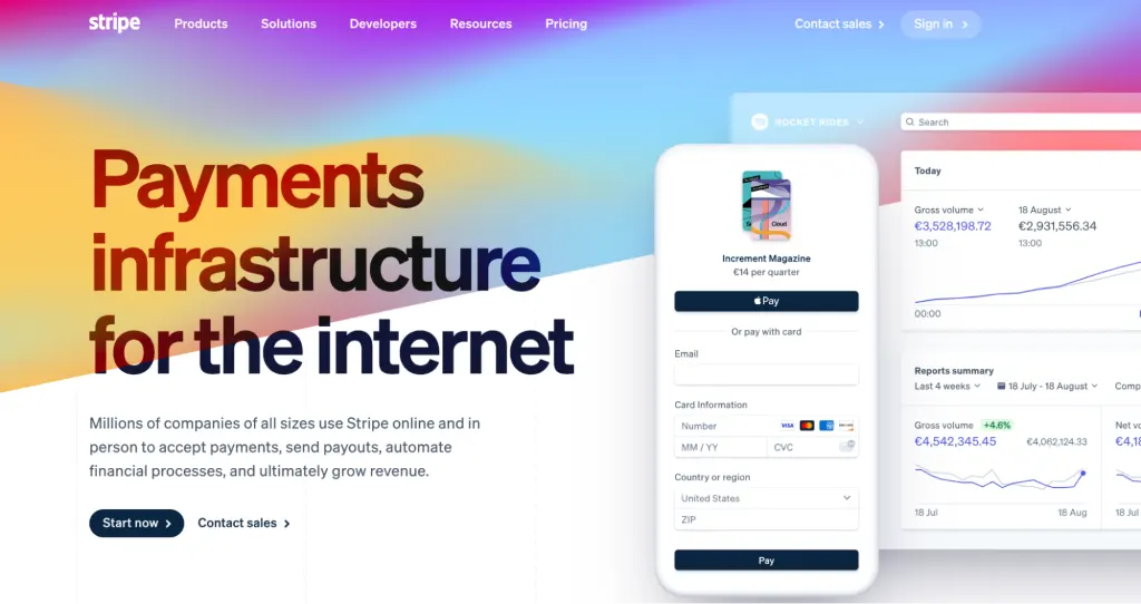
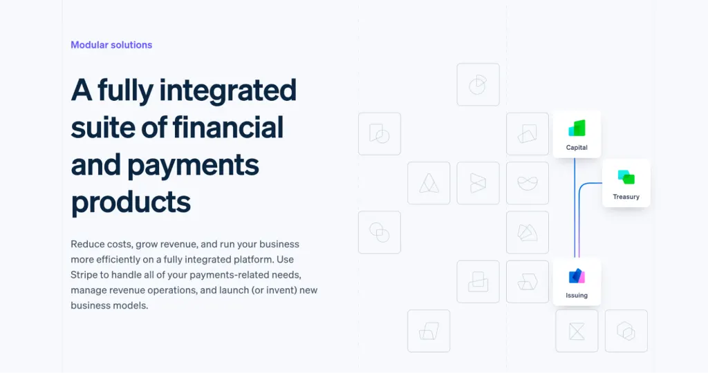
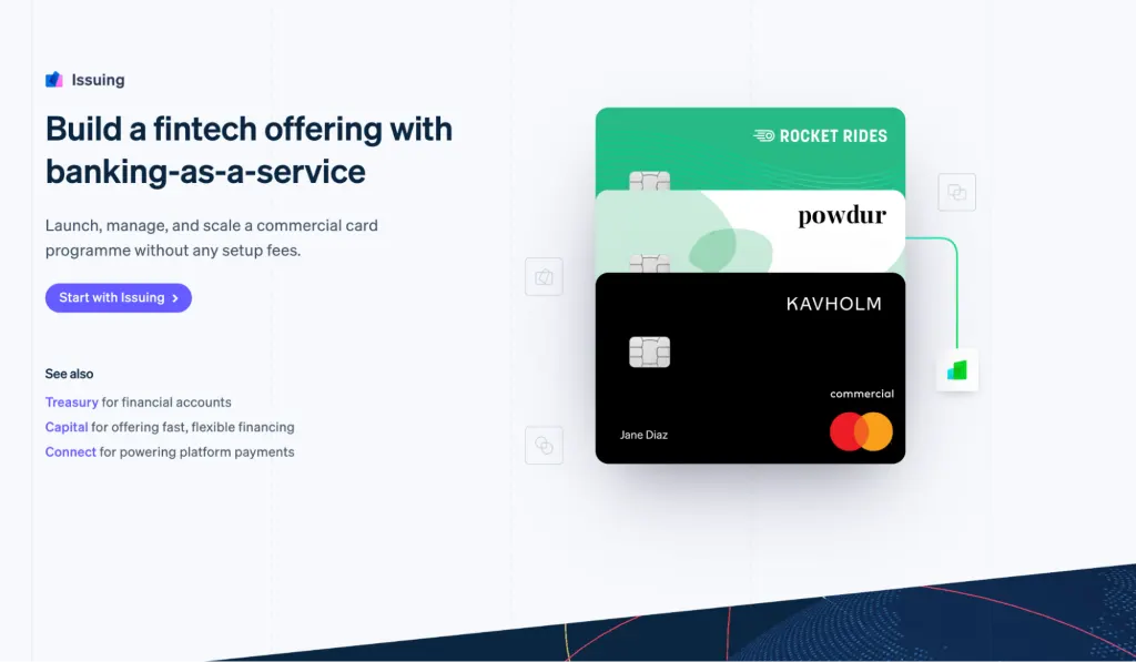
Stripe is a financial technology company that provides a platform for online payment processing. They are geared towards businesses of all sizes, ranging from small startups to large enterprises.
Now, fintech is not typically a bright-and-breezy topic. But, with their website UI design, Stripe hasn’t gone down the boring route. The website employs a powerful combination of clean, minimalist design (look at that excellent use of white space!) and bold, vibrant colours. The result is clean, clutter-free, and easy to digest—yet eye-catching enough to make an impression.
Aesthetics aside, the intuitive navigation, clear menu labels, and jargon-free copy all work together to ensure a seamless user experience.
Webflow
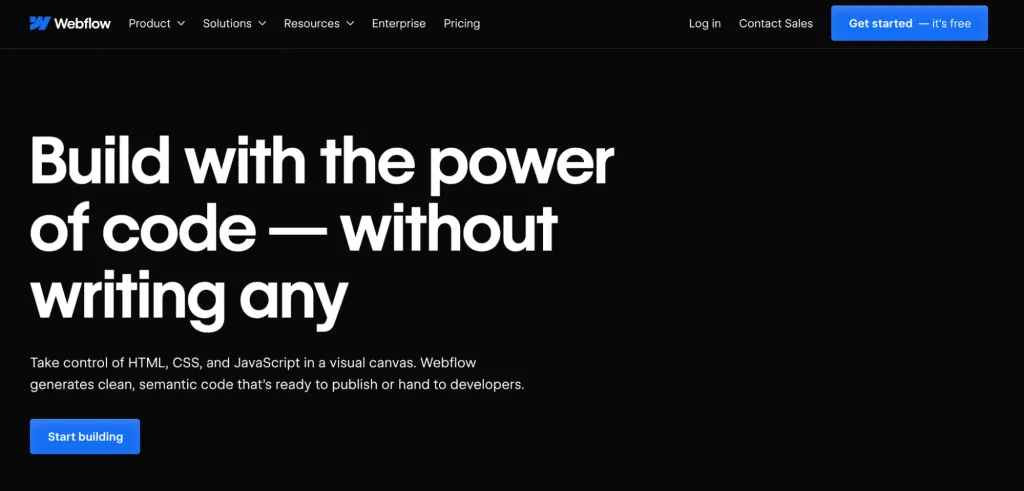
Webflow is a cloud-based web design and development platform that allows users to create responsive websites without any coding knowledge. The technology behind Webflow might be considered rather complex, but the website UI design is not.
And that’s no accident. The designers behind the Webflow website clearly recognised the importance of resonating with a less technical audience, so they made sure to create a design that’s extremely clear and accessible.
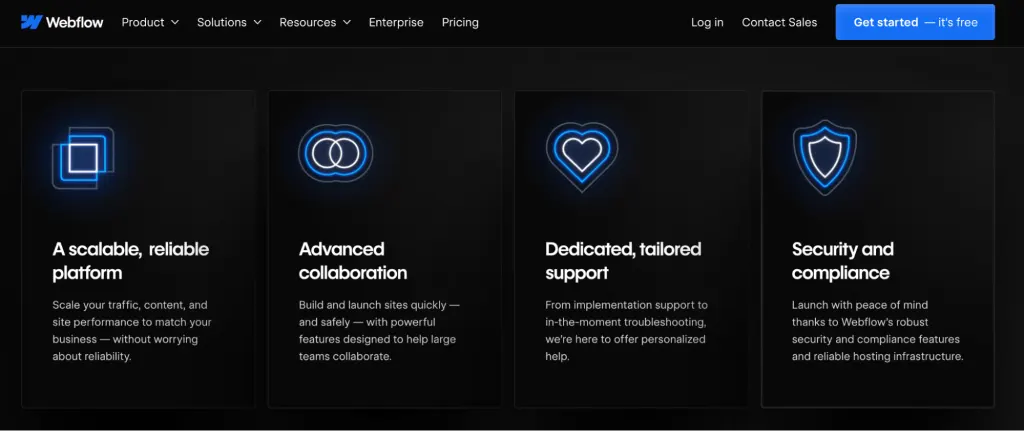
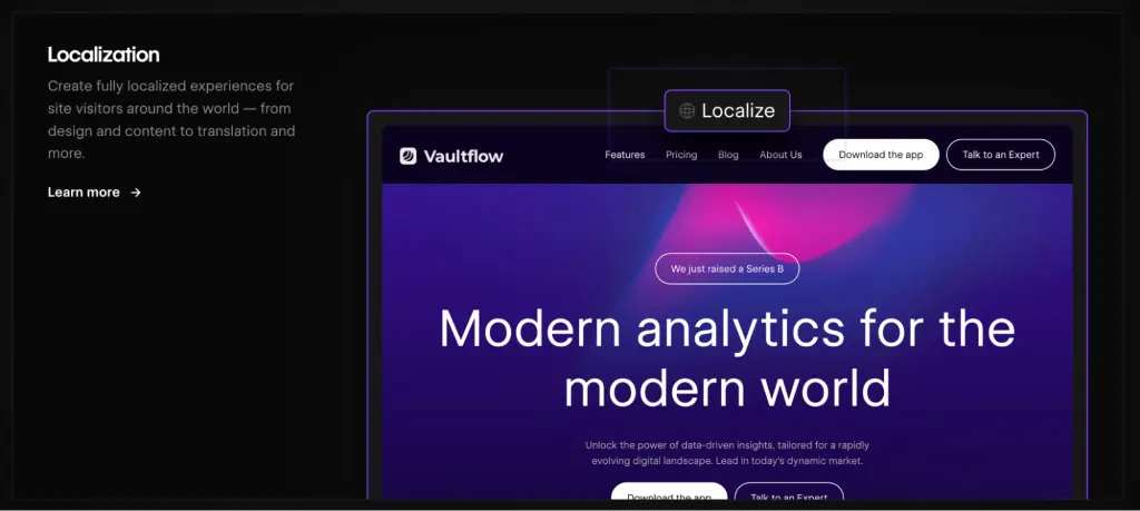
The Webflow website is undeniably sleek. White text on a black background creates ultimate contrast, with pops of blue to help important call-to-action buttons stand out. There’s negative space in abundance, ensuring a clean, well-balanced aesthetic, while custom icons and animations add a touch of dynamism and visual intrigue.
Then there’s the delightfully concise microcopy that features throughout. Every single word has been chosen with care, leaving the reader in no doubt as to what the Webflow product offers and why it’s valuable. A great example of how to present a complex tool with clarity!
National Geographic Kids
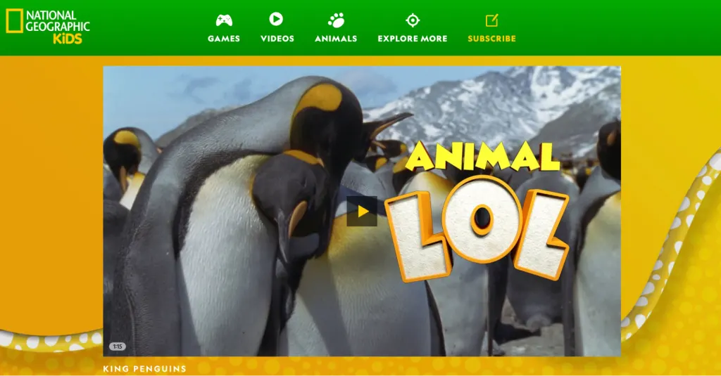
National Geographic Kids is a branch of the National Geographic Society that provides content and educational resources specifically tailored for children. It includes a magazine, books, educational materials and, of course, a website.
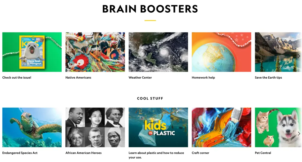
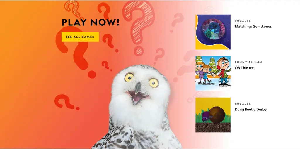
The National Geographic Kids website is an excellent example of user-centric design in action. The entire website UI design is geared towards a young audience, with the goal of inspiring and engaging kids in key topics related to science, nature, geography, and culture.
The colour palette is fun, bright, and colourful—and appropriately nature-inspired with its cheerful yellows, greens, and blues. The typography is playful and engaging, and you’ll find plenty of interesting imagery throughout.
The overall effect is approachable, accessible, and intriguing—encouraging the user to learn and explore to their heart’s content.
IV. Epicurrence
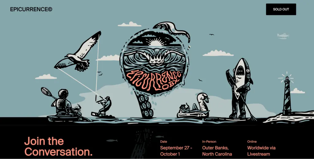
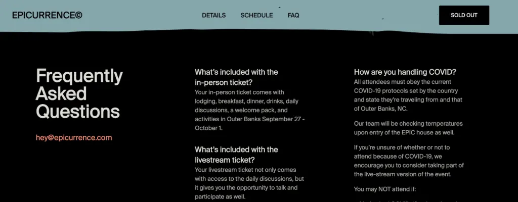
Epicurrence is an event series and community created by designer Dann Petty. The goal is to bring creative professionals together to foster collaboration and skill development among designers, developers, and other industry experts. Epicurrence is particularly renowned for its unique approach to conferences which often take place in inspiring locations.
Speaking of inspiring…the Epicurrence website is one of the most creative website UI designs we’ve come across. Elaborate custom illustrations take centre stage, accurately reflecting the originality and uniqueness that Epicurrence stands for.
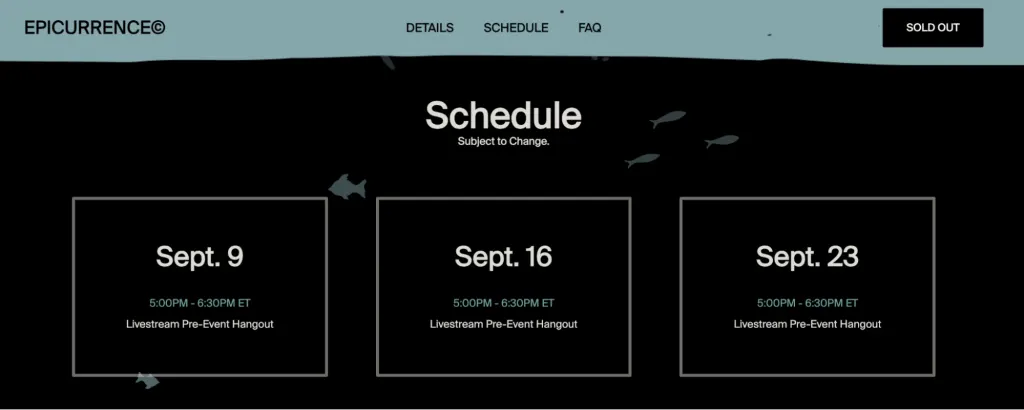
In contrast, the clean, sans-serif typeface used throughout evokes simplicity and clarity, ensuring that all key information is legible and accessible.
Altogether, the Epicurrence website provides a great example of how high-impact visuals, modest typography, and a unique colour palette can work harmoniously together for a truly memorable UI.
The Museum of Modern Art
The Museum of Modern Art (MoMA) is one of the most influential art museums in the world. Located in New York City, it’s dedicated to the collection, preservation, and exhibition of contemporary artworks.
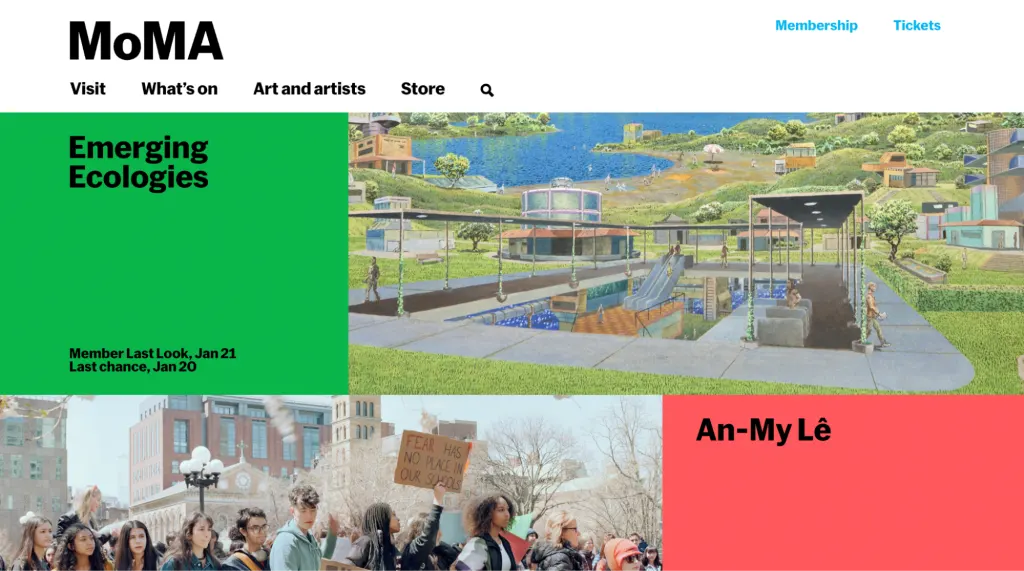
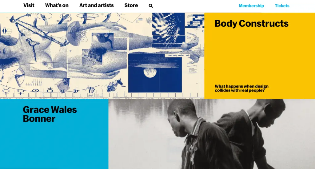
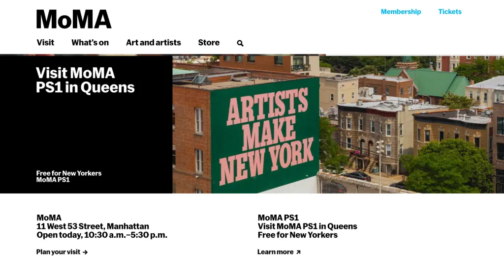
MoMA is all about innovation and breaking the mould, so it’s no surprise that their website’s UI design is a work of art in itself. Everything about it creates the feeling that you’re not scrolling through a website, but rather, flicking through the pages of a glossy editorial magazine.
It uses a grid layout—an ideal format for showcasing multiple exhibition types—with high-quality images providing the main focal point. The overall aesthetic is modern, cool, and eclectic; a fitting website for an organisation that celebrates diversity and creativity.
VI. Le Coucou
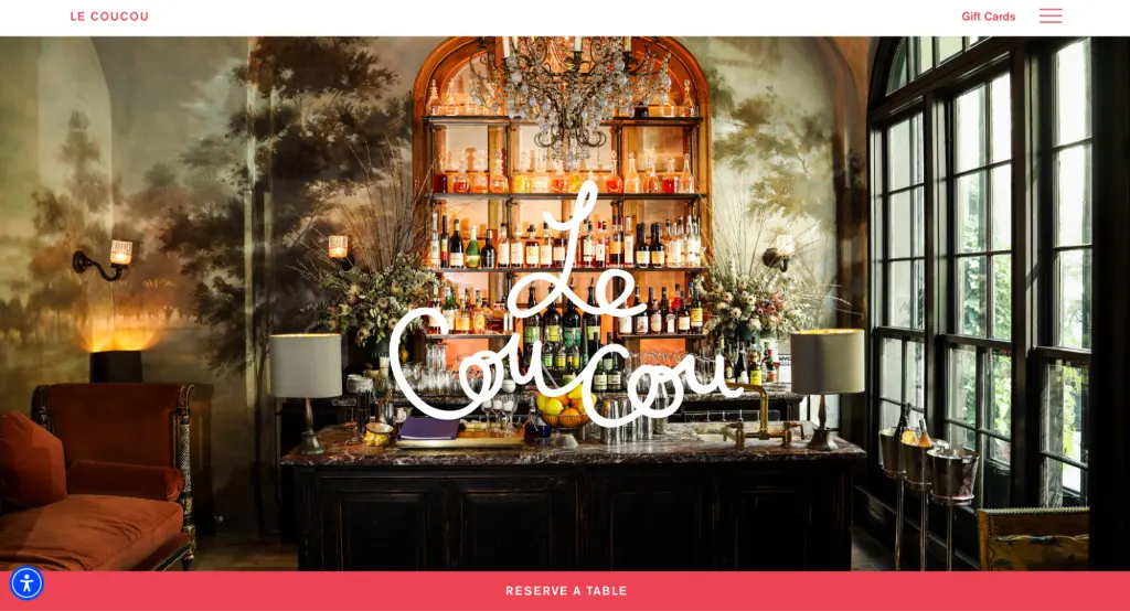
Le Coucou is a Michelin-starred restaurant located in New York City. Renowned for its French-inspired cuisine and elegant dining experience, Le Coucou has received critical acclaim for its culinary offerings, ambiance, and exceptional service.
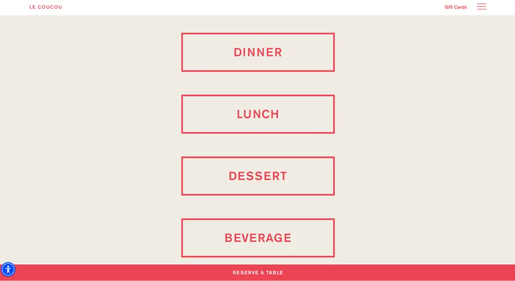
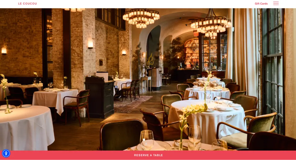
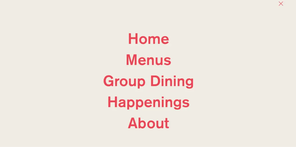
The website can also be praised for its excellent user experience and stunning UI design. The epitome of elegant simplicity, it centres on high-quality photos of the restaurant while keeping text to the bare minimum. This has the effect of immersing the user in the restaurant’s beautiful interior, giving them a taste of what it’s like to dine there.
Across the hero visual at the top of the homepage, you’ll find the words Le Coucou in looping type reminiscent of handwritten calligraphy. This adds to the sophisticated yet inviting aesthetic.
And, while text is featured sparingly throughout the website, you can’t miss the key call-to-action (“Reserve a table”), emphasised in white text against a pink background at the foot of the website. Any other necessary information can be found quickly and easily thanks to the website’s simple navigation system.
All in all, Le Coucou’s website UI design shows us that, with the right style choices, beauty and functionality go perfectly hand-in-hand.
Netgiro
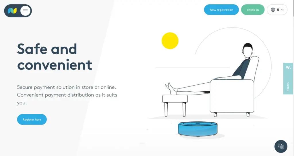
Netgiro is a financial institution in Iceland, offering secure payment solutions both in-store and online. Netgiro’s target audience is the everyday consumer—people who want to pay safely and conveniently with their smartphones.
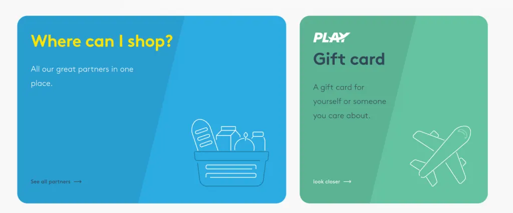
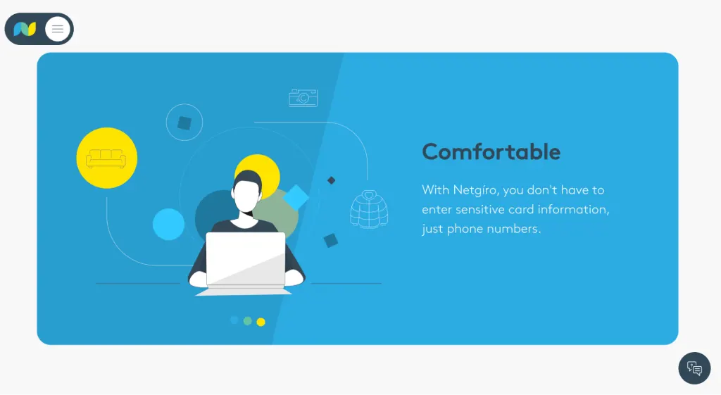
The Netgiro website UI design does a great job of softening the typically heavy topic of finance and security. It uses a gentle colour palette comprising soft blues and greens, with the occasional infusion of a vivid yellow. Coupled with plenty of white space, this has a soothing and reassuring effect. An excellent choice for conveying Netgiro’s core values of safety and convenience!
The friendly factor is enhanced with charming illustrations and super-simple microcopy. The website is light on text, favouring brevity to ensure that the key messaging is both clear and easily skimmable.
Equally straightforward is the website’s navigation system. Simply click the hamburger icon in the top left of the screen and a clearly labelled menu will reveal itself. Easy as pie!
Deed Delivery
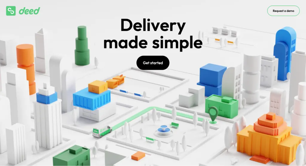
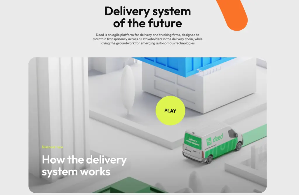
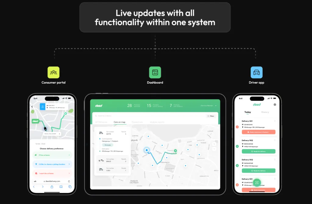
Deed is an agile platform for delivery and trucking firms. It merges all the technology typically used by delivery drivers into a single, easy-to-use app, promising maximum efficiency and full transparency for all stakeholders involved in the delivery chain.
We can’t speak to the technology itself, but one thing we do know is that the Deed website certainly delivers (pardon the pun). In fact, it’s not so much a website but a fully immersive, interactive experience.
You have to visit the Deed website to truly grasp the full effect of its UI design, but we’ll do our best to describe it in words. When you land on the homepage, you’re met with an image of what looks like a 3D model of a toy town. Scroll down and you feel like you’re flying over the town and zooming in.
Scroll some more and you’ll trigger an animation of a vehicle moving across the screen, leaving the words “Value add” in its wake. At the same time, key statistics about the value of Deed are progressively revealed—such as a 27% decrease in driver overtime.
The Deed website is dynamic, interactive, and extremely visually engaging. An outstanding example of creative website UI design!
Rainbow Plant Life
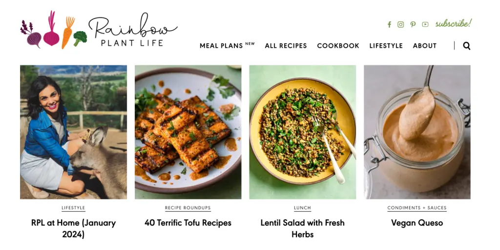
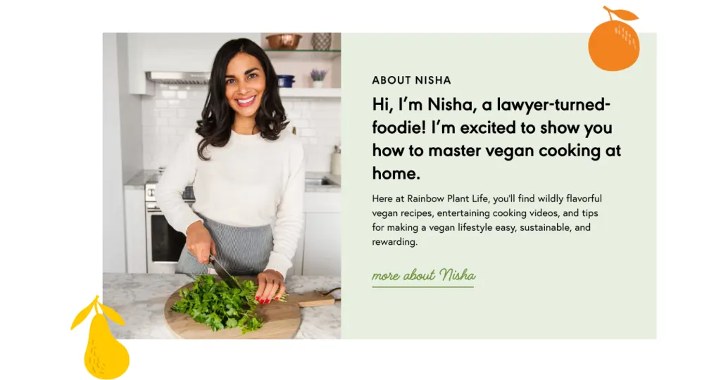
Rainbow Plant Life is a vegan food website run by Nisha, a lawyer-turned-foodie based in San Diego, CA. Rainbow Plant Life features everything you need to master the art of plant-based cooking, from recipes and videos to handy tips and tricks.
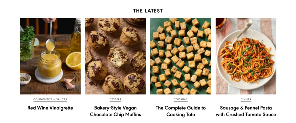
True to its name, this website is bursting with colour and scrumptious culinary imagery, neatly arranged in a gallery-style format. Note how, even though Rainbow Plant Life features lots of different content on the home page, it still feels completely organised and manageable. This is down to Nisha’s smart use of UI cards—self-contained, card-like components that display bite-sized pieces of content.
Beyond that, the Rainbow Plant Life website is full of personality. From the custom logo and cute vegetable illustrations to the contrasting typefaces, everything about the website is fun, friendly, and enticing. If you didn’t want to dive into plant-based cooking before, Rainbow Plant Life might just tempt you!
The Sill
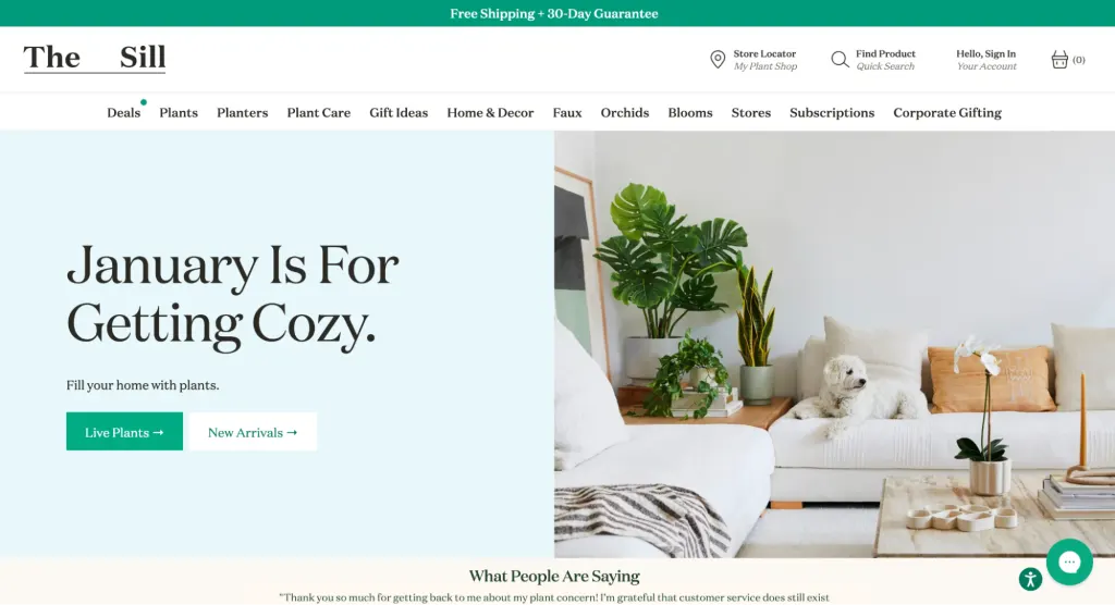
The Sill is a company that specialises in selling houseplants and related products, such as pots, plant care, and accessories. They have both a physical and online presence, and the website has two main purposes: to sell plants and to provide the user with helpful information on how to care for them.
There are many things to celebrate about The Sill’s website UI design. First and foremost, the colour palette is perfectly on-brand with its plant-inspired greens and earthy neutrals.
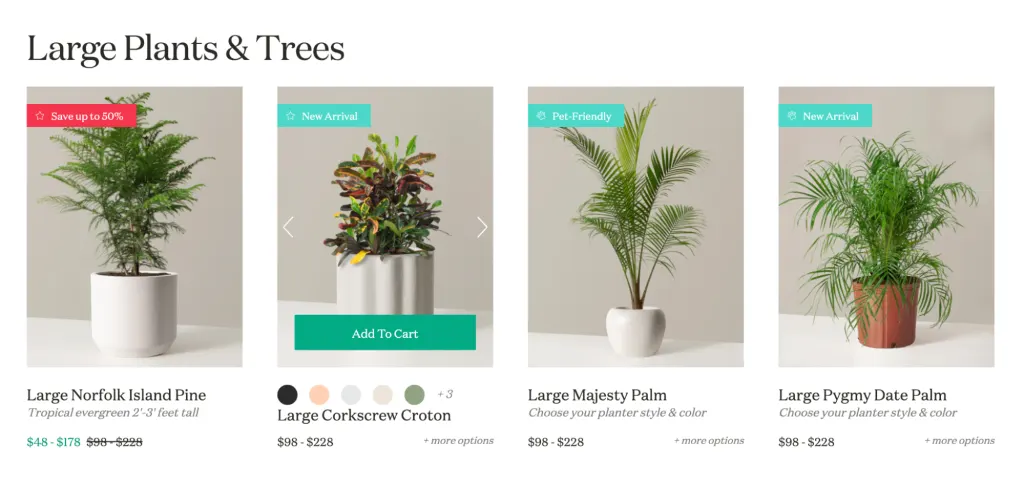
Then there are the gorgeous high-quality visuals of the plants themselves, divided into clearly labelled product categories such as Best Selling, Large Plants & Trees, and Pet-Friendly Plants. This helps the user quickly find what they’re looking for and navigate their way through the vast array of products on offer.
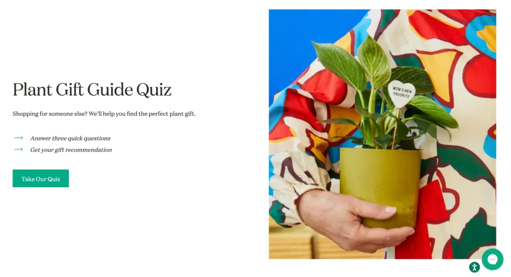
Overall, The Sill’s website UI design does a great job of conveying the brand identity while providing a consistent, intuitive, and efficient user experience.
3. Getting started: the best website UI design templates and tools
We hope our stunning website examples have left you feeling suitably inspired! If you’re keen to get started on your own web design project, here are some of the best website UI design templates and tools to help you.
Figma
Figma is a cloud-based UX/UI design tool used for collaborative wireframing and prototyping. If you don’t want to design from scratch, just browse the Figma community for a whole host of web design templates, UI kits, and inspirational resources to kick-start the creative process.
Squarespace
Squarespace is a website building and hosting platform that simplifies the task of designing professional-looking websites. Known for its user-friendly interface, Squarespace makes the website UI design process accessible and enjoyable for beginners and experienced designers alike. You can choose from a range of beautiful, responsive web design templates—all customisable to suit your needs.
Adobe XD
Adobe XD is a powerful design and prototyping tool ideal for creating interactive, visually stunning user interfaces. You can create wireframes, prototypes, and design layouts for all kinds of websites and apps—but bear in mind that Adobe XD doesn’t offer any ready-made templates. This is a good tool if you want full creative freedom over the website UI design process.
Wix
Similar to Squarespace, Wix is another popular website builder that enables you to create visually striking websites without the need for extensive coding. With its drag-and-drop interface, it’s one of the most user-friendly tools around—and it comes with a vast collection of customisable website templates.
Material Design Lite
Material Design Lite (MDL) is a framework developed by Google that allows developers to apply Google’s Material Design principles to web projects. It provides a set of guidelines, components, and templates for creating visually appealing and consistent UI designs. MDL is particularly useful for designers and developers aiming to implement Material Design in their websites, ensuring a modern and cohesive look inspired by Google’s design language.
For more tools to help you throughout the web design process, check out this round-up of the best UI design software and tools.
4. Learn more about website UI design
That’s a wrap! For more tips to help you create a beautiful website UI design, follow this step-by-step guide to choosing the right website colour palette and check out these 21 cool fonts to spruce up your next project.
If you’re looking for a practical education in UI design, consider a professional course. With the AND Academy UI Diploma, you’ll learn from industry experts, take part in interactive live sessions, and work on developing your UI design portfolio. You can take a look at this UI Case Study by AND learner Shrikant Subramaniam for deeper insights into student work.
You can learn all about the AND Academy courses here, or check out this comparison of the best UI design courses on the market right now.
5. What’s Next?
We hope our rundown of the best website UI design examples could ignite a spark of inspiration within you. If you wish to formally pursue the field of user interaction design, here are some of the resources you can consider:
- Watch this session by Shiva Viswanathan, Design Head of Ogilvy Pennywise, and Naman Singh, Product Experience Designer at RED.
- Talk to a course advisor to discuss how you can transform your career with one of our courses.
- Pursue our UX UI Design courses – all courses are taught through live, interactive classes by industry experts, and some even offer a Job Guarantee.
- Take advantage of the scholarship and funding options that come with our courses to overcome any financial hurdle on the path of your career transformation.
Note: All information and/or data from external sources is believed to be accurate as of the date of publication.


