Are you considering blue for your brand? Explore the fascinating color psychology of blue, plus tips for how to use it to create a strong brand identity.
Blue is one of the most versatile, universally popular colors in the world-renowned for evoking feelings of trust, calmness, and stability.
It’s also a firm favorite among brand designers. Think of your favorite brands and you’ll notice that many of them incorporate blue as a core part of their visual identity. In graphic design, blue is often used for its ability to evoke emotion and trust.
But what is it about blue that makes it so appealing? And how can you harness the power of blue to create a distinctive visual identity for your brand?
Consider this your ultimate guide to the color blue, including:
- A brief recap of color theory
- The Color Psychology of Blue and Why It’s Popular in Brand Design
- The many different shades of blue
- Building your brand color palette with blue
- 5 brands that use blue for their branding
- Tips and best practices for using blue in your branding
- Key takeaways
Ready to explore the fascinating color psychology of blue? Let’s go.
A brief recap of color theory
Color theory considers the role of color in art, design, and branding. It explores how different colors interact and work together to achieve visual effects — such as complementing each other for visual harmony or contrasting for a bolder, more eye-catching aesthetic.
Color theory also considers the psychological impact of color, exploring how different colors make people feel. We often associate green with nature, for example, while yellow can evoke a sense of cheer and joy.
That’s color psychology in action, and it’s an incredibly powerful tool for connecting with your target audience, communicating a certain message, and forging a strong brand identity.
In this post, we’ll focus on the color theory and color psychology of blue as well as its prominent role in brand design.
If you’d like a more detailed introduction to general color theory, bookmark this post for later: A Complete Guide to Color Theory in Design.
Now, though, let’s jump into our hue of the moment.
The color psychology of blue: how does it make us feel and why is it so popular in brand design?
What does the color blue mean? How does it make us feel?
Picture a clear blue sky on a summer’s day, or a vast expanse of deep blue ocean. How about a vibrant field of bluebells or the soft blue tones of a relaxing spa?
If you associate blue with feelings of calmness, serenity, and tranquility, you’re not alone. Numerous studies have shown that the color blue can help to lower the heart rate and reduce stress levels — solidifying blue’s reputation as a soothing, reassuring color.
Depending on the shade, blue can also evoke a sense of royalty, luxury, authority, or professionalism. Think a majestic blue sapphire ring, a luxurious navy blue silk, or an official dark blue uniform. In such contexts, blue can help to nurture feelings of trust, safety, and credibility.
Blue is an incredibly versatile color — and, because of the many positive qualities it denotes, it’s an extremely popular choice in branding. With that, let’s dive deeper into the benefits of using blue for your brand.
Why is blue so popular in branding design?
Defining a color palette for your brand is not just a case of aesthetics. Besides looking good, your brand colors should convey your brand personality and evoke the desired emotions in your target audience.
For many brands, blue holds the key — be that in combination with other colors, or as part of an all-blue palette in varying tones and shades.

Here’s why blue is such a popular choice in branding design:
- It’s versatile: With so many different shades and such a broad emotional range, blue is a suitable choice for all kinds of brand personalities and sectors — from tech and finance to healthcare, nature, and well-being.
- It’s universally appealing: Numerous surveys and studies have found that blue is one of the most beloved colors in the world, making it a popular choice for brands who want to connect with diverse audiences.
- Blue is professional and reliable: In color psychology, blue is often associated with credibility, trustworthiness, and professionalism — aligning with brands who want to emphasize their authority, competence, and reliability.
- Blue is calming and reassuring: Blue is renowned for its soothing effect and is typically a go-to color for brands who want to evoke a sense of tranquility, reassurance, and calmness.
- It can help to enhance accessibility: Blue offers strong contrast on digital interfaces, helping to increase readability, accessibility, and usability — which is crucial for creating a positive and inclusive user experience for all.
The many different shades of blue
We mentioned earlier just how versatile blue can be — and that’s because it comes in a great variety of shades, each with its own unique connotations and associations.
Understanding the different shades of blue will help you choose the right shade for your brand based on the qualities you want to portray and the emotions you want to evoke.
So what are some of the most popular and impactful shades of blue? Let’s take a look.
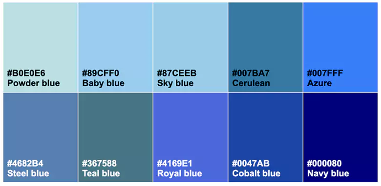
- Powder blue (#B0E0E6): A pale, delicate blue that feels soft, gentle, and elegant.
- Baby blue (#89CFF0): A soft pastel blue that feels gentle and soothing — ideal for brands related to children or healthcare.
- Sky blue (#87CEEB): A light, cheerful blue that’s reminiscent of a clear sky on a sunny day. This shade of blue is often associated with openness, happiness, and tranquility.
- Cerulean (#007BA7): A clear, sky-like blue that evokes freshness and clarity. Cerulean is a popular choice in interior design as well as in branding.
- Azure (#007FFF): A bright, bold shade of sky blue, often associated with energy, vitality, and positivity.
- Steel blue (#4682B4): A muted blue with a hint of gray, steel blue evokes a cool, industrial, and modern aesthetic.
- Teal blue (#367588): A mix of blue and green, teal is an earthy shade often associated with calmness, tranquility, and rejuvenation.
- Royal blue (#4169E1): A bright, deep blue associated with luxury, power, and regality.
- Cobalt blue (#0047AB): A vivid, medium-dark blue, cobalt evokes a sense of creativity, strength, and vibrance.
- Navy blue (#000080): A deep, dark shade of blue that evokes professionalism, authority, and sophistication — a popular choice for serious corporate brands.
For each shade of blue, we’ve included the HEX code. You can paste this HEX code into a free color palette tool (like Coolors) to find complementary and contrasting colors and explore different color combinations.
Building your brand color palette with blue: harmonious and contrasting colors
If you’re considering using blue as one of your brand colors, it’s useful to understand how it relates to other colors. This will enable you to define a high-impact color palette that effectively represents your brand.
First, let’s consider where blue sits on the color wheel. If you’re not familiar with the color wheel, it’s essentially a wheel that visually depicts the relationship between different colors.
This helps us understand the relationship between colors (or hues). Hues that sit opposite each other on the color wheel create high contrast, while hues that are situated closer together tend to create a more visually harmonious effect.
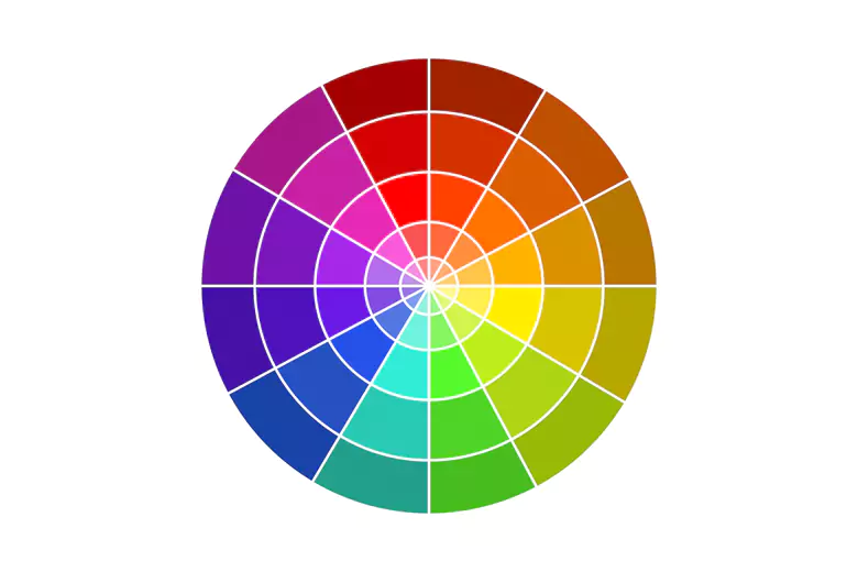
Blue is a primary hue that sits between violet and teal on the color wheel. Directly opposite blue, you’ll find orange. This means that blue and orange are complementary colors that, when paired together, create a strong contrast and a high visual impact.
Whether you opt for a harmonious or contrasting color palette depends on the visual aesthetic you want to create and the brand personality you want to convey.
Harmonious color palettes with blue
Harmonious palettes involve colors that are adjacent or close to blue on the color wheel, such as green and purple. Pairing blue with these colors creates a calming, cohesive feel that’s ideal for brands in industries like healthcare, wellness, and education.
If you’re designing for an eco-friendly, sustainability-focused brand, you might use blue and green as your brand colors to evoke a sense of nature, growth, and balance.
Perhaps you want your brand colors to convey creativity, luxury, and sophistication — in the beauty sector, for example, or the tech industry. In that case, consider pairing blue and purple.
Another option is to pair blue with neutral shades like gray or white. This creates a clean, professional aesthetic ideal for corporate or tech-related brands that want to convey a serious and professional identity.
Contrasting color palettes with blue
By pairing blue with complementary or contrasting colors, you can create impactful, eye-catching color palettes that are vibrant and energetic.
If you’re designing for a sports or entertainment brand, for example, you might pair blue and orange for the perfect balance between calmness and energy.
Another great option is blue and yellow — a cheerful combination that evokes trust, joy, and optimism.
Then there’s blue and red: a striking pair that creates a bold, dynamic contrast. This is a great option for brands that want to evoke a sense of excitement and energy — a food-related brand, for example, or an energy drink.
By considering how blue interacts with other colors, you can create an intentional and impactful visual identity that truly captures your brand and resonates with your target audience — both aesthetically and emotionally.
Learn more: A Designer’s Guide to Color Combinations.
5 brands that use blue for their branding
We’ve talked a lot about how blue works in branding design — but we’re yet to see it in action. So let’s take inspiration from some famous brands whose visual identity is built around the color blue.
IBM

IBM’s deep blue branding, often referred to as “Big Blue”, reflects its core identity as a leader in technology and enterprise solutions.
In this example, blue symbolizes professionalism, innovation, and authority — perfectly aligned with the company’s reputation for reliability and forward-thinking.
American Express

As a major player in the finance industry, it’s essential that American Express presents as a brand that can be trusted and relied upon. No wonder, then, that the brand designers chose blue for the American Express logo.
This is a great example of how blue can be used to communicate trust, security, and stability — helping to reassure customers that they’re in good hands.
IKEA

IKEA is a much-loved furniture retailer renowned for its affordable prices and easy-to-assemble products. By pairing blue and yellow, the IKEA brand creates a sense of warmth and optimism coupled with trust and dependability.
This results in a vibrant, cheerful brand that perfectly reflects IKEA’s goal of providing affordable, practical, and welcoming home goods with a sense of accessibility and fun.
Pepsi

Pepsi is all about refreshment and energy: a brand you can rely on to quench your thirst and cool you down.
Blue is a prominent feature in Pepsi’s branding, conveying a fresh yet reliable image. Together with red and white, this helps to reinforce the message that Pepsi is a fun, approachable, and trustworthy brand.
Calm
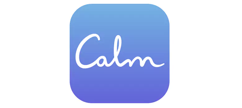
Calm is a popular well-being and meditation app that helps to manage stress, restore mental balance, and facilitate sleep. As a brand, Calm is all about tranquility, clarity, and relaxation — which is aptly conveyed through soft blue tones and ocean-inspired imagery.
The serene shades of blue help Calm’s users to feel centered and at peace, aligning with the brand’s core mission of promoting mindfulness and mental well-being.
Tips and best practices for using blue in your branding
Are you thinking about using blue for your branding design? The following tips will help you harness the power of this much-loved color and create a strong visual identity that resonates with your audience.
Make sure blue is right for your brand
Before you choose your brand colors, it’s important to be clear on the brand identity you want to convey. Only then can you decide whether or not blue is the best color to represent your brand.
Brainstorm three to five adjectives that describe the brand personality you want to portray, then three to five feelings or emotions you want your target audience to feel when they engage with your brand.
Let’s say you’re focusing on a health and wellness brand. You might describe the brand’s personality as nurturing, empowering, and trustworthy. Through this brand, you want to evoke feelings of relaxation, confidence, and inspiration.
Based on the adjectives you’ve come up with — and everything you’ve learned about the color psychology of blue — ask yourself: does the color blue align with this brand identity?
Choose your shade of blue
Next, consider the shade of blue that best aligns with your brand’s personality.
If you want to convey friendliness and tranquility, for example, you might opt for a lighter blue (like sky blue or baby blue). If you want to evoke a sense of professionalism and trustworthiness, a darker blue (like navy) might be more suitable.
Refer back to the earlier section of our guide where we explore different shades of blue, and do further research for inspiration. Once you’ve found the perfect blue for your brand, you’ll have a strong foundation on which to build the rest of your color palette.
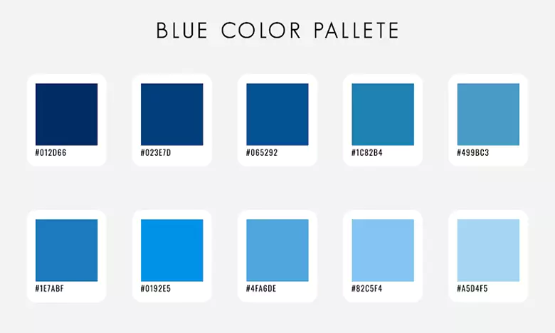
Build your brand’s color palette
You’ve settled on your chosen shade of blue. Now what colors will you pair it with to complete your brand’s color scheme?
Consider a high-contrast color palette (e.g. blue paired with yellow or orange) for a vibrant, energetic feel, or a harmonious color palette for a more soothing aesthetic (e.g. blue paired with purple).
Alternatively, you might build your color palette entirely on different shades of blue. This is known as a monochromatic color palette — an excellent choice if you want your branding to be simple, elegant, and sophisticated.
With your color palette established, you’re ready to forge a distinctive brand identity and connect with your target customers.
For more such insights, we highly recommend checking out Bibin S's Brand Identity Project in graphic design, created by AND learner.
Key takeaways
Blue is a powerful color in branding. It’s versatile, universally popular, and can be used to convey a broad range of qualities — from trust and reliability, calmness and tranquility, to authority and professionalism.
Whether you’re focusing on health and wellness, technology and innovation, or sports and entertainment; blue is a strong choice that will enable you to carve out a unique brand presence and resonate with your audience.
Learn more about branding design
Color is just one key element of your brand’s visual identity. If you’d like to learn more about branding design, continue with the following:
- How To Design a Logo: Your Ultimate Step-by-Step Guide
- Typography Design 101: Key Elements, Rules, and Principles of Effective Typography
- How To Choose Your Website Color Palette
Next Steps
We hope this guide on color theory on blue and why is it a favorite among branding designers was valuable to you. In case you need further assistance, here are some of our resources you can consider:
- Watch this session by design veteran and AND’s Academic Head, Prachi Mittal, and our Course Lead, Soumya Tiwari.
- Talk to a course advisor to discuss how you can transform your career with one of our courses.
- Pursue our Graphic Design courses - all courses are taught through live, interactive classes by industry experts, and some even offer a Job Guarantee.
- Take advantage of the scholarship and funding options that come with our courses to overcome any financial hurdle on the path of your career transformation.
Note: All information and/or data from external sources is believed to be accurate as of the date of publication.


