
Are you looking for typographic logo inspiration or tips on how to create your own? Keep reading. Our practical step-by-step guide, with real-world examples, is sure to spark your creativity.
SUMMARISE WITH:
Your logo is one of the most powerful assets in your brand toolkit. It captures the essence of your business at a glance, helps you stand out in your chosen niche, and makes a lasting impression on your audience — but only if it’s done right!
There are many different types of logos to choose from. But, if you’re looking for a clean, versatile option that puts your brand name front and center, typographic logos are the way to go.
So how do you create a typographic logo that’s both memorable and meaningful? We’ll cover everything you need to know in this guide, including:
- What is a typographic logo?
- When should you use a typographic logo?
- How to create a typographic logo (step-by-step)
- Typographic logo design best practices
- The 10 best typographic logo examples to inspire you
- Learn more about logo design and branding
So let’s begin.

What is a typographic logo?
A typographic logo is a type of logo design that focuses primarily on text.
It uses your brand name, initials, or even a single letter to create a visual identity, with the typography doing all the heavy lifting. Think of iconic examples like Google, Coca-Cola, or Netflix. These typographic logos are instantly recognizable, even without any accompanying symbols or imagery.
Unlike pictorial logos (like Apple’s apple, or what used to be Twitter’s bird) or abstract logos that rely on shapes and symbolism, typographic logos are all about the power of words. The choice of font, spacing, letter shape, and layout becomes central to expressing your brand’s personality — whether it’s bold and modern, classic and elegant, or playful and creative.
There are a few main kinds of typographic logos, each offering a slightly different take on this style:
- Wordmarks: These use the full brand name in a custom or distinctive typeface. Examples include Google, Visa, or Canon.
- Lettermarks (or monograms): These use initials or abbreviations instead of the full name — great for longer brand names. Think IBM, H&M, or CNN.
- Letterforms: These are single-letter logos, often highly stylized, like the McDonald’s “M” or Pinterest’s “P”.
- Combination logos: These blend typography with a symbol or icon. Examples include Adidas, which pairs its name with a stripe motif, or Burger King, where the brand name is integrated into a visual.
Each of these styles can help shape the way people perceive your brand — and, depending on the context, you can even use a mix of these logo formats.
If you’d like to learn more about what’s possible, check out our guide to the 7 different types of logo design.
Next, let’s consider the best use cases for a typographic logo — and when this style might be the perfect fit for your brand.

When should you use a typographic logo?
Not all logos serve the same purpose, and the right style depends on your brand’s personality, goals, and where and how your logo will be used.
While some brands benefit from abstract or image-based logos that create visual intrigue, a typographic logo can be the perfect choice when clarity, name recognition, and simplicity are top priorities.
Typographic logos work especially well if:
- You want to put your brand name front and center — ideal for new businesses still in the process of building brand awareness.
- Your brand name is distinctive, short, or easy to remember, and you want to let the name itself shine.
- You're aiming for a minimalist or modern look, without extra visual elements.
- You want a logo that’s versatile and scales well, whether it’s printed on packaging, used on a website, or embroidered on merchandise.
- You’re building a personal brand. Signature-style wordmarks are great for creators, freelancers, and consultants.
That said, it’s not just about strategy; think about your stylistic preferences, too! Some brands simply like the clean, timeless feel of a typographic logo, and that’s just as valid a reason to choose one.
If you're unsure whether this style is right for your brand, consider the following questions:
- Is your brand name strong or unique enough to stand alone?
- Do you want your audience to remember your brand name specifically, rather than associate your brand with a symbol?
- Would a clean, type-driven look reflect your brand’s personality better than a graphic?
- Do you want a logo that’s easy to use across many formats and sizes?
If you answered “yes” to any of the above, a typographic logo could be a great choice. And remember: you can always add to your logo later on if you decide that you want some graphics in there, too.
Think a typographic logo could work for you? Let’s take a look at how to create one.
How to create a typographic logo (step-by-step)
Creating a strong typographic logo is not just a case of picking a great font. It’s about choosing typography that captures the essence of your brand, stands out in all the right ways, and works across a variety of contexts and media.
So: how do you design an effective typographic logo that represents your brand with clarity and style? Follow this guide.
1. Define your brand identity
Before you get into the process of choosing a font and designing your logo, make sure you’re crystal clear on what your brand stands for.
What are your values? How do you want to be perceived by your audience? Are you professional, playful, edgy, or traditional?
Your logo should reflect your brand identity at first glance. So, if you haven’t already, take the time to really think about what persona your brand — and logo — should embody.
2. Decide what kind of typographic logo you’ll create
As we mentioned earlier in our guide, there are several different types of typographic logos. Explore these types — wordmarks, lettermarks, and combination logos — and decide what makes the most sense for your brand.
For example, if your business name is on the longer side, a sleek monogram might be more practical. But, if you’re trying to build brand name recognition, go for a full wordmark.
See what your competitors are doing, too, to get an idea of what’s common in your niche. This will help you meet user expectations and also find opportunities to stand out.
3. Explore font styles
Fonts are the very heart of typographic logos, so getting this step right is crucial. There are many different font styles to choose from — such as serif, sans serif, script, and display fonts — and they each bring their own personality.
For help with this step, check out our ultimate guide to font styles and their families, and browse these 21 cool font ideas for inspiration.
At this stage, you might narrow it down to a few different font styles, and that’s perfectly fine. Experimentation is key in logo design, and you can try out multiple creative directions before you settle on one.
4. Customise and refine
Don’t just rely on off-the-shelf fonts. Play with kerning (spacing), weight, case, and alignment, and even tweak or modify letterforms to create something distinctive. This is where your logo starts to feel uniquely “you.”
Want to level up your type design skills? Check out our typography design 101 for all the key elements, rules, and principles of good typography.
5. Pick your colors wisely
Even in a text-based logo, color has a big impact. Choose hues that align with your brand’s personality, and make sure there’s enough contrast for legibility. Also, keep it simple: a strong typographic logo often works best in one or two colors.
For more guidance on choosing the best colors for your logo, check out our complete guide to color theory.
6. Test for scalability and versatility
Your logo should look great everywhere, whether it’s a minuscule website favicon or on a massive billboard. Once your design starts to take shape, test it in black and white, at tiny sizes, and on different backgrounds. Does it still work? Does it remain crisp and clear no matter what? If not, refine further.
7. Use a logo design tool to bring it all together
You don’t need expensive software to design a great typographic logo. Try easy-to-use tools like Looka, Canva, Hatchful by Shopify, or Fontself to create and customize your design.
We’ve compiled the 17 best logo design tools and software in this guide — check it out.
The guide we just outlined focuses specifically on how to create typographic logos. But, if you’d like a more general guide that applies to all logo types — or want to explore certain steps in more detail — you can also refer to our ultimate logo design guide.

Typographic logo design: Top 5 best practices
As you go through the process of designing your logo, there are a few best practices to keep in mind. These will help ensure that your final design isn’t only visually appealing, but also effective, accessible, and uniquely reflective of your brand.
1. Keep it legible
First and foremost, your logo must be easy to read. Avoid overly decorative fonts that sacrifice clarity for style, especially if your logo will appear in small sizes or on mobile. Stick to strong letterforms with good spacing and contrast.
2. Aim for timelessness over trends
Trendy fonts can be fun, but they risk dating your brand as styles change. Opt for a design that will feel relevant and recognizable in five or ten years. Simplicity often stands the test of time.
3. Customize to stand out
It’s easy to fall into the trap of using a popular font and calling it done. Instead, look for ways to customize your typography — whether it’s adjusting letter spacing, modifying a single character, or combining styles — to make it unique.
4. Prioritize accessibility
Good typography — and indeed, good design — is accessible to everyone. Make sure your logo maintains high contrast, especially for those with visual impairments. At the same time, avoid overly thin or condensed fonts that can be hard to read for some users.
5. Test across real-world use cases
Your logo should look great on screen, in print, in black and white, and in different sizes. Test it on mockups of business cards, websites, social media headers, and product packaging to see how it holds up in various formats (depending on where and how you plan to use it).
6. Be intentional with color and spacing
White space is your friend (you can learn more about the significance of white space in design, with examples, here). Give your logo room to breathe, and be thoughtful about how different colors work together — not just in the logo itself, but in the broader context of your brand.
Keep these principles in mind and you’ll be well on your way to creating a typographic logo that’s both beautiful and functional. Next, let’s explore some real-world examples of typographic logos.
The 10 best typographic logo examples to inspire you
Great typographic logos don’t just look good — they say something about the brand. Whether it’s clean and minimalist or bold and distinctive, each of the following logos uses typography to full effect. Let’s take a look at these standout examples and what makes them work.
1. Coca-Cola

Source: Graphics by FreePngLogo
This iconic script logo proves the power of customization. Its flowing, hand-lettered style feels personal and timeless — exactly what you want for a heritage brand. It’s a masterclass in using custom typography to build instant recognition.
2. Google

Google’s logo is deceptively simple: a clean, geometric sans serif with primary colors that convey playfulness and innovation. It’s a great example of excellent legibility and adaptability — it works everywhere, from a search bar to a smartwatch and beyond.
3. Netflix

Source: Netflix
Netflix’s wordmark uses a bold, modern sans serif with subtle customization. It’s minimal yet instantly recognizable, showcasing the value of keeping things simple while adding a unique touch.
4. FedEx

Source: Graphics by FreePngLogo
The famous FedEx logo is a classic example of clever typography. The hidden arrow between the "E" and "x" not only reinforces speed and delivery but also shows how letter spacing and negative space can be used for visual storytelling — without adding extra elements.
5. Chanel

Source: Graphics by FreePngLogo
This elegant wordmark relies on symmetry and a refined sans serif font to communicate luxury and high fashion. It shows how a typographic logo can reflect a brand’s personality through spacing, letter shape, and restraint.
6. NASA

Source: CNN
The NASA logotype (known as the "worm" logo) uses smooth, rounded letterforms that feel futuristic and scientific. Its revival in recent years also shows how a well-designed typographic logo can remain relevant across decades.
7. Mailchimp

Source: Drupal
Mailchimp’s current logo features a casual, hand-drawn font that captures its approachable, creative tone. It’s a great example of matching font style to brand voice — and breaking convention in a way that feels confident and authentic.
8. The New York Times

Source: Logos-World
This iconic blackletter wordmark proves that typography alone can convey authority, history, and prestige. It’s a reminder that even highly decorative or stylized fonts can work, as long as they’re intentional and aligned with the brand.
9. Spotify

Source: Spotify
Spotify’s clean, rounded sans serif communicates friendliness and ease of use — qualities essential to the brand. It also scales beautifully across devices, showing the importance of designing for flexibility and digital use.
10. Glossier

Source: Logo by Glossier
Glossier’s wordmark is sleek and modern, using a simple sans-serif font that feels fresh and youthful. It’s often paired with a strong brand color (blush pink) to build memorability while maintaining a minimalist aesthetic.
What other iconic typographic logos can you think of? And what best practices and design techniques do they incorporate? Ask yourself these questions before you finalize your own. Once you start looking, you’ll notice that typographic logos are everywhere — so pay attention to the different styles and use them to inspire your work.
Learn more about logo design and branding
A strong typographic logo can elevate your brand, communicate your values, and leave a lasting impression. We’ve shown you what makes a great typography-based logo, and how to create one that truly connects with your target audience. Follow our step-by-step guide, keep those best practices in mind, and don’t be afraid to take inspiration from existing logos — with your own unique twist, of course!
Want to keep building your design skills? The following guides will help you deepen your knowledge and bring your creative ideas to life:
- What Is Branding Design? A Complete Guide
- 20 Famous Logo Designers and Their Most Iconic Work That’s Inspiring Designers in 2025
- Fundamental Graphic Design Principles and How to Apply Them
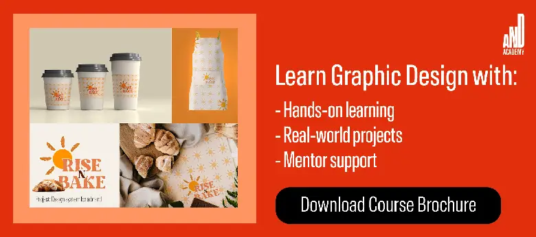
You can also check out this project by AND Learner, Sreya Sara Binoy, to get inspiration for your future typographic logo projects!
Level up your design skills with a professional course
Blog posts like this one are a great place to learn more about design — but, if you really want to level up and work in the field, you’ll need a more structured learning approach.
If you’re thinking about a career in graphic design, check out AND Academy’s professional graphic design courses. Whether you study part-time or full-time, you’ll be supported by industry experts, work on practical projects that mimic on-the-job scenarios and challenges, and master the most important graphic design skills, tools, and techniques that employers look for.
Next Steps
If you still have unanswered questions about pursuing graphic design, consider these additional resources for further information:
- Watch this session by graphic design industry leaders Soumya Tiwari and Sakshi Jain.
- Talk to a course advisor to discuss how you can transform your career with one of AND Academy’s courses.
- Explore our Graphic Design Course, which is taught through live, interactive classes by industry experts, and comes with a job guarantee.
- Take advantage of the scholarship and funding options that come with our courses to overcome any financial hurdle on the path of your career transformation.
Note: All information and/or data from external sources is believed to be accurate as of the date of publication.


