
Are you looking for typography inspiration? Prepare to be impressed by these 30 great examples of typography for logos, books, websites, t-shirts, and more.
Have you noticed how typography is everywhere? In books and magazines, on t-shirts, on album covers, and on posters…almost every design project requires the careful styling and placement of text.
Whether you’re looking for inspiration or simply want to browse great typography in all its different forms and contexts, this post is for you. We’ve rounded up 30 outstanding typography examples, with a brief analysis of each.
Contents:
- What is typography and why is it important?
- 30 outstanding typography examples to inspire you:
- Typography on posters
- Typography on t-shirts
- Typography for logos
- Typography art
- Typography in books and magazines
- Typography for album covers
- Typography in web design
- Typography for product packaging
- Typography for advertising
- Handwritten typography
- Learn more about typography
First, we’ll recap what typography is and why it’s important. But, if you want to jump straight to the examples, just use the clickable menu or keep scrolling!
1. What is Typography and Why is it Important?
Typography is the art of styling and arranging text.
To see typography in action and understand its impact on design, check out this inspiring short video.
Whenever a designer includes text in their designs, they must decide how that text will be styled, where it will be positioned in relation to other design elements, and what size and colour the text will be. They must also adjust the spacing between and around the text.
All of these design choices are part of typography, and they help to ensure that all text is legible, on-brand, and in keeping with the overall design. Most importantly, effective typography communicates the intended message or information to the viewer.
We’ve written in detail about what typography is and why it matters in this guide: What Is Typography? Everything You Need To Know. For now, though, let’s explore what excellent typography looks like in action.

2. 30 Outstanding Typography Examples to Inspire You
I. Typography on posters
Posters are a powerful tool for promoting events, products, and services, raising awareness about important issues, and providing useful information such as directions, announcements, or safety guidelines.
Typography plays a crucial role in catching the viewer’s eye and conveying the key message. Let’s take a look at some examples of typography on posters.
The Barbie movie poster

Source: Warner Bros
The official poster for Greta Gerwig’s box office-breaking Barbie movie uses Avante Garde typeface, a geometric sans-serif type that’s playful, a little cheeky, yet clear and easy to read. The white text enjoys plenty of contrast with the bright blue and pink background, ensuring the viewer instantly gets all the key information—the main actors’ names, a brief teaser of what the movie is about, and the release date.
Want to recreate the Barbie movie poster? Follow this Photoshop tutorial.
Taylor Swift “The Eras Tour” poster

Source: Taylor Swift Official Store
The Eras Tour is Taylor Swift’s sixth worldwide tour which takes fans on a journey through her entire musical career. The official poster is appropriately nostalgic, featuring a high-contrast serif typeface called Pistilli Roman which was designed in the 1960s. This type complements the vintage-style imagery perfectly.
Janis Joplin poster

Source: Etsy
Janis Joplin was a rock music icon who rose to fame in the 1960s. This poster promoting one of her 1968 shows is unapologetically bold and eye-catching with a retro, almost psychedelic feel. The typography is no exception, with its quirky 70s-style font in interesting colour pairings. In many settings, the chosen type might lose marks for legibility—but, in this context, it works by catching the viewer’s attention and promising a bold, one-of-a-kind musical experience.
II. Typography on t-shirts
There are many uses for typography on t-shirts—whether it’s conveying a brand name or logo, presenting a slogan or expressing a witty message, or displaying the name of your favourite artist, singer, or band. Let’s explore some great examples of typography on t-shirts.
Jack & Jones pizza t-shirt

Source: ASOS
This t-shirt is all about fun, and the typography does a great job of conveying that message. It’s bold and whimsical—the perfect complement to a smiling slice of pizza with arms and legs. The contrasting typefaces and colours help to create an engaging t-shirt design that no doubt piques the interest of passersby.
“Girls support girls” slogan t-shirt by Pieces

Source: ASOS
This t-shirt delivers a simple yet powerful message about sisterhood and the importance of women and girls empowering and uplifting each other. The cursive script typeface is elegant and decorative, and the hearts used to dot the “i”s add a charming touch. Thanks to the contrast of the darker pink type against the lighter pink t-shirt fabric, and the vast negative space around it, the message stands out for maximum impact.
“My nice clothes are in the wash” slogan t-shirt by Collusion

Source: ASOS
Collusion is a contemporary clothing brand “for the coming age”. Launched in 2018, it has been shaped by a generation of creatives who are unafraid to demand something different from fashion. As you might expect, their designs are modern, simple, and bold—as conveyed by the simple serif typeface in all caps on this t-shirt. The message “My nice clothes are in the wash” delivers an air of cool nonchalance, and the typography itself is cool and understated in its simplicity.
III. Typography for logos
Logos are the cornerstone of a strong and memorable brand—and many logos rely on powerful typography. Here are some outstanding examples of typographic logos.
Chanel logo

Source: Brands Logos
You don’t have to be into luxury fashion to instantly recognise the iconic Chanel logo. The interlocking “C”s have become renowned worldwide, and the custom type is rumoured to be based on Coco Chanel’s own handwriting. The clean sans-serif typeface and generous spacing between each letter in the word “Chanel” evoke elegance, sophistication, and luxury—everything the Chanel brand stands for.
Vintage Candy Shop logo

Source: Vintage Candy Shop
As you might guess, the Vintage Candy Shop sells vintage sweets. Their logo has been designed to evoke a sense of nostalgia and authenticity, representing the brand as a reliable retailer of all your favourite sugary classics. The word “Candy” uses a different typeface from the rest of the text, and it’s much larger. It’s also placed right in the centre of the logo, making it the first word the viewer is drawn to. This is an excellent use of contrast and hierarchy—some of the most important typography principles.
Razorpay logo

Source: People Matters
Razorpay is a payment solutions software company founded in India. Their brand is all about technological innovations, cutting-edge products, and the utmost security and reliability for their users. As such, their logo is serious and professional, using a no-frills sans-serif typeface in a sensible navy blue hue. At first glance, it’s reminiscent of the famous PayPal logo—a design choice that may work in the brand’s favour when it comes to building a credible and trustworthy reputation.
IV. Typography art
When working with typography, designers have almost endless scope to be creative and design beautiful works of art. In fact, typography is such a powerful tool that it’s often used as art in its own right. Here are some examples of delightful typography art.
“When life gives you a lemon” poster by David Shrigley

Source: Shrig Shop
This poster is a play on the well-known saying “When life gives you lemons, make lemonade”. As described by the artist, it has been designed “to encourage joy, thoughtfulness, and curiosity in any space for anyone.” Aptly, the type mimics cheerful, youthful handwriting, capturing and conveying the intended tone.
Bold & Noble type map prints

Source: Bold & Noble
These Bold & Noble prints create beautiful maps out of white type on high-contrast backgrounds. The text varies in size to represent the size of each city, and you’ll find a range of different typefaces throughout—creating an interesting design that urges you to look closer. A clever use of typography for art!
Bonjour print by Gayle Mansfield Designs
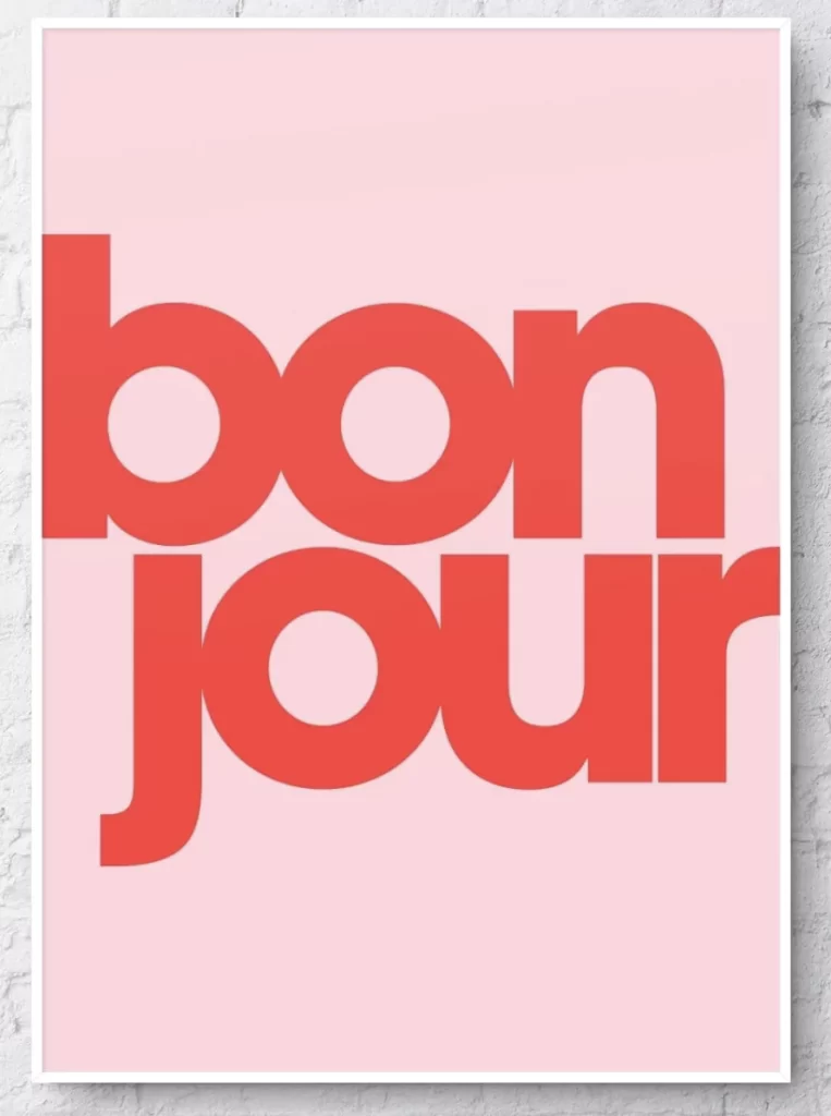
Source: Gayle Mansfield Designs
This bold, modern print by Gayle Mansfield Designs features just one word as the centrepiece. The contemporary sans-serif font breaks up the word “bonjour” over two lines, creating a simple yet high-impact piece of art that commands attention. Sometimes, a simple type works best, and that’s certainly the case here.
V. Typography in books and magazines
When it comes to graphic design for books and magazines, typography plays a critical role in creating captivating front covers and ensuring that large bodies of text are clear and legible. Let’s take a look at some of the most effective uses of typography in books and magazines.
What A Time To Be Alone by Chidera Eggerue


Source: Amazon
What A Time To Be Alone is an empowering self-help guide for women, written by Chidera Eggerue. The book is brimming with wisdom, positivity, practical advice, and personal anecdotes. Such a powerful, candid book demands an equally powerful design—and typography plays a huge role in achieving this. The type is modern, bold, and fearless, commanding the reader’s attention and giving important messages and themes of the book the prominence they deserve.
TIME magazine online

Source: TIME
Founded in 1923, TIME magazine is one of the oldest news publications of its kind. Now, it’s also available as an online magazine. Reporting on the most newsworthy stories and current affairs, readability is of utmost importance for TIME.
As such, every piece of text is presented clearly with plenty of contrast and generous spacing. Notably, header text uses a serif typeface while body text uses sans-serif. This typeface pairing draws attention to key headlines while ensuring that longer paragraphs of text are easy to read, despite being displayed in a smaller font size.
University of California’s 2022 annual report


Source: Mucho
The 2022 annual report released by UC Investments is one of the most impressive examples of typography design within the publishing realm. Available in both digital and print formats, the report reflects on a turbulent financial year while delivering a message of hope and optimism for the future. Typography is front and centre of the report’s design, with engaging typographic illustrations featured throughout. The chosen type is bold, modern, and authoritative—a perfect fit for the concept.
VI. Typography for album covers
Album covers have an important job to do. They must capture the viewer’s attention, spark enough intrigue to entice you to listen to the album, and accurately communicate the artist’s desired message. Typography, of course, is crucial in achieving the right aesthetic. Here are some examples of great typography designs for famous album covers.
Elvis Presley album, 1956

Source: Design & Paper
Elvis Presley’s 1956 album cover contains just two words, but the typography speaks volumes. It captures the spirit of rock and roll, with the words “Elvis” and “Presley” displayed in thick, heavy font. The pink and green provide a bold contrast against the black and white background image, drawing immediate attention to the King of rock ‘n’ roll’s name. The type is so iconic that it inspired the creation of a dedicated typeface known as London Presley.
Lady Gaga “The Fame Monster” album

Source: Design & Paper
Lady Gaga is renowned not only for her musical talent but also for her creativity and experimental style—both of which are evident in the album cover for “The Fame Monster”. The custom typeface is very similar to News Gothic, a grotesque sans-serif typeface designed by Morris Fuller Benton in 1909. The modified “T” in the word “Monster” adds a unique twist that’s right on brand for Lady Gaga herself.
Green Day “Dookie” album

Source: Design & Paper
Released in 1994, Dookie is Green Day’s third studio album. Musically, it explores themes such as anxiety, relationships, rebellion, and self-discovery in a unique blend of pop and punk rock. The album cover is a chaotic cartoon scene brimming with pop culture references and satirical depictions. The typography perfectly reflects the album’s punk rock spirit, with both the band and album names displayed in bold, hand-drawn lettering reminiscent of old comic books.
VII. Typography in web design
When it comes to designing websites and apps, there’s a huge focus on accessibility, readability, and user experience—in other words, making sure the website or app is easy to use and navigate. Typography plays a critical role here, ensuring that all text is clearly legible and that important information is easy to find. Of course, it also contributes to the overall visual brand. With that in mind, here are some examples of first-rate typography in web design.
Typozon design studio


Source: Typozon
Typozon is a brand and identity design studio. And, given that they offer custom typography as a service, it’s no surprise that we’re holding them up as an example of great typography. Throughout the website, you’ll find two prominent serif typefaces used in combination: Baskerville and Augereau, often displayed in italics. Contrasting these typefaces and fonts helps to highlight key information and create an interesting aesthetic overall.
The New Yorker


Source: The New Yorker
The New Yorker first started out as a print publication in 1925. Now it’s complemented by newyorker.com, a daily online source of news and cultural coverage. But make no mistake: the digital version remains true to its printed predecessor in almost all design aspects—including typography. Their website features the same famous New Yorker logo and custom serif typeface, effectively capturing the essence of a traditional and long-standing magazine.
Cacao Catering & Events website


Source: Cacao Catering & Events
Take one look at the Cacao Catering & Events website and you immediately think of elegance, sophistication, and a touch of glamour. With headings in italic serif type, you instantly believe the company’s claim that they offer a five-star catering service. The website also makes excellent use of whitespace around each text element, creating a clean, clutter-free aesthetic that enhances readability.
VIII. Typography for product packaging
Typography design for product packaging can be tricky; you want to convey all the necessary information within a limited space while staying true to the brand identity. Here are some inspirational examples of typography for product packaging.
The Ordinary skincare products

Source: The Ordinary
The Ordinary is a skincare brand based on “clinical formulations with integrity”. Their products are all about functional beauty, bringing the latest in skincare technology to the everyday user. Transparency and integrity are the foundation of the brand’s ethos, and this is reflected in its product packaging. Browse their product line and you’ll see clean, simple packaging with clear, easily legible sans-serif type. No frills, no gimmicks—only the most important information for each product and nothing more.
Noggin board game


Source: BoardgameGeek
Noggin is a fun, uncomplicated word game that promises to melt your brain. The packaging is suitably bright and playful, with whimsical typography to match. The text is likely styled in Aglet Sans, a rounded sans-serif typeface ideal for larger text elements such as headings.
Friend Zone beer packaging


Source: Kate Dehler
Friend Zone is a fruity beer produced collaboratively by multiple craft breweries in Port Moody, British Columbia. Illustrator Kate Dehler is the creative genius behind the illustrated packaging design and the hand-drawn typography. The clean, all-caps type in high contrast with the background draws the reader’s attention straight to the name of the beer—no doubt helping the product stand out on a crowded shelf.
IX. Typography for advertising
In advertising, the challenge lies in catching the viewer’s attention and communicating the key message quickly and succinctly. This relies, in part, on highly effective typography. Here are some examples of typography in advertising.
British Airways billboard ad

Source: Creative Review
This ad campaign for British Airways’ Cityflyer service seeks to highlight just how quick and easy it is to fly with BA from London’s City Airport. Designed by Uncommon Creative Studio, the ads mimic real British passports. The text is styled and formatted exactly as it would be on a passport, from the type and colour right through to the spacing and alignment. Clever!
CPB London’s Double Standards campaign

Source: Creative Boom
This ad campaign by creative agency CPB London aims to tackle gender bias. It focuses on the often subconscious use of gendered language, highlighting how certain qualities are often described positively in relation to men but negatively in relation to women—for example, the use of “assertive” versus “bossy” or “ambitious” versus “pushy”.
The posters used in the campaign comprise nothing but simple text on a white background. This draws the viewer’s full attention to the language the campaign wants to highlight, helping to deliver the message with impact.
CityCenterDC Celebrating You campaign


Source: CityCenterDC
CityCenterDC is a shopping and dining district in downtown Washington DC. A large-scale advertising campaign led by the creative agency Design Army sought to promote the centre as a place where anyone and everyone can express themselves and find joy, no matter their tastes or preferences.
Fittingly, the campaign is full of colour and character—and the chosen typography helps to convey the intended message of individuality and inclusivity. The word “You” is styled differently on different images—sometimes bold and heavy, sometimes sleek and thin—but always standing front and centre and speaking directly to the viewer.
X. Handwritten typography
Handwritten typography feels authentic, personal, and unique. It’s ideal for artwork, invitations, menus, decorations, and artisan product labels—emphasising that lots of care, attention, and skill have gone into creating a certain product. Here are some examples of beautiful handwritten typography.
Watercolour calligraphy quote

Source: Etsy
This beautiful watercolour quote in flowing, hand-painted script evokes a sense of wisdom, sincerity, and elegance. Because it’s handwritten, it feels like a personal and one-of-a-kind piece—making it a great gift.
3D handwritten sign

Source: Etsy
What better way to capture and immortalise a heartfelt message than through handwritten type? This custom-handwritten wooden sign frames your chosen personal message in the very style of your own handwriting, making for a one-of-a-kind and entirely unique gift.
Handwritten bar menu

Source: Etsy
This gorgeous handwritten drinks menu is full of charm and elegance. The looping script speaks of authenticity and quality—you can just imagine the care and skill that has gone into the drinks themselves. Handwritten typography is ideal for such settings, promising a one-of-a-kind culinary experience.
Learn More About Typography
We hope you’ve enjoyed browsing these outstanding typography examples, and feel suitably inspired for your own design projects.
If you’d like to learn more about typography, check out our practical guide to typography design. In it, we cover all the key elements, principles, and rules of effective typography—and show you how to apply them. You can also check out AND learner Bibin S’ type-based poster projects for more inspiration.
Learning about typography in your quest to become a graphic designer? Discover what additional skills you’ll need to start a career in the field, or kick-start your journey with a graphic design course.
3. Next Steps
Here are some additional resources and recommendations that will surely be useful in learning more about graphic design – the industry, career prospects, and much more:
- Watch this session by design veteran and AND’s Academic Head, Prachi Mittal, and our Course Lead, Soumya Tiwari.
- Talk to a course advisor to discuss how you can transform your career with one of our courses.
- Pursue our Graphic Design courses – all courses are taught through live, interactive classes by industry experts, and some even offer a Job Guarantee.
- Take advantage of the scholarship and funding options that come with our courses to overcome any financial hurdle on the path of your career transformation.
Note: All information and/or data from external sources is believed to be accurate as of the date of publication.


