
Want to know what colors will trend in 2026? Read our comprehensive guide on the colors all designers must know about below!
Design is subject to constant change and dynamically depends on trends, despite having set principles. Designs represent the world around us, and colors play a key role in helping most of us make sense of it all. As the world gears up for what is to come in 2026, a discussion about what colors will dominate our world is unavoidable.
From psychology to aesthetics, colors represent a lot and impact our decisions more than we know. For graphic designers, interior designers, and UI UX designers, knowing what colors will dominate 2026 is essential to staying ahead of the curve in the upcoming year.
Sounds like too much to keep up with? Worry not, we’re here with a guide for you!
Here is a brief of what we will be covering –
- Factors Influencing Color Trends in 2026
- Color Trends & Popular Palettes for 2026
- Electric Bioluminescence
- Deep Teal
- “Unbleached” Naturals
- Decadent Chocolate
- Synthesized Mint
- Burnished Amber
- Deeper Reds
- Liquid Chrome
- How to Use Color Trends in Interior Design for 2026?
- Tips to Enhance Digital Design Using Color Trends 2026
- Pantone Color of the Year 2026 – Verdict
- Conclusion
- Next Steps

Factors Influencing Color Trends in 2026
To know what factors will influence the color trends in 2026, it is important to get a brief understanding of where the world is heading. Here are the major ones.
- Cultural Mood – The last five years have been quite heavy with the pandemic, looming economic crises, and various disasters. As the world moves past the fatigue of past years, there might be a desire for colors that offer stability and vibrancy. The cultural mood may shift towards acceptance of chaos and reveling in whatever joy is available.
- AI & Digital Advancements – Generative AI has fundamentally changed how we perceive imagery. By 2026, the “uncanny valley” style of AI art will become more popular. With the rise of “Bio-Synthetic” colors, which signify hues that look organic but possess a vibrancy that can only be achieved digitally, designers may favor colors that are meant for 4K screens, not human eyes.
- Consumer Behavior – Economic fluctuations and environmental guilt will alter purchasing habits. Consumers in 2026 may be less interested in short-term trends and more interested in longevity. This drives a resurgence of colors that feel timeless, historic, and high-quality, in turn meaning that loud colors or synthetic textures may not be as popular.
- Economic Climate – The “Quiet Luxury” trend may not be as prevalent in 2026. The upcoming year may not be about looking expensive but feeling valuable. The upcoming economic climate suggests a high demand for rare, deep pigments combined with a mass-market use of warm neutrals that make smaller living spaces feel expansive and comforting.
Color Trends & Popular Palettes for 2026
Color trends of 2026 will be influenced by the human need for touch and connection while they navigate an increasingly digital world. With that in mind, the colors for 2026 will be a mix of human touch with digital sensitivity. So, let us get into the color trends and popular color palettes that are likely to dominate 2026!
1. Electric Bioluminescence

Influenced by generative AI art and the “phygital” world, these colors reject the natural spectrum. They mimic the depth of deep-sea creatures and OLED screens. In graphic design, these are used as gradients on dark backgrounds and as mood lighting in interior design.
- The Vibe: Synthetic and hyper-digital.
- The Palette: Acid Green, Cyan Blue, Hyper-Violet.
2. Deep Teal

Blue-greens will be THE color trend of 2026. These shades blend the natural mystery of the ocean with the sleekness of clean technology. It is one of the few colors that works equally well in sterile and fun environments, making it a popular choice for the upcoming year.
- The Vibe: Fluid and bio-technological.
- The Palette: Aegean Blue, Deep Teal, Kelp.
3. “Unbleached” Naturals
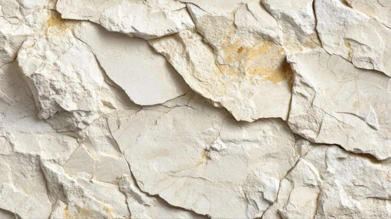
In 2026, bright white will feel too sterile and processed. In the upcoming year, creamy, imperfect colors are more likely to make their mark. Imagine textures of oat milk, undyed wool, and limestone, offering a non-toxic visual break from screen fatigue.
- The Vibe: Raw and filtered.
- The Palette: Bone White, Warm Limestone.
4. Decadent Chocolate

Deep brown might just be the new black. It offers high contrast but with warmth. It feels comfortable like coffee or chocolate while also creating a strong sense of stability and safety. Remember Mocha Mousse, the Pantone color of 2025? It is here to stay, just with more depth and richness.
- The Vibe: Grounding and savory.
- The Palette: Espresso, Cacao Nibs, Warm Sepia.
5. Synthesized Mint

Mints are the new wellness color of 2026. All industries, but especially wellness, will experience a pull toward medical-grade greens. These soft, dusty, almost digital colors will feel like a breath of fresh air among all the other dark colors dominating this year.
- The Vibe: Clean and restoring.
- The Palette: Dusty Mint, Pale Pistachio, Clinical Green.
6. Burnished Amber

Replacing the harsh yellow that sometimes hurts our eyes, this hue is denser and calmer. Described as the color of the “golden hour” or retro 70s glassware, it is predicted to bridge the gap between nostalgia and a sunny outlook for the future.
- The Vibe: Warm and nostalgic.
- The Palette: Honey, Amber Glass, Ochre.
7. Deeper Reds

Red is an evergreen color, making it to the list of color trends nearly every year. However, now we are moving from terracottas and marrons to deeper reds that feel more luxurious. Such colors bring instant gravity and an “old money” vibe to a brand or room. They make rooms look more serious and luxurious.
- The Vibe: Dramatic and savory.
- The Palette: Deep Merlot, Rust, Glazed Cherry.
8. Liquid Chrome

Y2K is old; the younger generation is now all about 3D designs and “Y3K” aesthetics. This means an increase in the use of colors that represent liquid metal and mirrors. It reflects the other colors in the room, making it the ultimate neutral choice for digital designs in 2026.
- The Vibe: Futuristic and reflective.
- The Palette: Silver, Cool Steel, Mercury.
How to Use Color Trends in Interior Design for 2026?
Want to know how these color trends will impact interior design in 2026? Read below to find out!
- Color Drenching – It is a technique that involves painting the walls, trim, ceiling, and even doors in the same hue. It creates a cohesive interior design look that feels comfortable and peaceful. Color drenching also makes the rooms look larger, giving a quality, expansive feel to your surroundings.
- Use of Textures – In 2026, color trends cannot be separated from texture. A flat color on the walls is not going to cut it; you’ll need to add textures. Think pastel velvet sofa instead of just pastel colors on the wall. Designers will make it a trend to layer the same color in different textures to add depth without visual noise.
- Biophilic Accents – In 2026, mimicking the outdoors will be a trend. Use Aquatic Teal and Honeyed Gold as accent colors against neutral backdrops. Incorporate them through cushions, rugs, or statement armchairs. It is much easier than committing to a full wall renovation and gives your rooms more light, making them look inviting.
- Mixing Neutral with the Bright – In line with these trends, using bright color accents with neutral color walls will be the most happening color trend within interior design in 2026. While people love the sophistication of a neutral wall, they will increasingly appreciate the bright accents that give it character.
Tips to Enhance Digital Design Using Color Trends of 2026
Designs in the digital realm will also not stay untouched by the color trends in 2026. Here is how you can enhance your digital designs using color trends in the upcoming year!
- Mesh Gradients – Flat designs will no longer be in trend in 2026. It is now all about using colors that add more depth. Mesh gradients have multiple colors, where you can move the gradient in the direction you want and twist and turn the colors to create unique designs. Mesh gradients add a premium feel to the designs and are a great option for tech-based apps.
- Accessibility – While greys and silver text look cool, they can be hard to read. Accessibility is one of the strongest trends, so make sure the colors you use align with it. For example, use deeper colors for text instead of pure black to make reading softer on the eyes while maintaining strong legibility. Always ensure your typography maintains high contrast.
- Dark Mode Aesthetic – The translucent “frosted glass” look has made it to color trends of 2026, but with a more colorful twist. So, instead of white frosting, use tinted frosting. Use a slight “Holographic Silver” tint in a website element that shifts as the user scrolls. This mimics the physical world and adds a tactile delight to digital interactions.
- Translucent Iridescence – Dark mode no longer means just black. In 2026, customized dark modes can be a great branding opportunity. Use deep colors as the dark base to align it with your brand- think dark green for a wellness app. Avoid pure black and instead resort to bioluminescent hues to keep up with the color trends.
Pantone Color of the Year 2026 – What’s the Verdict?

Pantone has finally revealed their Color of the Year for 2026. And, it is PANTONE 11-4201 Cloud Dancer. The color is inspired by a future inspired by clarity.
“The cacophony that surrounds us has become overwhelming, making it harder to hear the voices of our inner selves. A conscious statement of simplification, Cloud Dancer enhances our focus, providing release from the distraction of external influences,” says Laurie Pressman, Vice President of the Pantone Color Institute.
Want to know more about Pantone Colors? Read this blog: A Guide to Pantone Colors – Meaning & Applications
Conclusion
Color trends of 2026 have a lot to offer, and every designer must brace themselves for the transformation they will bring to their design process. We hope our list of trending colors and how they apply to specific design disciplines will help you plan your designs for the upcoming year!
Next Steps
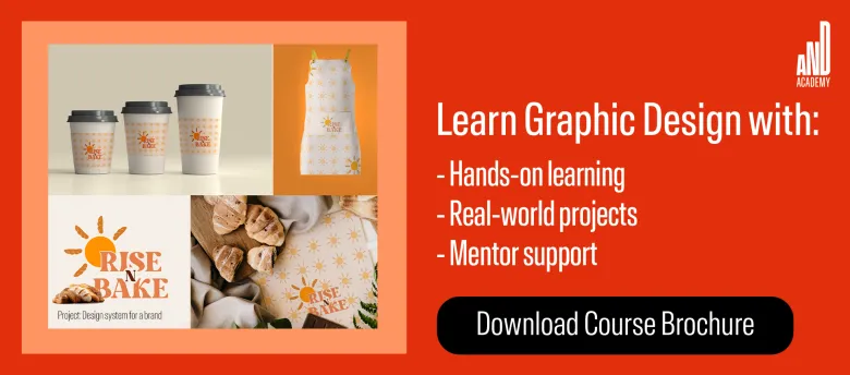
We highly recommend you check out this project by AND Learner, Aromal Jose Baby, for inspiration on how to use colors when creating an application!
In case you need further assistance, here are some of our resources you can consider:
- Watch this session by design veteran and AND’s Academic Head, Prachi Mittal, and our Course Lead, Soumya Tiwari.
- Talk to a course advisor to discuss how you can transform your career with one of our courses.
- Pursue our Graphic Design courses – all courses are taught through live, interactive classes by industry experts, and some even offer a Job Guarantee.
- Take advantage of the scholarship and funding options that come with our courses to overcome any financial hurdle on the path to your career transformation.
Note: All information and/or data from external sources is believed to be accurate as of the date of publication.


