What role does typography play in different contexts? How do you design typography for different use cases, such as logos, posters, or websites? Find out here.
Typography is used in many different contexts—from logos, websites, and apps, to books, posters, and t-shirts (to name just a few!)
While there are common rules and principles that apply to all kinds of typography design, it’s important to recognise that typography can serve different purposes depending on the project and the medium.
How you design typography for a website, for example, will differ greatly from your approach to typography for product packaging. Likewise, typography that works well on a printed poster might not be suitable for a magazine.
In this guide, we’ll explore five common typography use cases and show you how to design for them—illustrating each use case with real-world examples.
Contents:
- What is typography and what purpose does it serve?
- How to design typography for:
- How to get started with typography design
Ready to pick up some typography tips and best practices? Let’s begin!
1. What is Typography and What Purpose Does it Serve?
Most design projects include some kind of text—be it the cover artwork for a book, a promotional poster, a banner ad for social media, or the packaging for your favourite products. Graphic designers are responsible for styling and arranging this text based on the fundamental elements and principles of typography. Take a look at some of our AND learners’ work using typography:-
Typography is a crucial pillar of graphic design. It ensures that any text featured within a given design is aligned with the brand identity, clear, and easy to read, and ultimately determines how effectively the intended message is delivered to the target audience.
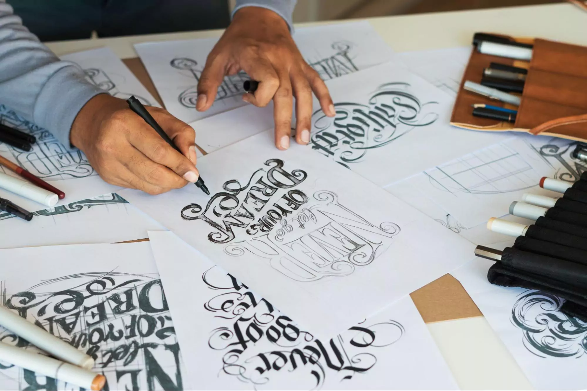
Typography is both an art and a process. It involves choosing the typefaces and fonts that define how each individual letter will be displayed; adjusting the spacing between letters, words, lines, and paragraphs; aligning and arranging the text in harmony with other design elements; and ensuring sufficient colour contrast between the text and the background.
And we’ve only scratched the surface! For a more in-depth exploration of what typography is and why it matters—as well as definitions of key typography terminology—refer to our full guide: What Is Typography? Everything You Need To Know.
Next, let’s consider how typography varies across different use cases—starting with typography for logo design.
2. How to Design Typography for Logos
Logos are a fundamental pillar of a strong brand identity. Consider the iconic Coca-Cola logo or the legendary Nike swoosh. You’d recognise them anywhere and immediately know what brand they represent.

Source: Vecteezy

The purpose of a good logo is to create an emblem for the brand that becomes memorable and easily recognisable. It should capture the brand’s values, help them stand out from the competition, and evoke certain emotions in the viewer.
Often, logos consist solely of type (text), or both text and an icon or image.
In the case of logo design, the goal of typography is to clearly convey the brand name and accurately represent the brand’s personality and ethos.
I. Typography design for logos: Tips and best practices
When designing typography for a logo, you need to first get a clear understanding of the brand, then use this to inform your typeface and colour choices. Let’s consider those factors in detail.
Understand what the brand stands for
What are the brand’s core values? What three adjectives would you use to describe the brand? This will guide you when it comes to choosing a typeface and colours.
Choose a typeface
Typeface refers to how the letters and characters within your logo will be styled. There are three main categories: serif typefaces (like Times New Roman), sans-serif typefaces (like Arial), and script typefaces that mimic handwriting (like Quintessential).
Your chosen typeface should align with the brand personality and ensure that the text is clearly legible. The logo for a luxury beauty brand might suit an elegant script typeface, while the logo for a bank might require a cleaner, more formal sans-serif typeface. Do your research and see what styles work best for the context.
Select your colours (and ensure sufficient contrast)
If the brand already has a defined color palette, you’ll want to use that for your logo typography. If not, refer back to the brand values and personality you’re trying to convey. Different colours hold different associations and can even evoke certain emotions, so think about what colours might be suitable for the brand and the target audience.
If you’re placing your logo text on a coloured background, make sure there’s sufficient contrast between the two colours. This will ensure that your logo is easy to read at first glance.
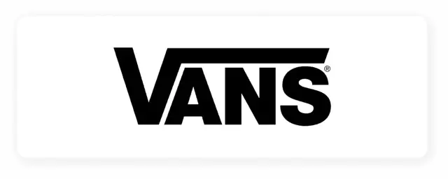
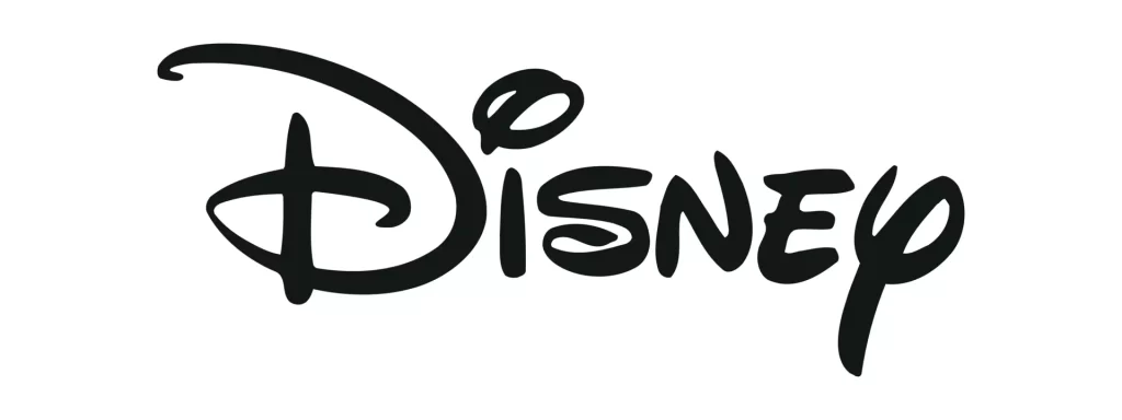
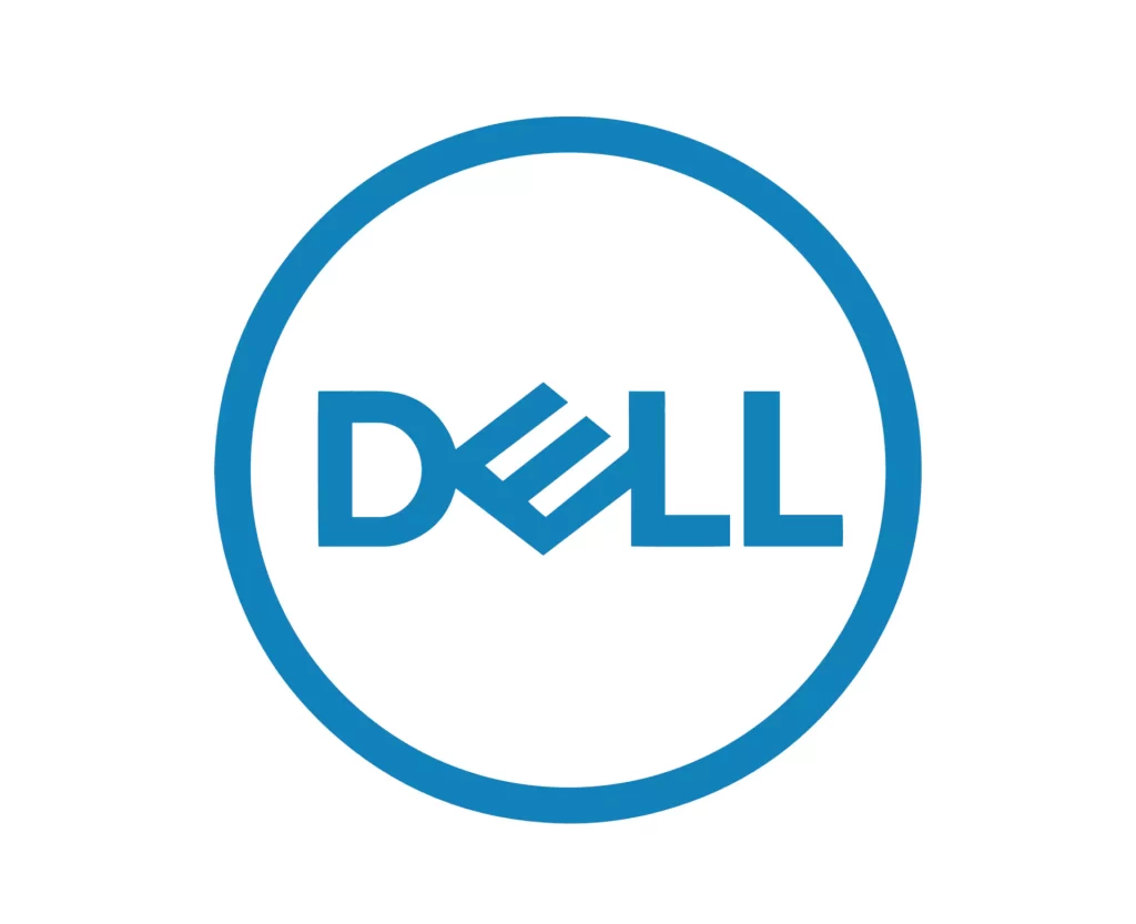
II. Typographic logo examples
Here are some examples of typographic logos to inspire you:
Source: Tailor Brands
Source: Vecteezy
Source: Vecteezy
3. How to Design Typography for Posters
Posters are used for many different purposes: to promote events (think concerts, book signings, and local markets), to advertise products and services (for example, you might see posters promoting a band’s new album or a sale at the supermarket), to raise awareness of important issues, or to provide warnings or instructions.
Whatever message the poster aims to convey, typography plays a critical role. It must catch the viewer’s eye so they want to stop and read what’s on the poster, and it must guide the reader to the most important information first.
See how, in The Little Mermaid movie poster, the title of the film stands out the most, closely followed by the name of the main character (Ariel) and the actor playing her (Halle Bailey)?
That’s no coincidence. That’s down to effective typography!

Source: Deadline
III. Typography design for posters: Tips and best practices
When designing typography for a poster, it’s important to define the key message you want to convey, choose appropriate typefaces, and establish a clear visual hierarchy. Let’s explore these steps in more detail.
Define the key message you want to convey
With posters, you have a mere few seconds to pique the viewer’s interest. Depending on where the poster is located, your target viewer might be passing by in a hurry or not particularly paying attention. So, when you do catch their eye, you want to make sure that you’re delivering the most important information first.
Identify the primary message you want to convey—that will be the focal point of your poster, and it will inform how you style the text. Then establish the secondary and tertiary information that doesn’t need to be as noticeable, but is there if the viewer takes a closer look.
Choose one or two typefaces to feature throughout
With poster typography, you have more scope to use a variety of typefaces and/or fonts—and this can help you to emphasise the most important information.
You might choose a unique, bold typeface for the main message (such as a movie title or the name of a band) and then opt for something cleaner and more legible for the smaller, less prominent text. And, even if you’re using contrasting typefaces, make sure that the overall aesthetic works harmoniously.
Establish a clear visual hierarchy
Hierarchy is a fundamental typography principle. It’s essential that you style and position each piece of text in order of importance.
For example, you’ll want your poster headline or main message to be big and bold, positioned in the centre or at the top of the poster. Secondary information can be smaller and positioned lower down. You can also emphasise key information by surrounding it with plenty of whitespace.
A clear visual hierarchy will naturally guide the viewer’s eye and ensure that they perceive the most important information first.
III. Examples of typography on posters
Here are some examples to inspire you:
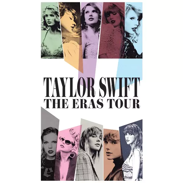
Source: Taylor Swift Official Store

Source: Junique

Source: Wikimedia Commons
4. How to Design Typography for T-Shirts
Fashion can be a powerful way for the wearer to express their views and beliefs, showcase their personality, or convey their love of a certain movie, band, or product.
Depending on the design, typography on t-shirts may have the simple task of displaying the brand name—or it might deliver an impactful slogan or humorous message.
Consider this “Girls support girls” slogan t-shirt by clothing brand Pieces. The cursive script typeface is elegant and eye-catching, and the positioning of the text ensures that this high-impact message stands out.
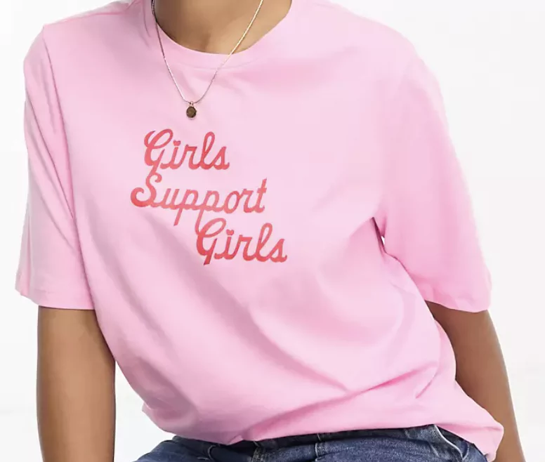
Source: ASOS
I. Typography design for t-shirts: Tips and best practices
Here are some key considerations to make when designing t-shirt typography:
Consider your target audience and the intended message
Like any design project, you’re designing for a specific user or target audience—and, in the case of t-shirt design, a specific wearer. Think about your target persona and what kind of style preferences they might have. Are you designing for a high-fashion crowd or the active outdoorsy type? For festival-goers or business casual?
At the same time, think about the message your t-shirt will convey. Are you designing a one-word logo or a full slogan? A humorous play on words or a serious message?
Each of those factors will help you to design your typography accordingly—from choosing the most appropriate typeface to applying colour and texture.
Experiment with custom lettering
T-shirts with typography are usually worn to make a statement, so don’t be afraid to experiment. Custom lettering is a great way to design something unique and exclusive.
And, because t-shirt design typically contains less text than, say, a website or a poster, you have more freedom to be creative with unusual fonts—without the worry of compromising readability.
Use whitespace generously
Some of the best typography t-shirt designs feature just one piece of text on an otherwise plain background. Make generous use of whitespace—that’s the empty space between and around different design elements—to help the t-shirt’s message stand out.
II. Examples of t-shirt typography
Here are some examples of typography on t-shirts:
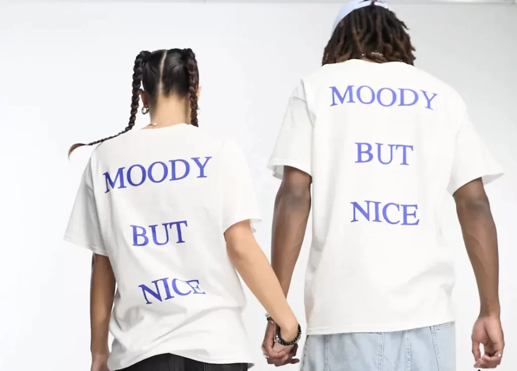
Source: ASOS
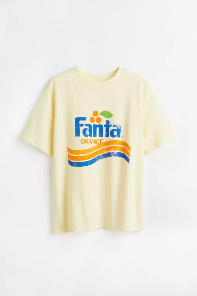
Source: H&M

Source: ASOS
5. How to Design Typography for Websites and Apps
Typography plays a special role in the design of websites and apps because it greatly impacts the user experience—or the UX—of the product in question.
When designing a website or app, the goal is to create something that’s both aesthetically pleasing and user-friendly. It must be designed in a way that’s easy to navigate, enabling the user to find all the information they need and complete their goals—for example, purchasing a product on an e-commerce website or checking their balance on a banking app.
Text helps to guide the user around the website or app, providing instructions and information to help them move from A to B. And, in the case of blogs and e-magazines, text is, of course, crucial for delivering the content the user wants to read.
No matter the context, graphic designers (and, in the case of apps and websites, UX and UI designers) must style the text to ensure that it’s accessible, easy to find and read, and helpful to the user.
I. Typography for websites and apps: Tips and best practices
To ensure effective typography for websites and apps, you must prioritise accessibility, design for different devices and screen sizes, and conduct thorough user testing. Here’s how to do so:
Prioritise accessibility and readability
When it comes to website and app typography, accessibility and readability must be your number one priority. Any text the user encounters should be easy to read—and that goes for every user, including those with visual impairments.
You can prioritise accessibility by choosing easy-to-read typefaces for large chunks of text. Sans-serif typefaces tend to be most prominent in web and app design for that very reason. Examples include Arial, Futura, and Helvetica.
Ensure plenty of contrast between text and the background it’s on—you can use the WebAIM contrast checker tool to make sure that you’re meeting web accessibility standards.
You’ll also need to pay attention to line spacing. Web Content Accessibility Guidelines (WCAG) advise that line height (leading) be at least 1.5x the font size, letter spacing (tracking) be at least 0.12x the font size, and word spacing be at least 0.16x the font size.
Design for different devices and screen sizes
Most users will be viewing your website or app on a mobile device at some point, so you want to make sure that your typography displays perfectly on different screen sizes.
Usually, this requires the application of fluid typography—a technique whereby the text automatically scales depending on the screen size. With fluid typography, values such as font size, line spacing, and letter spacing all scale up or down based on the user’s device.
You can learn more about fluid typography in this guide.
User test
Before you launch your website or app, test your typography to make sure it displays as intended on every page or screen. User and usability testing is common practice in UX and UI design (the design of apps and websites), helping you to identify and fix usability issues—and, in the case of typography, readability issues—before your product is developed.
II. Examples of typography for websites and apps
Check out these examples for inspiration:
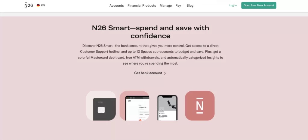
Source: N26 bank website

Source: Hologram blog
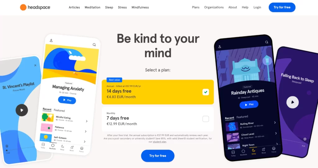
Source: Headspace
6. How to Design Typography for Product Packaging
Typography design for product packaging has the goal of conveying the brand’s identity and marketing that product to the target audience. At the same time, it must condense important product information into limited space—think chocolate bar wrappers, cosmetics bottles, and drink cans.
It also presents the unique challenge of designing for physical materials and, often, for unusual shapes and textures. Designers must prioritise what information the customer is drawn to first, and design in a way that helps the product stand out on a crowded shelf.
I. Typography for product packaging: Tips and best practices
When designing typography for product packaging, allow these tips and best practices to guide you:
Align with the brand identity
Product packaging is an important branding and marketing tool. Think about your favourite products and how you feel drawn to certain brands over others. Often, this plays out on a subconscious level; we just like how certain products look and feel.
When designing the typography for product packaging, you must first and foremost consider the brand identity and the target customer. What are the brand values? What market are they competing in? What does your target customer expect and require from the product?
A consumer shopping for luxury cosmetics will prioritise different factors than, say, someone shopping for organic food. The better you understand the brand and the audience, the more effectively you can design typography for the product packaging.
Choose suitable typefaces for different types of information
Consider all the different types of information your product packaging should present, and choose a suitable typeface for each.
If you’re designing the logo for the front of the packaging, you might opt for a unique, custom typeface. If you’re listing out ingredients, you’ll want a simple typeface that’ll be legible even when small.
Your chosen typefaces and fonts will determine how eye-catching the product packaging is and, equally important, how legible the information is to the consumer.
Place key information at the front, and extra detail at the back
Visual hierarchy takes on a new meaning when it comes to product packaging. Organise the text in order of importance and position it accordingly—with the brand name and/or product name highly visible at the front, and any additional information (like ingredients or instructions) at the back.
II. Examples of typography for product packaging
Here are some product packaging examples to inspire you:

Source: The Ordinary Skincare
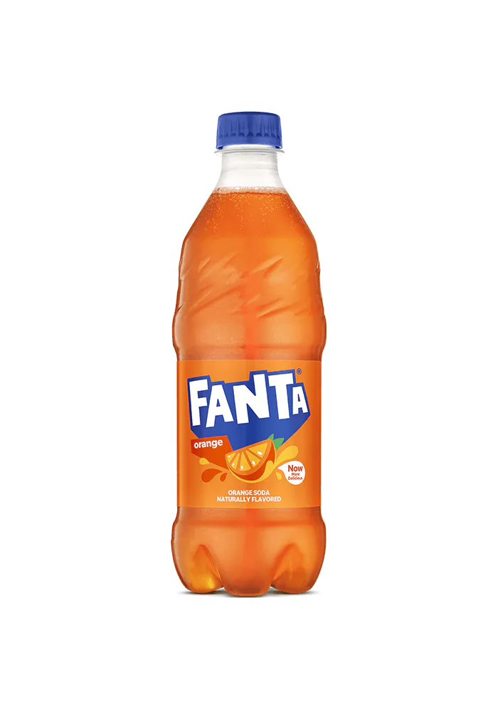
Source: Fanta
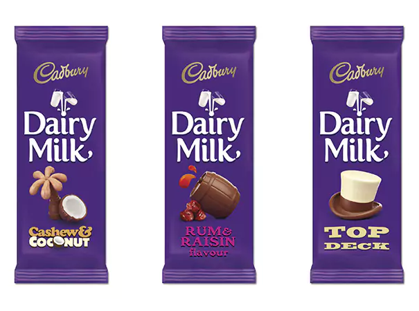
Source: Solopress
7. How to Get Started with Typography Design
That concludes our exploration of typography in different contexts. We hope you found it useful and can now see how, although typography generally follows the same set of principles and best practices, it’s important to adapt your approach and make appropriate choices based on the context for which you’re designing.
If you’re keen to get started with typography design, these resources will help you:
- Drawing Type: An Introduction to Illustrating Letterforms, book by Alex Fowkes (also featured on our graphic design reading list for 2023)
- Thinking with Type, book by Ellen Lupton
- Typography Design 101: Key Elements, Rules, and Principles of Good Typography (blog article)
- AND Academy Graphic Design Course—teaches typography and other essential graphic design skills such as the fundamentals of visual design, brand identity, and designing for print
- Typography logo design tutorial in Adobe Illustrator (free YouTube tutorial)
- Typography t-shirt design tutorial in Adobe Illustrator (free YouTube tutorial)
Want more graphic design inspiration? Check out these 30 outstanding typography examples and these 9 graphic design examples for print, digital, and branding.
8. Next Steps
Here are some additional resources and recommendations that will surely be useful in learning more about graphic design – the industry, career prospects, and much more:
- Watch this session by design veteran and AND’s Academic Head, Prachi Mittal, and our Course Lead, Soumya Tiwari.
- Talk to a course advisor to discuss how you can transform your career with one of our courses.
- Pursue our Graphic Design courses – all courses are taught through live, interactive classes by industry experts, and some even offer a Job Guarantee.
- Take advantage of the scholarship and funding options that come with our courses to overcome any financial hurdle on the path of your career transformation.
Note: All information and/or data from external sources is believed to be accurate as of the date of publication.

