Ever wondered about Pantone colors and what they signify? Read this guide to understand the Pantone color system and its different applications.
SUMMARISE WITH:
Ever wondered about Pantone colors and what they signify? Read this guide to understand the Pantone color system and its different applications.
Have you ever thought to yourself, how is it that the Coca-Cola red, the Red Bull blue, and the Barbie pink always look the same regardless of the medium? The colors are always perfectly consistent. It doesn’t matter if the surface is plastic, metal, fabric, or even LED screens. But how does this happen?
There is a very simple yet powerful system in place that makes sure colors that are reproduced look identical across surfaces and mediums. That system is called the Pantone Matching System (PMS). In this article, we will explore how Pantone became one of the universal language of color, their science, their importance in design, and how they’re used across industries.
Here’s a brief of what we have covered.
- What Are Pantone Colors?
- What is the Science Behind the Pantone Matching System?
- Why Pantone Colors Matter in Design
- Applications of Pantone Colors Across Industries
- How to Incorporate Pantone Colors in Your Workflow
- Challenges of Using Pantone Colors
- New Trends in Pantone Usage
- Pantone Color of the Year
- Final Thoughts
- Next Steps
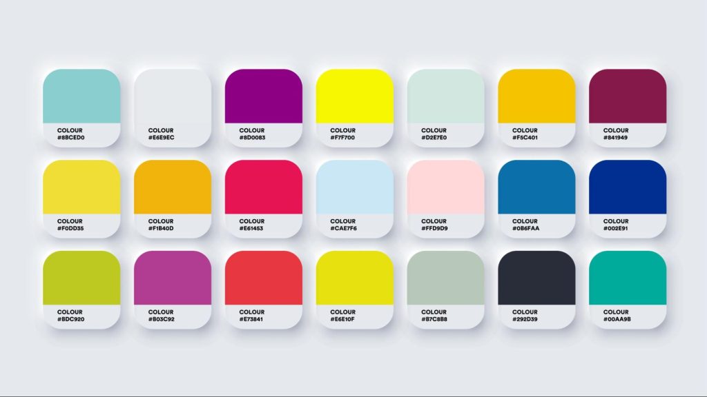
What Are Pantone Colors?
Pantone started as a printing company, back in the early 60s, run by Lawrence Herbert. They would print color swatches for companies that offered products in a range of colors, for instance, a makeup company that sells different shades of lipsticks.
You might think what problem are the color swatches solving? Well, a big one. Let’s say you want to print book covers or packaging boxes for your products. You ask a manufacturer to print the items in a specific color. How do you specify the exact color? How do you tell a manufacturer halfway across the world the exact shade of ‘sand blue’ you want for your boxes? You can send them a HEX code of the color, the #fffhf color codes you see in design software, but how they see it will depend on the brightness and pixel quality of their screen. You can describe it in words, saying ‘similar to turquoise’ or ‘lighter than sea blue’ but that is even more vague. However, if you were to specify the Pantone color code of ‘sand blue’ by looking at your swatch book, the manufacturer would be able to easily identify the color by also looking at their swatch book. And, that is how PMS solved the problem of color matching.
Before Pantone, designers and manufacturers faced challenges in maintaining color consistency. A color that looked perfect on a designer’s screen appeared completely different when printed on plastic and other surfaces.
Thus, Pantone created a shared language for color. When a designer says, “Use Pantone 185 C,” everyone from the printer to the product manager knows exactly what shade of red they’re talking about. This universal language eliminates all ambiguity, ensuring that the final product matches the requirement and remains consistent.
What is the Science Behind the Pantone Matching System?

The Pantone Matching System (PMS) is an engineered system based on color science. At its core, PMS is designed to standardize color reproduction across different materials and processes. Here’s how it works.
Pantone colors are created using a precise mix of base inks. Each color is formulated to ensure consistency across different materials and printing processes. For example, a Pantone color printed on coated paper will look the same as the one printed on uncoated paper, even though the textures and finishes are different. This is achieved by adjusting the ink formulas to account for variations in absorption and reflection by different materials.
For example, “Pantone 19-4052 Classic Blue” is a specific shade of blue that will look the same whether it’s printed on paper, painted on a wall, or woven into fabric. The PMS system also includes different libraries for various applications, such as solid colors, metallics, and pastels. These libraries are updated regularly so that they keep pace with trends and technological advancements.
Pantone swatches work in a way similar to clocks. ‘6 PM’ does not exist outside of the clock, but it is a common reference point that two people across cities can use without any confusion as to what it means. Similarly, Pantone swatches are a common reference point between two people looking to match colors.

An important aspect of the PMS is that, unlike RGB and CMYK color production systems, it relies on and accounts for the way the human eye sees color. RGB and CMYK are methods of mixing ink or lighting pixels to produce colors. The human eye can see more colors than systems like RGB, CMYK or even Pantone can produce. But, since Pantone offers proprietary color swatches and formulas for matching and reproducing colors for various surfaces that look identical to the human eye, it is often preferred over other color models. Moreover, Pantone swatches have RGB and HTML codes along with unique Pantone color codes, which makes matching colors from a screen easier.
Why Pantone Colors Matter in Design
The principle of the Pantone system relies on how color is produced– during the design phase of a product, perceived– on the mockups and prototypes, and then produced again– by the manufacturer, as intended on the final product.
Let’s say a designer creates a logo for a brand. They will first note the RGB color code– let’s say RGB (164,120,100) of that color specified by their software. Then, they will use the PMS software plugin or a PMS swatch book to find the corresponding Pantone color for the same RGB code- which is PMS 17-1230 in this case. They will then send the design to the manufacturer who will use the respective ink formula of the Pantone 17-1230 to reproduce it on various surfaces that the logo needs to be printed on, for example – paper, plastic, or metal. This is how PSM is used to make sure that colors look consistent across mediums like paper, plastic, vinyl, aluminum, and other mediums, after printing.
Applications of Pantone Colors Across Industries
Since Pantone offers formulas for creating ink to achieve specific colors, it becomes applicable to a wide range of industries, from fashion to packaging to interior design. In graphic design, Pantone is widely used in print and digital design to ensure color accuracy. For example, a designer creating a brochure for a luxury brand might refer to the ink formula of Pantone metallics to achieve a premium look.
In the fashion industry, designers use Pantone to create color palettes for their collections so that the colors of fabrics, accessories, and even makeup align perfectly.
Product designers also rely on Pantone to maintain color consistency across products. Whether it’s a smartphone, a kitchen appliance, or a piece of furniture, Pantone ensures that the final product matches the designer’s vision. This is especially important for brands that offer products in multiple colors, such as Apple or IKEA.
In the packaging industry, Pantone ensures that product packaging looks the same on the shelf as it does in the design mockup. This is important for creating a strong visual identity and attracting customers. For example, a brand might use a specific Pantone color palette to make its packaging stand out among others.
Filmmakers use the system to achieve specific visual aesthetics, ensuring that a film’s color palette aligns first with its storytelling and later with the screens and fabric it is displayed or projected on respectively. The film’s color palette refers to the different sets of colors that are meant to convey the emotion of a specific scene as well as specify the setting of the scene. For example, the color palette for a Disney princess movie will be very different from that of a movie like Birdman.
1. Pantone in Branding
The USP of Pantone is in the consistency it offers as a solution. It ensures that colors remain consistent across different mediums, from print to digital to physical products. This consistency is important for brands, which rely on color to create a recognizable identity. Think of Coca-Cola’s iconic red or Tiffany & Co.’s signature blue. These colors are instantly recognizable and evoke emotional responses. If these colors were not to remain identical across mediums, the brand identity would crumble. Without Pantone, maintaining this level of consistency would be nearly impossible.
The consistency offered by Pantone is such that Heinz ran an ad campaign saying that any ketchup that does not match Pantone RED 57, is a knockoff. We also recommend that you check out this brand identity project by AND Learner, Meenakshi S, for inspiration!
2. Pantone in Interior Design
Interior designers rely on Pantone to create color schemes for homes, offices, and public spaces they design through their software. Whether it’s choosing the shade of white for a minimalist living room or an accent color for a modern kitchen, consistency among the colors while drawing the schematics is highly important. Since Pantone also offers their matching system as integrations or add-ons to existing software packages, it becomes easier for designers to match color as they go through the design process.
Another challenge in interior design is ensuring that colors look the same in different lighting conditions. PMS helps designers overcome this challenge by providing accurate color references. For example, a designer might use Pantone chart guides to select a shade of blue that looks perfect in both natural and artificial light.

How to Incorporate Pantone Colors in Your Workflow
Working with Pantone colors might seem intimidating at first, but it’s actually a straightforward process once you understand the available tools. The first step is to invest in a Pantone swatch book, which provides a physical reference for every shade. This is particularly useful for print projects.
For digital designers, Pantone offers plugins for software like Adobe Photoshop and Illustrator, so that you can integrate Pantone shades into your projects. These tools also allow you to convert Pantone colors into RGB, CMYK, or HEX formats.
Pantone provides conversion tools that simplify this process, ensuring consistency across platforms. For instance, you might need to translate a Pantone color into a CMYK mix for printing, since most printers understand CMYK or an RGB code for digital use.
Challenges of Using Pantone Colors
A common misconception among designers is that Pantone owns colors.
Pantone does not own colors, but the process of matching and reproducing them. The matching process is embodied in the swatch books that they sell. A major drawback is cost. Pantone tools, including swatch books and digital licenses, can be expensive, making them less accessible for freelance designers and small businesses.
Another issue is accessibility. While Pantone is widely used in industries like fashion and packaging, it’s not universal. Some sectors prefer alternative color systems like CMYK or open-source options. This can lead to compatibility issues, particularly when collaborating with international teams.

New Trends in Pantone Usage
The world of design is constantly evolving, and Pantone is no exception. One notable trend is the integration of Pantone with digital platforms. Software and apps now allow designers to experiment with Pantone colors in virtual environments, enabling faster iteration and greater creative freedom.
Sustainability is another growing focus. Pantone has introduced eco-friendly initiatives, such as water-based inks and biodegradable swatches, reflecting the design community’s shift towards environmentally responsible practices. This aligns with the broader movement towards sustainable design, where color choices play a significant role in reducing waste.
Pantone Color of the Year
Each December, the Pantone Color Institute makes headlines by announcing its Color of the Year, a shade that reflects the mood and aspirations of the coming year. This tradition, which began in 2000, is more than marketing; it reflects the macro-level zeitgeist of the current cultural and societal trends.
The Color of the Year takes inspiration from as well as influences a wide range of industries, from interior design to technology. For instance, “Living Coral,” Pantone’s Color of the Year for 2019, symbolized a push toward environmental awareness and sustainability. Meanwhile, “Very Peri,” a vibrant ‘periwinkle blue’ chosen for 2022, celebrated creativity and innovation during a time of global transformation. Designers eagerly anticipate Pantone’s announcement, as it often serves as a guiding light for their creative projects. Almost all fashion runways reflect the Pantone color of the year.
What is the Pantone Color Of The Year 2026?
The Color Of The Year for 2026 is PANTONE 11-4201 Cloud Dancer. The color is inspired by a future inspired by clarity.
“The cacophony that surrounds us has become overwhelming, making it harder to hear the voices of our inner selves. A conscious statement of simplification, Cloud Dancer enhances our focus, providing release from the distraction of external influences,” says Laurie Pressman, Vice President of the Pantone Color Institute.

Final Thoughts
Pantone colors are one of those things most people never think about but rely on all the time. They’re why Coca-Cola red, Barbie pink, or Tiffany blue always look exactly right, whether on a billboard, a dress, or a glossy brochure. It is surprising when you realize how much effort goes into keeping the world visually consistent. A simple swatch book solves what could be a chaotic mess of mismatched colors. From high-end fashion collections to ketchup bottle labels, Pantone is in the background, making sure things look the way they’re supposed to and the way people know them to be.
Next Steps
In case you need further assistance, here are some of our resources you can consider:
- Watch this session by design veteran and AND’s Academic Head, Prachi Mittal, and our Course Lead, Soumya Tiwari.
- Talk to a course advisor to discuss how you can transform your career with one of our courses.
- Pursue our Graphic Design courses – all courses are taught through live, interactive classes by industry experts, and some even offer a Job Guarantee.
- Take advantage of the scholarship and funding options that come with our courses to overcome any financial hurdle on the path of your career transformation.
Note: All information and/or data from external sources is believed to be accurate as of the date of publication.


