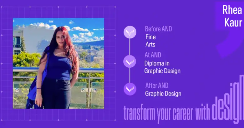
In this edition of our student journeys, Rea Kaur, a talented graphic designer, shares her transformative learning journey as she transitions into the world of Graphic design and gives us a detailed walkthrough of her capstone project.
“There’s not really a right or wrong answer, it just has to make sense in a visual language.”
Back with another insightful student journey, we are in conversation with Rea Kaur- an AND learner who has completed the Diploma in Graphic Design course with us. Come along as she shares her design process, project insights, and experience at AND Academy in this engaging student interaction.
Here’s an overview of our conversation:
- Rea’s background and interests
- What sparked her interest in Graphic Design?
- Capstone Project Brief
- Walkthrough of her Pashmina Brochure Project
- Overall experience in creating the Brochure
- Challenges faced by her on the Project
- Top three aspects of her experience at AND Academy
- Her career aspirations as a Graphic Designer
- Advice for aspiring Graphic designers
Q1. Rea, tell us a bit about yourself and your background before design. Also, what initially sparked your interest in the design world?
I’m Rea Kaur, and I was born and raised in Greece. My background is in Fine Arts. To be honest, after graduating, I felt very lost. I still loved art and knew I wanted to do something within that realm, but I didn’t exactly know what.
That’s when I started approaching design. I initially thought, “Okay, this might change my thinking.” I have always been interested in art, even as a kid. I was always daydreaming in school, and I felt very much like an outsider. When I found art, I realized I could use colors and different materials to express myself in a way that helped me understand myself better. Also, I was never really into science, so pursuing art felt perfect for me!
My interest in graphic design started when I was 10 or 11 years old and took the GCSE Art course. As I started building my portfolio for that, I found myself creating a lot of work with elements resembling graphic design. From then onwards, my interest peaked, and I became very curious to explore graphic design further.
So you found your calling in art early on!
Q2. What specifically drew you to graphic design from Fine Arts, and why did you choose AND Academy for this learning journey?
Transitioning from Fine Arts to Graphic Design was a natural progression based on the work I created for my art portfolio. The visual elements just clicked for me.
A big factor in choosing AND Academy was my location. At the time, I couldn’t move somewhere physically to study graphic design in person. I was also looking at various schools, and several I initially looked at didn’t have the fun and excitement I was looking for when it came to studying graphic design.
So, one day I just searched online for design courses, and AND Academy popped up – it was the first option I saw. I looked into it and thought, “Okay, maybe this is perfect.” I was already very used to online classes, so the remote aspect didn’t bother me; I didn’t mind the distance.
The admission process itself was very smooth and I felt welcomed right from the start. I explained my background and the distance factor, and they understood my situation. It just felt right.
Good to hear that AND Academy organically fit into your needs.
Q3. Let’s talk about your brochure project. Can you describe the project brief and your initial approach to understanding it?
This project was from Module 2 and focused on Kashmiri Pashmina shawls. The core task was to create a brochure for an exhibition centered around this theme: “The Journey in Textile”. It was for an exhibition about Pashmina. For the organizer side, I imagined using the Dastakar Society for Crafts would be appropriate, since they represent a lot of different, authentic arts and crafts- all showcasing the heritage of Pashmina.
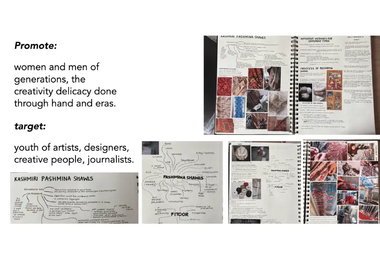
Project Brief for PASHMINA SHAWLS
My initial approach was very hands-on, almost entirely manual at first. I believe in really immersing myself in the topic. So, I started doing everything by hand, extensively researching and brainstorming. I spent much time collecting images of Pashmina, Kashmiri culture, textiles, and craftsmanship. I filled pages in my sketchbook, just trying to absorb everything and understand the topic deeply before moving to the final output. These sketchbook pages were crucial for me to get comfortable with the subject.
A great overview with attention to detail in each step.
Q4. Mind walking us through your design process for the Pashmina brochure project?
Okay, so after the initial sketchbook phase, I moved toward creating a digital mood board. It was essential to see the different types of shawls that exist out there and to get a feel for the visual language. I explored the various types of embroidery specific to Pashmina and looked at close-up details to understand the intricacy and how the shawls were styled historically and currently.
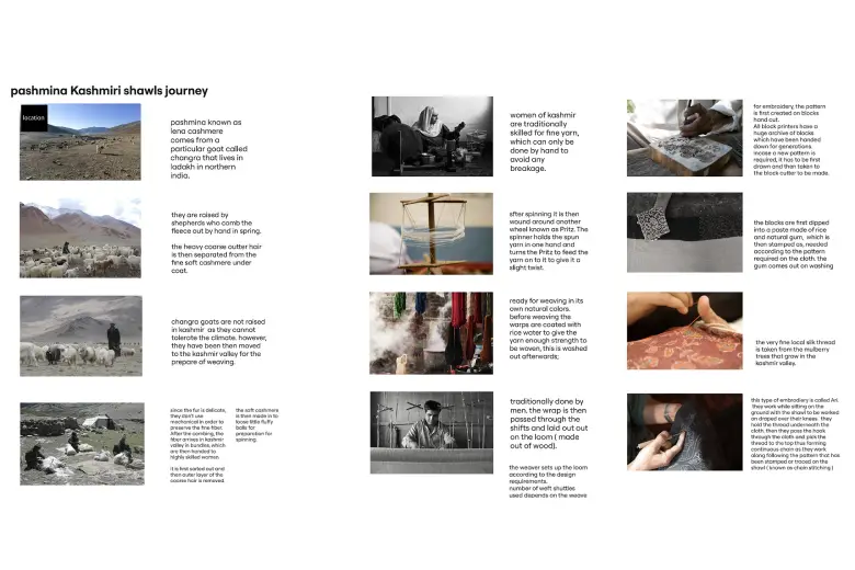
Pashmina Shawl Journey
My research could not be superficial; I had to dive into the topic to grasp what I needed to produce. I started with the history – where did Pashmina start? What was the journey of the craft? I learned about how women were traditionally the primary artisans skilled in this and how men didn’t participate as much in the past. I looked at more types of embroidery and how they’re meticulously made – they’re incredibly intricate! I also researched various traditional patterns in the region.
Then, I started trying to produce some patterns based on this research. However, the timeframe for the project felt quite tight, so I tried not to get into very complex motifs. I focused on developing patterns that captured the essence based on what I’d managed to research and absorb.
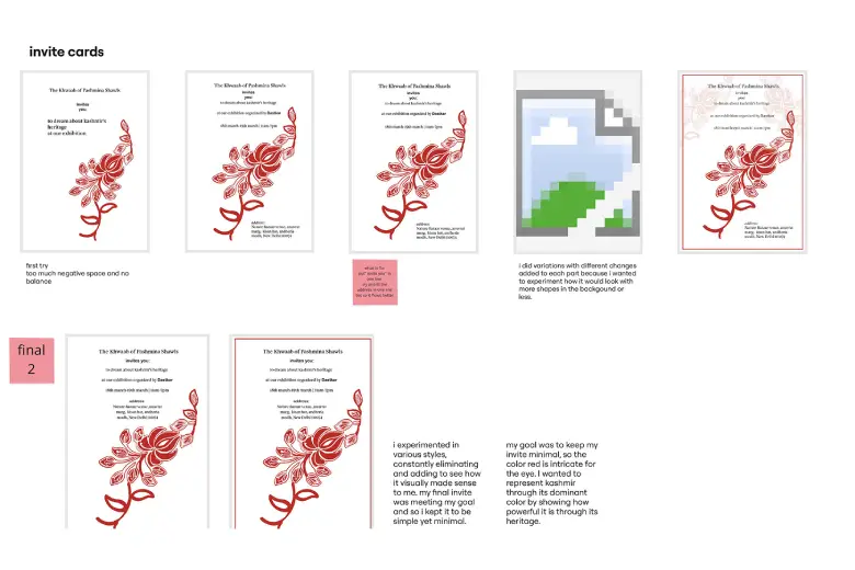
Invitation cards
Next came the actual brochure design. I started with an invitation card concept. At first, I didn’t think practically about the space needed for text versus visuals. In my head, it just made sense that I could fit a lot of information in. But when I started designing it, I realized it took a lot of effort to remove and simplify information to make it visually appealing and readable. I first created several hand drafts of the brochure layout, exploring different folding styles and how the information could be contained. These hand-drawn drafts became my references.
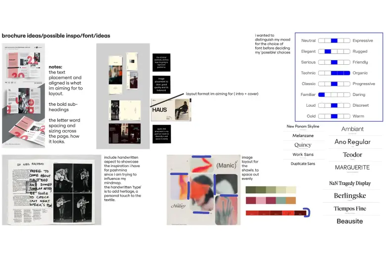
Brochure and font ideas.
I also spent time specifically looking at typography. I wasn’t initially sure what mood I wanted the text to convey, so experimenting with different fonts and styles was really helpful in finding the right fit. I printed the brochure drafts to see how the colors would look. It’s one thing to see colors on the screen, but printing helps understand the pigmentation, though, of course, the lighting affects it, too. Finally, I created a few digital mockups to visualize the final brochure in a more realistic context. I chose red as the primary color because, somehow, it strongly represented Pashmina as a topic for me. For the typography, I chose black because I thought it would be the simplest, cleanest option to complement the visuals without being too distracting- not too much, and not too little.
Well, that’s really a lot of research that you’ve done.
Q5. How would you describe the overall experience involved in creating this brochure?
The process felt like a roller coaster, with ups and downs but mostly intense emotions! When we initially got the list of topics, I picked Pashmina first. Miss Lopa was my mentor then, and I was grateful for her support. She knew time management wasn’t my strong suit but consistently supported me throughout each session.
When I first received the topic, my immediate reaction was to brainstorm the final idea, which I now know is wrong as a designer. You tend to think about the outcome and neglect the crucial initial stages. Upon realizing this, I consciously pulled back and started focusing on my sketchbook pages. I needed to get comfortable with the topic of Pashmina, asking myself, “What does this mean to me? What do I think? Why is it this way?” It involved a lot of questions and deep research. I was really intrigued by the process itself. I even told Lopa Ma’am that I was taking more time than others on research and doing everything by hand before moving to digital mood boards.
Defining the target audience was another important stage. This isn’t just about visual design; it’s about communication. I wasn’t just designing something pretty; I had to think about who would receive this brochure. I envisioned targeting everyone in the creative world and art space because artists and designers often operate in correlated but different spheres. I also wondered how different fields would feel about this topic if I presented it at the Dastakar event. I targeted artists, designers, creative people, and even journalists because each would have their own opinions and perspectives on the design.
The classes and feedback helped me refine things. For example, learning about visual hierarchy and balancing elements made me realize I couldn’t just put everything I researched into the brochure. Feedback helped me see the need for simplification and better alignment with my chosen narrative. It’s still informative; people know what I’m talking about, but it’s not overwhelming.
That’s a great thought process.
Q6. What were your biggest challenges on these projects (brochure and poster), and what key learnings did you gain?
Oh, the challenges were definitely part of the process! As I mentioned, time was a major factor for the brochure, and effectively managing the sheer volume of information was tough. All the research overstimulated me, and I initially felt I had to include every detail, which was wrong. Learning to edit, prioritize, and place information strategically was a big challenge. About the design aspect, making it visually cohesive and balanced also took significant effort.
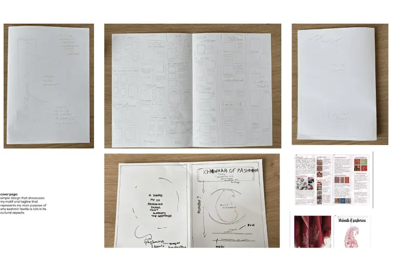
Design Process
For the typography poster, the challenge was different. I started with messy, random ideas because I felt blocked. Translating these hand-drawn sketches and traces into a refined digital composition took time. The biggest challenge came with the feedback from Prachi Ma’am. When she questioned why I deviated so far from my simpler initial idea, it made me pause. Hearing that my final, more complex version wasn’t the strongest was challenging. It felt like, “What did I do wrong?” But it led to a crucial learning moment.
That feedback has stuck with me. Since then, I have kept referring back to her advice about being mindful of my decisions and their impact on the design outcomes. It taught me to be more confident in my initial instincts and not overwork ideas just for the sake of complexity.
Across all these portfolio projects, the main challenge was the internal pressure and stress. This was my first portfolio project, so everything had to be the best and look perfect. I kept looking back at the initial stages, wondering if I was missing something or needed to add more. It led to a lot of overthinking.
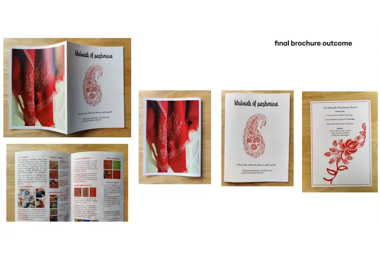
Final Brochure
But the learnings were huge! These projects unlocked new skills, a new way of thinking, and a new approach to design. While I have a set routine now, each project conveyed a different emotion and taught me something unique. A key learning, reinforced by feedback, is to always look at things from various perspectives, experiment, and understand what creates balance. I initially neglected that, especially when placing elements and text, but now I take it very seriously. Fundamentally, these projects solidified my reliance on pen and paper. Even with iPads and software, starting with my sketchbook is the only way things make sense. It’s about making mistakes and taking the process down, and that’s my final stretch before digital refinement.
Your reflection on your design process and challenges show great effort.
Q7. What were the top three most impactful aspects of your learning experience at AND Academy?
My top three aspects would be the mentors, the learning environment, and the masterclasses.
Each mentor offered a different insight. It felt like having various types of friends as mentors and that made me comfortable expressing my needs and self, even though I’m usually the type who never raises her hand in class! They pushed me to express my ideas out loud, and I’m thankful for that.
The second thing was the classroom environment–it was interactive and fun. The people in the class also made it interactive; it never felt boring or like I wanted to nap! I felt like I was sitting in a real classroom, even though it was online. I started in Batch 5, and though I had to take a break from work and rejoin Batch 6, Batch 5 holds a special place in my heart. I made two of my most inseparable friends from that batch. Everyone was so creative, never ashamed, never feeling superior. They always helped, provided insight, and made the classroom feel like a home, like a little get-together with design colleagues. I’m very thankful for all of them.
And lastly, the masterclasses were fantastic. Each topic brought in a different perspective but connected back to our portfolio projects. I liked those masterclasses, and hope to join future ones!
That’s great to know.
Q8. What are your current career aspirations? What roles or industries are you targeting?
Right now, I’m focusing on both my artistic and design sides. Regarding design, my primary focus is building a stronger portfolio. I’m reworking most of the projects I did during the course to improve them.
And I hope to land a design job somewhere. My goal is also to move back to India at some point. I miss the graphic design and art aspect there. It feels very limited where I am currently, in Greece. When I see the opportunities, experiments, and innovation happening in India, I want to push myself, do better, and get more support to be part of that scene. So, landing a good design job in India is my main goal.
Those are some very focused aspirations!
Q9. What’s your key advice for someone starting a similar graphic design journey?
My advice would be: Go for it! You have nothing to lose. Once you start, you’ll figure things out. Always be in the loop throughout the journey, be more expressive with your work, and be confident. Keep striving to put much into your work – the more variety you show, the better.
And importantly, don’t neglect the old-school techniques! Don’t neglect the pen and paper. Always keep it with you. You might not even have it in the near future, so use it now!
Also, regarding the AND curriculum, I found it very structured and to the point. Nothing is confusing. The mentors always remind you what to focus on for each module. My advice for tackling the curriculum would be always to stay up-to-date. When you receive your module, review the Canva materials and each topic, and be prepared. Be ready to be interactive! Keep all your work up-to-date.
That’s a piece of great advice—go for it and figure things out along the way.
Rea Kaur’s path from Fine Arts to Graphic Design is a story of rediscovery and adaptation. Her journey demonstrates that basic art skills can lead to new creative opportunities. Design education and a willingness to learn also play important roles.
Her experience at AND Academy shows how important it is to have supportive mentors and highlights the value of an interactive learning environment. Peer collaboration is powerful, even when learning online.
Feeling inspired by Rea’s journey? Explore how AND Academy’s Graphic Design courses can help you refine your skills and build a strong portfolio. Contact our Course Advisors to learn more about our programs and start your own design career today!
Note: All information and/or data from external sources is believed to be accurate as of the date of publication.

