From too many fonts to slow load times, what are the most common mistakes in UI and UX design and how can you avoid them?
With websites and apps competing for user attention, the user experience has become a key market differentiator for brands seeking to stand out from the crowd. Users are quick to abandon platforms that offer a poor experience, instead turning to those that offer the same service in a clearer, faster, or more intuitive way. Companies are increasingly realizing that even the most innovative and beautifully designed apps and websites can fail if they don’t prioritize usability, accessibility, and functionality.
If you want to ensure your website or app meets the needs of your audience, keep reading. In this article, we’ll outline the nine most common UI and UX design mistakes that hinder usability, frustrate users, and prevent you from providing an optimal user experience. From ignoring user research to poor visual hierarchy, we’ll cover the errors that can compromise the success of your project and provide clear, actionable steps on how to avoid them.
If you’d like a quick visual overview before diving in, this video provides a walkthrough of some of the most common UI and UX design mistakes, accompanied by practical examples that bring these challenges to life.
Here’s a quick brief of what we’ll cover in this blog.
Contents:
- Ignoring user research
- Overcomplicating navigation
- Neglecting mobile optimization
- Poor visual hierarchy
- Using too many fonts
- Slow load times
- Not providing feedback
- Overloading with content
- Poor color choices
- Conclusion
What are the most common mistakes found in UI and UX design?
Let’s dive into the errors most frequently made by UI and UX designers–and how you can solve them.
1. Ignoring user research

The mistake
Have you ever been part of a team where, instead of paying attention to user feedback, you’ve been encouraged to follow a hunch or make an assumption? Perhaps you’ve even been told not to bother with user research at all, as the team assumes it already knows how users think, feel, and behave.
Ignoring user research is a huge mistake, but it’s an oversight that you often see the poor results of. Although you may be under the impression that not performing user research will save time, this is far from true. In the long term, ignoring your user’s feedback will lead to many more rounds of designing and testing as well as products that do not meet user’s needs.
How to avoid it
The only way to avoid this mistake is to make user research an absolute priority.
Before you begin sketching your ideas, perform user interviews, surveys, and usability testing to uncover qualitative and quantitative user data, you may want to consider using tools like personas, journey maps, and wireframes, too. These techniques help visualize your initial thoughts and assess how you’ll address user needs, pain points, and preferences.
While user research should always be the first step in the design process, it doesn’t end there. Aim to gather continuous feedback from real users throughout the design and development of your product to ensure that it aligns with user expectations and fully meets their needs.
2. Overcomplicating navigation

The mistake
Overcomplicating navigation is an all-too-common mistake in UI and UX design. While trying to give users a range of options and experiences, designers can end up making their navigation overly feature-rich, offering a confusing array of options, categories, or menus.
Despite being well-intentioned, this can often result in a cluttered page and a confusing experience. Users come away feeling overwhelmed and not achieving what they came to the site or app to do.
Overcomplicated navigation isn’t just annoying for users, it can also be frustrating. Prioritizing a trendy design element or layout may look impressive initially, but when it’s hindering accessibility and usability, users will jump to a competitor’s site or app that they can navigate more easily.
How to avoid it
If ever there was a case for keeping it simple, this is it.
Navigation should feel intuitive to users, so don’t include anything that does not absolutely need to be there. Instead, focus on the essential actions and pieces of content that users need.
Next, organize these elements into a logical sequence, limiting the number of options users have at each stage. In addition, try to keep patterns familiar and consistent as this will reduce cognitive load. Use clear menus, breadcrumbs, and intuitive icons, keeping small elements in the same position on the page each time.
User testing will be pivotal to the success of your on-screen navigation, informing you of the best way to guide users toward their destination. It’s a good idea to conduct usability tests to identify pain points in the navigation and uncover any areas that would benefit from streamlining.
Finally, consider incorporating a search function to help users find specific content fast.
3. Neglecting mobile optimization

The mistake
With so many of us accessing websites and apps via mobile devices these days, it’s surprising how common it is for brands and products to neglect mobile optimization. Indeed, there are still many designs that are simply not tailored for smaller screens.
When content is too small to read or buttons are hard to click on via a touchscreen, users get frustrated. Worse still, users are likely to abandon a site that doesn’t cater to their mobile device, leading to higher bounce rates, lower engagement, and unhappy customers.
How to avoid it
Avoiding this mistake is simple: adopt a mobile-first approach to design. This means that rather than designing with a laptop or desktop computer in mind, prioritize designing for handheld devices. From this starting point, you can progressively enhance your design for larger screens like tablets and computers.
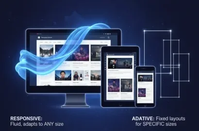
Responsive design is important here. Use a grid system as part of your adjustment process as this will help you to create flexible interface layouts that can easily adapt and change to differently-sized screens and resolutions.
Here are some other top tips to improve mobile optimization:
- Ensure buttons and links are large enough for users to tap on them
- Provide plenty of space between clickable elements
- Optimize images for quick loading on mobile networks
- Test your design on a wide range of devices to uncover any issues
- Prioritize speed, accessibility, and clarity to ensure a seamless mobile experience
4. Poor visual hierarchy

The mistake
Poor visual hierarchy is another UX and UI design error that users often cite. Visual hierarchy is important to the user experience because it helps them know what is most important on the page and where to focus their attention. When this is neglected, a page doesn’t just feel chaotic and disorganized, it’s also much harder for users to find what they’re looking for and to absorb the available information.
Examples of poor visual hierarchy include:
- Not distinguishing between font sizes for headers and body text
- Overcrowding the interface with too many design elements
- CTA buttons that are not clearly highlighted
How to avoid it:
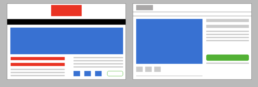
Your first step in avoiding a poor visual hierarchy is to identify the most important elements on the page. Make a list of these things and number them in order of importance. Next up, using different font sizes, weights, and styles, organize the page’s content into headings, subheads, and body text.
Color and contrast are also helpful here. High contrast between text and background colors bolsters accessibility for those who have vision impairments as well as improving readability for everybody. Use colors to strategically highlight key actions or content too. For example, make your CTAs red so that they immediately stand out on the page.
Finally, group together related items on the page while being mindful not to overwhelm users with too much information at once. Use white space between different sections to give your users time to digest what they are reading. This will also make the page feel less crowded.
5. Using too many fonts

The mistake
It can be tempting to use a range of different fonts when designing the interface of an app or website in an attempt to draw the user in or create a certain on-page aesthetic.
However, even with good intentions, mixing together multiple fonts can create an inconsistent and unprofessional impression, making the page not only feel cluttered but also inhibiting a user’s ability to read the text.
Using too many fonts is distracting too. Users get confused when they are trying to discern where they should or shouldn’t focus their attention. Not only does this overall lack of consistency negatively impact your brand’s identity, but different fonts completely undermine a cohesive aesthetic, limit accessibility, and make your site unpleasant to navigate.
How to avoid it
There’s a simple way to avoid making this common mistake: limit the number of fonts you use in your design.
We’d recommend sticking to two or three–one for headings, one for body text, and possibly a third for CTAs. Whatever you decide, make consistency your priority, and, when choosing your fonts, select those that complement each other, rather than those that clash or compete for a user’s attention.
If you’d like to create contrast and emphasis, use font weights and styles within a single font family instead of placing different ones next to each other. By approaching typography this way, you will maintain visual harmony on the page while still drawing attention to the right elements.
6. Slow load times

The mistake
Is there anything more annoying than a website or app that takes ages to load? The unanimous answer would likely be, NO.
Not only does this experience impact user engagement and lead to frustration, it frequently causes users to abandon the website or app altogether to seek out a competitor who can provide the same service more promptly.
Even a small delay can be enough to make your bounce rate higher, your conversion rate lower, and lead to a more negative perception of your brand.
Elements that impact load times negatively include:
- Large image files
- Unoptimized code
- Excessive third-party scripts
How to avoid it
Your first step in speeding up load times and reducing user frustration is to optimize images and media files. You can do this by compressing images and using appropriate file formats like WebP or SVG for graphics. A quick solution is to use an online JPG to WebP converter, which reduces file sizes significantly while keeping the image quality intact.
Next up, ensure that so-called “lazy loading” (also known as “asynchronous loading”) is implemented. This commonly used computer programming technique means that media files and objects are only initialized or loaded when they come into view for the user. This reduces the initial page load time.
There are several more steps you can take to speed up load times. Minify and combine files such as CSS, JavaScript, and HTML. This reduces the number of requests the browser needs to make, in doing so streamlining the loading process.
Also consider leveraging caching, which stores regularly-accessed resources on the user’s computer or phone. This makes the pages faster to load on future visits.
7. Not providing feedback

The mistake
Feedback is usually a clear visual, auditory, or haptic response to, say, a button being clicked, a form being submitted, or a page being loaded. It’s integral to the success of the UI design of a website or app and works as a real-time communication bridge between the user and the system.
When this feedback is neglected or forgotten, users are left unsure of the success of their inputs which leads to confusion and frustration. It may result in them repeating their initial action, confusing the process further, or, worse, abandoning the website or app altogether.
How to avoid it
It’s of paramount importance that UI designers issue immediate, clear feedback in response to every user interaction. They can do this using:
- Visual cues like a loading spinner to signal that an action is being processed
- Confirmation messages after actions like a form being submitted or a purchase being completed
- Status indicators to show progress and manage a user’s expectations
- Clear, actionable error messages that state the problem and how to fix it
To identify the areas where feedback is lacking or unclear, test your design regularly with real users.
Finally, when implementing feedback, always ensure it is timely and understandable. This is crucial for improving usability issues and boosting user satisfaction.
8. Overloading with content

The mistake
Overloading an interface with content refers to when a page contains excessive text, images, or interactive elements. This is a common mistake made by designers who are looking to communicate too many messages or ideas at once.
When this occurs, users struggle to identify what is important on the page and to process all the details at once. This cognitive overload can leave users feeling lost or frustrated, resulting in a very poor user experience.
How to avoid it
When deciding what content to display on your website or app, think carefully about the key messages or actions you want to draw your users’ attention to first.
With this identified, seek to prioritize and simplify this information until those key messages and actions stand out. You can do this by using clear hierarchies, different font sizes, color contrast, and spacing. By organizing your content this way, you’ll guide users to the most important content on the page and avoid confusing or frustrating them.
Finally, leverage the following techniques to make the information on your page easier to scan:
- Break up content into digestible sections
- Use headings, bullet points, and collapsible panels
- Avoid cramming everything into a single screen
- Use white space to reduce the feeling of clutter
- Implement progressive disclosure, where only essential content is shown at first and more detail appears upon interaction
9. Poor color choices

The mistake
Clashing colors, insufficient contrast, and overly bright or muted palettes are all examples of poor color choices that can lead to an unpleasant user experience.
When these errors are not addressed, users can struggle with readability issues, visual discomfort, and accessibility, making it difficult for them to navigate an interface or find the information they’re looking for.
When it comes to those with color blindness or visual disabilities, poor color choices can exclude them from engaging with the content at all.
How to avoid it
To avoid this mistake and design a more pleasant experience for users of your website or app, you’ll need to ensure there is sufficient contrast between the text and background colors on the page. High-contrast interfaces improve readability for all readers but also better support those who may have accessibility issues.
Rather than mixing together a wide range of colors or shades, stick to a limited color palette that aligns with your branding. Use color consistently across the page, for example using the same colors for specific elements. This cohesive approach helps users familiarize themselves more quickly with your interface and understand how it functions.
It’s important that you don’t only use color to convey information as those with color blindness will be excluded from these communications. Instead, use color alongside an icon or text label to ensure everybody can understand what is being communicated.
Conclusion
In this article, we’ve outlined the importance of creating a seamless, intuitive experience that guides users effortlessly through a platform. By demonstrating the most common mistakes made by UI and UX designers and showing you how to avoid them, we hope you feel more confident in designing interfaces that meet user expectations and are a pleasure to interact with. Remember to always prioritize simplicity, clarity, and user feedback throughout your design process to ensure the creation of usable and successful products.
If you’d like to learn more about the UI design principles and process, as well as its best practices and principles, head back to the AND Academy blog now for more articles like this one. You can also check out this project by AND Learner, Abhishek Singh to understand the UX UI design process better.
Next Steps
In case you think you need further assistance, here are some of our resources you can consider:
- Watch this session by Shiva Viswanathan, Design Head of Ogilvy Pennywise, and Naman Singh, Product Experience Designer at RED.
- Talk to a course advisor to discuss how you can transform your career with one of our courses.
- Pursue our UI UX Design courses – all courses are taught through live, interactive classes by industry experts, and some even offer a Job Guarantee.
- Take advantage of our scholarship and funding options to overcome any financial hurdle on the path of your career transformation.
Note: All information and/or data from external sources is believed to be accurate as of the date of publication.


