Information architecture is a crucial pillar of UX design. But what exactly is it and what does the process involve? Learn everything you need to know in our practical guide.
Information architecture is the process of organizing, labeling, and structuring information—making sure that it’s easy to find, and housed within a logical system.
It’s the blueprint upon which websites and apps are built. Just like a well-organized library or a neatly arranged supermarket, good information architecture ensures that users can easily find their way around and locate what they need. This is crucial for designing products that are intuitive, accessible, and user-friendly.
In this post, we’ll provide a comprehensive introduction to information architecture, exploring:
- What is information architecture?
- The importance of information architecture in UX design
- The 8 principles of information architecture (with examples)
- A step-by-step guide to creating information architecture
- What are the best information architecture tools?
- Information architecture FAQs
- Key takeaways and next steps
Let’s begin with a definition.
1. What is information architecture?
Information architecture (IA) is the process of organizing and structuring information.
When designing a website, an app, or any other kind of digital product or experience, you want to make it as easy as possible for users to find the information they need. This requires careful planning of all the content involved, and the meticulous design of a logical and intuitive framework in which that content exists.
Consider a large supermarket with lots of different products, ranging from fresh fruit and veg to frozen foods, cosmetics, pet food, bakery goods, and household items.
Now imagine if all those different products were positioned randomly throughout the store, all mixed in together with no clear structure or logical categorisation. It would be very difficult to find what you need, and the overall experience of shopping in that store would be rather chaotic and frustrating.
The same principle applies to digital design. You can’t just place different types of content randomly throughout your website or app and hope for the best. Just like all the different products in the supermarket, your website content needs to be organized into logical categories and clearly labelled.
And that’s what IA is all about: bringing order and logic to information and content. It involves:
- Organising all the different types of information and content into logical categories. If you’re designing a recipe website, for example, you might organise your content into the following groups: Lunch recipes, dinner recipes, dessert recipes, vegan recipes, and high-protein recipes.
- Establishing a clear information hierarchy where content is organised and presented based on importance and relevance. With our hypothetical recipe website, we might determine that the various recipe types are the most important pieces of information and should therefore be featured in the main menu. We might then break them down into further subcategories, visible only when the user clicks on a recipe type (slightly lower down in the information hierarchy).
- Labelling menu items, navigation links, buttons, and other elements to help the user navigate the system.
- Implementing search functionality so the user can quickly find specific information or content.
- Designing intuitive navigation systems that help users move around the product efficiently (e.g. breadcrumb navigation, dropdown menus, sidebars, etc).
- Writing metadata such as tags, descriptions, and keywords for each piece of content. This provides additional context, making it easier to search, find, and understand different pieces of data within the system.
We’ll share a step-by-step process for designing information architecture in section four of this guide. First, though, let’s consider why information architecture is such an important step in the UX design process.

2. The importance of information architecture in UX design
When designing websites, apps, and other digital products, UX designers want to solve a specific user problem, create solutions (i.e. products) that are easy to use, and generally provide the user with an efficient, enjoyable experience.
Information architecture has a pivotal role to play. It enhances the usability of a product by making sure that the user can easily find the information they’re looking for. It also provides a clear and intuitive navigation system, enabling the user to find their way around the product and complete their tasks.
Without well-designed information architecture, it’s impossible to deliver a positive user experience. It’s like the chaotic supermarket example we outlined earlier: you need logical categories, intuitive navigation, and clear labels to signpost the user and guide them from A to B.
There are no two ways about it: information architecture is a crucial part of user experience (UX) design.
So what are the key principles that underpin this important discipline? Let’s take a look.
3. The 8 principles of information architecture (with examples)
In 2010, web designer and information architect Dan Brown outlined eight principles of information architecture. In combination, these principles provide a useful framework for designing intuitive and user-centric information systems.
1. The principle of objects
The principle of objects suggests that we treat content as a living, breathing thing with a lifecycle, behaviors, and attributes.
In the context of information architecture, an object refers to a piece of content that has its own unique characteristics and purpose. Before you can think about how to organize and structure your content, you must first identify all your different content objects.
Let’s say you’re designing an online bookstore. Within the website, you’d have many different content types: individual book listings, author profiles, featured collections, and reviews. Each of these content types represents an individual object within the information architecture.
2. The principle of choices
According to the principle of choices, it’s important to provide users with meaningful choices and options throughout their interaction with a product. This allows the user to navigate, explore, and take action based on their goals and preferences.
Each set of choices should be focused on a particular task, with limited options available. You don’t want to overwhelm the user with too much choice; this requires too much cognitive effort and complicates the user experience.
Most websites serve a pop-up regarding cookies when you first access the website, giving you the option to accept cookies, reject them, or customize your preferences. Providing just three options makes it easy for you to decide what action to take, allowing you to quickly continue to the website itself.

The principle of choices keeps the user in control without overloading them, striking the perfect balance.
3. The principle of disclosure
Per the principle of disclosure, information should be revealed progressively bit by bit. The user should have enough information to make a decision and anticipate what’s coming next, but not so much information that they’re overwhelmed.
Consider the process of searching and booking flights on the easyJet website. After entering your destination and dates, you’re shown a range of flight options.
Once you select your preferred flight and press ‘continue’, you get a pop-up showing you three possible packages. Once you’ve selected a package, the next screen asks you to choose a seat—and so on, right up until the moment of payment.
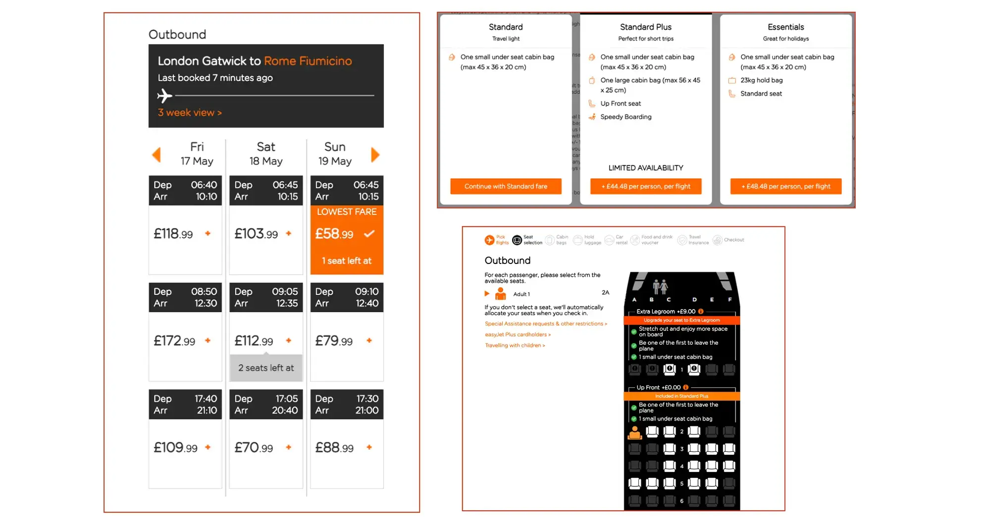
This format requires you to make just one decision at a time, only revealing each piece of information as needed. Now imagine if you were presented with every single element all at once; it would be very overwhelming, not to mention unnecessary.
4. The principle of exemplars
The principle of exemplars states that we should describe the contents contained within certain categories by showing examples of the contents.
In other words: exemplars give the user a visual preview of what to expect when they explore a particular category.
On the IKEA homepage, each product category contains an exemplar in the form of an image. In the furniture category, the exemplar is a sofa—so the user knows to expect sofas, chairs, and similar items within that category.

The principle of exemplars helps the user to make informed choices and quickly find what they’re looking for.
5. The principle of front doors
There are many different entry points through which a user can access a website—not just the homepage. The principle of front doors tells us that, no matter how a user lands on your website, they should be presented with information that helps them navigate the site further.
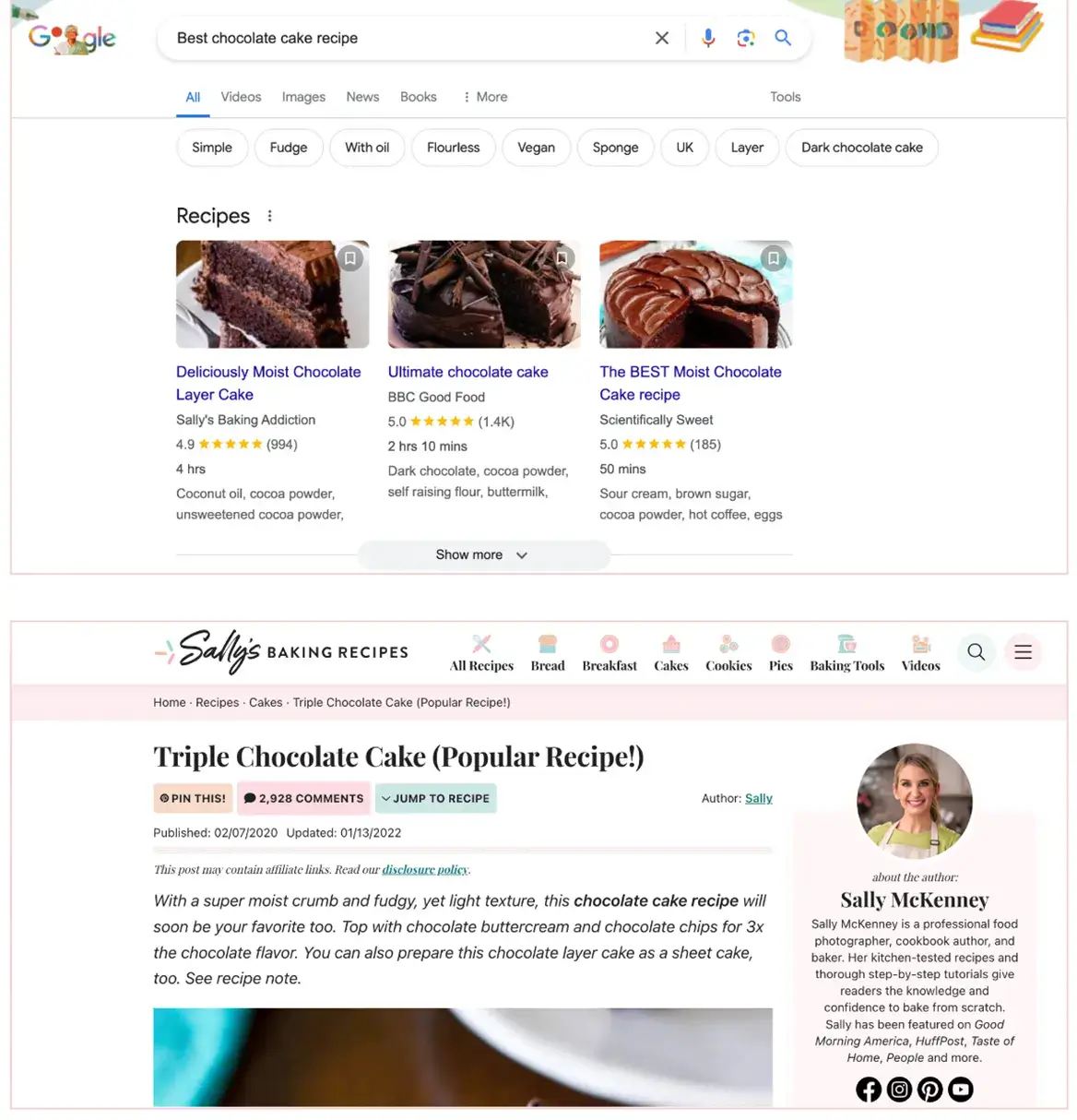
Say you search “Best chocolate cake recipe” on Google and click on the first result that comes up. This takes you straight to the recipe—which means you’re bypassing the homepage and entering the website through a different point.
In addition to the recipe you searched for, this page should provide information to help you understand exactly where you are on the website, as well as options to navigate and explore the website further.
6. The principle of multiple classification
The principle of classification considers the fact that not everybody searches for information in the same way. As such, it’s important to provide multiple classification systems—i.e. different pathways that lead to the same destination.
Consider the ASOS clothing website. Some customers will visit the website with something very specific in mind—say, a pair of pink Adidas Samba trainers. In that case, they might type “Adidas Samba pink trainers” into the search bar.
Another user might also be looking for a new pair of Adidas Samba trainers, but their preferred method for accessing this category is to click through the main menu and filter by brand.
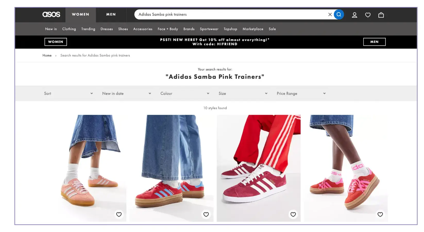
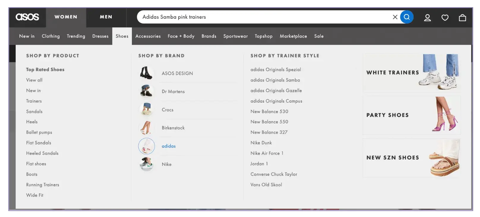
The ASOS website offers multiple classification systems for all their products. Customers can browse by categories such as clothing type, brand, size, new in, trending, and sale, they can browse curated collections, or they can enter keywords into the search bar.
7. The principle of focused navigation
According to the principle of focused navigation, a website’s navigation system should be streamlined and optimized to guide users toward their intended goals or tasks.
Quite simply, the navigation system should provide clear pathways the user can follow, helping them get to where they want to go as quickly and efficiently as possible.
Consider The Gym Group website. The main menu provides a variety of options based on what the user might want to do—be it finding their nearest gym, viewing the class timetable, or signing up for a membership. Each menu item is distinct and clear, taking the user straight to the section they’re interested in.
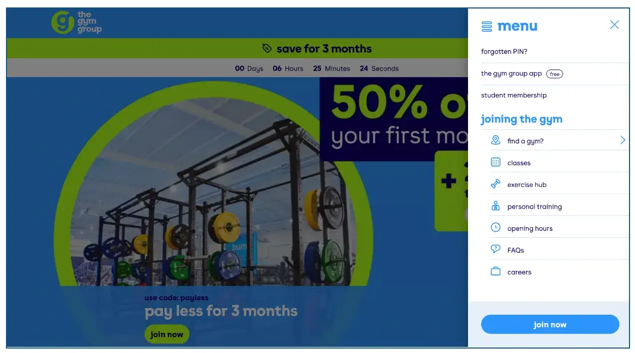
That’s what focused navigation is all about minimizing distractions, keeping cognitive load to a minimum, and helping the user find their way around.
8. The principle of growth
The principle of growth assumes that the content you have within your system (i.e. your website) right now will grow in volume and complexity as time goes on. It’s therefore important to design your information architecture so that it’s scalable and adaptable.
As your content ‘body’ expands, you should be able to accommodate new types of content without completely redesigning your information architecture. Ideally, you should be able to create brand new content categories, as well as add more content and different content types to existing categories.
4. A step-by-step guide to creating information architecture
Let’s imagine we’re designing the information architecture for an e-commerce website that sells indoor plants and offers plant care tips. Here’s the process we might follow.
1. Define goals and objectives
Start by understanding the needs, goals, preferences, and behaviors of your target audience.
Conduct user research (such as interviews, surveys, and observational studies) to determine who you’re designing the information architecture for and what actions they’ll want to take when using the product.
Based on your user research, create personas to represent different segments of your target audience. For help with this step, check out our step-by-step guide to creating a user persona, as well as these user persona examples.
Next, identify the business goals you want to achieve—for example, increasing sales, gaining newsletter subscribers, or boosting customer retention.
2. Conduct competitor analysis
When designing information architecture, it’s crucial to design with your users’ mental models in mind. Our mental models are shaped by our past experiences and beliefs, and they form our expectations of how certain things should work. When we see a door with a handle, for example, we know to turn the handle to open the door.
The same goes for information architecture: you want to play into your users’ mental models to create a system that feels familiar, predictable, and intuitive.
In the example of our plant shop, we’d research other e-commerce websites that sell indoor plants to see how they group and label different types of content, and what kind of navigation systems they use. Identify strengths and weaknesses so you know which aspects to emulate and what you can do differently to provide a better user experience.
3. Audit existing content and identify new content requirements
The next step is to get a clear and thorough overview of all the different content you’re working with. If you’re redesigning an existing website, conduct an inventory to take stock of all the content you’ve already got. You might already have lots of product listings for indoor plants, organized into certain categories, for example.
Now decide what content you’re going to keep, what content you can get rid of, and identify gaps where new content is required.
If you’re designing a brand new product from scratch, map out all the different types of content you need across the website: e.g. product listings, informational blog posts, plant care tutorial videos, a checkout page, and so on.
4. Group and label your content
Right now, you may have a rather disorganized assortment of content, so your next task is to bring some structure and order. The goal is to organize your content into logical groups and categories, based on your users’ mental models.
Use card sorting exercises to learn how your users understand and group the different content within your system (i.e. your website). In a card sorting exercise, you invite users to organize individual pieces of content (as presented on content cards) into categories that make sense to them.
You can also use card sorting to determine what kind of labels and terminology make sense to your users within this particular context.
With our plant shop website, we might group indoor plants by type—e.g. succulents, ferns, and tropical plants. Another approach might focus on ease of care or on various locations such as living room plants, patio plants, and bathroom plants.
This step in the process should leave you with clear categories and subcategories, as well as consistent labels.
5. Create a sitemap
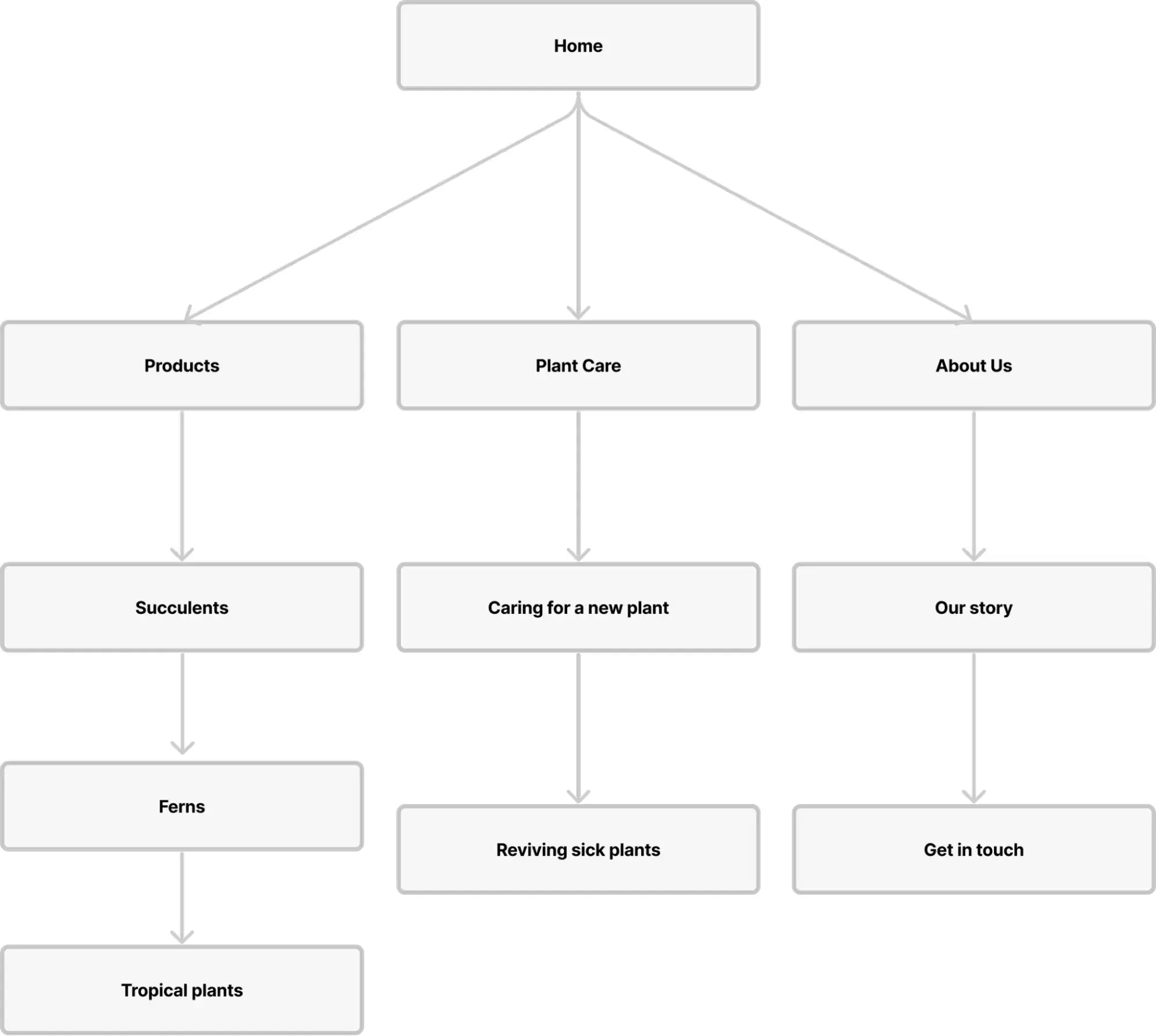
A sitemap is a visual representation of your website’s structure, providing a high-level overview of the various pages, content, and navigation pathways.
To create your sitemap, start with the top of your information hierarchy—the most important items—and then map out the lower-level items they lead to.
For example, your sitemap might depict the homepage at the top, branching off to categories such as products, tutorials, and the ‘about’ page. Branching off of the product page, you might have further sub-categories such as the different plant types.
6. Design a clear navigation system
The penultimate step in the process is to design a navigation system that guides the user seamlessly through the website and helps them find what they’re looking for quickly and easily.
Think about all the possible pathways a user can take to get to individual pages and content items, as well as how all your website content will interlink. Prioritize the most important content within your navigation system—for example, prominently featuring product categories in the main menu—and aid navigation with breadcrumbs and a search bar.
And remember: your navigation should be as intuitive as possible, so refer back to your competitor’s research and your users’ mental models throughout.
7. Prototype and test
Once you’re happy with your information architecture (and have received feedback from all relevant stakeholders), create wireframes and prototypes of how the website will look and function, based on the informational blueprint you’ve designed.
Test your prototypes with real (or representative) users to make sure that your information architecture is clear, user-friendly, and easy to navigate. You can run tests to see how long it takes users to find certain content items, for example, and to identify where people get lost or stuck.
Iterate on the design based on user feedback, making adjustments to improve navigation pathways, content organization, and labeling as needed.
5. What are the best information architecture tools?
There are many different tools to help with information architecture. The exact tools you use will depend on the specific nature and requirements of the project, but you’ll typically need at least some of the following:
- User research and testing tools to understand your users’ mental models—that is, how they expect content to be grouped and labeled in different contexts—and to test your information architecture to ensure that it’s intuitive and user-friendly. Popular tools include Optimal Workshop for card sorting and tree-testing, Hotjar for website analytics, and UserTesting for interviews and feedback.
- Diagramming tools such as Microsoft Visio, OmniGraffle, and Lucidchart to create visual representations of your information architecture, including sitemaps, flowcharts, and user journey diagrams. These tools help you to communicate the relationship between different types of content, as well as the overall content structure.
- Wireframing and prototyping tools. As your information architecture takes shape, you’ll create wireframes and prototypes to map out navigation flows, page layouts, and interactions—bringing your content system to life within the product you’re designing. Adobe XD, Sketch, and Figma are among the most popular wireframing and prototyping tools.
- Collaboration and documentation tools such as Google Docs, Confluence, and Trello. Such tools are crucial for collaborating with multiple stakeholders, getting everybody aligned, tracking revisions, and creating a central hub for all your design assets and related documentation.
For more UX tools, check out this round-up of the 17 best UX design tools and software.
6. Information architecture FAQs
What is the primary goal of information architecture in UX design?
The primary goal of information architecture in UX design is to organize, structure, and label content so that it’s easy to find. It involves creating logical content categories and designing intuitive navigation systems. This ensures that the digital product you’re designing (e.g. a website or an app) is intuitive and user-friendly.
What is the difference between UX writing and information architecture?
Information architecture is the process of organizing and structuring content to facilitate navigation and content retrieval. UX writing focuses specifically on crafting the messaging that guides a user through a product—such as button labels, error messages, and onboarding instructions. Both contribute to the usability and user experience of a product, but they involve different skills and techniques.
What is the difference between a sitemap and information architecture?
A sitemap is a visual representation of the structure and hierarchy of a website’s pages—like a blueprint. Information architecture encompasses the overall organisation and structure of all the content within and across a website. A sitemap is just one deliverable created as part of the information architecture process.
7. Key takeaways and next steps
Information architecture is a crucial step in the UX design process. It lays the foundation for experiences that feel logical, predictable, and intuitive—allowing the user to quickly find what they’re looking for, accomplish their desired tasks, and enjoy the overall experience of the product.
After information architecture, the focus shifts to the finer design details, such as the visual and interactive properties of each page or screen. If you’d like to learn more about the process of designing awesome user experiences, continue with these guides:
- Everything You Need to Know About User Interface (UI) Design
- A Complete Guide to Interaction Design
- Fundamental UX Design Principles That All Designers Must Follow
In case you need further help, here are some additional resources you can consider:
- Watch this session by Shiva Viswanathan, Design Head of Ogilvy Pennywise, and Naman Singh, Product Experience Designer at RED.
- Talk to a course advisor to discuss how you can transform your career with one of our courses.
- Pursue our UX UI Design courses – all courses are taught through live, interactive classes by industry experts, and some even offer a Job Guarantee.
- Take advantage of our scholarship and funding options to overcome any financial hurdle on the path of your career transformation.
Note: All information and/or data from external sources is believed to be accurate as of the date of publication.


