
Read this blog to learn how to use psychological principles to master tab UI design!
When using a web browser, you might want to keep a tab open for your email, another for a research article, and a third for music. When using an eCommerce app you might want to look at different product descriptions at once for comparison. But screen space is limited, which means your laptop or phone can’t show everything at once. It would become chaotic and overwhelming. But is the idea totally out of the question or is there a way to show everything at once? Would that make it difficult to navigate the interface? This is where tab UI design principles come into the picture and tell us how to present multiple streams of information within a space.
In this article, we will discuss everything about tab UI design from its historical roots to its cognitive foundations, aesthetics, and the future.
Here is a list of topics that we have covered!
- What is Tab UI Design?
- The How and The Why Behind Tab UI Design
- The Tab UI Design Process
- Tab UI Design Best Practices
- Final Thoughts
- FAQs

What is Tab UI Design?
Tabs are placeholders for information. In UI design, they are used to separate information into sections and help the user navigate between them. One of the fundamental challenges of web design is presenting multiple streams of information within a limited space, and tab UI design offers a sophisticated solution.
At its essence, tab design operates on two overarching principles—presentation and experience. The principle of presentation concerns how a piece of information reaches the user, i.e. how information is presented and made accessible. It asks: How do we make sure the user sees what they need when they need it? The experience domain concerns how users engage with tab systems and remember them. It looks at what happens after the information is presented: How do users interact with it, remember it, and then form habits around it?
In tab design, presentation happens in two ways: through functional means (how the design works structurally) and through aesthetic means (how it looks and feels visually). Both are equally important. A tab system must work correctly and logically, but it also needs to look good and be pleasant to use. In the latter paragraphs, we will discuss how these variables work together, or sometimes against each other, to affect design choices.
In the functional aspect, designers use specific rules to arrange tabs in ways that make sense. They use techniques such as spatial organization –positioning of tabs and boundaries; content containers –that hold different pieces of information so they don’t spill into one another; negative space, also known as white space –the empty area around elements that separates different parts visually.
The aesthetics of the UI design is for storytelling, and concerns color theory, typography, and feedback systems. Color theory governs how colors work together in a given context, for example, making the active tab dark blue while the others are light grey. Typographic hierarchy has to do with how fonts guide attention, for example, using a bold, 14-point font for an active ‘Settings’ tab and a regular, 12-point font for others.
Visual feedback systems decide how the interface responds to actions, like a button changing color when hovered over or the animation of selecting and deselecting tabs. These are important aesthetic factors to understand because they help with the storytelling.
These two factors, namely, functional and aesthetic sum up the design aspects that enhance the presentation or delivery of the information to the user.
Once users receive the information through a well-designed tab UI system, what happens next? How do users remember and return to the system? What is the experience? To understand this, we need to understand that our memory, in the context of a tab interface, works in two parts, spatial memory, and recognition memory.
Spatial memory remembers where things are located, while recognition memory identifies something based on familiarity. This is how the brain registers an event or an experience. When people use an interface repeatedly, they start to form mental maps. Like where the ‘Profile’ or ‘Messages’ tabs are.
Recognition memory sees something and instantly knows what it means. For example, seeing a tab labeled ‘Inbox’ signals that it contains emails. When people use the same layout repeatedly and know where everything is, it becomes familiar and the experience becomes a habit.
Depending on the context of the user and the business in question, tab UI designs of all varieties play with the above variables. Sometimes this is done `to reduce the effort needed to think/search and lower cognitive load, as well as encourage the desired consumer behavior- for instance, increasing the minimum order value for ordering food online. Other times, they play with the same variables to increase the effort needed to think/search which results in increased cognitive load so that they can discourage undesired behaviors. For instance, canceling a subscription.
The How and The Why Behind Tab UI Design?
The effectiveness of tab interfaces stems from cognitive mechanisms that govern how humans process information. At the center of it is the way our brains handle decision-making, memory, and recognition. Several psychological principles help explain why tabs feel so natural and useful in digital interfaces.
Two key principles from the Gestalt psychological theory help explain tab design. The law of proximity says that things that are close together are seen as belonging together. So, when tab labels and their content are positioned near each other, users understand they are connected. The law of common region states that elements enclosed in the same area, like within a box or under a line, are viewed as a group. Tabs use borders, lines, or background shading to create this visual boundary. For instance, the four tabs at the bottom of the mockup below, group information in a certain way, which is highly intuitive to grasp.

One of the important theories behind the usability of tabs is Hick’s Law. This law states that the time it takes a person to make a decision increases logarithmically (exponentially) with the number of choices they have. In simpler terms, the more options are given at once, the longer it takes the brain to pick one. Tab menu UI design solves this problem by limiting the number of visible choices available at once.
Another one of these theories is Miller’s Law which comes from cognitive psychology. It states that the ‘number seven, plus or minus two’ is the limit of human short-term memory capacity. Tabs manage these boundaries by chunking information into units. For example, Gmail, instead of showing all emails at once, categorizes them into primary, social, and promotion tabs automatically sorting them.
Another important concept is affordances, a term from ecological psychology that refers to the perceived actions an object allows. Popularized in design by Don Norman, writer of ‘Emotional Design’, it explains why tabs appear immediately usable even to first-time users. In design, an affordance tells users what they can do with an element, like a button that looks clickable or a handle that suggests pulling, in mobile tab UI design.
So, on the Zomato app, the ‘district’ tab at the bottom uses a purple color on a white background with an asymmetrical boundary to make it look clickable and so does the heart icon next to a product description. The bookmark symbol under each Instagram reel also elicits the same response.

Multiple tabs UI design offer affordances because they resemble familiar physical objects—like file folder tabs, notebook dividers, arrows, or bookmarks. These symbols build a mental model in the user’s mind, making them immediately understandable even for someone who has never used a tabbed interface before.
The Tab UI Design Process: Applying Principles Step by Step
The tab UI design process involves translating content into clean structures (presentation), and then ensuring that users can understand and remember how to interact with them over time (experience). Below, we explore a step-by-step breakdown of how designers can practically apply the principles of presentation and experience, to real-world interfaces.
1. Start with User Context
Before beginning to sketch the visual layout of tabs, the designer must first understand the context of the user and the one in which they will interact with the system. This includes the demographic of the user (persona) as well as the kind of information they’re looking for, the mental models they carry, and the tasks they’re trying to accomplish.
Tab interfaces are built around compartmentalization, so knowing what needs to be compartmentalized is the first task. For instance, in a streaming app, users may need to switch between ‘Movies’, ‘TV Shows’, and ‘My List’. They are reflections of how users mentally categorize entertainment content in the physical world.
This step often involves research methods like card sorting (where users group pieces of information in a way that feels natural to them) or user flow analysis (which shows the features users visit most often and in what order). Without this foundational work, tabs risk being counterintuitive.
2. Build Functional Delivery
Once the categories or compartments have been established, the next step is to organize them functionally—meaning, how they are arranged on the screen and how they behave structurally. This is where spatial organization, content grouping, and interaction hierarchy come into play. Tabs should be logically grouped, with each tab representing a unique, mutually exclusive domain. A good example is the LinkedIn mobile app, which separates the content into tabs like Home, My Network, Post, Notifications, and Jobs. Users know where to look for different types of content.
Also, the number of tabs should be constrained in line with Miller’s Law (7 +- 2). Interfaces that offer 10–12 tabs at once (as some complex dashboards do) can overload users.
Tabs should also be ordered purposefully, either by usage frequency (placing the most-used tabs first) or by the flow of tasks (for example, ‘Search’ > ‘Cart’ > ‘Checkout’ in a shopping app). This order can be informed by analytics, usability studies, or simply thoughtful observation of common user behavior patterns.
3. Layer in Aesthetic Delivery
Once the structure of the tabs is defined, the next layer is aesthetic delivery—how the interface looks and feels. Aesthetics are often misunderstood as a matter of beauty, but in design, aesthetics are deeply tied to clarity and emotional engagement. One of the most important aesthetic tools in tab UI design is contrast, especially when distinguishing the active tab from the inactive ones. For instance, Spotify uses color and typography to clearly highlight the active navigation icon (such as ‘Home’ or ‘Search’), by pairing a bright color with a bold font, at the same time dimming the inactive options.
Similarly, negative space– the empty space around elements- is just as critical. Crammed tabs tend to blur together and make scanning harder. Responsive feedback, such as animation or highlighting when a user hovers over or taps a tab, reinforces the interactive nature of the component.
These small touches signal to users that their actions have consequences, which gives the user a sense of control, eventually increasing the trust factor.

4. Design for Recognition and Memory
For an interface that is functional and visually refined, the designer must address the experience layer—specifically, how users remember and navigate the system over time. Think of how, on Instagram, the tab for ‘Reels’ always appears in the same spot. Even without looking directly at it, regular users build a mental map and muscle memory leads them to it.
When someone sees the heart icon in an eCommerce app, they immediately recognize it as a ‘favorites’ or ‘wishlist,’ without needing to think it through. Designers should avoid changing tab locations across sessions, use familiar terminology (e.g., ‘Inbox’, ‘Profile’), and avoid abstract or confusing icons that require explanation. Predictability is a very handy tool in UI design.
A good habit for measuring the recognisability and usability of a visual design element, such as an icon, a shape, or an interaction, is to think about it in terms of the physical object it symbolizes. In other words, ask: What is this reminding the user of from the physical world? If the symbol doesn’t evoke a real-world counterpart, like a folder tab, a pushpin, a book, a door handle, or anything related to the context of the interface, it’s likely to be more confusing than helpful.
5. Reinforce Habit
Tab UI design influences habit formation. The more consistent and satisfying a user’s interaction is, the more likely it is to become automatic. Designers can support this by architecting consistent behavior, e.g. the same animation playing each time a tab is opened.
Tabs should also show users that something has changed or been updated. For instance, if the ‘Orders’ tab in a food delivery app shows a live progress bar for your ongoing order, it gives a reason to check back. Over time, these micro-interactions train users to engage with the tab system in a habitual way. This is particularly useful in mobile apps, where the goal sometimes is to increase daily engagement.
6. Test, Observe, and Refine
Finally, no tab design is complete without testing in the real world. Design decisions based on theory must eventually be validated through user observation and analytics. Tools like heatmaps can show which tabs users click the most (or the least). Session recordings reveal patterns of hesitation, confusion, or overuse of the ‘back’ button- a sign that users aren’t finding what they need quickly. Designers should conduct usability tests, where real users are asked to complete tasks using the tab interface. Watching users interact with the product can uncover problems that no amount of theoretical planning could predict. For more advanced optimization, A/B testing can be used to trial different tab labels, icon placements, or tab orders to see what performs best.
Even after a meticulous process of designing the interface, however, there are situations where the above-mentioned variables and principles do not conclude the said outcome. That is why, the context of the user is important to research. The act of switching tabs, for example, can create unnecessary work for users in a certain context. It could also be that a certain kind of user, say an artist, on a certain art website, wants things to be chaotic and not highly organized. Maybe there are certain groups of people who prefer one art style over another. The point here is that tab UI design as well as UI design in general, is a very context-dependent process. And so, it becomes important to understand the user’s mental model, behavioral patterns, cultural background, etc. in order to make more informed design choices.

Tab UI Design Best Practices and Tips
Tabs are effective when they offer clarity, consistency, and accessibility. Good tab UI guides users with visual clarity, intuitive behavior, and consistent placement. Here are some practices followed by expert UI designers that might help you make better tab UI designs. Nevertheless, these practices are not limited to tab UI design and apply to all UI designs.
Tappability
Users should never wonder if a tab is clickable; make the difference between active and inactive tabs obvious. Use colors, underlines, or filled icons for active tabs, and dimmed or outlined styles for inactive ones. You can also use animations such as pulse, jump, shake, etc. to signal expected motion.
Accessibility
Tab design should be accessible to everyone. High contrast between text and background, meeting WCAG’s 4.5:1 ratio helps users with visual impairments, avoiding reliance on color alone to show state. Also, adding shape or typography cues, like underlines or bold text, are some of the boxes to check. Use proper HTML semantics and ARIA attributes so screen readers can interpret tabs correctly.
Simplicity
Always choose simplicity over flashiness. This applies to tab UI as well as UI design in general. When everything is demanding attention on a webpage, nothing gets it and you risk drowning the important bits of information in visual clutter. For instance, you could use a clear and opaque background instead of a flashy gradient. A good way to apply this technique is to use the 60% – 30% – 10% ratio –making 60% of the UI follow a neutral color palette, 30% of the UI a complementary color, and the remaining 10% the main brand color.

Final Thoughts
Tab UI design is a reflection of how humans process, remember, and interact with information. When used thoughtfully, it reduces cognitive strain, reinforces memory, and subtly shapes user behavior. But like all design systems, its power depends on understanding context. The most successful tab interfaces aren’t those that follow rules blindly, but those that make rules that serve the user’s needs and habits.
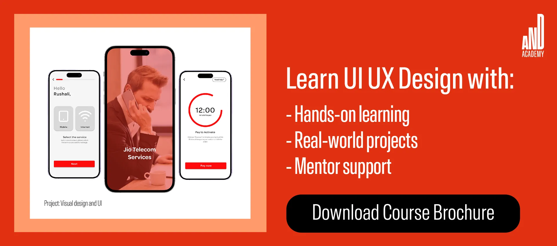
We recommend that you check out this project by AND Learner, Vinay Bandi, to further understand the nuances of creating an effective UI design for your project.
FAQs
Q. What is a tab in UI design?
- Tabs in UI design, are placeholders for information. They are used to separate information into logical sections and to navigate between them.
Q. How many tabs should a UI have?
- Ideally, a UI should have no more than 5–7 visible tabs at once. This aligns with cognitive load guidelines and prevents users from feeling overwhelmed.
Next Steps
In case you think you need further assistance, here are some of our resources you can consider:
- Watch this session by Shiva Viswanathan, Design Head of Ogilvy Pennywise, and Naman Singh, Product Experience Designer at RED.
- Talk to a course advisor to discuss how you can transform your career with one of our courses.
- Pursue our UI UX Design courses – all courses are taught through live, interactive classes by industry experts, and some even offer a Job Guarantee.
- Take advantage of our scholarship and funding options to overcome any financial hurdle on the path of your career transformation.
Note: All information and/or data from external sources is believed to be accurate as of the date of publication.


