
A great user interface simply blends into the background, leaving behind a natural and intuitive interaction. Learn the 12 most important UI design principles behind building an interface that is not only user-friendly but also purposeful.
Have you ever recommended an application solely for its beauty, only to find it difficult to navigate? Aesthetics are important, but they lose their charm when the interface hinders efficient user interaction.
While functionality is believed to be primarily the responsibility of UX designers, UI designers help design a user experience that addresses core needs in a way that is expeditious and effective. In this article, we are going to explore 12 fundamental principles that guide every UI designer tasked with creating user-centred interfaces for various digital platforms.
Content:
- What is UI Design and Why it Matters
- 12 UI Design Principles To Follow
- People Also Asked
- How to learn UI Design?
1. What Is UI Design And Why Does It Matter
User Interface (UI) design is like the architect of digital spaces, carefully crafting how users interact with technology. It’s not just about looks; it’s about making sure that websites, apps, or any digital platforms are easy to use and a joy to navigate. Great UI design isn’t just visually pleasing, it’s the secret sauce that makes technology work seamlessly for people, leaving them satisfied and happy with their digital journey.
The benefits of effective UI design are manifold:
- It ensures that users can easily access information and perform actions without unnecessary complications.
- Intuitive design reduces the need for extensive user training, allowing users to quickly grasp how to use the system.
- A well-designed UI fosters user engagement, contributing to positive brand perception and increased user retention.
- Thoughtful UI design encourages users to provide valuable feedback, contributing to continuous improvement.

2. The 12 Important UI Design Principles
UI designers are steered by a few fundamental design principles when crafting modern, user-friendly digital interfaces. Let’s dive into these principles, complemented by practical illustrations and tangible examples, that propel the creation of seamless digital experiences.
1. Lead with Functionality
In prioritising functionality, the user takes centre stage in the design process. UI designers ensure seamless interfaces by understanding user tasks, streamlining journeys, and aligning design choices with core purposes. This principle establishes a foundation for a user-centric approach, emphasising that aesthetics serve functionality.
Here’s a more detailed exploration of how you can improve functionality in your design:
Prioritise Features: Identify essential features that align with user goals, ensuring easy accessibility. For example, a weather application might prioritise displaying current temperatures and forecasts prominently for users seeking quick weather updates.

Source: Apple
Streamline User Journey: Eliminate unnecessary steps ensures users are guided effortlessly from point A to B for enhanced satisfaction. For example on an e-commerce platform, a streamlined checkout process with minimal form fields reduces friction for users making purchases.

Source: Myntra
Align Design Choices: Ensure that every decision, from button placement to layout, serves the primary function and purpose of the interface. For instance, in a task management app, placing the “Add Task” button prominently on the main screen aligns with the core purpose of allowing users to quickly create new tasks.
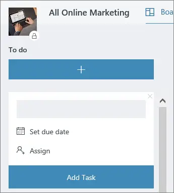
Source: Microsoft Support
2. Establish Hierarchy
Creating a hierarchy within design is the art of orchestrating visual elements to communicate importance, guiding users effortlessly through the interface. Through a clear order of significance, effective use of visual cues, and intuitive content organisation, UI designers enhance navigation, allowing users to focus on pertinent information.
Here’s a more detailed exploration of how you can establish hierarchy in the user interface:
Define a visual hierarchy to guide user attention: Structure the content and elements on the interface in a way that guides users’ attention naturally. This involves prioritising information based on its importance and leading users through a logical flow of content. In the Logical Flow, two predominant types of reading, commonly referred to as “shapes,” take precedence – F shape and Z shape.

Source: Prototypr.io
Use size, colour, and placement to convey importance: Leverage visual cues such as varying font sizes, distinct colours, and strategic placement to convey the relative importance of different elements. Larger fonts, vibrant colours, and prominent placement signal significance, while smaller fonts and subdued colours suggest less importance.

Source: Appleton
Organise Content for Intuitive Scanning: Arrange content for easy scanning. If we consider a news app, grouping related articles, using clear headlines, and maintaining consistent formatting allow users to quickly grasp headlines and decide which articles to read further.

3. Maintain Consistency
Consistency in UI design is the foundation of a coherent and user-friendly interface. Establishing a design language that resonates across the entire system, with consistent styles, fonts, and UI elements, fosters unity and contributes to a harmonious user experience.
Here’s a more detailed exploration of how you can implement this principle:
Apply Consistent Styles, Fonts, and UI Elements: Craft a cohesive design language through the fonts, styles, icons, colours, and elements you choose. In a workout app, using the same font for headlines, consistent button styles, and uniform icons creates a seamless and visually cohesive reading experience.
Create a Unified Experience Across Pages/Screens/Applications: Ensure design elements and experiences remain consistent. Take, for instance, a technology giant like Google; their suite of applications exhibits a unified design language. Icons across various applications share a consistent style and colour palette, contributing to a cohesive and recognizable user experience.

Source: UX Collective
Enhance Predictability and User Confidence: Consistency breeds predictability. If we take a map application as an example, its users anticipate a consistent colour scheme and iconography, which further instils confidence and enables proficiency in understanding what each colour stands for.

Source: Google Images
4. Ensure Accessibility
Ensuring accessibility in UI design is a commitment to inclusivity, breaking down digital barriers for users of all abilities. By prioritising users with disabilities, incorporating accessible colour contrasts and readable text sizes, and implementing features like keyboard navigation and screen reader compatibility, UI designers contribute to a more equitable and user-friendly digital landscape.
Here’s a more detailed exploration of how one can create an accessible user interface:
Design with Inclusivity in Mind: Prioritise inclusivity by addressing the needs of users with disabilities. For instance, designing interfaces that accommodate users with motor impairments ensures a seamless experience, allowing them to navigate effortlessly.

Source: YouTube (Web Accessibility Perspective)
Utilise Accessible Colour Contrasts and Readable Text Sizes: Choose colour combinations that cater to users with visual impairments. Considering high contrast between text and background ensures readability, accommodating users with varying visual abilities.

Source:
Implement Keyboard Navigation and Screen Reader Compatibility: Enable keyboard navigation for users relying on this feature. Ensuring compatibility with screen readers allows visually impaired users to engage with content without barriers.
5. Prioritise Minimalism
Prioritising minimalism involves simplifying the user experience by removing excess elements that don’t contribute to functionality or user understanding. It enhances user experience by presenting a clean and unobtrusive interface, allowing effortless navigation and a focus on core functionalities.
Here’s a more detailed exploration of how you can create a minimalist design:
Streamline Content: Review and refine content to include only essential elements for user understanding. For instance, in an e-commerce app, product information is presented concisely, without unnecessary details.
Focus on Essential Features: Identify and prioritise core features aligned with user goals. For instance, in a task management app, concentrate on functionalities like creating, editing, and completing tasks, avoiding unnecessary complexities.

Source: Teamhood
Create a Clean Design: Implement a visually pleasing and distraction-free design. In a social media app, maintain simplicity in the user interface by decluttering excessive buttons or elements, providing users with a focused and enjoyable browsing experience.

Source: Medium
6. Build Intuitive Design
Building intuitive design is about creating a user interface that feels natural, requiring minimal effort from users. Prioritising intuitive design fosters a user-friendly environment, reducing the learning curve and enhancing overall satisfaction.
Here’s a more detailed exploration of how you can build an intuitive design:
Design interfaces that align with user expectations: Understand user behaviours and expectations, shaping the design accordingly. By aligning the interface with what users anticipate, designers can create a more intuitive experience.

Source: Hexadesign
Simplify navigation and interactions: Streamline navigation pathways and interactions to reduce complexity. Intuitive designs prioritise simplicity, allowing users to effortlessly move through the interface without unnecessary complications or confusion.
Use Intuitive Cues: Minimise the need for explicit instructions by incorporating intuitive cues. For instance, in a note-taking app, using a “+” icon for adding new notes intuitively guides users, eliminating the necessity for detailed instructions on creating new entries.

Source: Code with random
7. Provide Relevant Feedback
Feedback serves as a communication channel between the user and the interface, informing the former about the outcome of their actions and guiding their navigation. Ensuring a responsive and communicative user interface is crucial for user confidence and understanding.
Here’s a more detailed exploration of how you can implement this into your UI design:
Offer Real-time Responses: Implement immediate feedback for user actions, as seen in the following image from a messaging app where the “sent” status appears instantly, confirming the action to users.

Source: Time
Communicate Clearly: Convey outcomes, whether successful or encountering errors. In an e-commerce app, notifying users about successful order placement or providing clear error messages is an excellent example of this.

Source: Dribble
Enhance Confidence: Consistent and informative feedback enhances user confidence. In a file-sharing app, real-time progress updates during file uploads provide users with transparency in their interactions, eventually enhancing confidence.

Source: G2
8. Use Colour Purposefully
Colour in UI design is a powerful tool that goes beyond aesthetics. Leveraging colour purposefully in UI design influences emotions, branding, and accessibility.
Here’s a more detailed exploration of how you can use colour to your advantage within your designs:
Evoke Emotions: Understand the psychological impact of colours to evoke specific emotions. In a meditation app, calming shades like soft blues and greens contribute to a serene atmosphere, aligning with the app’s purpose.

Source: Knowledgenile
Consistent Branding: Establish a consistent colour palette for branding purposes. Just like in a food delivery app, where a recognizable colour scheme reinforces brand identity, creating a visually harmonious and memorable experience.

Source: Zomato
Ensure Readability: Prioritise sufficient colour contrast for readability. Taking the example of a news application again, using high contrast between text and background ensures content is legible, catering to users with varying visual abilities.

Source: Appfigures
9. Make it Responsive
Ensuring responsive design is essential in today’s multi-device landscape. A responsive UI adapts seamlessly to different screen sizes and resolutions, ensuring a consistent experience across devices.
Here’s a more detailed exploration of how you can improve your design’s responsiveness:
Adapt to Screen Sizes: In a real estate app, responsive design ensures that property listings and images are presented optimally on screens of different sizes. Users browsing on a tablet or smartphone can seamlessly explore available properties with a user-friendly interface.

Source: Redfin
Seamless Cross-Device Experience: Prioritise a consistent user experience across devices. For instance, in a travel planning app, users should seamlessly transition from exploring destinations on a desktop to finalising details on a mobile device.

Source: Quadlabs
Test and Optimise: Rigorously test designs on various devices to enhance accessibility. This practice ensures that users can interact effortlessly with the interface regardless of their device.
10. Implement Grid Systems
Creating grid systems is about incorporating a systematic structure into UI design. By creating structured layouts, organising content using grids, and enhancing visual harmony and readability through this approach, UI designers ensure a cohesive visual experience.
Here’s a more detailed exploration of how to implement a grid system in your design:
Create a structured layout for consistent alignment: Grid systems provide a framework for consistently aligning elements within an interface. By establishing a grid, you ensure that the placement of content and UI elements follows a structured and organised pattern. For example, in a news website, articles, images, and headlines align seamlessly in a grid, enhancing visual appeal and readability.

Source: NNGroup
Use grid systems to organise and balance content: Grids help systematically organise content, promoting a logical flow and hierarchy. Visualise an e-commerce platform implementing a grid-based structure for product listings. This systematic organisation not only balances content but also guides users through a logical flow, improving overall comprehension.

Source: Dribble
Enhance visual harmony and readability through grid-based designs: Grid-based layouts contribute to visual harmony by creating a sense of order and alignment which, in turn, improves readability. Imagine a photography portfolio app using a grid layout for images, creating visual harmony and making it more readable.

Source: Pinterest
11. Emphasise Contrast
Emphasising contrast is about creating a dynamic visual experience. By strategically using contrast you can highlight important elements, enhance visual hierarchy through colour and size variations, and improve overall aesthetics.
Here’s a more detailed exploration of how you can use contrast in your designs:
Highlight important elements: Employ contrast strategically to draw attention to critical elements such as buttons, calls to action, or significant information. This ensures that users quickly identify and engage with essential parts of the interface.

Source: Figma
Enhance visual hierarchy: Leverage variations in colour and size to establish a clear visual hierarchy. Larger or differently coloured elements naturally attract attention, guiding users through the interface and emphasising the relative importance of each element.
Improving aesthetics and branding: The use of contrast is essential in crafting visually attractive interfaces that resonate with a brand’s essence. Designers can achieve a visually impactful and unforgettable interface by incorporating contrasting colours. For instance, a company with a bold and vibrant brand may opt for contrasting colours to craft a dynamic and captivating user interface, mirroring the personality of its brand.

12. Reduce Cognitive Load
Reducing cognitive load is about creating a design that respects users’ mental capacity. By simplifying information, minimising distractions and choices, as well as enhancing comprehension and decision-making, UI designers create interfaces that are not only visually appealing but also cognitively efficient.
Here’s a more detailed exploration of how you can reduce cognitive load in your designs:
Simplify information presentation to ease mental processing: Present information clearly and straightforwardly, avoiding unnecessary complexity. Simplifying the presentation reduces the cognitive effort required for users to comprehend and process information.

Source: QubStudio
Leverage Common Design Patterns: Use familiar design patterns to reduce the learning curve. Design with elements users already understand. In a shopping app, a recognizable shopping cart icon reduces the cognitive effort needed to understand its purpose.

Source: Nicepage
Minimise Choices: Limit choices, especially in navigation and forms, to avoid decision paralysis and increase user focus. For instance, in a news app, display a curated list of top stories instead of overwhelming users with a multitude of options

Frequently Asked Questions about UI Design Principles
Here are the answers to some of the most frequently asked questions about UI design:
Q.1 What are the 4 golden rules of UI design?
The 4 golden rules of UI design, often attributed to Ben Shneiderman, are visibility, feedback, constraints, and consistency. Interfaces should provide clear feedback, maintain consistency, offer intuitive constraints, and ensure elements are visible, in order to aid user understanding and interaction.
Q.2 What are the 7 laws of UI design?
While specific “laws” may vary, principles like Hick’s Law, Fitts’s Law, and the Law of Proximity contribute to effective UI design. These laws address factors such as decision time, movement, and spatial organisation, guiding designers in creating more user-friendly interfaces.
Q.3 What are the pillars of UI design?
The pillars of UI design include simplicity, consistency, visibility, and feedback. A simple, consistent interface with clear visibility and responsive feedback enhances user experience, promoting engagement and satisfaction.
Q.4 What is the rule of 8 in UI design?
The Rule of 8 in UI design suggests that users typically lose interest after 8 seconds. Designers must capture attention promptly, offering a visually appealing and efficient interface to retain user engagement within this brief timeframe.
How to learn UI Design?
Engaging in extensive reading on UI design, and UX UI Design is a valuable learning approach. Explore this resource section for further reading on these topics.
Alternatively, here are some additional steps to kickstart your journey into learning UI Design:
- Watch this session by Shiva Viswanathan, Design Head of Ogilvy Pennywise, and Naman Singh, Product Experience Designer at RED.
- Talk to a course advisor to discuss how you can transform your career with one of our courses.
- Enrol in our UI Design course, where all sessions are conducted through live, interactive classes featuring hands-on learning via guided projects led by industry experts. Additionally, select courses provide a Job Guarantee upon completion.
- Take advantage of the scholarship and funding options that come with our courses to overcome any financial hurdle on the path of your career transformation.
Note: All information and/or data from external sources is believed to be accurate as of the date of publication.


