
Want to be fluent in the language of UI UX design? Here are 50+ essential UX UI terms and their definitions.
If you’re working in UI UX design, or aspiring to do so, it’s important to get to grips with industry terminology. This will deepen your understanding of the field, enable you to participate confidently in design discussions and empower you to collaborate seamlessly with fellow designers and stakeholders.
So what are the most important UI UX terms to add to your vocabulary? Let’s find out.
1. A/B testing
A/B testing is a research method that compares two different versions of a design to see which one performs best. You might A/B test two versions of your website home page, for example, with a different CTA on each.
A/B tests can help you figure out the best layouts, call-to-action buttons, content, and color schemes for your product or interface by measuring which variations yield the most favorable response from your users.
2. Accessibility
As a UI UX designer, it’s essential to prioritize accessibility in your designs. Accessibility is about designing products, services, and experiences that are inclusive of, accessible to, and usable by everybody—including people with visual, auditory, motor, and cognitive impairments.
3. Affordance
According to the affordance principle, an element or object’s appearance should clearly convey its functionality. Consider a coffee mug—you know how it functions and how to use it because of its form. The same goes for digital products; you want to make it easy for your users to determine what different elements can do. Buttons can be raised or shadowed to show that they’re clickable, for example.
4. As-is journey maps
As-is journey maps visually represent the experience a user currently has with a product or service. They depict the steps a user goes through to complete a specific task within that product or interface—for example, renewing their subscription on a website—showing all the different touchpoints they interact with along the way. Journey maps also outline user pain points, as well as how the user feels at each stage.
5. Call-to-action (CTA)
A call-to-action is a strategically placed button or prompt that encourages users to take a specific action. In a blog post, you might have a call to action prompting the reader to click through to another article or download a free ebook. On an e-commerce website, you might have a call-to-action button encouraging you to add an item to your basket.

An example of a call-to-action button on miro.com
6. Card sorting
Card sorting is a user research method that helps you understand how your users categorize information. This is useful when designing the information architecture of a digital product—that is, deciding where different pieces of information should reside and how they should be labeled.
During a card sorting exercise, participants are asked to group random content items into categories. This gives you insight into your users’ mental models, allowing you to organize and classify content in a way that aligns with their expectations. If you’re not familiar with mental models, check out number 26 in our UI UX glossary.
7. Cognitive load
Cognitive load refers to the mental effort required to process information. In UX UI design, you want to keep the cognitive load to a minimum to make it as easy as possible for the user to interact with your product.
You can reduce cognitive load by avoiding or removing unnecessary elements, using common design patterns that feel familiar to the user, presenting information clearly and concisely, and limiting the number of options a user has when completing a certain task.
8. Color contrast
Color contrast is the difference in color between two elements—for example, text and the background it’s placed on. Color contrast is a crucial factor in accessible design; you need sufficient contrast to ensure that all text is legible. When designing apps and websites, use a free color contrast checker to make sure that your color choices are compliant with Web Content Accessibility Guidelines.
9. Color theory
Color has an important role to play in UI UX design. It shapes the brand identity, evokes certain emotions in the target audience, and impacts accessibility and usability. As such, UX UI designers must choose their color palettes carefully.
Color theory provides a practical framework for using color and choosing appropriate color schemes. It explores how different hues combine and interact to achieve different visual effects, considering things like contrast, harmony, and color psychology.
Learn more in our ultimate guide to color theory.

10. Contextual inquiry
Contextual inquiry is a user research method that involves observing and interviewing users in their natural environment. This provides valuable insight into user behaviors, motivations, needs, and challenges within a certain context—for example, visiting the dentist or shopping for groceries. When conducting a contextual inquiry, you’ll observe your participants and ask questions to better understand how and why they take certain actions.
11. Design system
A design system is a comprehensive collection of reusable components, patterns, and guidelines that ensure consistency in design and development across a product or organization. It promotes efficiency, maintainability, and a cohesive user experience. Google’s Material Design, Apple’s Human Interface Guidelines, and Adobe Spectrum are all examples of design systems.
12. Design Thinking
Design Thinking is a problem-solving approach that emphasizes empathy, ideation, and iteration. It involves understanding users’ needs, brainstorming creative solutions, and incorporating user feedback to iterate on designs. Design Thinking is especially useful for solving complex or ‘wicked’ problems that are difficult to define and articulate.
Learn more: What is Design Thinking? Everything You Need To Know.
13. D-V-F (Desirable, viable, feasible) model
The D-V-F model is a framework used in product design and development to evaluate the desirability for users, the viability of the business, and feasibility in terms of technology and resources.
If a product is desirable, it means that there’s a real need for it among the target user group. If it’s viable, it means that the product will contribute to the achievement of business goals—such as driving revenue or retaining loyal customers. If it’s feasible, it means that you have the necessary technology and expertise to build it.
The D-V-F model helps to ensure that product ideas align with user needs, business goals, and technical capabilities.
14. Empathy map
An empathy map is a visual tool used in UX design to help teams understand and empathize with their target users. To create an empathy map, divide a piece of paper (or whiteboard space) into four quadrants labeled “Says”, “Thinks”, “Does”, and “Feels”. Based on what you learn during the user research phase, you can fill in your empathy map to create a clear visual summary of your users’ perspective.

An empathy map template from Figma
15. Eye tracking
Eye tracking is a research method that involves monitoring and recording the movements of users’ eyes as they interact with a website or app. This provides insights into where users focus their attention, helping designers optimize the product’s layout and information architecture.
16. Fitts’s law
Fitts’s Law is a model that predicts the time it takes for a user to move to a target based on the target’s size and distance. It is often used to inform the design of interactive elements, such as buttons, in order to optimize usability and efficiency.
17. Gamification
Gamification involves integrating game elements and principles into non-game contexts to engage and motivate users. This can include elements such as points, badges, leaderboards, and challenges to enhance user participation and satisfaction.
Language-learning app Duolingo is a great example of gamification in the UX design space. Duolingo uses game elements such as streaks, league tables, points, and progress bars to motivate users and encourage them to engage with the app every day.
18. Gestalt principles
Gestalt principles are psychological principles that describe how people tend to organize visual elements into groups or wholes based on certain principles such as proximity, similarity, and closure. These principles guide UI UX designers in the creation of user-friendly interfaces. You can learn all about the Gestalt principles in this guide.
19. Golden Ratio
The Golden Ratio is a mathematical ratio between two numbers of approximately 1.618, often found in nature and used in design for its aesthetic appeal. It’s used to create visually harmonious proportions and layouts. Flower petals, pine cones, and tree branches are all naturally occurring examples of the Golden Ratio.
20. Hamburger menu
A hamburger menu is a navigation icon consisting of three horizontal lines, resembling a hamburger. When clicked or tapped, it typically reveals a menu with additional navigation options. It is commonly used in responsive design to save space on the screen.

An example of a hamburger menu in the Gmail web app
21. Heatmap
A heatmap is a visual map where values are depicted by colors. In UX UI design, heatmaps are often used to show areas of a web page or app that receive more user attention or interaction. They help designers identify patterns and optimize page layouts. You can generate heatmaps with analytics tools like Hotjar and FullStory.
22. Heuristic evaluation
Designers and researchers conduct heuristic evaluations to assess the usability of a product interface and identify any issues. During a heuristic evaluation, the interface is evaluated against a set of usability heuristics. These are general principles of user-friendly design, covering things like user control and freedom, consistency and standards, and error prevention. You can learn more about Jakob Nielsen’s 10 usability heuristics for interface design here.
23. Information architecture (IA)
Information architecture (IA) is the process of organizing, structuring, and labeling content in a system, website, or app. The goal of information architecture is to organize content in a way that aligns with the end users’ expectations. This helps to create digital products that are intuitive and easy to use.
24. Interaction design (IxD)
Interaction design (IxD) is a design discipline focused on creating meaningful, effective, and seamless interactions between end users (i.e. people) and digital products. It involves defining the behavior and functionality of interactive elements to ensure a positive user experience. Clicking, scrolling, swiping, and dragging-and-dropping are all examples of interaction design in action.
25. Jobs-to-be-done (JTBD)
Jobs-to-be-done is a UX framework that seeks to understand what goals a user wants to accomplish when they use a product or service. The JTBD framework is based on the “Jobs” theory developed by Clayton M. Christensen, which suggests that people buy products and services to get a job done. If you understand what job your users want done, you can create useful, effective solutions.

A jobs-to-be-done template from the Figma community
26. Mental model
A mental model is a cognitive framework that a user builds up based on their prior knowledge and experiences. It informs their understanding or expectation of how a system or interface should work. For example, based on previous experiences with online shopping, our mental models might tell us that the shopping cart icon will show us items we’ve added to our basket. It’s important to design with mental models in mind as this will help you to create intuitive user experiences.
27. Microcopy
Microcopy is the text that guides a user around a digital interface. It includes things like button labels, error messages, and form fields. The purpose of microcopy is to guide, inform, reassure, and provide feedback—helping the user to achieve their goals. The art of writing microcopy is a dedicated design discipline of its own, known as UX writing or content design.

An example of a microcopy from the Mailchimp website
28. Microinteractions
Microinteractions are subtle, often brief, and focused moments of interaction between a user and a digital interface. These interactions provide feedback, acknowledgment, or guidance in response to user actions, contributing to a more engaging and responsive user experience. When you click the heart icon on a social media platform to “like” something, this might trigger a brief animation. That’s an example of a micro-interaction!
29. Modal window
A modal window is a window or box that pops up while you’re using a website or app. It typically overlays the main content, requiring the user to interact with it in order to return to the original screen or page they were viewing. When reading a blog article, for example, you might get a modal window asking you to subscribe to the company newsletter. You’ll need to either subscribe or click the “X” to get rid of the modal window.
30. Mobile-first design
Mobile-first design is an approach to web and app design that prioritizes designing for mobile devices before considering larger screens. It involves creating a responsive design that adapts and scales up to accommodate larger devices. Mobile accounts for 57.8% of global Internet traffic, so mobile-first design is increasingly important.
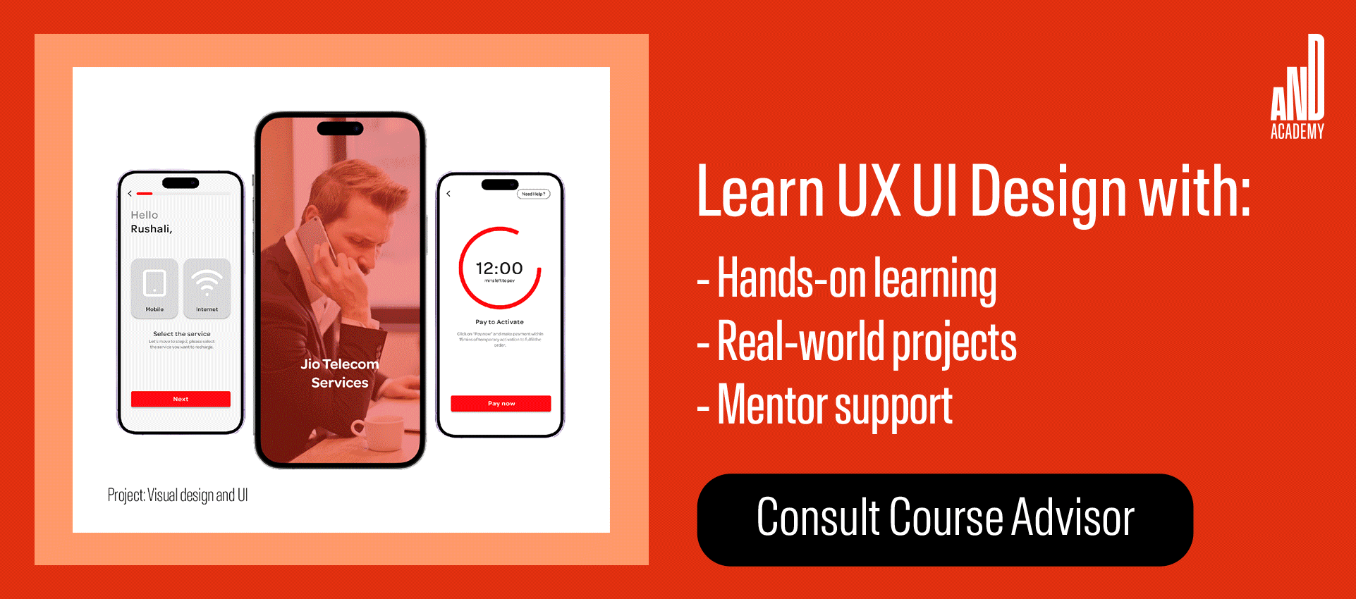
Want to know what a mobile-first design looks like? Here’s a project by a learner at AND’s UI UX Design program to give you some insight.
31. Navigation bar
A navigation bar, or navbar, is a UI element that contains links or buttons to help users navigate a website or app. It’s typically positioned at the top of the page and provides a clear structure for accessing different sections or pages. The navigation bar will usually include links such as “Home”, “About Us”, “Services”, and “Contact”.

The navigation bar at the top of the AND Academy home page
32. Parallax scrolling
Parallax scrolling is a design technique where background images move at a different speed than the foreground content as the user scrolls down a webpage. This creates the illusion of depth and adds a dynamic and visually engaging effect. For an example of parallax scrolling in action, check out the Supernatural website.
33. Persona
Personas are fictional characters created based on insights and data gathered through user research. Personas represent different user types or audience segments, and they embody the characteristics, behaviors, and goals of the people you want to appeal to when designing products.
If you’re designing a fitness app, for example, you might have personas such as “Freelance fitness enthusiast Emily” who wants detailed workout plans, or “Busy corporate employee Finn” who needs quick and efficient exercise routines.
34. Problem statement
A problem statement succinctly articulates a specific issue or challenge that a design team aims to address. It serves as a clear and focused description of the problem, guiding the design process toward effective solutions. An example of a problem statement could be “Users frequently abandon their shopping cart before completing the checkout process due to a complex and confusing payment page.”
35. Progressive disclosure
Progressive disclosure is a design strategy where information is revealed gradually to users based on their actions or needs. It helps prevent information overload and guides users through a step-by-step process, revealing details as necessary. When filling out an online form, for example, you might see only essential fields first. Then, based on your answers, the form might progressively reveal advanced options or further questions.
36. Prototyping
A prototype is a visual, interactive representation of how a product will look and function once it’s been built. Prototyping is a key step in the UI UX design process as it enables designers to test and evaluate ideas before getting the product developed. With working prototypes, designers can identify usability issues and design flaws early on.
37. Readability
Readability refers to how easy it is for users to read and understand the text within your product interface. Readability is influenced by factors such as font choice, size, line spacing, and contrast. Designing with readability in mind ensures that users can access and consume key information—and enjoy a smooth user experience.
38. Responsive design
Responsive design is an approach to web design that ensures a seamless user experience across various devices and screen sizes. The layout adapts to accommodate different screen resolutions, ensuring consistency and usability no matter what device is being used.
39. Scrolling patterns
Scrolling patterns refer to the ways in which users navigate content by scrolling on a webpage. Different scrolling patterns impact the user experience and determine how information is presented. Scrolling patterns include continuous scrolling, paginated scrolling, and parallax scrolling (see number 32 in our glossary). A news website, for example, might use infinite scrolling, allowing the user to view and load an endless number of articles as they scroll down the page.
40. Skeleton screen
A skeleton screen is a visual placeholder or loading state displayed on a screen while content is loading. It typically consists of simplified outlines and structural elements, providing users with a sense of the page’s layout before the actual content appears. When you open the LinkedIn app on your phone, for example, you often see a grayscale outline of where the content will appear before it loads.
41. Storyboarding
Storyboarding involves creating a sequence of visual sketches or illustrations to outline the flow of a user’s interaction with a product or interface. It helps designers plan and visualize user journeys, identifying key touchpoints, interactions, and pain points along the way.
42. Task flow
A task flow is a series of steps or interactions that users take to complete a specific task within a digital product. It maps out the user’s journey from start to finish, emphasizing the sequence of actions required to achieve a goal. If you wanted to create a task flow for the process of making a purchase via an e-commerce app, you might map out the following steps: open the app → log in → browse through product categories…and so on.
43. Typography
Typography is the art of designing, styling, and arranging letters and text. It considers how each letter looks, as well as the spacing between letters, words, and entire lines of text. Typography is an essential pillar of UX UI design as it shapes the brand identity, communicates key information to the user, and impacts readability and accessibility.
Learn more: What Is Typography? Everything You Need To Know.
44. User-centered design (UCD)
User-centered design (UCD) is an iterative design process that prioritizes the needs, preferences, and behaviors of users. It actively involves users throughout the design and development phases to create products that meet their expectations and provide a positive user experience.
45. User experience (UX)
User experience, or UX, refers to the overall experience a user has when interacting with a product, system, or service. It’s influenced by how usable and intuitive the experience is, how accessible it is, and how it makes the user feel. UX is the sum of all the parts: the user’s overall satisfaction with the experience.
Learn more: What Is UX Design?
46. User interface (UI)
A user interface is the point of interaction between a user and a digital product. It comprises all the screens, pages, buttons, icons, and other visual elements that the user encounters and interacts with when they navigate an app, website, or software. User interface (UI) design is the discipline focused on designing user interfaces so that they’re aesthetically pleasing, intuitive, accessible, and user-friendly.
Learn more: Everything You Need to Know About User Interface (UI) Design.
47. User research
User research is the very foundation of great design! It involves the systematic study of users’ behaviors, needs, and preferences in order to cultivate empathy for the target audience and understand what problems your product, service, or interface needs to solve. Popular user research methods include interviews, surveys, contextual inquiries (refer back to number 10 in our glossary), and card sorting (number 6 on our list).
48. Usability
Usability refers to how easy it is for a user to interact with a specific product. It considers how learnable, memorable, and intuitive the system is—in other words, how self-explanatory it is—and how efficiently it enables the user to accomplish their goals. Products that score high on usability provide a great user experience.
49. Usability testing
Usability testing is a technique used to evaluate a product’s usability—that is, how easy it is to use and navigate. Usability testing involves putting a product (or product prototype) in front of real people and observing them as they interact with it. This is crucial for identifying usability issues, gathering user feedback, and making continuous improvements to the user experience.
50. UX UI patterns
UX UI patterns, or design patterns, are recurring solutions to common design problems. They provide proven and effective solutions that address specific user interface challenges, promoting consistency and familiarity in design. Examples include the navigation bar that we’re accustomed to finding at the top of a webpage, image carousels, modal windows, and progress bars—to name just a few.
51. White space
White space, also known as negative space, is the empty or unused space between design elements. It helps improve visual clarity and readability and creates a balanced and clutter-free aesthetic.
52. Wireframe
A wireframe is a simplified visual representation of a webpage or interface that outlines the structure and layout without including detailed design elements. It serves as a blueprint for the overall design and content placement. Wireframes are usually created early on in the design process, before prototyping and visual design.
Learn more about UX and UI design
We hope you enjoyed our UI UX Design glossary and are now feeling much more confident with industry terminology. For further UI UX Design insights, check out these guides:
- Fundamental UX Design Principles and How To Apply Them
- How to Create a Standout UI UX Design Portfolio (Step-by-Step)
- 15 Must-Have UI UX Design Skills (And How to Develop Them)
If you’re seeking further help and resources, we’ve got some fantastic options to offer:
Here are some of our resources that will help you make up your mind:
- Watch this session by Shiva Viswanathan, Design Head of Ogilvy Pennywise, and Naman Singh, Product Experience Designer at RED.
- Talk to a course advisor to discuss how you can transform your career with one of our courses.
- Pursue our UI UX Design courses – all courses are taught through live, interactive classes by industry experts, and some even offer a Job Guarantee.
- Take advantage of the scholarship and funding options that come with our courses to overcome any financial hurdle on the path of your career transformation.
Note: All information and/or data from external sources is believed to be accurate as of the date of publication.


