Grayscale is a method of showing images using only a range of shades from black to white instead of colors. It helps create depth and contrast in pictures.
Designers use grayscale in photography, illustrations, and logo making. It is a simplified version of visual representation that helps focus the form, texture, and contrast without the interference of colors.
Grayscale helps designers to concentrate on contrast, lighting, and texture without having to worry about color. It is helpful when designing images with great clarity as well as ensuring designs are aesthetically pleasing in black and white.
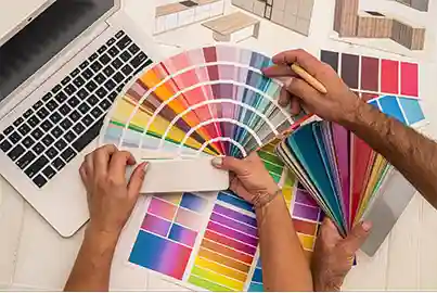
Many designers start in grayscale to test layouts before adding color for the following reasons:
In design, printing, and photography, grayscale is used for artistic effect. It also improves the clarity and vision of images for those with color blindness. However, depending just on grayscale could eliminate crucial elements that color can accentuate.
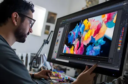
Here are a few of the practical applications of grayscale:
Note: All information and/or data from external sources is believed to be accurate as of the date of publication.
Consult Course Advisors
Hire Our Graduate / Upskill Your Team
Become An Instructor