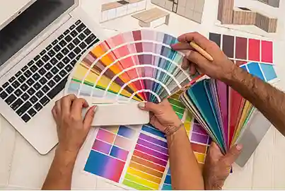
Saturation, also known as “chroma”, refers to the purity or intensity of a color. It is an indication of how bright or dull a color appears. Fully saturated colors are known to be the purest. Some examples of fully saturated colors include cadmium red, ultramarine blue, and permanent green. Once, other colors are added to these colors, they become less saturated.
colors with the least saturation often appear greyish. Black and white colors are known to have zero saturation which is why adding them to pure colors also reduces their saturation.
Vibrance
It intensifies the colors in a design in relation to other colors. It only adjusts to the less dominant colors.
In graphic design, saturation is used to understand how strong or weak a color is. It is also a technique that allows designers to manipulate colors to get the desired effect. Saturation is useful in creating visual effects that help in adequate communication via design. Highly saturated colors are used to create bold and attention-grabbing designs. On the other hand, colors with low saturation are used for a more subdued look.
As per color theory, saturation is mostly relative. The saturation of a color also depends a lot on what colors are beside it. For example, a color with 50% saturation when placed next to a color with 25% saturation will appear to have 75% saturation. Hence, the saturation of a color will depend on various factors. It is crucial for designers to exercise their discretion and do what they think is best for the design.
Saturation and hue are two terms that are often confused with each other. However, knowing the difference between the two is essential to understanding color theory. While hue refers to the actual color, saturation is the intensity of the color. In practice, saturation is how pure or intense a hue is.
Note: All information and/or data from external sources is believed to be accurate as of the date of publication.
Consult Course Advisors
Hire Our Graduate / Upskill Your Team
Become An Instructor