Tone refers to the darkness or lightness of a color or object. In graphic design, tone is used to create contrast or depth in a design. It is an essential color theory component that helps differentiate between colors.
Tone is used to describe whether a color is dark or light. It is naturally created by the way light falls on an object - the part where light is brightest is called a highlight, whereas the part where light is weaker is called a shadow. It is an interesting concept often applied by designers to enhance the visual quality of their designs.
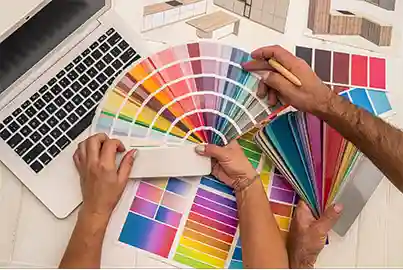
Tone refers to a color in which black and white hues are added in equal quantities. To create a tone, grey is added to the pure hue to make a color that is much duller in intensity.
Tone in graphic design can be used for the following reasons -
A tone-on-tone design uses different shades and tints of one color to create a design with minimum contrast. It is one of the techniques graphic designers use to give their work a cohesive look.
Tone-on-tone is used by designers to play with the lightness and darkness of a color. It creates visual interest and adds depth to a design. Since this type of design uses only one color family, it is quite subtle and minimal. Apart from graphic design, this technique is also popular in interior design.
Note: All information and/or data from external sources is believed to be accurate as of the date of publication.
Consult Course Advisors
Hire Our Graduate / Upskill Your Team
Become An Instructor