Vibrance is a color adjustment tool that increases the intensity of muted colors while protecting the already saturated colors and tones. This enhancement brings life to images without causing oversaturation or unnatural color shifts.
Traditional saturation adjustments apply a uniform increase across all colors, which can sometimes lead to oversaturation, especially in areas that are already vivid.
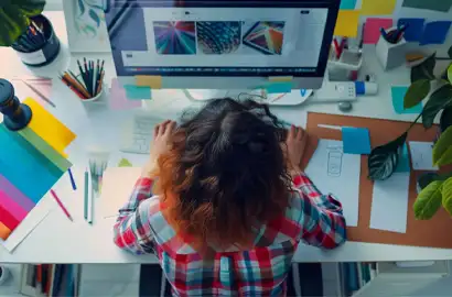
Knowing when and how to apply vibrance can improve digital photos without looking artificial. Vibrance is a powerful tool for bringing out the best in your visual content.
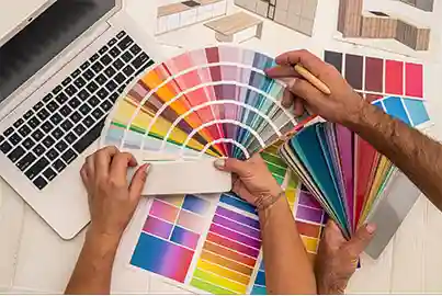
Here is how you can apply vibrance in your project:
Vibrance plays an important role in design by selectively improving colors for a balanced and eye-catching visual impact.
Here are a few important aspects of vibrance in graphic design:
Note: All information and/or data from external sources is believed to be accurate as of the date of publication.
Consult Course Advisors
Hire Our Graduate / Upskill Your Team
Become An Instructor