Want to pick purple for your brand? Understand the color psychology of purple and learn to use it effectively through actionable tips and examples.
SUMMARISE WITH:
Have you ever been reminded of a particular company because of its brand colors or felt influenced by the colors shaping a brand’s identity? Colors may seem like a simple concept or, in some cases, an afterthought, but they have an undeniable power on how consumers perceive and engage with brands. Talking about colors, purple is one of the most versatile and universally loved colors associated with wisdom, royalty, and creativity.
From tech giants and luxury to beauty and wellness brands, purple is a popular pick among brand designers. The color is often used in graphic design for its psychological and cultural associations.
If you want to know how to use purple to create a distinct visual identity for your brand, start by learning how color theory works, followed by compelling examples and best practices.
Here’s a breakdown of the ultimate guide to the color purple:
- Importance of color theory
- Color psychology of purple: Why is it so popular in brand design?
- Different shades of purple
- 3 successful brands that have used purple as their branding color
- How can you build your brand color palette with purple?
- Best practices to use purple for your next project
- Conclusion and next steps
Importance of color theory
Color theory is a discipline dedicated to the study and application of colors. It examines how colors combine to form different visual effects and informs the role of color in design and branding at large. Besides identifying color combinations that are visually pleasing to the eye, color theory also considers the psychological impact of color — how diverse color combinations make people feel and the messages they communicate. For example, we often associate yellow with happiness, red with urgency, and blue with calmness.
Color palettes can either create contrast or harmony, but as long as the combination works together, they can produce a satisfying effect on a visual as well as psychological level. A lack of harmony or contrast can make even the best designs fall flat.
Color theory provides designers a framework for selecting, merging, and applying colors. It’s an incredibly useful tool that helps achieve balance in designs and effectively connects with your target audience.
Color psychology of purple: Why is it so popular in brand design?
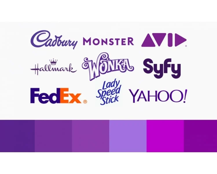
Color psychology, although not an exact science, assigns symbolic meanings and evokes emotions attached to different colors, usually based on one’s personal experiences and cultural influences. As a designer, it’s important to be aware of colour psychology and how it can impact your audience. If your goal is to inspire your audience, for example, using a color scheme that promotes calmness might send the wrong message.
Purple has a rich historical and cultural background. Back in the day, purple dye was rare and expensive to create. So, naturally, it became a symbol of wealth and royalty and was used only by the elite. This association with luxury and exclusivity continues to shape how we perceive purple even today.
That said, although the color purple carries positive qualities, its interpretation can change depending on the cultural context. In most Western cultures, it’s seen as a color of luxury and nobility. However, in some Eastern cultures, purple may be associated with mourning and death. So, if you're catering to a brand for a global audience, it’s essential to keep these cultural differences in mind.
On a psychological level, purple combines the calmness of blue with the energy of red, creating a color that feels intriguing as much as mysterious. It's often connected with imagination, luxury, and deep thinking, making it a popular choice for brands operating in the tech and innovation space.
 " class="wp-image-19564"/>
Why is purple so popular in branding design?
Finalising a color palette for your brand is so much more than just the aesthetic appeal. Your brand colors convey your personality, evoke the desired emotions in your target audience, and make them take action. For many brands, purple is a favorite — be it in combination with other colors or as part of an all-purple palette in varying tones and shades.
Here’s why purple is a go-to choice in branding design:
Unconventional - Purple is not commonly used in corporate branding compared to colors like blue or red, which gives it a distinctive and bold edge. It’s an excellent choice for companies that want to break the mold and create a memorable impression. That said, it’s essential to make sure that the color purple is a good fit for your brand ethos and target audience.
Association with opulence - As mentioned earlier, purple’s deep-rooted association with prestige and exclusivity makes it a perfect choice for brands aiming to convey premium quality, indulgence, and sophistication.
Versatile - With numerous shades, purple is a suitable choice for tech, innovation, beauty, jewelry, fashion, and wellness sectors.
Feminine appeal - Purple has strong ties to spirituality, mystery, and introspection. These are often seen as more feminine traits or areas of interest in some cultural contexts, making purple a natural fit for brands in the wellness, self-care, or holistic health sectors that target everyone who identifies as a woman.
Futuristic approach - Purple naturally carries a futuristic quality that resonates with forward-thinking brands, especially in the field of technology and innovation. It suggests progress and a willingness to push boundaries. Companies aiming to position themselves as thought leaders can include purple as a brand color in order to convey their futuristic ideas.
Different shades of purple
Purple comes in a wide variety of shades, each carrying its own value and emotional weight. Understanding the nuances of different shades of purple can help you select the right one that fits your brand guidelines and effortlessly portrays the emotions you want to evoke in your audience.
There’s a shade of purple for every vision. Let’s take a look at some of the most admired and impactful shades of purple.
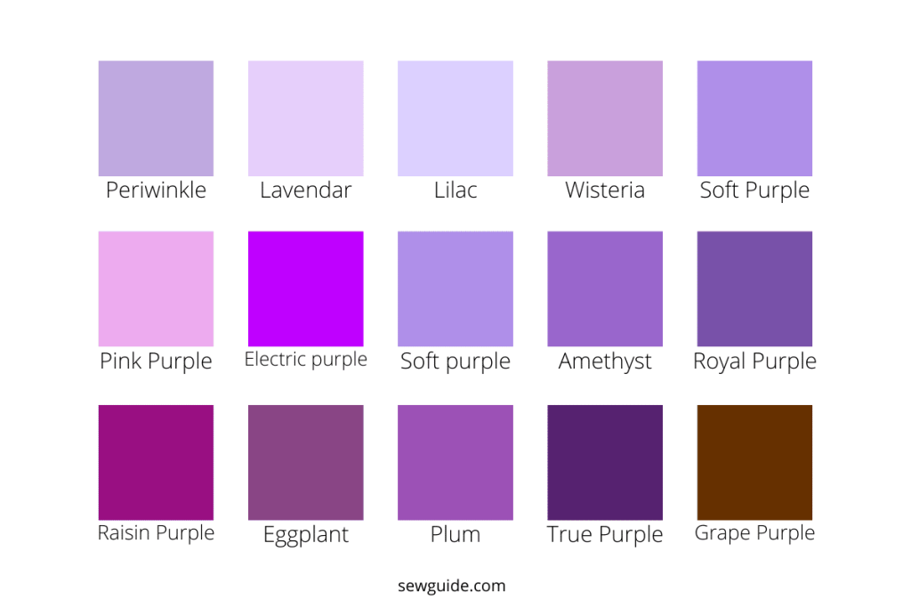
Image Courtesy: Sew Guide
Lavender (#E6E6FA): A very light purple with a floral softness, lavender conveys calmness, femininity, and grace. It’s often used by brands in wellness, beauty, and relaxation.
Mauve (#E0B0FF): This pale purple with pinkish undertones feels vintage, romantic, and artistic. Mauve is ideal for brands that are all about creativity and sophistication.
Lilac (#C8A2C8): A light, muted purple, lilac gives off a dreamy and youthful vibe. It works well in branding for lifestyle, fashion, or children’s products.
Amethyst (#9966CC): Inspired by the gemstone, this medium purple shade symbolizes spirituality, protection, and intuition. It’s often used by brands in holistic health and luxury goods.
Orchid (#DA70D6): A rich pinkish-purple, orchid is bold, contemporary, and slightly playful — great for modern fashion, beauty, or creative sectors.
Violet (#8F00FF): This intense blue-toned purple represents mystery, ambition, and magic. Violet stands out in tech, entertainment, and futuristic branding.
Plum (#8E4585): A deep purple with red undertones, plum is rich and mature, often associated with depth, elegance, and romance. It’s popular in luxury and wine branding.
Royal Purple (#7851A9): True to its name, royal purple symbolizes power, prestige, and grandeur. It’s a favored choice for upscale, heritage, or ceremonial brands.
Eggplant (#614051): A dark, moody purple with earthy tones, eggplant brings a grounded sophistication and pairs beautifully with neutrals. It works well in interior design, fashion, and gourmet branding.
Grape (#6F2DA8): A vibrant, juicy shade of purple that is bold, youthful, and full of energy. It is ideal for food-and-beverage-related brands.
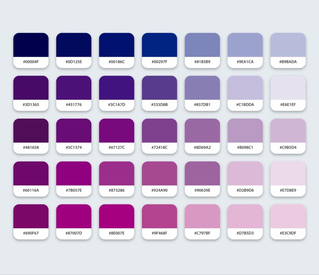
For each shade of purple, we’ve included the HEX code so you can plug it into a free color palette tool (like Coolors) to find the perfect complementary or contrasting color palettes, or test combinations for your brand’s visual identity.
3 Successful brands that have used purple as their branding color
Now that we have explored the know-how of using purple in branding design, it’s time to see it in action. Let’s take a look at some renowned brands that have built their visual identity around the color purple.
1. Twitch
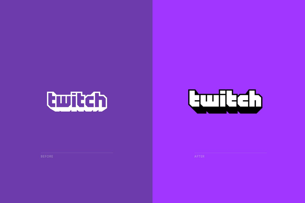
Image Courtesy: House of Van Schneider
Twitch is a live streaming platform that uses purple to tap into its predominantly younger audience of gamers and creators. The bright neon shade of purple immediately feels modern, innovative, and slightly unconventional.
It is an excellent example of how color choices can help you speak directly to your community and outperform your competitors. Purple, often linked with uniqueness and creativity, draws the audience to the content shared on the platform.
The brand strategy of Twitch is highly effective because of its consistent use of purple throughout the entire user interface, which strengthens brand identity and builds connection and loyalty with its users.
2. Cadbury

Image Courtesy: Steph Corrigan Design
Cadbury is one of the most loved chocolate brands that uses a distinct shade of purple to make its place in a competitive confectionery market. The use of a rich and deep purple in its packaging narrates its brand story about indulgence and premium quality. This luxurious color appeals to its consumers.
The strategic use of the color purple has made Cadbury products a go-to choice for chocolate lovers. It is easily recognizable and is a brand that consumers trust.
3. Hallmark
Image Courtesy: Remfry and Sagar
Hallmark, popularly known for its greeting cards and gifts, uses purple to convey the quality it provides. The use of a muted and elegant shade of purple in its packaging and branding materials suggests elegance and an assurance of a premium experience. This perfectly aligns with the brand objective of creating an emotional connection.
The intentional use of purple makes Hallmark stand apart from its competitors and establishes a brand image built on authenticity, trust, and quality. The logo even includes a crown, which highlights its historical association with royalty and exclusivity.
How can you build your brand color palette with purple?
If you’re considering using purple as one of your brand colors, it helps to understand how it works with other colors. This will allow you to build an impressive color palette that visually supports your brand identity and conveys the intended message.
Let’s start by exploring where purple sits on the color wheel. If you’re not familiar with the color wheel, it is a circular diagram that depicts the relationship between different colors (or hues). Hues that are located on opposite ends of the color wheel create striking contrast, whereas hues that are adjacent or closer to each other tend to blend effortlessly and form a sense of harmony.
On the color wheel, purple sits between red and blue, as it’s a secondary color created by mixing these two primary colors. Depending on the ratio of red and blue, the tone of purple can be warmer (toward red) or cooler (toward blue).
Directly opposite purple, you’ll find yellow on the color wheel. This makes purple and yellow complementary colors, meaning when paired together, they create a sharp contrast and high-quality visual. On the other hand, colors that sit next to purple, such as blue and magenta, form analogous palettes that are more subtle and visually harmonious.
Whether you want your palette to pop with contrast or flow with elegance depends on your brand’s tone. Purple gives you the flexibility to explore both.
Harmonious color palette examples with purple
- Analogous Palettes (colors next to purple on the color wheel)
1. Purple (#8A2BE2) + Royal Blue (#4169E1) + Mangenta (#FF00FF)
Ideal for tech, beauty, and fashion brands
2. Lavender (#E6E6FA) + Lilac (#C8A2C8) + Rose Pink (#F4C2C2)
Perfect for wellness, skincare, and event planning brands
3. Plum (#8E4585) + Eggplant (#614051 + Burgundy (#800020)
Works for luxury and home décor brands
Monochromatic Palettes (varied tints and shades of purple)
4. Lavender (#E6E6FA) + Purple (#9B59B6) + Deep Purple (#4B0082)
Great for health and education brands
5. Lilac (#C8A2C8) + Medium Purple (#9370DB) + Amethyst (#9966CC)
Used for jewelry, lifestyle, or spiritual brands
Cool Analogous Palettes (cool tones around purple)
6. Indigo (#4B0082) + Violet (#8F00FF) + Blue (#1E90FF)
Works for AI, digital design, or innovation-led brands
Complementary color palette examples with purple
1. Purple (#8A2BE2) + Yellow (#FFD700) + Soft White (#F5F5F5)
Perfect for creative or youth-focused brands
2. Lavender (#E6E6FA) + Mustard Yellow (#FFDB58) + Warm Grey (#D8CAB8)
Great for fashion or lifestyle brands
3. Plum (#8E4585) + Goldenrod (#DAA520) + Beige (#F5F5DC)
Used for luxury, interiors, or gourmet brands
4. Violet (#8F00FF) + Lemon Yellow (#FFF44F) + Slate (#708090)
Works well for tech, entertainment, or futuristic brands
5. Amethsyt (#) + Light Gold (#) + Cool Charcoal (#)
Ideal for beauty, wellness, or high-end services
Best practices to use purple for your next project
If you’re thinking of using purple for your branding design, here are a few tips that will tell you how and help you create an effective visual identity perfect for your audience.
1. Make sure purple is the right choice for your brand
Before you pick your brand colors, it's important to first be sure about the identity you want your brand to be known for. Once that's clear, you can decide whether purple can best represent your brand. As per the industry you’re focusing on, brainstorm a few adjectives that come close to the emotions you want to evoke when the audience interacts with your brand. Based on the adjectives you’ve come up with and everything that you’ve learned about the color psychology of purple, evaluate if it fits your brand identity and make a call.
2. Decide on the shade of purple
Next, think carefully about the shade of purple that does justice to your brand’s personality.
If you’re aiming to express creativity, playfulness, or a modern edge, consider using a lighter shade of purple like lavender, lilac, or orchid. These shades are soft, expressive, and work well for brands in lifestyle, wellness, or creative industries. On the other hand, if your brand leans toward luxury, depth, or sophistication, a richer and darker purple, such as plum, royal purple, or eggplant, may be more appropriate. These shades can bring in a sense of elegance and royalty to your brand’s visual identity.
Refer back to the earlier section of our guide where we break down the most popular and impactful shades of purple. Dive deeper into design inspiration to see how others are using purple successfully. Once you’ve chosen the right tone, you’ll have a powerful anchor for developing the rest of your color palette with purpose and clarity.
3. Create your brand’s color palette
After choosing the perfect shade of purple, you now need to identify the rest of your brand’s color palette.
Think about the kind of visual experience you want to create.
For a bold, attention-grabbing look, go for a high-contrast color palette — for example, purple paired with yellow or gold. This combination creates instant impact and energy, which is ideal for brands that want to make a statement.
Prefer something more balanced and calming? Try a harmonious palette, such as purple alongside blue or magenta. These analogous colors work beautifully together to create a soothing aesthetic.
Alternatively, you could also embrace a monochromatic color palette, built entirely from varying tints and shades of purple. This approach is great for achieving an elegant and modern aesthetic, perfect for luxury, wellness, or creative brands.
Conclusion
We hope that by the end of this comprehensive guide, you’re in a position to decide if purple is the right fit for your brand. If you’re leaning towards using it, consider the color psychology of purple and analyze how successful brands have used it before incorporating this color into your brand identity. Factor in the industry, brand personality, and the emotional impact of various shades of purple. Also, remember to test the color in multiple applications to ensure that the chosen color appears the same across platforms, devices, screen sizes, and print media.
Want to learn more about graphic design? These guides will help you build your skills and turn your ideas into reality:
1. A Complete Guide to Colour Theory in Design
2. What Is Branding Design? A Complete Guide
3. The Significance of White Space in Design (With Examples)
Next Steps
If you’d like to know more about graphic design or related topics, head over to the AND Academy blog for more articles. For more insights, we recommend you check out Bibin S’s Brand Identity Project in graphic design.
In case you need further assistance, here are some of our resources you can consider:
- Watch this session by design veteran and AND’s Academic Head, Prachi Mittal, and our Course Lead, Soumya Tiwari.
- Talk to a course advisor to discuss how you can transform your career with one of our courses.
- Pursue our Graphic Design courses - all courses are taught through live, interactive classes by industry experts, and some even offer a Job Guarantee.
- Take advantage of the scholarship and funding options that come with our courses to overcome any financial hurdle on the path of your career transformation.
Note: All information and/or data from external sources is believed to be accurate as of the date of publication.


