
From logos and colors to stories and values, brands are made of layers that often get mixed up. Read on to see how visual identity and brand identity come together to shape design.
What do you think of when you hear the name “Nike”?
Many people first think of the simple checkmark logo, called the “swoosh.” Others might think of their cool black-and-white ads. But for millions of people, Nike makes them feel something. It’s a feeling of trying hard, pushing yourself, and being strong. It’s like a voice in your head saying, “Just Do It.”
That simple example highlights a question many might have: What’s the difference between what a brand looks like and what a brand is? The answer lies in understanding visual identity vs. brand identity.
To make it easy, let’s think of your brand like a person.
- Brand Identity is like a person’s soul and personality. It’s who they are deep inside: their beliefs, what they care about, how they talk, and their life story. It’s what makes them special and easy to remember.
- Visual Identity is like a person’s style and how they look. It’s their face, the clothes they wear, their haircut, and how they move. It’s everything you can see that gives you a first idea of who they are.
In this guide, we will explain these two concepts and how they differ. We’ll show you exactly what they are, how they work together, and how they help you make every design choice. By the end, you will know how to build a brand that not only looks good but also connects with people.
Here is a list of topics we have covered!
- What Is Visual Identity?
- What Is Brand Identity?
- Key Differences Between Visual and Brand Identity
- Correlation of Brand & Visual Identity With Graphic Design
- How Visual Identity Impacts Design Strategy
- How Brand Identity Impacts Design Strategy
- FAQ
- Conclusion
What Is Visual Identity?
Visual identity is how your brand looks. It is the first thing people notice about you. It works like an introduction; a way of saying “hello” without words.
When you meet someone new, you make a quick judgment based on their appearance. The same happens with brands. A strong visual identity helps people trust you and remember you.
The Core Components of Visual Identity
A brand’s look is built on these few key parts:
- Logo: It is a symbol that makes people recognize you quickly. The best logos are simple and easy to remember, like the golden arches of McDonald’s or the half-bitten apple for Apple Inc.
- Colors: The set of colors that represent the brand. Colors create emotions. The famous light blue of a Tiffany & Co. box makes you think of fancy and nice things, even before you see the name.
- Fonts: The style of your letters. A serif font feels formal and serious. A simple, clean font feels modern and friendly. Coca-Cola’s script, for example, feels classic and warm.
- Pictures: The style of your photos, drawings, and videos. Nike often uses strong photos of athletes to show action and determination.
- Extra Elements: Patterns, textures, or icons that make your brand unique. These small touches complete the look.
When all these parts are used together the same way all the time, they make a strong visual look that people can recognize right away.
What Is Brand Identity?
Brand identity goes much deeper than the look. It is what your brand stands for, what it believes in, and how it behaves. Think of it as your brand’s personality and soul.
Someone can dress well but still be forgettable if they lack character. The same is true for brands. A nice logo means little if the business has no clear purpose or voice. What people remember is the meaning behind the brand.
The Core Components of Brand Identity
Brand identity is formed by important parts that are not always visible:
- Mission & Values: These are the reasons your business exists and the principles that guide it. Patagonia, for example, focuses on protecting nature and solving problems for the planet.
- Brand Personality & Voice: If your brand were a person, how would it speak? Friendly, bold, smart, or adventurous? Wendy’s, for example, uses a bold and funny voice on social media.
- Positioning: Positioning relates to how your brand stands out from competitors. The brand might be the affordable option, the luxury option, or the most innovative option, depending on the identity you choose.
- Brand Story: This is the history of your brand. Where did you start? What hard things did you get through? What are you trying to do? A good story helps people feel a connection to your brand.
- And the Visual Identity: The look of the brand is also part of this bigger picture. The logo, fonts, and colors are chosen to reflect the deeper mission and personality.
Key Differences Between Visual and Brand Identity

The easiest way to understand the difference is to think about what people notice first and what they remember later.
- Visual identity is the look of your brand. It is the logo, colors, fonts, and images that people see right away. It creates the first impression.
- Brand identity is the meaning behind your brand. It is your values, story, voice, and mission. It helps people understand who you are and why you matter.
Here is a quick breakdown:
|
Concept |
Visual Identity |
Brand Identity |
|
What it is |
The look and feel of the brand. |
The meaning of the brand. |
|
Nature |
Tangible & Visible (You can see it) |
Intangible & Strategic (You can feel it) |
|
Question it Answers |
“What does the brand look like?” |
“Who is the brand?” |
|
Includes |
Logo, colors, fonts, images. |
Mission, values, voice, story, and the visual identity. |
|
Analogy |
A person’s face and clothes. |
A person’s character and personality. |
|
Function |
To be recognized and create a first impression. |
To build trust, loyalty, and a lasting relationship. |
Correlation of Brand & Visual Identity With Graphic Design
So, how does graphic design fit into all this?
Graphic design is the skill used to make collaterals or visuals that show what your brand looks like. Think of it like this:
- Brand Identity is like your personality.
- Visual Identity is like your style.
- A Graphic Designer is like your personal stylist.
A good personal stylist does not just pick clothes they think are popular. They first get to know you. They ask about your personality, your daily life, your job, and how you want people to see you. With that information, which is like your personal “brand identity,” they help you pick the perfect clothes, hairstyle, and jewelry that truly show who you are.
In the same way, a graphic designer uses your brand identity as their guide. They use their skills with colors, how things are placed, and different fonts to show your brand’s personality and what it cares about. They create the logo, pick the colors, and choose the fonts that will be the face of your brand to everyone.
To put it simply, “branding” is the big plan for creating your identity. “Graphic design” is the hands-on work of making the visual parts of that plan.
How Visual Identity Impacts Design Strategy

Once you pick a look for your brand, like your logo, colors, and letters, your main job is to keep it the same everywhere. This is called consistency.
Your brand’s look helps people know who you are and that you can be trusted. This works best if people see the same style every time they connect with your brand. Think about your website, social media, business cards, product boxes, and ads. Each one is a chance to make your brand’s appearance stronger and cohesive.
This is why consistency is so powerful. It makes your brand known even more. The first time a customer sees your logo, it might not mean much. The tenth time, it starts to feel normal. By the hundredth time they see it used the same way in different places, it makes them think of your brand right away. This is how being familiar builds trust and makes your brand valuable over time.
Not being consistent, on the other hand, hurts your brand a lot. If your website has one logo and colors, but your social media has another, it confuses people. This small problem with consistency can make your brand seem unprofessional and untrustworthy. It also makes your brand seem less valuable to the customer and takes away from the recall value it could have attained.
Case Study: Coca-Cola’s Visual Identity

Coca-Cola always looks the same everywhere. This sameness makes it strong and easy to trust. Their design plan is simple but works really well: they use the same major elements over and over again, all around the world.
- The “Coca-Cola Red”: They use a bright red color so much that when you see that red, you immediately think of Coca-Cola. It makes you feel happy and refreshed.
- The Spencerian Script: The fancy, flowing letters they use for their name have looked almost the same for more than 100 years. This sameness shows it’s been around for a long time and is real. No new brand can do that easily.
- The Contour Bottle: In 1915, Coca-Cola made a bottle so special you could know it was Coca-Cola just by feeling it in the dark, or even if it was broken. This unique shape is another strong visual that stands for Coca-Cola in everyone’s heads.
It’s super straightforward. Whether you are in New York, Tokyo, or Cairo, Coca-Cola always looks the same. This never-changing look has made it one of the most famous, trusted, and valuable brands ever.
How Brand Identity Impacts Design Strategy
Visual identity is about making sure things look the same every time. But brand identity is much more important. It is the main idea that decides how everything will be designed from the very start. The pictures and colors are not picked just to look pretty. They are chosen carefully to show what the brand is truly like.
A strong brand identity is more than just a way to sell things. It helps the whole company. It shapes how people act at work, how new workers are hired and taught, and how new products are made. When everyone in the company understands and believes in what the brand stands for, their actions naturally match what the brand promises. When people inside the company agree, customers feel that the brand is real and can be trusted.
When a company’s actions do not match what it says in its ads, customers can tell. This difference between what a brand says and what it does breaks trust. To make designs that truly feel real, the company itself must believe in the identity it’s selling.
Case Study 1: Apple’s Brand Identity
Apple is very good at using its strong brand to make every design choice. Known for being simple, new, creative, and fancy, its main promise is to make technology that is strong but also easy to use.
How it Impacts Design Strategy: This brand identity is not just a saying. It is a strict set of rules for how things are designed. Here are a few ways in which Apple leverages brand identity:
- Product Design: iPhones, MacBooks, and other Apple products are known for being clean, having few buttons, and smooth materials. The design itself clearly says “simple” and “good quality.”
- Packaging: Opening an Apple box is a famous part of the Apple brand. The clean, neatly organized boxes make you feel like you bought a fancy, well-thought-out product.
- Website & Ads: Apple’s website and ads use a lot of empty white space, simple letters, and beautiful, high-quality pictures of products. They focus on how it feels to use the product and what you can make with it, not on a long list of technical details.
- Retail Stores: Apple Stores look like modern art places. They are open, clean, and not messy. These stores perfectly show the brand’s focus on simplicity and sophistication.
Case Study 2: Nike’s Brand Identity
Nike wants to make everyone feel strong, brave, and excited. Their goal is to inspire every athlete in the world. And, they believe that if you have a body, you are an athlete.
How this affects their designs: Nike’s designs help show off this powerful personality. Here are a few ways in which they leverage brand identity:
- Imagery: Nike uses exciting and emotional pictures of athletes working hard. Their ads do not focus on the shoes themselves. Instead, they tell stories of people trying their best and winning. The shoes are just a tool to help them on their journey.
- Typography: Nike always uses big, strong, simple letters that are all capital. This makes people feel like they are seeing action, power, and confidence.
- Logo (The Swoosh): The Nike logo is amazing. The “swoosh” shape looks like movement, speed, and a checkmark. It is a perfect picture for a company that cares about doing well and winning.
- Tone: The tagline “Just Do It” shows what Nike is all about. It is not just about a product. It is a command, a way of thinking, and the shortest pep-talk ever. This thought guides every design and messaging the company creates.
FAQ
Here are answers to some of the most common questions about visual and brand identity.
1. Which comes first, visual identity or brand identity?
Brand identity comes first. You need to know who you are before deciding how you look.
2. Can you have a visual identity without a brand identity?
Yes, but it will not work well. A logo and colors with no story or purpose are just aesthetics. They will not build trust or loyalty.
3. Which is more important, visual identity or brand identity?
Brand identity is more important. It is the heart of your business. A strong identity with a simple look is more powerful than a stylish look with no meaning. The best brands, though, have both working together.
4. How do I start building my brand identity?
Ask yourself: Why does my business exist? What values guide me? Who do I want to help? What makes me different from others? Your answers will shape your brand’s voice and personality.
Conclusion
Visual identity and brand identity work together, but they are not the same. One is about how you look. The other is about who you are. The order matters. First, you need to know your brand’s purpose, values, and story. Only then should you choose the look that shows them clearly.
When both sides are aligned, your brand becomes more than a logo or a name. It becomes something people recognize, trust, and believe in.
The most successful brands in the world, such as Nike, Apple, and Coca-Cola, do not win only because of design. They win because their design reflects a deeper identity. That is what makes them memorable.
To build a strong brand, follow these three steps:
- Define your brand identity, which is your inner self.
- Show it through your visual identity, which is your style.
- Keep it consistent across every place where people see you.
When you do this, your brand will not just look good. It will feel real and meaningful, and your audience will connect with it.
To learn more about visual or brand identity, head over to the AND Academy blog for more articles. As a starting point, you can consider going through the following resources:
- Color Theory: Importance of Purple as a Branding Color (With Examples)
- How to Create Social Media Graphics: Tips and Tools to Bank on in 2025
- Hex Codes for Colors: What Are They and How Are They Used in Graphic Design?
Next Steps
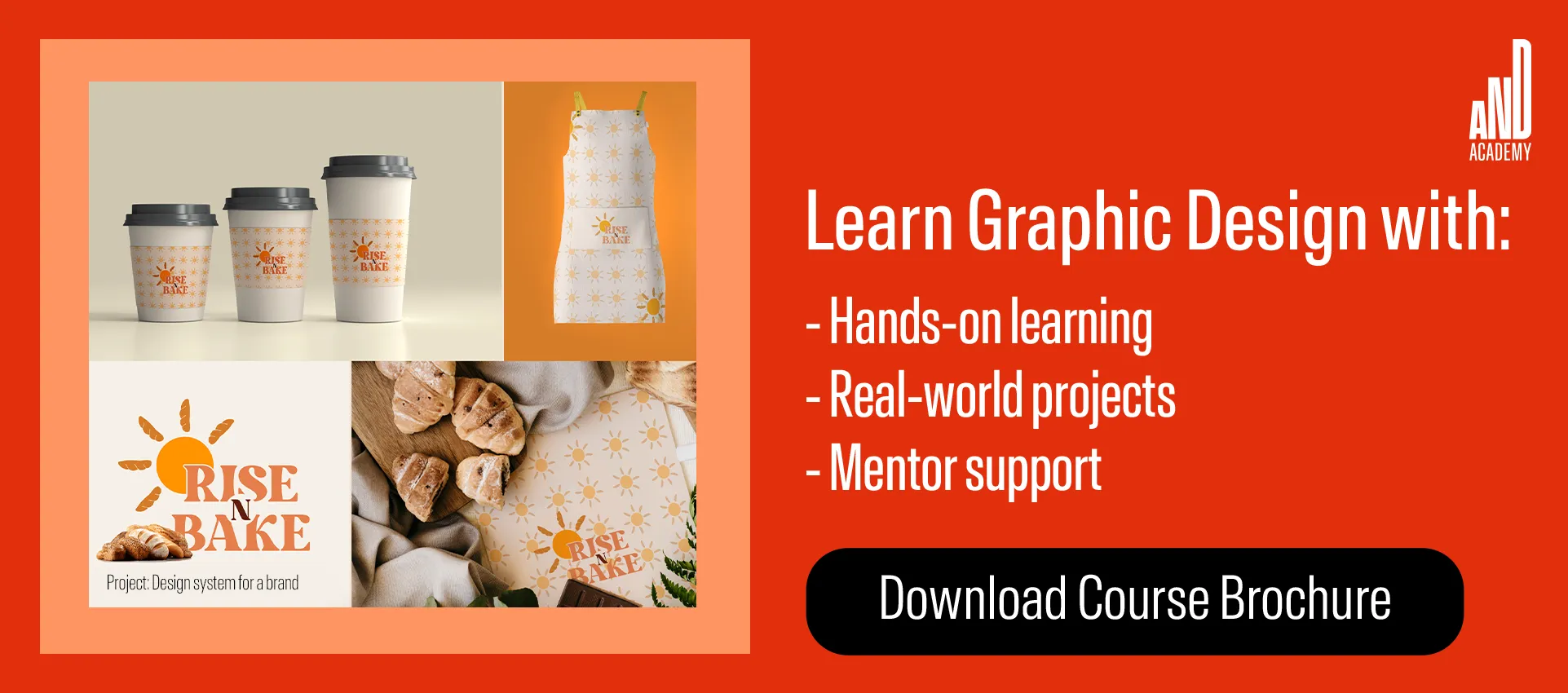
You can check out this project by AND Learner, Dushyant Singh, to get inspiration for your next advertising design project!
In case you need further assistance, here are some of our resources you can consider:
- Watch this session by design veteran and AND’s Academic Head, Prachi Mittal, and our Course Lead, Soumya Tiwari.
- Talk to a course advisor to discuss how you can transform your career with one of our courses.
- Pursue our Graphic Design courses – all courses are taught through live, interactive classes by industry experts, and some even offer a Job Guarantee.
- Take advantage of the scholarship and funding options that come with our courses to overcome any financial hurdle on the path to your career transformation.
Note: All information and/or data from external sources is believed to be accurate as of the date of publication.


