

×
Save up to ₹11,500 on your Graphic Design course | Apply by 17 June
|
03
Days
18
Hours
25
Minutes
37
Seconds
|
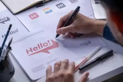
Baseline is the invisible line that letters sit on in typography. It is the line where most letters rest, not counting letters with tails like g, j, p, q, and y. The baseline helps designers align text properly and create clean, professional layouts.
Baseline is crucial for typography and layout design in both print and digital projects. It ensures text looks organized and easy to read across different fonts and sizes. Understanding the baseline helps designers maintain consistent spacing and alignment in their work.
X-Height
X-height is the height of lowercase letters from the baseline, the line letters sit on.
Baseline works differently depending on the design context and alignment needs. Here are the main types of baseline applications in graphic design:
Baseline improves text organization and visual harmony in many design situations. Knowing when to use it makes layouts stronger. Here are the best times to use baseline:
Note: All information and/or data from external sources is believed to be accurate as of the date of publication.
Consult Course Advisors
Hire Our Graduate / Upskill Your Team
Become An Instructor
Save up to ₹11,500 on your Graphic Design course | Apply by 17 June
|
03
Days
18
Hours
25
Minutes
37
Seconds
|