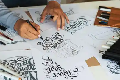
In typography, a descender refers to the characters that tend to extend beyond the baseline. It mostly applied to letters with a tail, such as g, j, p, q, and y. Descenders may not be explicitly visible, but are crucial for the readability and legibility of the text in a design.
Descenders are primarily used to ensure rhythm and alignment in graphic design. When designing buttons and menus, descenders ensure proper visibility of words by ensuring enough vertical space for each word.
Ascender
It refers to the characters that tend to extend above the baseline.
Descenders in typography ensure the overall visual balance of a design. Here is why they are extremely important.
Check out the three major types of descenders in graphic design below.
Note: All information and/or data from external sources is believed to be accurate as of the date of publication.
Consult Course Advisors
Hire Our Graduate / Upskill Your Team
Become An Instructor