Your interior design logo is the first impression clients get of your business. Learn how to create a memorable logo that attracts more clients and showcases your design expertise.
SUMMARISE WITH:
A logo is your brand's face. It's the first thing people see when they discover your business. Think of it as your visual handshake with potential clients. A good logo makes people remember you, and a unique logo makes you memorable and helps you stand out in a crowded market.
In interior design, a logo shows your working style to anyone discovering you. Most interior design logos use simple shapes; some might even show furniture, houses, or abstract designs. The best ones are clean and easy to understand. A clean, professional logo suggests that you create beautiful, organized spaces. This helps build trust in your design skills, which is crucial when clients invest significant amounts of money.
If you’re wondering how to create an impactful interior design logo, you’ve landed on the right page. Here is what we will cover in this blog:
- Key Elements of an Effective Interior Design Logo
- Types of Interior Design Logos
- Step‑by‑Step Logo Creation Process
- Interior Design Logo Examples & Ideas
- Common Mistakes to Avoid
- Conclusion
Key Elements of an Effective Interior Design Logo
A great logo uses three main elements: color, font, and image. When these work well together, your logo can clearly show your design style and message.
1. Color Palette
Color is pure emotion and a powerful way to share your brand’s story. The right color palette enhances your mood, such as calm, excitement, or luxury, without using words. Neutral shades like beige, gray, and white give a sophisticated look and pair well with any style. Earthy tones such as brown, green, and warm orange create a cozy, welcoming vibe. Bold hues such as bright blue, deep purple, or rich red help your logo stand out with personality. Black gives a sense of luxury and professionalism. To keep your logo clear and strong, use only two or three colors. Using too many colors can look messy and weaken your message.
2. Typography
Typography is your brand’s voice. The font you choose tells people if your style is classic or modern. Sans serif fonts are clean and simple and suit minimalist interior designers. Serif fonts have small lines at the ends of letters and feel traditional. Script fonts look fancy and work well for luxury designs, but can be hard to read. Custom lettering gives your logo a unique look that no one else has. Always make sure your text is easy to read at any size. If people cannot read your name, your logo will not work.
3. Iconography
An icon is a visual shortcut for your brand. You can choose a literal icon or an abstract one. Literal icons use items like houses, chairs, or lamps. They show exactly what you do and help people understand quickly. Abstract icons use shapes, monograms, or swirls. They feel creative and stylish and hint at elegance or precision. Plant symbols like leaves or flowers can show how you bring life to rooms. Keep your icon simple so it still looks good when small. A clear icon makes your logo easy to read and remember.
Types of Interior Design Logos
Now that you understand the core elements, let's look at the different formats for your logo. Each type has its own strengths and is suited for different brand strategies.
1. Wordmarks (Text‑Only Logos)
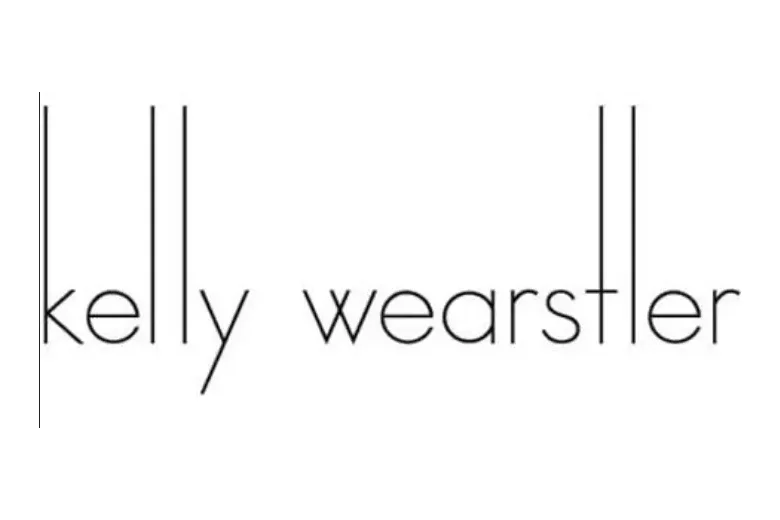
Image Source: Pinterest
A wordmark is a logo made only from your full business name in a custom font. Kelly Wearstler uses her own name in clean, unique type to keep her brand front and center. Wordmarks work best for short, memorable names. They look simple and professional, are easy to remember, and scale well at any size.
2. Lettermarks (Monogram Logos)
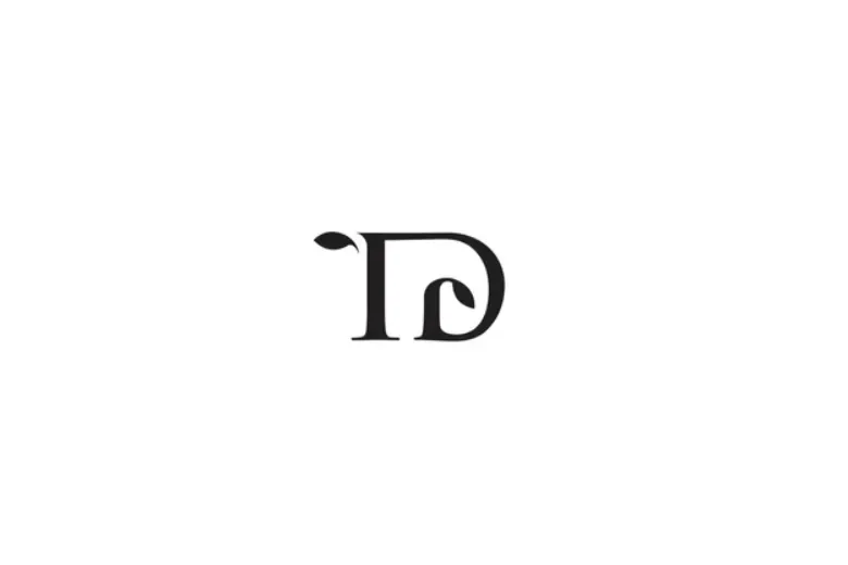
Image Source: Shutterstock.com
A lettermark is a logo built from your initials instead of the full name. The Designory often uses lettermarks to simplify a longer name. Lettermarks suit brands with long or complex names. They feel elegant, are easy to recall, and make great social media avatars.
3. Combination Marks
Image Source: StartupTalky
A combination mark pairs text and an icon, so you get both clarity and memorability. Livspace, for example, often pairs its name with a simplified floor plan or a speech bubble. Combination marks suit almost any interior design business. They let you use the icon alone on social media or the full logo on your website, offering maximum flexibility.
4. Emblems and Badges
Image Source:https://www.tiffanykenyondesign.com/
An emblem places your text inside a shape or seal, giving a sense of heritage and trust. Damien L. Busillo Architect, uses a round crest to evoke tradition and high quality. Emblems work well for luxury or classical interior designers. They look premium, feel established, and stand out in a crowded market.
Step‑by‑Step Logo Creation Process
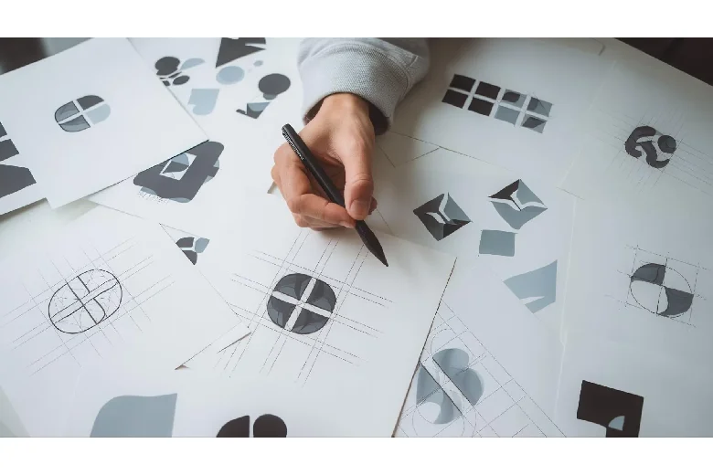
Ready to bring your brand to life? Follow these six steps to transform your idea into a polished, professional logo.
1. Research
Begin by studying other interior design logos. Look at local firms and well-known designers to see what works and what does not. Make a list of elements you like and those you do not. Then gather visual inspiration beyond logos, including photos of rooms, art, architecture, fashion, nature, and textures. Use a platform such as Pinterest to create a mood board with all these images. Seeing your ideas together helps you spot patterns and guide your own logo design.
2. Conceptualization & Sketching
Begin by listing words that describe your interior design business. Think of your style, such as modern or rustic; your values, like quality or comfort; and your clients, whether families or high-end customers. These words will keep your logo focused on your brand.
Next, start sketching with a pencil and paper. Try writing your name in different fonts. Add simple icons or symbols that match your style. Test different layouts and arrangements. Focus on getting lots of ideas out rather than making perfect drawings. Even rough sketches can lead to your best logo design.
3. Digital Drafting
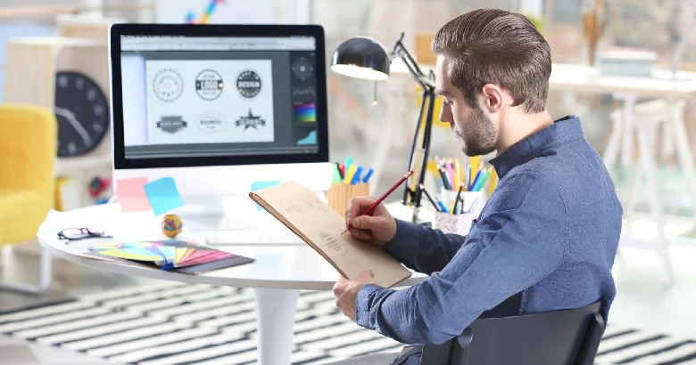
Begin on paper before you open any software. Sketch at least five rough ideas to explore layouts, icons, and text arrangements. Once you have your best sketches, pick three to five and recreate them digitally. Choose a tool that fits your skill and budget. You can use Canva or LogoMaker for simple web-based design, or Adobe Illustrator or Figma for more control. Use basic shapes, lines, and text so you focus on structure. Make several versions of each concept with different fonts, sizes, and layouts.
4. Color & Typography Selection
Now bring your digital drafts to life with color and font tests. Try a monochrome palette with varied shades of one hue, a complementary scheme using opposite colors on the wheel, or an analogous mix of adjacent colors. See which feels right for your brand. Then test font families in light, regular, and bold weights and at different sizes. Always view your logo in simple black and white to ensure it still works without color. Check that any text remains clear even at small sizes, like a business card.
5. Refinement & Feedback
Share your top logo options with others. Ask them what they think the business does, how the logo makes them feel, and which version they prefer. Look for feedback you hear more than once and use it to adjust your colors, swap fonts, or simplify any complex parts. Finally, test your logo at a social media icon size. If it becomes blurry or unreadable when small, simplify it further.
6. Finalization & Delivery
Prepare your logo files in every format. Export vector files (AI, EPS, SVG) for printing and large-scale use. Create raster files (PNG with a transparent background and JPG) for websites and digital documents. Produce versions in different sizes and orientations. Then, make a one‑page brand guide that lists the correct logo use, your color codes in HEX, RGB, and CMYK, and the font names and sizes. This guide ensures your logo stays consistent everywhere.
Interior Design Logo Examples
Need logo ideas? Here are interior design logos by style. Some are simple and clean. Others are rich and detailed. See how they match. Then try making your own logo.
1. Icon‑Driven
Image Source: https://www.manypixels.co/
Icon-driven logos use one simple symbol to show what you do. They turn ideas like homes or keys into a clear mark. This makes your brand easy to spot at a glance. Effective examples include:
- Sierra Interiors: Features a stylized window icon with curtain silhouettes, representing their expertise in window treatments. The minimalist icon works equally well on digital platforms.
- MM Interiors: Two interconnected “M” letters form a subtle house silhouette, conveying home-focused services without literal imagery.
- Laura Miller Design: A door-shaped frame enclosing the designer’s initials, representing home entryways and architectural transformation.
Image Source: https://www.manypixels.co/
Why it works: Icons transcend language barriers and enhance brand recall. For residential firms, house motifs (windows, roofs, keys) perform best, while commercial designers might use abstract structures or floor plans. Limit icons to one focal element for scalability.
2. Minimalist
Image Source: Pinterest
Minimalist logos cut back to the basics. They use clean type and white space. This lets your work stand out instead of the mark. Notable examples:
- Julia Longchamps: It features a clean, modern look with plain sans-serif typography, neutral colors, and a full-name wordmark, making this design versatile and perfect for minimalist interior design.
- Fieldhaus: Industrial-inspired sans-serif font with rigid geometry, reflecting structural precision in commercial projects.
Image Source: https://www.manypixels.co/
Why it works: Minimalist logos adapt seamlessly to business cards, websites, and signage. They signal modernity and focus attention on your work rather than decorative elements. Neutral palettes (black/white/beige) ensure versatility across materials.
3. Luxury
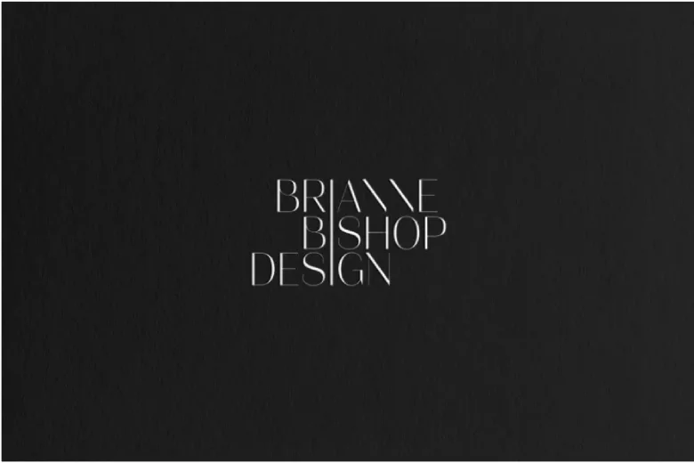
Image Source: https://www.tiffanykenyondesign.com/
Luxury logos mix ornate lettering with rich accents. They speak of quality care and fine taste. They make clients feel they will get the very best. Take a look at these examples:
- Brianne Bishop Design: A sharp-angled gold “B” with negative space detailing, featured in The Wall Street Journal for its opulent aesthetic.
- Alexandrea Rose: Combines a serif “A” with flowing script “Rose”, balancing tradition with bespoke elegance.
- Viktoria Barannik: The conjoined Ns in Barannik’s logo and the off-white and emerald green palette create a classy, luxurious look.
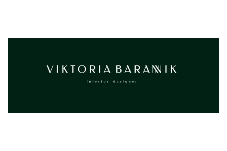
Image Source: https://www.manypixels.co/
Why it works: Monograms distill brands into signature marks. Serif fonts suggest heritage, while gold foil or embossing elevates print materials. Best for firms specializing in luxury residential or boutique hospitality projects.
4. Hand‑Lettered
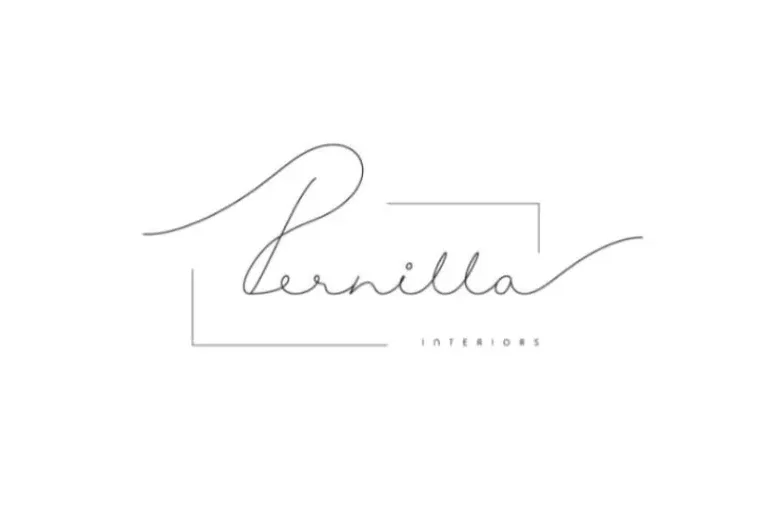
Image Source: https://www.manypixels.co/
Hand-lettered logos feel personal and warm. They look like custom art made just for you. They show that you give each project careful attention. Here are a few real-world examples of it:
- Pernilla Interiors: Soft pastel-pink signature with connected letters, framed by a delicate line for balance.
- Xenia Ko: An elegant, signature‑style logo paired with a clean, versatile wordmark, adding a personal, artistic flair.
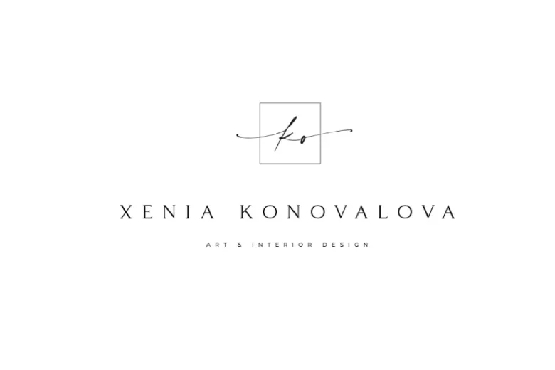
Image Source: Behance (Anastasia)
Why it works: Scripts humanize brands, making boutique firms feel accessible. Pair with subtle icons (like Pernilla’s frame) for structure. Avoid overly ornate fonts for digital readability.
5. Geometric
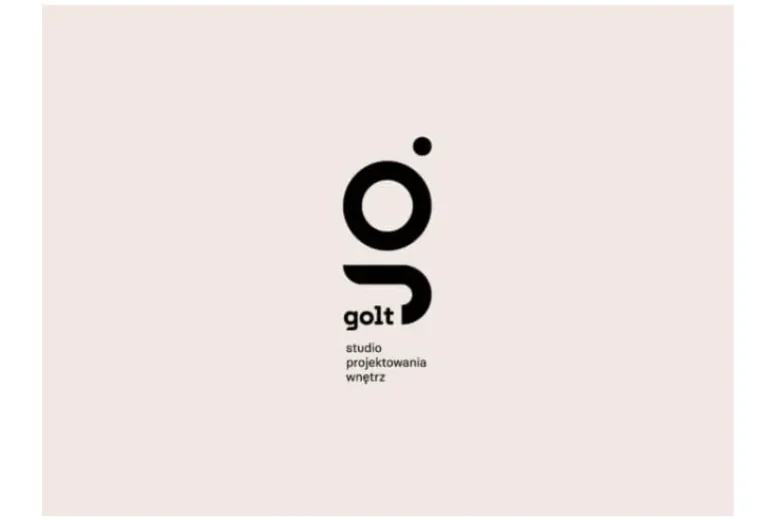
Image Source: https://www.manypixels.co/
Geometric logos build shapes like circles, squares, or triangles into a mark. They hint at quality build and exact skill. They suit studios that mix art with data. These are the notable implementations:
- Zona: A 3D “Z” built from overlapping blocks, symbolizing architectural volume and modern industrial style.
- Golt Studio: Interlocking triangles/circles forming a hidden “G”, representing multidimensional design thinking.
Why it works: Geometry implies precision and forward-thinking. Dynamic compositions work well for tech-savvy or sustainability-focused firms. Use 2-3 complementary colors for cohesion without clutter.
Common Mistakes to Avoid
Common mistakes in logo design often come down to too much detail, poor scalability, and inconsistent branding. Many new designers try to include every idea they have in one mark. This makes it hard to read at small sizes, difficult to remember, and prone to fail online. To avoid this, focus on one main element, limit your palette to two or three colors, and choose a single font family.
Always test your logo in all the places it will appear: as a small social media profile image, on a large billboard, in black and white, on various background colors, and even as a photo watermark. If it does not work in any of these contexts, simplify the design until it does. Then make sure your logo matches the rest of your brand—your website, business cards, social media look, and overall design style. Consistency builds trust and recognition.
Keep these guidelines in mind as simple rules rather than trends:
- Do keep your logo simple so it is easy to remember and recognize.
- Do make sure it is legible at any size, from a business card to a billboard.
- Do aim for a timeless look that will still feel fresh in years to come.
- Do ensure it works just as well in a single color as it does in full color.
- Do not use clichés such as generic house shapes or standard light bulb icons.
- Do not follow trends blindly or overcomplicate your design.
Conclusion
Creating a great interior design logo takes time and thought, but it pays off in the long run. Your logo is often the first thing potential clients see, and it sets expectations for your work. Remember to keep it simple and clear, match it to your brand personality, test it at different sizes, gather feedback before finalizing, and stay consistent across all your marketing. Whether you aim for a luxury feel or a clean, modern look, focus on clarity and professionalism. The best interior design logos tell a story, hint at the beautiful spaces you create, and build trust before you even meet a client.
Next Steps
If you’d like to learn more about other interior design styles and related topics, head back over to the AND Academy blog for more articles like this one.
You can also check out this project by AND Learner, Jaladhi Shah to get inspiration for your next project.
In case you need further assistance, here are some resources to consider:
- Watch this session by Snehanshu Mukherjee, Founding Partner at T.E.A.M and Mansi Almadi, an Interior Designer at Studio Lotus
- Talk to a course advisor to discuss how you can transform your career with one of our courses.
- Check out our Interior Design courses - all courses are taught through live, interactive classes by industry experts.
- Take advantage of our scholarship and funding options to overcome any financial hurdle on the path of your career transformation.
Note: All information and/or data from external sources is believed to be accurate as of the date of publication.

